Yeti: From Start to Finish
-
I'm liking the color palette a lot.
Jose A. Galue
www.instagram.com/artofjosegalue/ -
@ArtofJoseGalue The colors are really nice with each other! I must say that I really enjoy how the crystals are infused with your yeti. It makes for a really cool design
")
-
@ArtofJoseGalue looking good
-
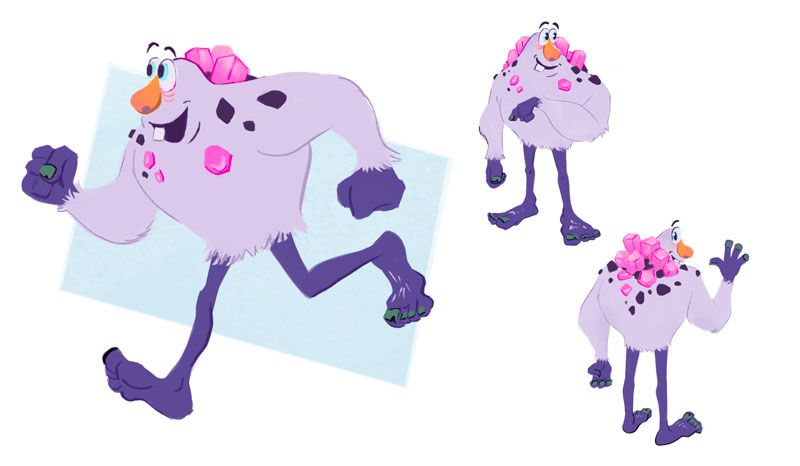
Looking good! I love how the big torso and small legs seems to be a constant theme with everyone’s yeti designs. It just seems to fit so well. I like the pop of colour in the nose here as well, way to bring a little contrast with a complimentary hue.
-
Thank you everybody for the feedback! I had a few hours to play today and I moved ahead with the running pose. At this point, I have no idea how I'm gonna be able to make this guy sit down. I was thinking of kneeling down (monk pose?)
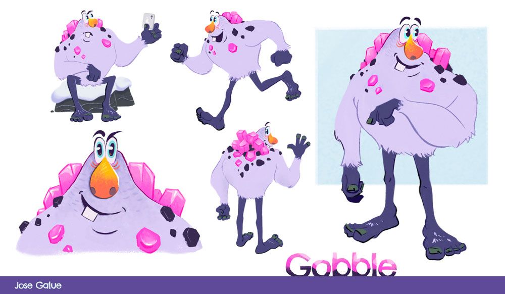
Also, a name for our friend here... Gobble?
Jose A. Galue
www.instagram.com/artofjosegalue/ -
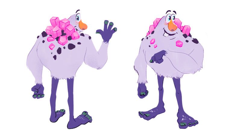
@ArtofJoseGalue I picture him hunkered down over top of his legs in a crouched position but his body covering most of his knees with the exception of his big feet sticking out. Maybe I’ve seen too many pics of yetis with mountains on their backs lately but I see this guy being huge and when he sits down, he resembles a big hill with those cool crystals sprouting out of his back like some beautiful, mysterious rock formations.
-
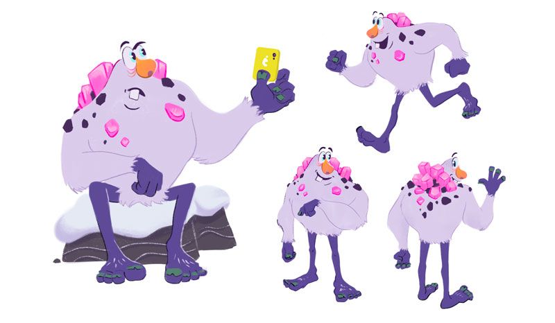
It took me a while to find the "sitting down" position. I'll be lying if I say that I've done a character like this at this intensity before Gobble.
@DaveLeekArt I started to think about the scale of the character too. That thing he is holding is an iPad so maybe he is about 10 feet tall.
-
I'm almost done with it, I think. I'm going to rest on it for a day and then go back to it with fresh eyes.
Usually, If I have the time and the deadline is far I will take 1-2 days off from working on the piece. I highly recommend it, it has helped me a lot.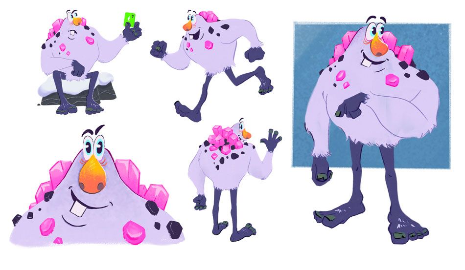
Jose A. Galue
www.instagram.com/artofjosegalue/ -
@ArtofJoseGalue Very cool design! I enjoyed seeing the evolution of the character. Good call on changing the fur to rocks--the fur was cool too, but I love how the rocks work with the crystals (happy accidents are the best
 )
)The design looks great, so I just have a couple of very nit-picky comments about the presentation. For the accent square you have behind the main design, I think I prefer the light blue you used previously since it still drew your attention and had more contrast against the yeti's legs. Also, the green of the phone keeps catching my eye like it's meant to be a focal point. Maybe try making it the same blue you use for the accent square or the yellow-orange from the nose.
Very cool! Keep up the good work!
-
Thank you so much @miranda-hoover I agree with you. It looks so much better now.
I finished Gobble! I haven't done character design in almost a year. My art is currently going through a lot of changes, the struggle between graphic design and visual development is taxing. But, if you want to see what that mess looks like, check out my Instagram. Thank you for being part of the journey.