Making a New Book - Documenting my own process
-
@Gary-Wilkinson Really nice work Garry.
its great seeing your process, you characters ideas are great. -
This is really good @Gary-Wilkinson! Thank you for taking the time to share your insights!
-
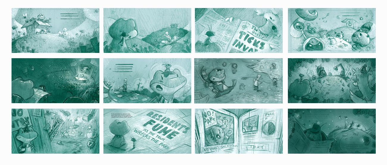
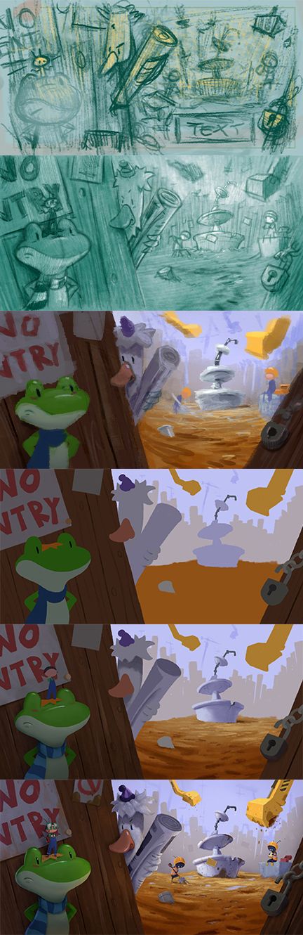
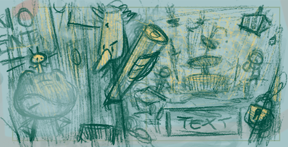
Light and Shadow Studies
When I'm happy with the concepts i'll send them over to the publisher to get them approved and I'll begin to refine them and add in more detail. Most of the designs stayed mostly the same, however I wanted to redo spread 7 as the composition felt too similar to spread 6. I also needed to adjust spread 11 as the stories in the newspaper needed to have an uneven coverage.
To get a better sense of the scene I add some light and shadow, which adds some life to the sketches. These studies will be used as reference as I move into the next stage of adding color and when I wish to check my values later on.
My next step will be to do some quick color studies and then finalize the sketches so that they are ready for the final painting.
-
I love this! Your marks remind me a bit if Will Terry’s pencil works. So good!
-
@Gary-Wilkinson This is so amazing! Thank you for sharing your process! Really appreciate it!
I have a couple of questions if you don't mind.-
Were you given any illustrator notes before starting this project? If not, did you ask for any?
-
Is the first thing that the publisher sees from you? All previous decisions of character design, style etc. were made by you personally?
-
Did you do the value studies in thumbnail size? That's a lot of clean detailing and texture!
-
Is there a reason you use a tint in your studies as opposed to B&W?
-
-
Thus whole post is so good!! Love your characters. Getting to see your process is amazing too.
-
Thanks for sharing this Gary! This is very helpful and enjoy seeing your approach!! Keep up the great work!
-
Very cool man! Quick question on size on the thumbs - there's still what looks to me like a fair amount of detailed marks on the last step you posted (Light and Shadow Studies). Are you completely redrawing each of these at a larger size for the final detail and painting? Or are you doing the thumbs really zoomed out and you're working on the "final" sizes at this point?
Thanks for posting all these!
-
- No notes exactly, I have worked with this publisher/author before and gives me quite a bit of freedom in how I work.
- I initial send character concept sketches and then idea thumbnail sketches of the concepts, these value studies are the last step before focusing on the final paintings.
- The value studies were of a larger size so not really thumbnails at this point, but I still try to keep things simple. You could do these as thumbnails too, but I wanted to refine the sketches anyhow so I blended both processes. @jdubz
- No reason, just a personal choice. I have done them b+w, bluish tints etc in the past. As long as I get the information I need it doesn't matter so much.
-
@Gary-Wilkinson said in Making a New Book - Documenting my own process:
I initial send character concept sketches and then idea thumbnail sketches of the concepts
-
How many character concept sketches do you send? Do you give them an option or do you send the ones you've chosen and just tweak them based on feedback?
-
Is the thumbnails with the yellow highlights in the previous thread what you shared with them?
-
Do you share these with the whole team or just the AD privately?
-
Have you maintained the same process since your first book with them?
I'm just starting work on a big project and have been given full freedom to work as well. They've given me a deadline for the sketches but I'm wondering if I should share my character sketches and rough thumbnails with the AD first?
-
-
@Gary-Wilkinson Ah gotcha. I had just started thinking about this in a project I'm working on right now. I had made small thumbnails and then redrew them at the larger size and I felt like it lost something in translation between. I had thought to maybe do them at the same size but just zoom out so that I'm refining all that energy from the sketches once I was happy with a basic comp.
-
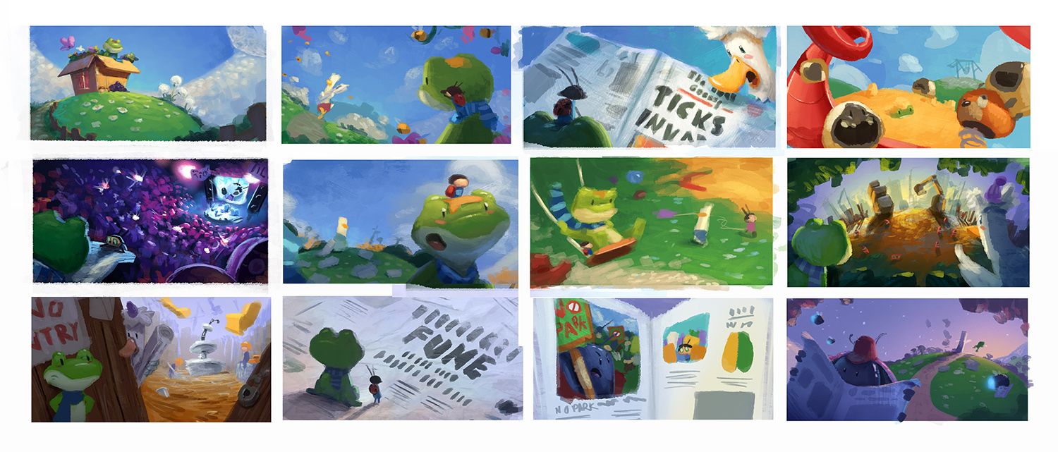
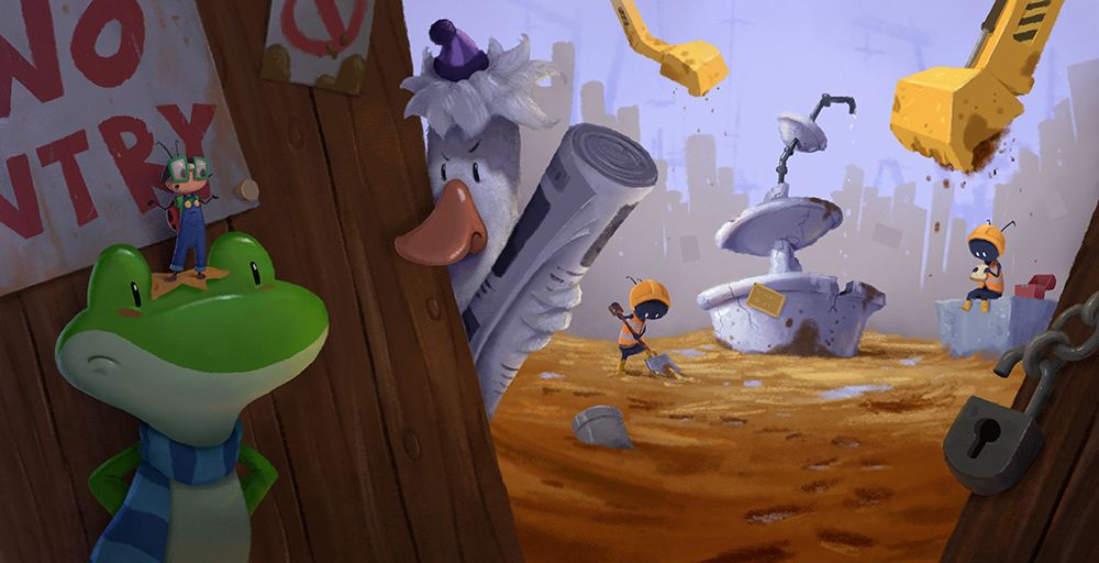
Color Studies
With my value studies sorted I can start looking at color. I try to use a big brush and put down a bunch of colors until I can find what works well. I like to keep things simple and in keeping with my style. These colors will be a guideline for the final painting and I expect to add in a lot more detail, but for this stage they are complete enough.
Whilst painting, there were a few areas that weren't fitting in as well that became more noticeable, so even though i'm mostly focusing on color it still helps further refine the overall painting.
-
@Gary-Wilkinson looking beautiful!
-
Really coming to life @Gary-Wilkinson!
-
Hi @Gary-Wilkinson can I ask how you chose your color palette?
Its clear from your thumbnails that there is a consistent palette running through the book but you're not limiting yourself and including saturated blues, greens, purples, reds, oranges etc.
This is something I struggle with so its nice to see it done so well. I often find my colors losing saturation as I try to make them work together.
Great job.
-
@Gary-Wilkinson I love your lighting and style huhu. Thanks for sharing your process!!!
-
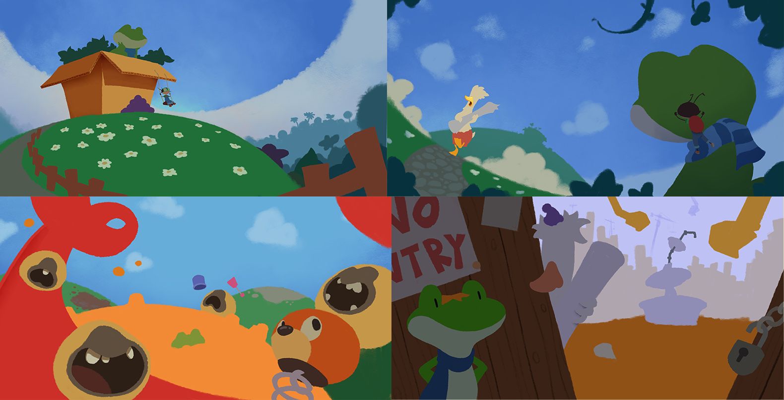
Sorry for the late update. I was hoping to upload a WIP to final piece painting, however I've been working through a few spreads at the same time, so nothing is at it's final stage yet. However I thought I would show how I start a painting.
Previously I started painting everything on the canvas and detailed parts at different speeds, however in trying to simplify my process I begin with flat colors and separate them on their own layers. Each additional layer will be clipped to the master layer so that I can adjust things quickly and not worry about having to backtrack if I make a mistake.
@skillydan Good question, however I don't really have a great answer as to how I chose my palette. Generally I try to keep things simple and focus on the primary colors, and just go with what feels right. I try play with my lighting to avoid making everything feel over saturated (though I always feel like I walk a fine line), and this also helps put more focus on where I want the reader to look.
-
@Gary-Wilkinson This thread is a course on his own. Thank you for your work and for sharing it. I payed for SVS subscription because I love will Terry style and I wanted to learn his process, how he makes textures, etc. Now I say the same for you. I visited your site, Charles Bronson's caricature sketch is sick, I love it!!!!
Have an amazing day!!!!!
-
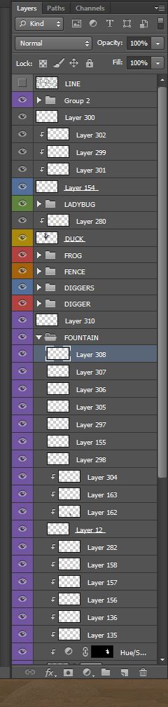
Painting Process
Here is a step by step shot of how I go from start to finish when creating a painting. As mentioned in the last post I put down a flat layer of the base colors first and from that point I start adding light and color. I try and keep my workflow nice and tidy, but as you can see in the layers image, it becomes pretty messed up by the end point...., however if I put everything in folders then it helps for when I have to flatten each part down.
I try to avoid using too many layer effects, but those that I like to use are:
overlay - lighting and color balancing
multiply - for shadows
screen - adding some faint lightingAs I also mentioned previously, by having a good foundation for what you what your painting to look like will really help get it to an endpoint as painlessly as possible. I stuck quite close to my color study and everything else is just detailing. For the moment i'll be putting this painting to the side and checking it again after I have a few more pages done to look at it with fresh eyes, but it's now in a place that feels like it's mostly done.
-
Wow. @Gary-Wilkinson thank you so much for sharing your process.
I am wondering how you manage to do this when working with a publisher? I was not very happy about the terms I have to sign when working on the last couple of books - everything has to be in private (only shared between me, my editor/AD, and my agent). It feels like working in a dark cave in comparing to how I developed my personal work, which I use the forum and my critique group a lot, and always in communication with other artists.
Currently I am planning a personal book project along with working for clients. The main reason is that I really want to have an outlet that I can grow my art in a community such as SVSLearn. I can not do that with client work because of the contract. This threads gives me a lot of ideas of how to organise my process better. Thank you so much.