Camera angle, perspective and character design for scene in book
-
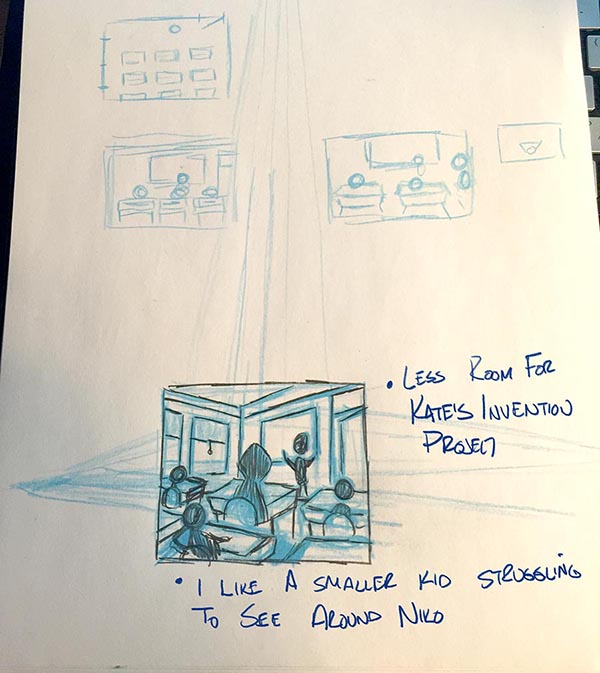
I have a bunch of these I have tossed and I am not even showing here as I know they did not work out the way I wanted them to. But these two are getting there.
In this first one - I think it may still look a bit like a view point of someone looking out over the class, as opposed to that of someone seated in their desk. I think that may have to do with the fact that I reveal too much of the tops of the desks - they need to skewed down to show a more narrow slice and then it may not feel like we are so much over them.
What I like in this one is that Niko is clearly larger than his class mates. And with a kid behind him I can have that kid leaning to show he is struggling to see around NIko to add to his awkwardness in this gnome world. But I find in all of the thumbnails either he or Kate will end up in the center of the image. Not sure yet how to avoid that as I dont want to put either of them to much to the left as this is a page that will be on the right side of the book so I want the critical visual info to stay away from the left edge and gutter.
The other thing is that this page layout is not leaving much room for text. So that needs to be considered as well.
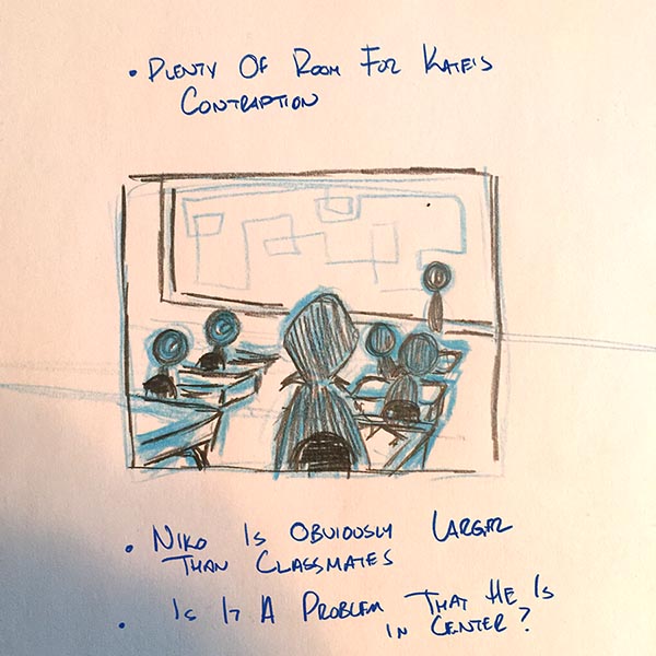
In this next variation I feel like we are definitely viewing this like a kid seated behind NIko. (As opposed to a view from the back looking out over the room).
I like how much blank board space this provides for the text on the page but also for Kate's contraption (could either be a real model or her designs drawn on the board - I like having those options).
We get a real feel for Niko being larger than his classmates. But again he ends up in the center - so from a composition stand point that might not be good, not sure since Kate is actually the one with an action in this scene.
-
I think I may have had a little break through!
After snapping the photo of my thumbnails earlier I pulled them into Photoshop and starting moving some things around and then I did a fresh draw over.
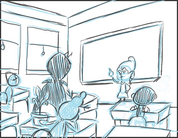
In this version I think I am able to work everything I want visually into the scene.
I have the character Kate presenting at the front of the class. A bit to the right of center which I like. I removed the door to allow more room for Kate and the board and I think that solves that problem.
I have the character Niko appearing much larger than the class mates but now in a position that is slightly left of center which I think is working so much better.
The kid behind Niko is the classmate who has the Kudzu vine (which will play a role later in the story). She is going to be leaning to see around Niko and her crazy hair design will provide a really nice shape silhouette. And the vine will be able to contrast nicely against the dark cape Niko wears (since he is a vampire).
And the bit of desk in the lower right - I can place a pencil/graded test in a way that pays homage to that part of the Tyler Carter piece I shared in the comments below that I enjoyed so much.
-
I really like the composition of your piece
-
Hey!
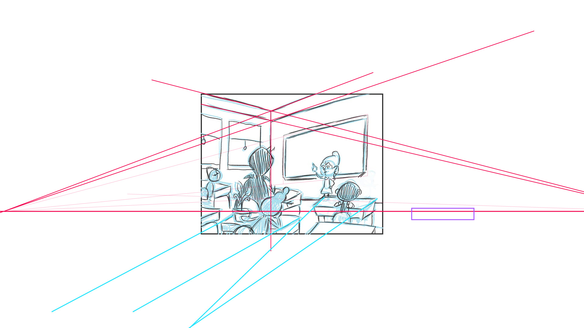
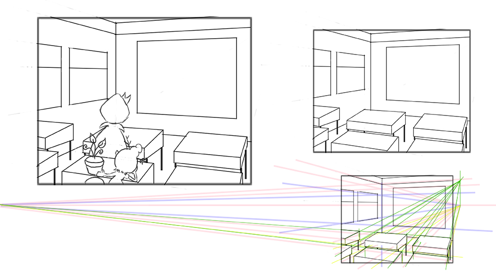
It's definitely coming along compositionally and like I say, composition trumps all. Now it's just working out the perspective for it. There seem to be a few weird things happening. The pink lines are all going to a horizon line and vanishing points, but the bottom half has different things going on. The floor is above the horizon. The desks have some kind of reverse perspective where the vanishing point is behind on a low horizon point. The desk on the right, if it goes through the horizon line that conforms with the top half, you wouldn't see the top or bottom because they cut through the horizon (purple box).
I'm loving the composition though, it looks really nice.
-
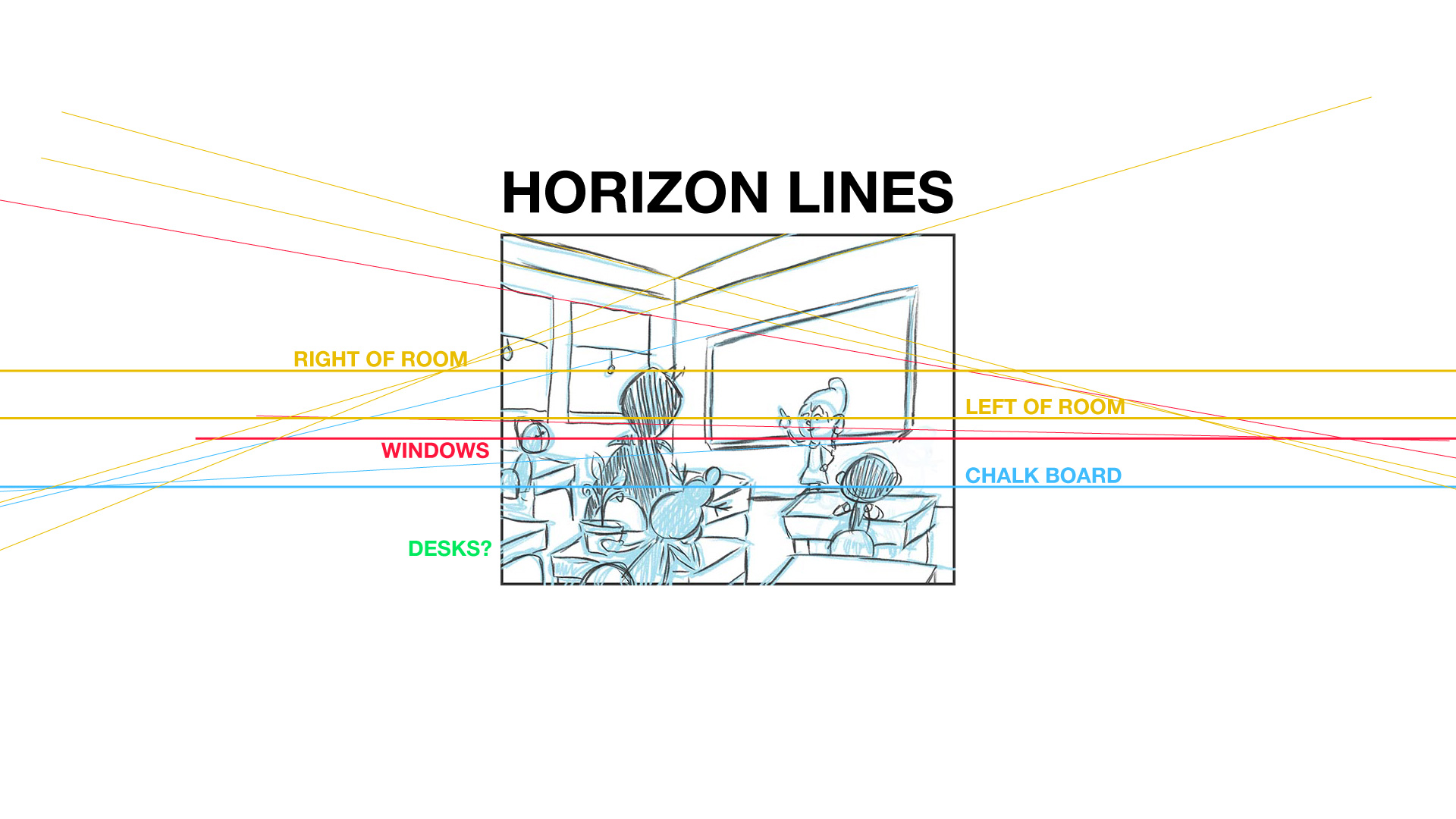
Here are your different horizon lines.
Take care,
Ace
-
@Ace-Connell -First of all - I really appreciate the help on this. Man is it playing some serious tricks on me at the moment.
Until you just did the horizon line drawing, I did not realize I had let so many horizon lines creep into this one. I am not even sure how I did that as I had used lines as guides along the way.
OK, so first up I am going to go back in now and get the right/left/windows and chalk board sorted out and all back onto a single horizon.
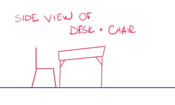
Then I need to figure out the desk situation. I had imagined the desks tops as being slightly angled and not parallel to the floor as shown in this simple side view.
But it is probably that additional angle that is really throwing me off - and where I am losing track of my perspectives. Basically I am further complicating this for myself but I want to conquer this challenge!
-
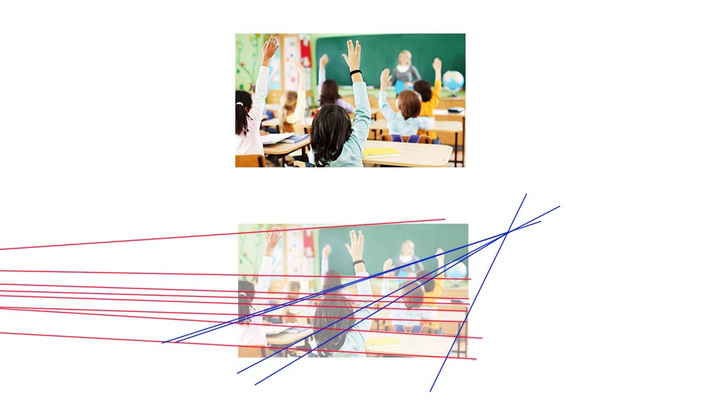
Ok I think this is where I am getting confused. I just found this sample image that shows basically the angle I am trying to accomplish. It does not have the side wall of windows like I had drawn but lets not worry about that for now.
If I follow the lines of the wall, board and horizontals of the desk they are in red and seem to vanish off to the left somewhere.
But if I then take the more vertical sides of the desk and follow them off into the distance they go up towards the right.
So I guessing that the horizon line is going to be up high towards the right intersection points is that true?
-
I really think that was my problem - as you pointed out @Ace-Connell in your horizon line image - I was making the desks vanish in the wrong direction with that reverse perspective thing I had going on.
If I instead move the vanishing point for the desks up and off to the right side of the image - I will get the plain I am looking for as well as the point of view from a child student in their seat at a desk.
I am kind of embarrassed that I could not see this before - and it has taken so many iterations and false starts in my sketchbook and all of these posts here.
-
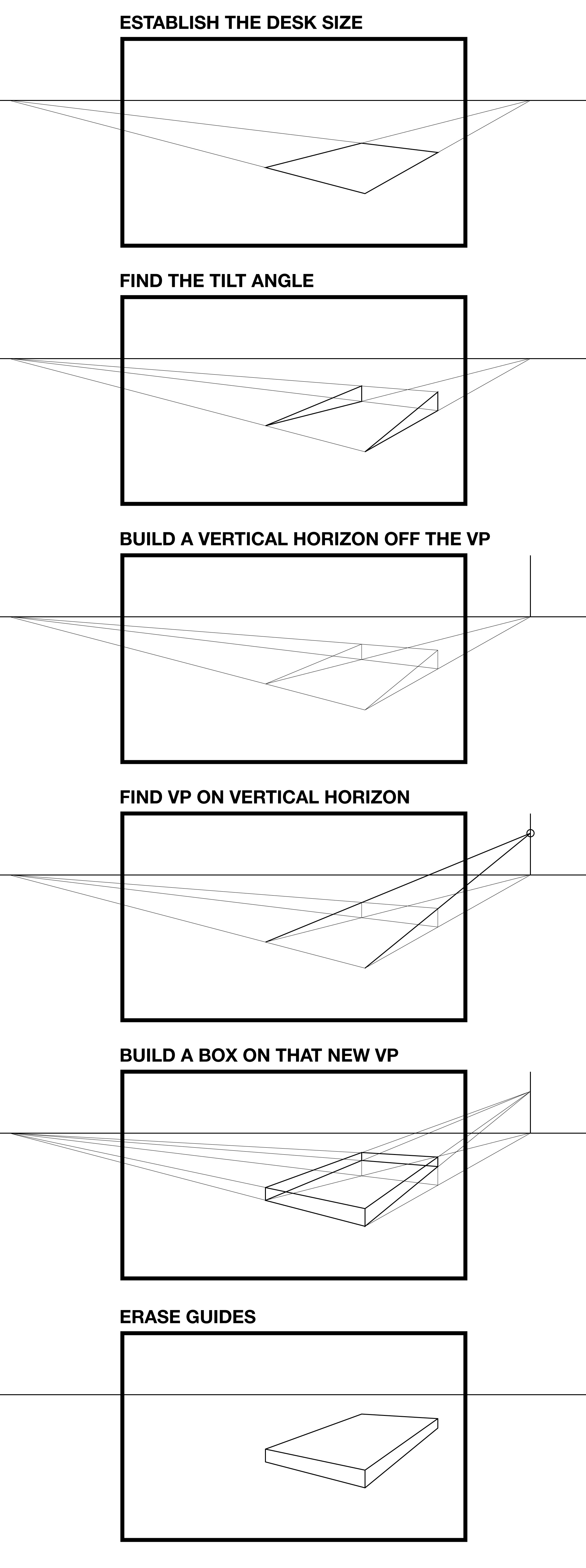
@Rich-Green Here's what I've mocked up for you about adding tilts in perspective...
The final image looks weird because there are no legs on it, so it looks weirdly tilted in space, but add legs to that and follow that and you will have perfect tilts in perspective
")
Ace
-
@Ace-Connell Slowly but surely making progress.
Going to rework the size of the desks a bit more - but once I have it just the way I like in this more technical drawing, then I will lower the opacity and place a new layer over the top and start drawing it out to keep it looser and less architectural. But wow are those guides going to make a huge difference!
-
Feeling a lot meow constructed now
I'd just watch the desk on the left. To me it feels like it's going through the wall?Ace
-
@Ace-Connell Yes - I completely agree about the left desk - that is one of the things I am going to resolve as I also adjust the size (width of the desks).
I also want to try and get the look of that sample image I shared a bit more - which has the kids at the desks taking up two thirds of the scene vertically - as that places the viewer down in there with them more.
So I may lose the tops of the walls and let the chalkboard go out of frame at the top as well - so that I can fit everything I want into the image. But knowing the angles will line up - makes it so much easier to plan it out - now that I have my head wrapped around the perspective technique better!