Need help with a new project/client
-
After putting it off for a long time with the typical, "I'll do it when my portfolio is perfect" I finally* did the email blast thing and sent out a letter to a bunch of publishers, agents, and art directors. Well, yesterday I got an offer for a 6 panel story project for a kid's magazine which is amazing!
As this is my first job with a contract, I want to make a great first impression and not look like a noob.The art director has a sketch deadline for the project but my question for any of you experienced people out there is what size and level of detail should these sketches be? The finished images are going to be 8X10 if that has any impact on the sketches. My thinking, from CBPro and book dummies, is that they would be significantly smaller and relatively rough but still convey the composition and layout of each image, so the director has a vision for the final product.
Quick Version: What size and level of detail should I submit to the art director in the sketch phase?
Thank you for any help!
*Thanks @Jeremy-Ross for giving me the final push a few weeks ago!
-
@jeremiahbrown Congratulations!! That is so exciting!!
 ️
️I think you kind of answered your own question lol. The most important thing is that your sketches are the same aspect ratio as the final Illustration and are large enough that someone can easily understand what is happening. I wouldn't stress too much about the precise sizes you send them unless they requested it.
Personally I like to place the text with the Illustrations - so I find that is easier to do when the image is actual size. However, when you export the size may compress anyway so as long as it's the same proportions as the final it should be fine.
Personally this is my process:
I do tiny thumbnails in my sketchbook first and then place my thumbnails with the text at actual size. I then clean up as needed to share with the art director (usually a second rough sketch, but I keep the images small on screen when I sketch) It's difficult to go straight to full scale roughs before thumbnails so that process works best for me.Good luck!
️ -
@jeremiahbrown congratulations!!!
Quick answer: Communicate. That's the most important thing. Be open, honest, and professional.
Slightly longer answer: If this is your first time working for a children's magazine and/or your first client, let them know! There's nothing wrong with that and the AD will probably thank you for it. If they know that this is new to you, they can adjust their art direction or communication style so that you understand what they want from you and so the job can be completed successfully and on time.
Make sure you ask for a brief, examples, and art specifications (including dimensions, dpi, file format, color profile, etc.) -- if these things aren't supplied at the outset. Asking questions and making sure you have all the information you need to get the job done and deliver on time will make the best impression, whether you're a noob or not. The AD will appreciate your professionalism.
Hope this helps! And sending you well wishes for an awesome first contract job!
-
Congratulations @jeremiahbrown! I’m so glad I inspired you to take the leap!
Agree with @carlianne and @Melissa_Bailey , that communication is essential. Bonus points if you send minutes of your meeting (if a teleconference is held) with alignment on path forward.
For the avoidance and f doubt, don’t forget the most important part:
DO NOT START UNTIL THE CONTRACT IS SIGNED BY BOTH PARTIES.
I’m so happy for you and wish you the best on this deal!
-
@carlianne ,@Jeremy-Ross ,@Melissa_Bailey Thanks so much for the great advice! All of it was very helpful and greatly appreciated

-
@jeremiahbrown Congratulations! That is so exciting for you!
-
@jeremiahbrown Congratulations! Thought I'd take a moment and show my process of working with AD's. This is a children's theater poster I did a couple years back.
as @Melissa_Bailey wrote:
Make sure you ask for a brief, examples, and art specifications (including dimensions, dpi, file format, color profile, etc.) -- if these things aren't supplied at the outset.
I work in proportion to the finished art right from the start.
So this is 22"wide x 26" tall poster that I've scaled down, in proportion, onto a 15" x 15" (ish) page.
Most of these are true "thumbnails". That is, drawings that really only I understand, and are about 3" tall.
I'm spending about 2 - 3 min on any one of these. But you can see that 3 have been toned. Those are the three options I selected to submit.
Note: This page is only ever for me. I don't show all these other thumbnails to the AD.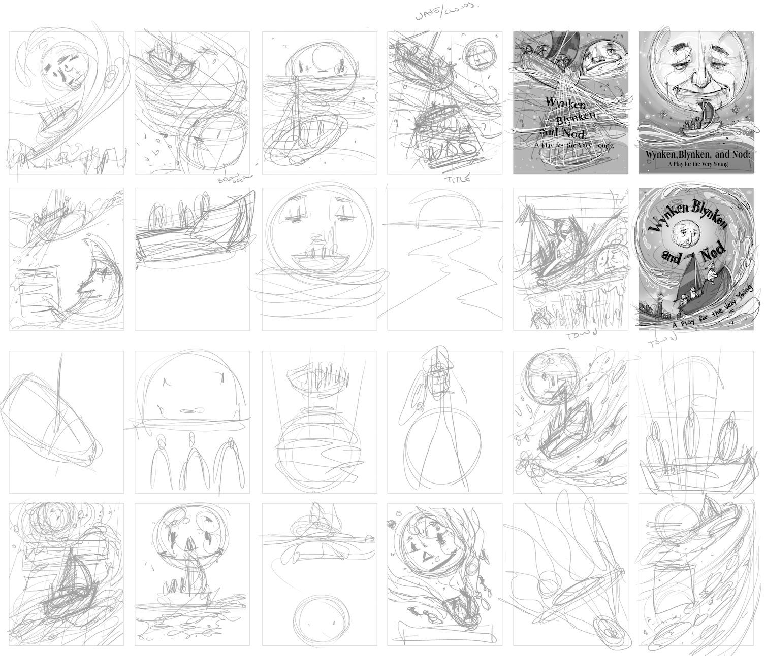
The selected thumbnails are to a "Rough Sketch" level.
This is what I will show an AD for the first time.
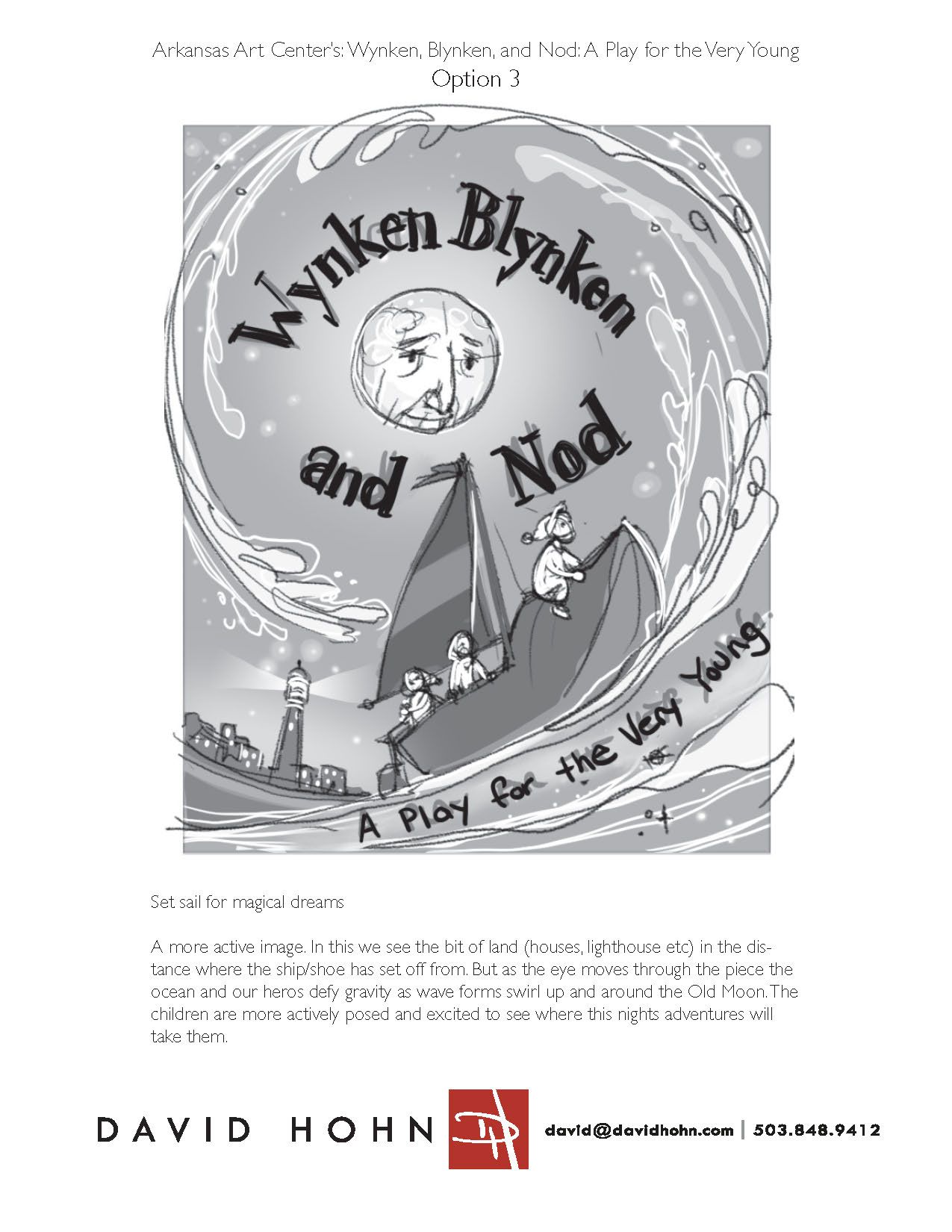
I'm simply putting a piece of tracing paper (in this case a new PSD layer) over the initial thumbnail and refining the drawing to make it readable to the average person. There's about 5 - 10 min worth of drawing here. I also add in about 10 - 15 min worth of toning. Toning is incredibly valuable for my process and easily my favorite part of any project. I haven't scaled up the drawings at all yet. These are still about 3" tall. (I'm working at a resolution of 300 ppi)I copy and paste the toned rough sketch into an 8.5 x 11 Indesign document (but it could just as easily be a PSD) and format it with the client name, project title, Option # (as needed) and my contact info.
I include a title and written pitch on each of my Rough Sketch options. The drawing is still pretty rough, and I want to make sure the AD knows that the kids are "excited" and that this is a "night scene" and that the waves are "defying gravity". Basically I don't have to draw a lot of specific detail at this stage since I can supplement with written description. I also try to weave in "keywords". That is how I want the audience to feel as they look at the image. In this case "active" and "magical".
Before sending out to AD I save as PDF or Jpeg. Something easy to view on screen or print out, but still a nice small file size (under 500K)
Next I do a color study.
I always do this for my own benefit. (Color is hard! And I'd rather play around in this low-stakes sketch version, trying out a bunch of options) But sometimes the client specifically asks for a color study before final art. I'm always happy to send that off. I would format it the same as the Rough Sketch option, with keywords and pitch.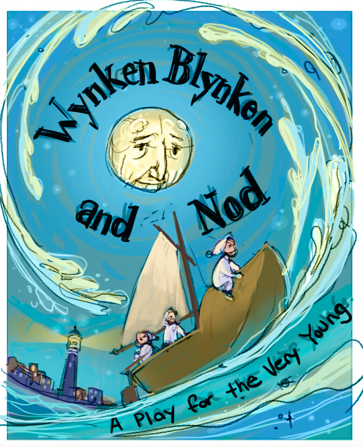
I will also send off a finished sketch. This is exactly what the the art will look like (in line drawing form) and where everything will be placed. This is drawn 125% of the printed size (that is I draw it 25% larger than it will print) This is especially important to allow designers to confidently place type so that there aren't weird overlaps or accidental tangents.
In this case I was designing the type myself so it was straightforward. But when I'm doing a book I will ask that the designer place the type and send me a PDF so that I can adjust the final art as needed.The large drawing is placed into a similar InDesign template (8.5 x 11) and scaled down to fill the available space. You will notice that I don't include a written pitch. That's because by this stage everything should be specific enough that no written description is needed. Art Director change requests should be fairly minimal at this stage and easy to accommodate.
And then it's on to the finished art!
This is painted at the same size as the Finished Sketch, but I also add "bleed" to all four sides. My habit is to add 1" to each side.
With the approvals I've gotten along the way I rarely, if ever, get changes at this stage. Not unheard of though. And I handle them on a case by case basis. If the change is fairly small and easy, I'll simply do it no charge. But if it's larger then I will negotiate a "change fee" with the AD.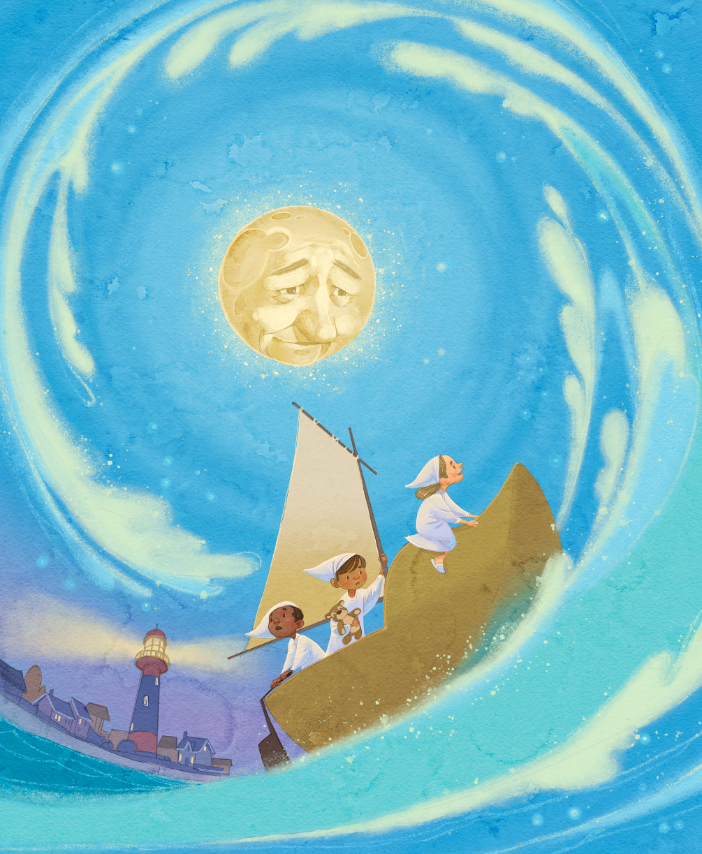
-
@davidhohn That looks amazing!
-
@jeremiahbrown Hey, that's great! Good for you for just biting the bullet and sending things out. And you have also started a very valuable thread here! Following!
-
@chrisaakins @LauraA Thank you! @davidhohn Wow, thanks so much for taking the time to post this. It's extremely helpful for not just me I'm sure! Thanks again!
-
@davidhohn This is absolutely gorgeous by the way. It felt wrong not to mention that in my first reply.
-
@jeremiahbrown Glad that it's helpful. Feel like I'm paying forward all the great advice I got starting out!
-
@davidhohn Wow. That’s incredibly helpful! Bookmarked your answer.
Beautiful poster too!! I love Winkin Blinkin and Nod. -
Last quick follow up question that I don't remember being covered in CBpro:
What are most AD's expected time frames for submitting projects in relation to their deadlines?
For example, AD puts a deadline for sketches at Jun 5th, but the illustrator finishes the sketches on May15th. How long should the illustrator wait before submitting those sketches, so that they are early enough to be helpfully but not too early to be a nuisance? Thank you!
-
@jeremiahbrown how exactly did you go about the email blast, gathering contacts, figuring out what to include? If there info on this stuff in the podcast and/or in classes?
-
What are most AD's expected time frames for submitting projects in relation to their deadlines?
That's a great question!
No doubt this will be different for everyone, but if I'm done really early I'll hold the image(s) and send it 3 to 5 days earlier than the specified deadline.Right now I'm getting ready to send off the cover art for a new picture book. The deadline for cover art is next Tuesday. But I'm done, and looking to generate some goodwill and confidence from the AD, so I'm submitting today.
-
@davidhohn Awesome, thanks a lot, that's so helpful!
@Griffin I don't have a great method for email blasting really, just a bunch of googling. Anoosha Sayed has a pretty good Youtube video if I remember correctly, and I think there's a 3PP podcast that mentions tips. Also, I think our very own community member @NessIllustration has a helpful video or two on this topic. I had watched/listened to these resources several months back and never acted but this time I just started googling and googling... things like "agents", "kid's magazines", "art directors", etc., found contacts, and then sent them emails. It took 2 full days to do it all and I'm sure half of my emails went to inactive inboxes or someone's dog, but doing nothing hadn't gotten me any results, so I figured I'd try something.
-
Thanks everyone for your help and insights (especially @davidhohn for your extremely thorough response)! They were really helpful and made the process really simple and enjoyable.
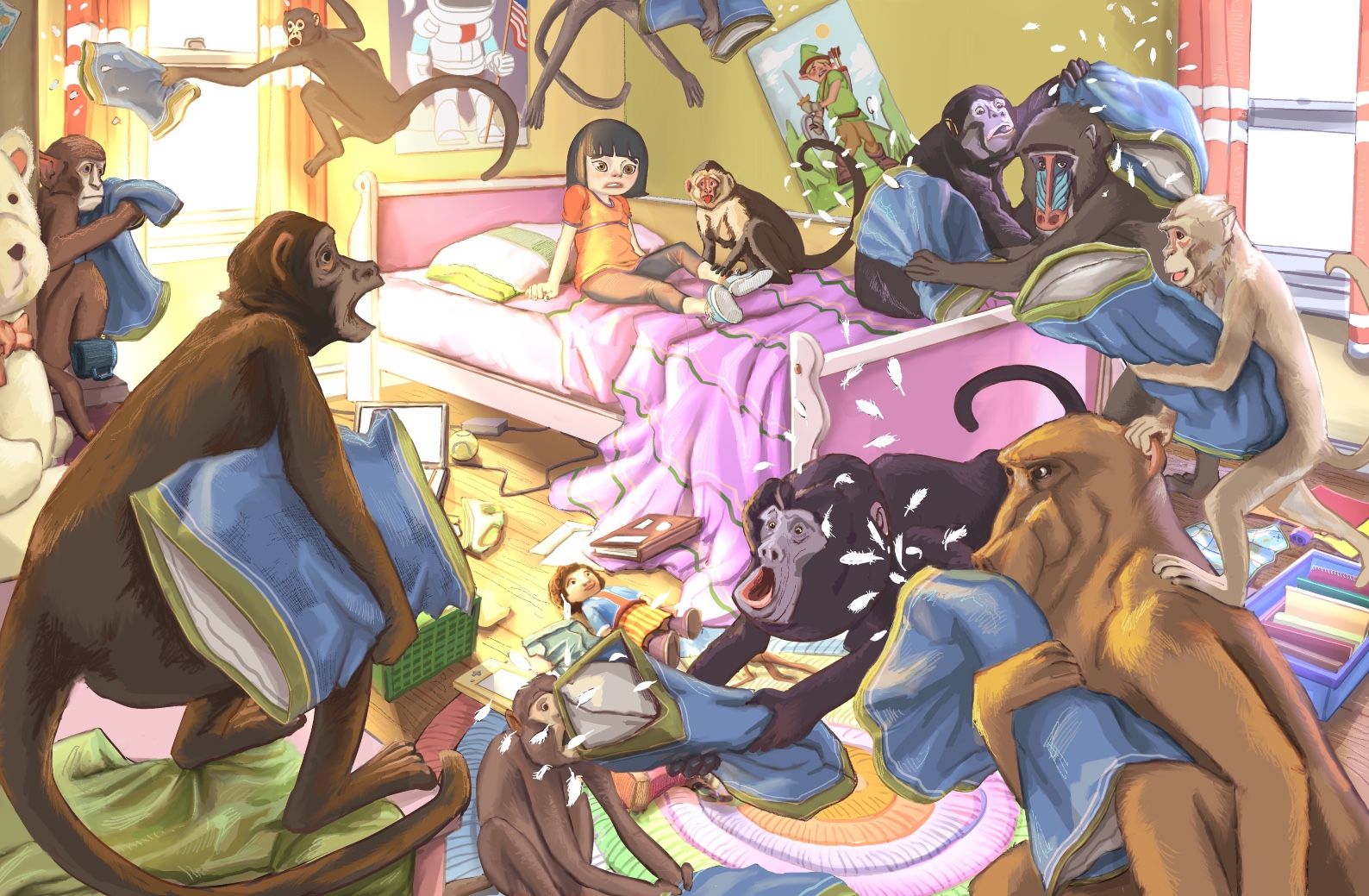
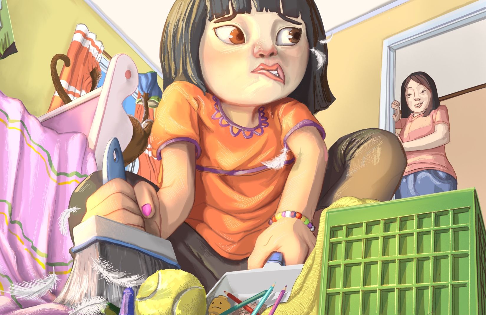
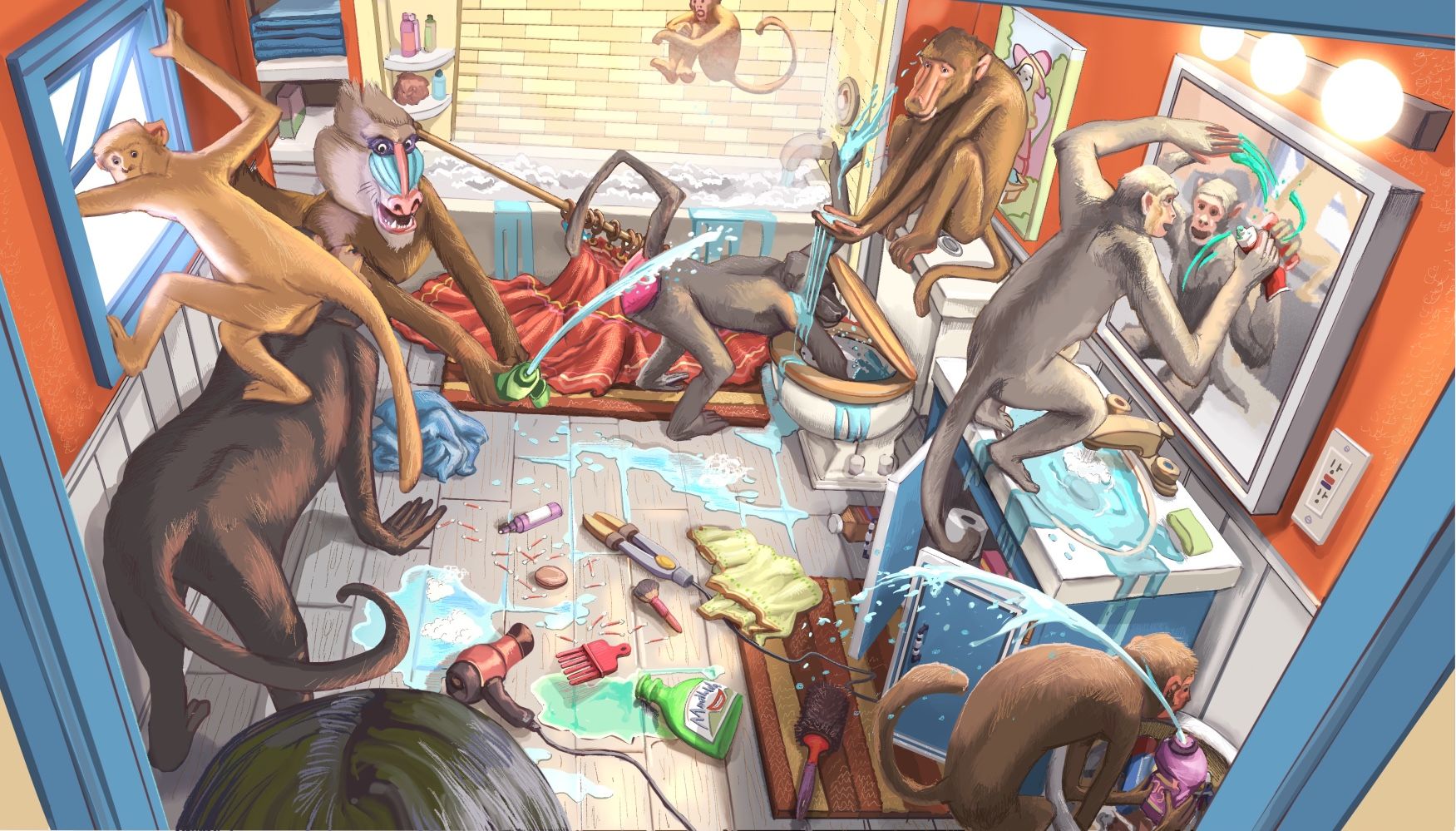
The art director gave me permission to share the artwork before the release so here are 4 of the 6. The images are for the upcoming July '22 issue of Spider magazine for the short story Outsmarting the Saturday Similes by Joel Stetler. Thanks again!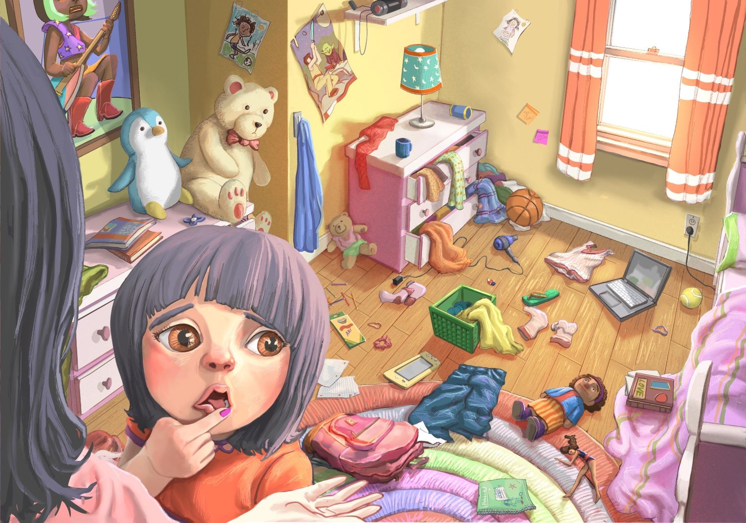
-
@Jeremiahbrown Congratulations! This series looks great. Happy to assist in any small way.
-
@Jeremiahbrown Wow! Great work! You really nailed it on the chaotic scenes!