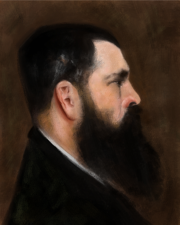
Updated John Singer Sargent Master Copy attempt
-
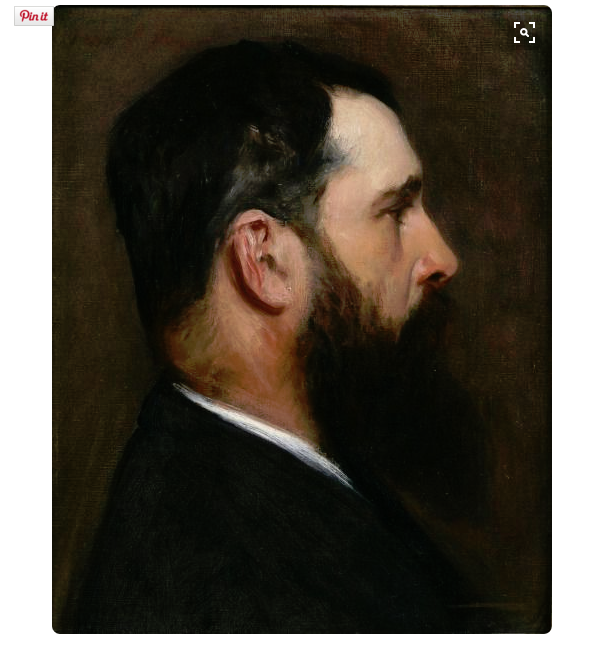
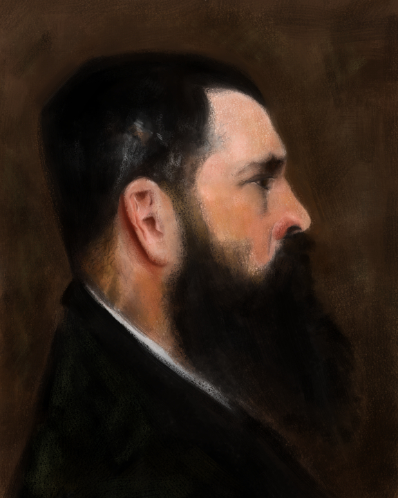
I think this is as close as I am going to get with my current skill set without starting over. Proportions and color, skin tones are still off but overall I'm ok with it. @Lee-White the eye is so detailed and dark it is really hard to pin down and that is what would have really captured a decent like-ness. I added in the vein details on the forehead and some stray hairs etc but without the eye right it just does not work. The added yellow tones in the skin show up better on my wacom too. Not sure how else to get there. From the first one till now there is a big improvement but not quite there.
Happy Creating
www.charlieeveryan.com -
Looks very good, I read the post from @Lee-White about the master copy and even though its intimidating I think i'm going to attempt it. Keep up the good work.
-
@HaHernandez Thanks! It really is great practice!
-
wow, awesome job!
Follow me on Instagram and twitter! @christinabdraws
Facebook: https://www.facebook.com/cbrownillustration/ -
Very nice!
-
@Charlie-Eve-Ryan I see a big difference between this and your first attempt. You're definitely getting there, in my opinion. As I look at the eyes, one difference I see is that on Sargent's painting, the angle describing the top and bottom eyelid is wider than on yours, the slant of his eyebrow is steeper. Maybe making some changes there might help get this to an even higher level?
Anyway, I am impressed with your work!
-
@anthemsweet Thank you!! I see what you mean, my top lid is a bit closed. I can try to fiddle with that...thanks!
-
@Christina-Taylor-Brown and @imrush thank you!!
-
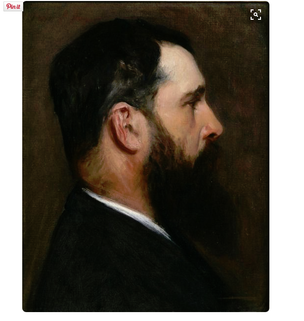
I adjusted the angle on the eye a bit and added some more details to the neckline plus added more yellow tones. At this point since I basically painted a different guy in the style of John Singer Sargent, now if I adjust the features too much it is all thrown off balance. So I'm not sure how to fix it without starting from scratch. I've never done one of these to this extent so I think this was a pretty good run through and I learned a lot for next time and painting all on one layer etc was a good challenge. Thanks all and thanks @lee-white for the advice.

-
really great! so happy you did this assignment.
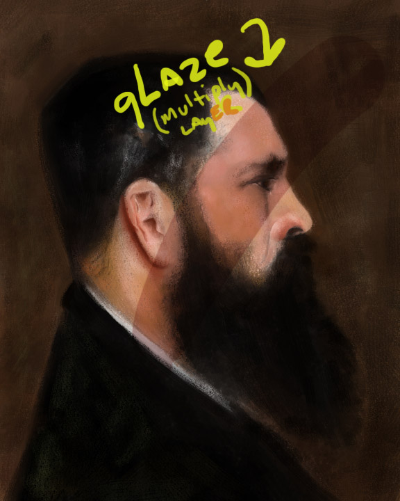
If you wanted to mess around with it some more, this is where I would recommend two layers on top of your base layer. The first is a "glazing" layer and should be set to multiply (so it's transparent). This layer is for DARKENING and altering color.
The other layer (if needed) is an regular layer and should be done with the opacity control setting on. This layer is used for slightly lightening areas that need it (your image does not need this step).
Both these techniques are used in traditional painting and that is why I encourage it digitally as well.
SVS Faculty Instructor
www.leewhiteillustration.com -
@Lee-White Ohhh, that's nice! I'll try it out..thank you!!
-
You did a great job! This is not an easy thing to do.
-
Nice, thank you for sharing!
-
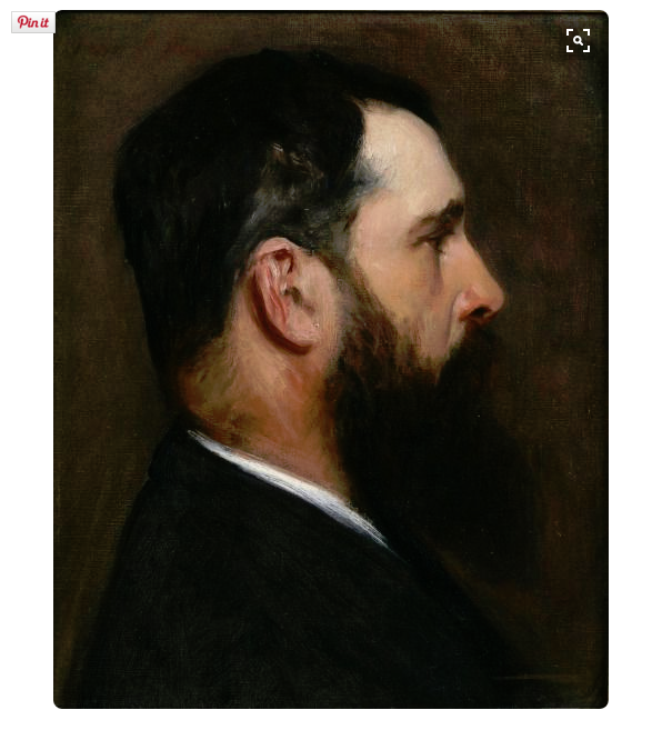
@Lee-White I adjusted the nose a bit and added glazing on mostly the face, neck and lower half of the image, but I wonder if I should have done a fill over the whole image? Either way I think it looks much warmer than before and the nose adjustment helps.
-
I think it looks great! : )
SVS Faculty Instructor
www.leewhiteillustration.com -
@Lee-White Thanks Lee!! It was a sweet kind of creative torture working on this painting and very eye-opening.

-
Wow! Great job!
I started mine this weekend, it takes a lot longer than I expected, but I am sure it's worth it!
-
Great. you're a painter
-
@Charlie-Eve-Ryan Wow! You are doing an awesome job. Your last post is so improved as compared with your first post.
-
I've done a couple of these as well! So much fun and you learn a lot. Great progress on these.
If I were to critique at all it would be to build brushes that have more of a bristle look so you can get the chunky impasto that he gets with his brush work. I have a few I've built that I can share.