Society of Visual Storytelling

    SVSLearn Forums

    • Register
    • Login
    • Search
    • Recent
    • Tags
    • Popular
    • Users
    • Groups
    • Search

    Kamari Concepts-Which one?

    Projects
    10
    34
    1660
    Loading More Posts
    • Oldest to Newest
    • Newest to Oldest
    • Most Votes
    Reply
    • Reply as topic
    Log in to reply
    This topic has been deleted. Only users with topic management privileges can see it.
    • kirsten-mcg
      kirsten-mcg last edited by

      Hi all! Wondering if I could get your opinions on which Kamari concept I should go with. It's taken me all month so far, but I've finally come up with 4 that I like. Untitled_Artwork-2.jpg

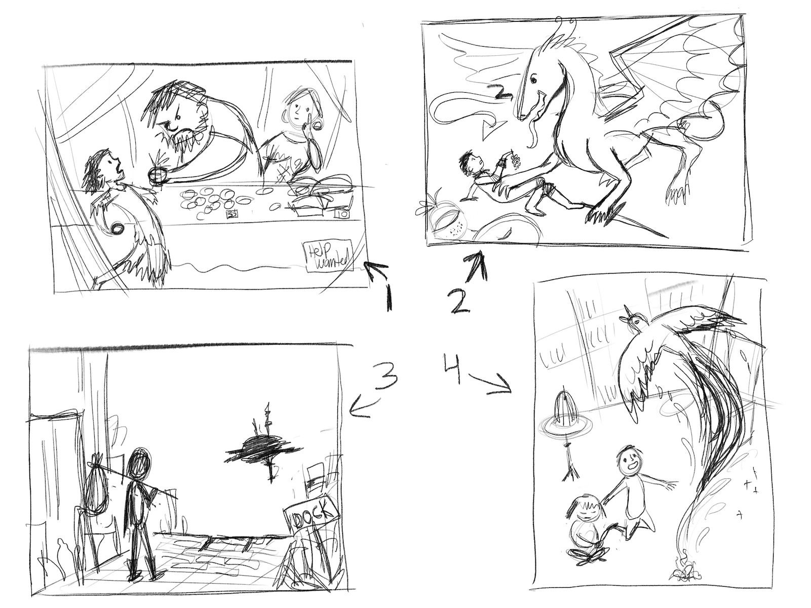
      1: A ragged girl tried stealing from a street vender and gets caught...but ends up becoming hired help.
      2: The boy looses his fight to a dragon, but then makes friends with the dragon when he offered it a bunch of grapes (or some other food)
      3: A ragged traveler standing at the literal end of a road (it drops off the face of a cliff) which also happens to be a dock for air ships. An air ship approaches in the distance.
      4: 2 children are distraught when their pet phoenix bursts into flames, but then the Phoenix rises again from it's ashes (Kamari is the Phoenix).

      Let me know which concept you think is clearest!

      Instagram: https://www.instagram.com/kirsten.mcgonigal.art/
      Portfolio Site: www.kirstenmcgonigalart.com

      Chantal Goetheer LittleRaven 2 Replies Last reply Reply Quote 0
      • LittleRaven
        LittleRaven @kirsten-mcg last edited by

        @kirsten-mcg I like all of them, but I think I like number 4 with the phoenix one the most. I think if you make it super obvious its a phoenix it will be pretty clear, but not so sure on how to go about that. I also really like the composition with the birds eye view from above, maybe you could also make the phoenix fly out of the frame a bit. Like it's tail is swirling a bit out of frame on the right and the phoenix itself also sticks out at the top right, gives it a nice swirl you know. ๐Ÿ˜œ

        kirsten-mcg 1 Reply Last reply Reply Quote 0
        • Chantal Goetheer
          Chantal Goetheer @kirsten-mcg last edited by

          @kirsten-mcg I think nr 3 & 4 are clearest. Nr 2 is most confusing to me. I like the Phoenix rising idea, but I think nr 3, though more literal, can also be really cool.

          1 Reply Last reply Reply Quote 1
          • kirsten-mcg
            kirsten-mcg @LittleRaven last edited by

            @LittleRaven Oooh I like that idea! Thank you!
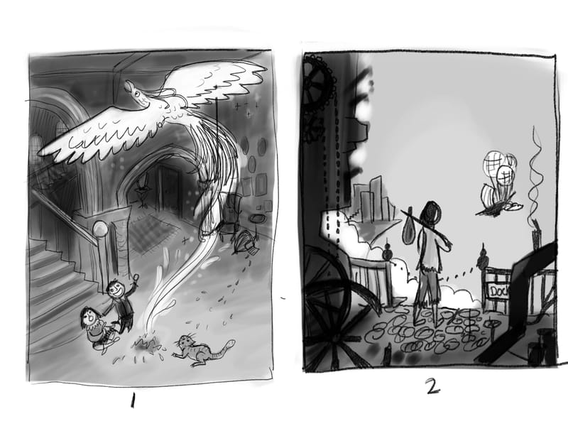
            Instagram: https://www.instagram.com/kirsten.mcgonigal.art/
            Portfolio Site: www.kirstenmcgonigalart.com

            1 Reply Last reply Reply Quote 1
            • kirsten-mcg
              kirsten-mcg last edited by

              Iโ€™ve taken numbers 3 and 4 and added a little more detail and some value. Any other thoughts or suggestions? So far I think number 1 is my favorite. I would love to finish out the 2nd one too if I have time. Critiques are always welcome!C2202498-DE2B-47E1-A7DA-A3F7A7232FC0.jpeg

              Instagram: https://www.instagram.com/kirsten.mcgonigal.art/
              Portfolio Site: www.kirstenmcgonigalart.com

              MarcRobinson Asyas_illos ? 3 Replies Last reply Reply Quote 0
              • MarcRobinson
                MarcRobinson @kirsten-mcg last edited by

                @kirsten-mcg I'm really drawn to the 1st one. Love the top down composition.

                1 Reply Last reply Reply Quote 1
                • Asyas_illos
                  Asyas_illos @kirsten-mcg last edited by

                  @kirsten-mcg these are both beautiful compositionally, but the story is clearer I think in the Phoenix, one. Lovely canโ€™t wait to see how they turn out.

                  Asyasewardillos@gmail.com
                  www.Instagram.com/asyas_illos/
                  https://asyasewardillos.wixsite.com/mysite

                  1 Reply Last reply Reply Quote 1
                  • ?
                    A Former User @kirsten-mcg last edited by

                    @kirsten-mcg I like number 1, the composition is more dynamic and exciting. My eye is drawn to it.

                    1 Reply Last reply Reply Quote 1
                    • kirsten-mcg
                      kirsten-mcg last edited by

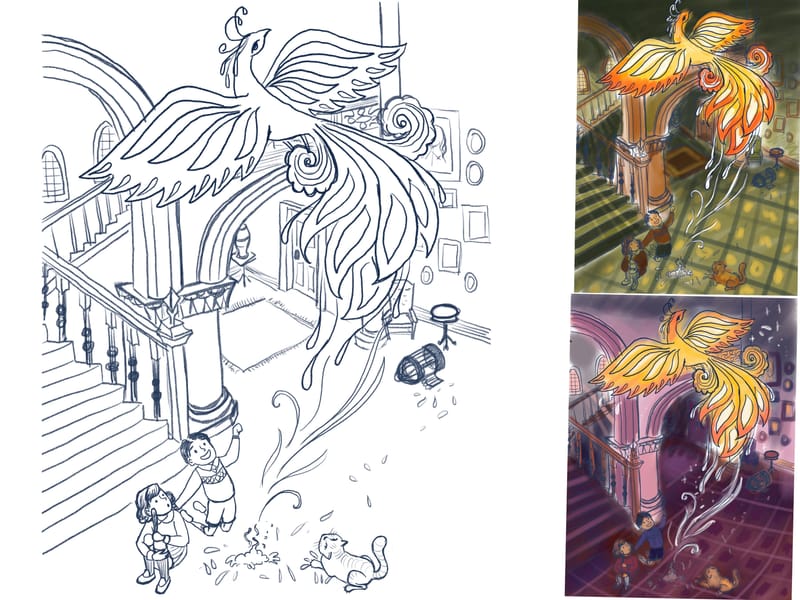
                      Progress. Finished sketch and color studies. 2C5F8F1A-6C5B-4D0D-91FC-26E25D84341C.jpeg

                      Instagram: https://www.instagram.com/kirsten.mcgonigal.art/
                      Portfolio Site: www.kirstenmcgonigalart.com

                      Asyas_illos Chantal Goetheer ArtistErin MarcRobinson 4 Replies Last reply Reply Quote 2
                      • Asyas_illos
                        Asyas_illos @kirsten-mcg last edited by

                        @kirsten-mcg these look great, could you maybe try a blue toned background? It would lend to fact that were sad because it died and go nicely with the warm tones.

                        Asyasewardillos@gmail.com
                        www.Instagram.com/asyas_illos/
                        https://asyasewardillos.wixsite.com/mysite

                        kirsten-mcg 1 Reply Last reply Reply Quote 2
                        • Chantal Goetheer
                          Chantal Goetheer @kirsten-mcg last edited by

                          @kirsten-mcg nice! They both look good. In the purple background the characters blend more into the background and are not so obvious in their sadness. I like the suggestion of blue of @Asyas_illos . The green gives a more retro feel but also not much sadness

                          1 Reply Last reply Reply Quote 1
                          • ArtistErin
                            ArtistErin @kirsten-mcg last edited by

                            @kirsten-mcg I love the Phoenix concept! ๐Ÿ™‚ It's easiest to understand and you are doing great so far with color ๐Ÿ™‚

                            Erin Richardson
                            instagram.com/erinrichardsondesigns21
                            www.erinrichardsondesigns.com

                            kirsten-mcg 1 Reply Last reply Reply Quote 1
                            • kirsten-mcg
                              kirsten-mcg @Asyas_illos last edited by

                              @Asyas_illos THat's true! I've been trying to keep too much blue out of my artwork, because in the past I've had a tendency to use it too much. But you're right that this time there's a good reason for it!

                              Instagram: https://www.instagram.com/kirsten.mcgonigal.art/
                              Portfolio Site: www.kirstenmcgonigalart.com

                              1 Reply Last reply Reply Quote 0
                              • kirsten-mcg
                                kirsten-mcg @ArtistErin last edited by

                                @ArtistErin I'm so glad to hear that my concept comes across! I've been a little worried about that part. ๐Ÿ˜…

                                Instagram: https://www.instagram.com/kirsten.mcgonigal.art/
                                Portfolio Site: www.kirstenmcgonigalart.com

                                1 Reply Last reply Reply Quote 0
                                • MarcRobinson
                                  MarcRobinson @kirsten-mcg last edited by

                                  @kirsten-mcg liking the way this is going! Idea... Maybe try and keep the background elements cool in colour temperature. This'll help the warm phoenix glow better. On the two colour comps you've got the whole image quite warm, and it'd be a shame for such a great creature design to not pop off the page.

                                  kirsten-mcg Sarah VanDam 2 Replies Last reply Reply Quote 2
                                  • kirsten-mcg
                                    kirsten-mcg @MarcRobinson last edited by

                                    @MarcRobinson Good point! I'm working on a blue version right now to see how I like it. That would definitely cool things down. ๐Ÿ˜

                                    Instagram: https://www.instagram.com/kirsten.mcgonigal.art/
                                    Portfolio Site: www.kirstenmcgonigalart.com

                                    1 Reply Last reply Reply Quote 0
                                    • Sarah VanDam
                                      Sarah VanDam @MarcRobinson last edited by

                                      @MarcRobinson I agree. Maybe more of a sapphire blue or blue-green base

                                      https://sarahvandam.art/
                                      Instagram: @sarahvandam.art and @artistsandbox.etsy

                                      1 Reply Last reply Reply Quote 1
                                      • kirsten-mcg
                                        kirsten-mcg last edited by

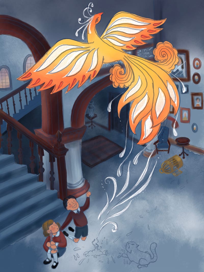
                                        Started working on this version in blue. Iโ€™m liking the color combo with the warm phenix colors.57344CD3-9F78-49A2-BB61-16030C4FAF77.jpeg

                                        Instagram: https://www.instagram.com/kirsten.mcgonigal.art/
                                        Portfolio Site: www.kirstenmcgonigalart.com

                                        Chantal Goetheer mzameckaart Miriam 3 Replies Last reply Reply Quote 2
                                        • Chantal Goetheer
                                          Chantal Goetheer @kirsten-mcg last edited by

                                          @kirsten-mcg indeed the combination looks great! Could you make those brown edges on walls, stairs and paintings more a blue tinted type of brown? Now they steel too much of my attention from the Phoenix.

                                          kirsten-mcg 1 Reply Last reply Reply Quote 2
                                          • kirsten-mcg
                                            kirsten-mcg @Chantal Goetheer last edited by

                                            @Chantal-Goetheer I've been playing with the color of those quite a bit. Still haven't hit on something I'm completely happy with. I'll try a more blue shade and see how it looks. Thanks!

                                            Instagram: https://www.instagram.com/kirsten.mcgonigal.art/
                                            Portfolio Site: www.kirstenmcgonigalart.com

                                            1 Reply Last reply Reply Quote 0
                                            • First post
                                              Last post