December Rock fortress Help!
-
@R-Fey-Realme I think this composition is much stronger than before and is going to be great, especially when you add strong contrast between the foreground and background.
-
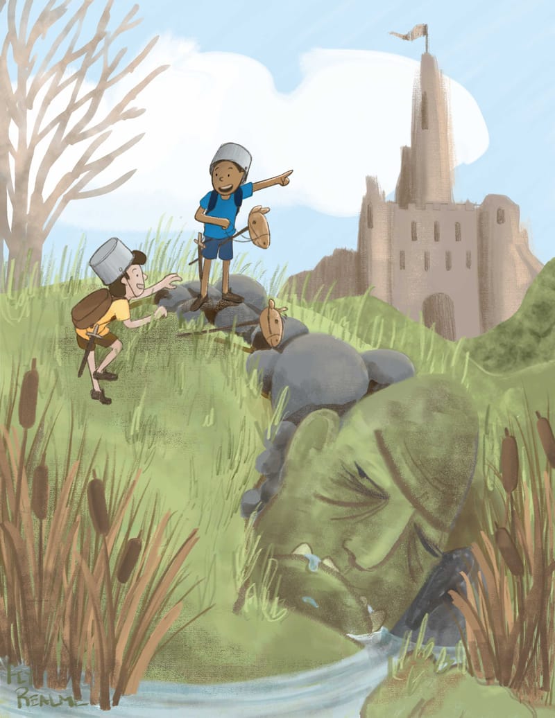
@R-Fey-Realme It's looking better, and kids look great. Good poses! But, I am still stuck on the real/imaginary part of the story. Does the text mention them pretending? Just looking at this as a single image, there is no way to tell the kids are pretending, other than perhaps the toy horses, but to have the troll be imagined already, and the "fortress" not yet be is confusing to me. And even if the text says they are pretending, then everything imaginary should already show as such in the scene. Would be so much stronger.
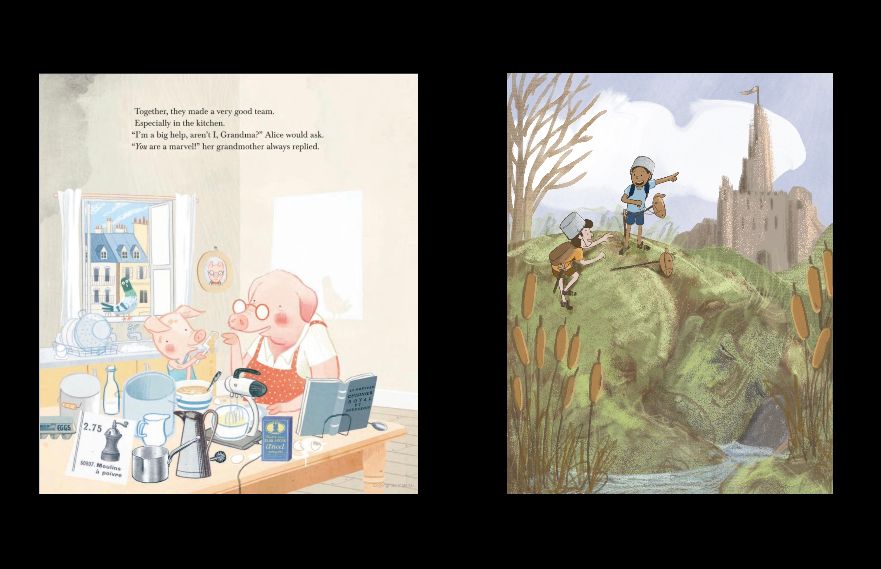
For example, the Gus Gordon image you included leaves no doubt as to what the pair are doing. It is up to the text to say why.
Yours should have the same clarity.
-
@tom-barrett thanks! Yeah that does make sense. Is this less confusing? I have been leaving rendering/decoration on the castle and troll for later in favor of getting the underlying shapes and structures right, so it has all been a part of the master plan.
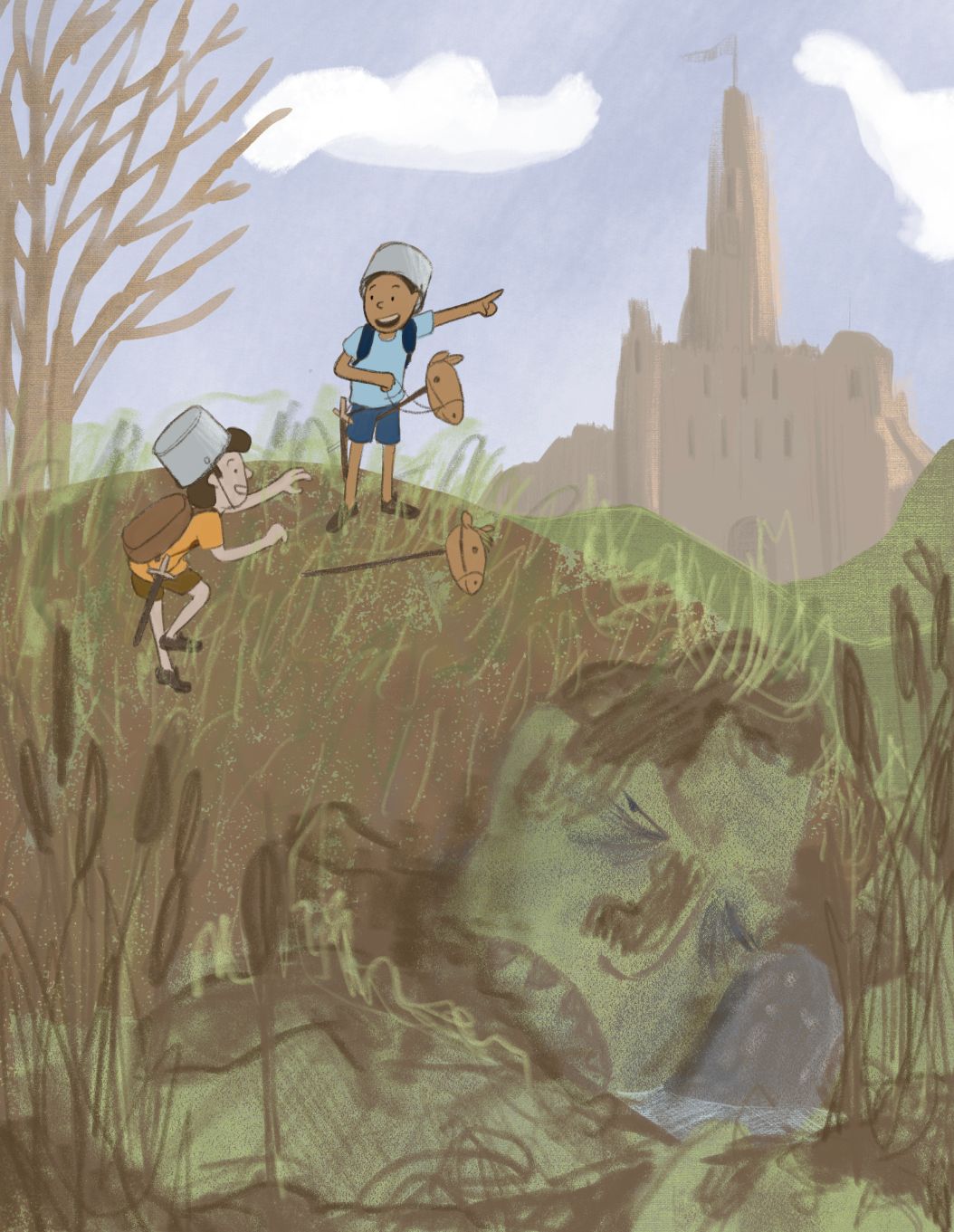
These are scribbles to indicate how I’m thinking about rendering it out, none of these marks are final. Any thoughts? The render philosophy is to show the effects of light on structures in the environment and on props and leave the characters almost completely flat except for a ground shadow, line weight +color, and an optional second tone wash that is so close to the original color its basically still flat. I haven’t really indicated the highlights on the troll or mud, but it will probably be mostly focused on the cat tails, doing something like this:
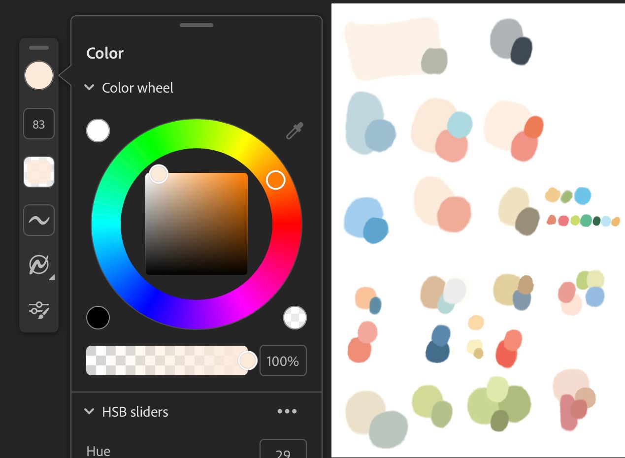
I found a digital preview for G.Gordons book which i updated my palette from (i was Color picking from photos i have of his book, which were all tinted orange/brown bc of the lighting i took them in). He uses really bright clear sharp colors, everything is basically in the top third of the color square. Fascinating. It made a big difference to not use muddy colors!
-
@R-Fey-Realme this is much better!
One thing I just thought of, since the prompt is "rock fortress", maybe think about making the fortress more of the focus. Not that you have to make it larger, but pull back the lighting on the kids and troll so your eye goes straight to the fortress, or create the lighting so as to lead you from the kids to the fortress. Just food for thought.

-
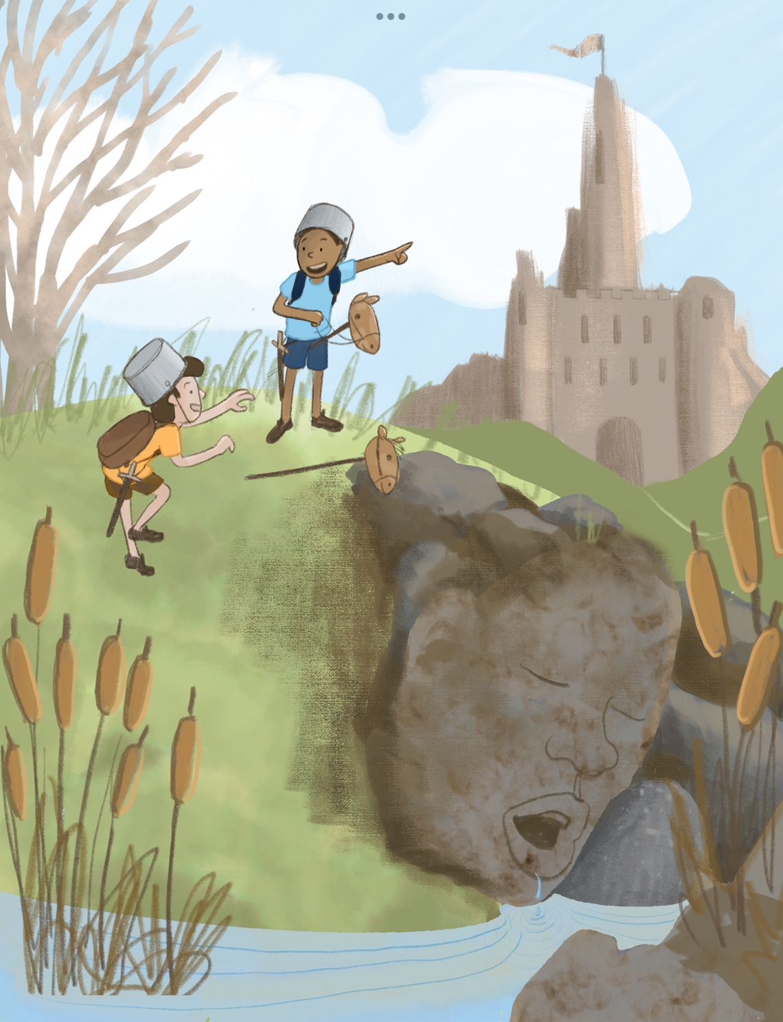
Ive been whittling away at it some more, and I've made some progress!
In comparing mine to the color correct finding francois spreads it seemed obvious Gus works very bright and i should try to lean that way too. I also have been trying to channel Will terry’s light on dark/dark on light advice and push readability that wsy.
So i tried to push it brighter and make it look sunny.
I think its a lot closer to great now. This is still a color study basically, i have to figure out how im going to render it with interesting surfaces and lines.Do yall have any improvement ideas on shape/color grouping or anything?
I just have a hard time even imagining making something so high key
-
Here are some of my troll attempts for your amusement.
I was struggling to make a sleepy drooling face look and also struggling to render the face to fit in with what i had already.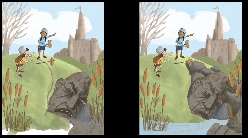
They really weren’t working, so i looked up drooling while sleeping and traced this face, which… yeah
Really derpy haha, it didnt match the shape language or the story at all. So i looked up “troll designs” and found lots of help and inspiration. So mush flat, linebased examples with interesting shape language. Here are a few of my faves
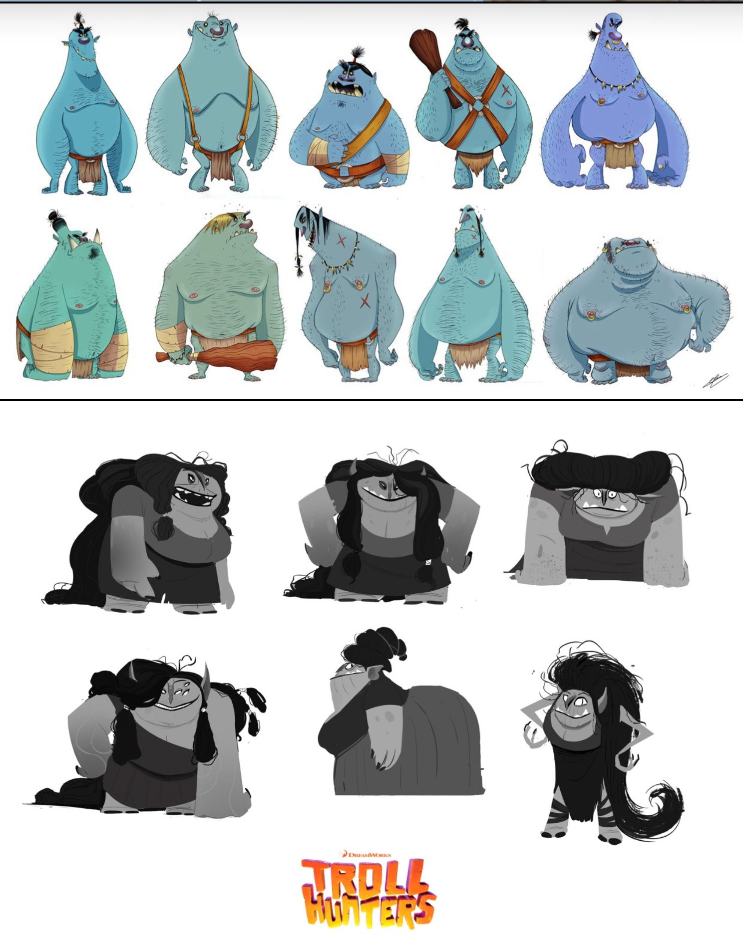
And with that help and inspiration i made this version, which im going with. I think i could improve the eyes and the mouth a bit… enlarge the eyes, change the mouth angle? Idk let me know what you think.
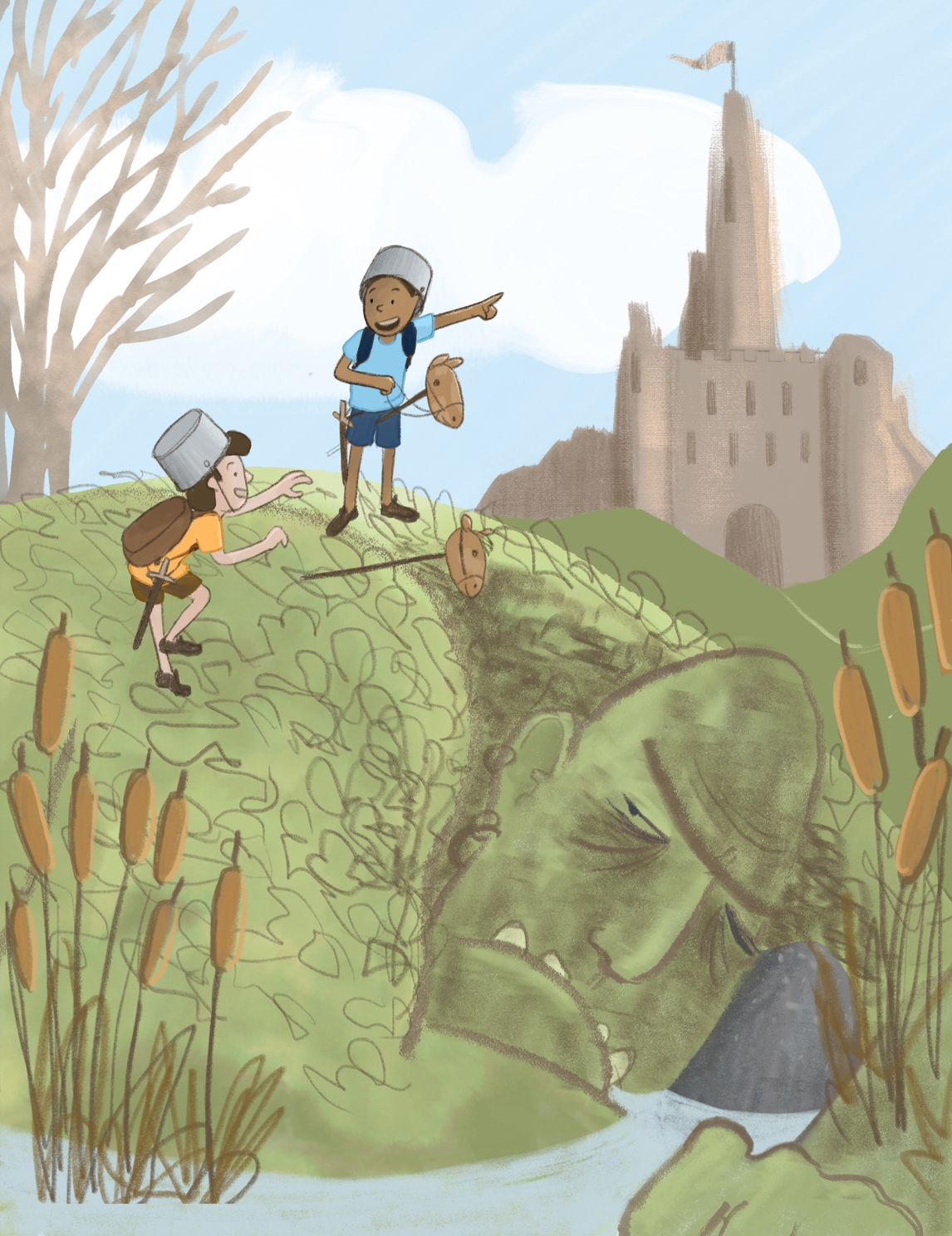
Next on my plate is shadows, grass, and more integration and hierarchy in general. I want you to see the kids first, then the rock fortress and then the troll. Just a few days before the deadline! It will be interesting to see the htfya for december bc so far there are much fewer subs than last time.
Blog: mamatheartist.blogspot.com
Coloring page newsletter: https://bit.ly/Color-in -
@R-Fey-Realme It's looking really good!
If you like the style of Gus Gordon's art, perhaps studying examples closer to your piece might help. You may have seen these before, but they are better examples of what you may be trying to do rather than the kitchen scene.
-
@R-Fey-Realme Is really coming alive! Thanks for sharing your process. Sorry I can't be of more help, but I think you're doing great work. I'm looking forward to seeing the final illustration!
-
@alexw @ksfabian @Larue @makekong @Robyn-Hepburn @tom-barrett thank you all so much for your input and supportive comments! You all are fantastic! I couldnt have made this so cool without you! With your help my slowvember-master study-htfya submission experience has been a huge success (first actually successful art challenge lol)
Heres what i ended up with
See you guys next time! I look forward to seeing your projects!
-
Referenced by
 Fey Realme
 -
Referenced by Fey Realme
-
Hey y'all, i made another piece applying what i learned from my troll hill study and i wanted to share it here.
Putting it next to the study helps me see just how desaturated i was working in sthe study, even though i was already outside of my comfort zone trying to work light and bright
 crazy how that goes.