Society of Visual Storytelling

    SVSLearn Forums

    • Register
    • Login
    • Search
    • Recent
    • Tags
    • Popular
    • Users
    • Groups
    • Search

    Album Cover Illustration

    Projects
    11
    31
    12910
    Loading More Posts
    • Oldest to Newest
    • Newest to Oldest
    • Most Votes
    Reply
    • Reply as topic
    Log in to reply
    This topic has been deleted. Only users with topic management privileges can see it.
    • Christine Garner
      Christine Garner last edited by

      I like the strong graphic style of this. I'm looking forward to seeing all the details you describe, it sounds really epic.

      website: https://thimblefolio.com

      1 Reply Last reply Reply Quote 0
      • Durrell Odom
        Durrell Odom last edited by

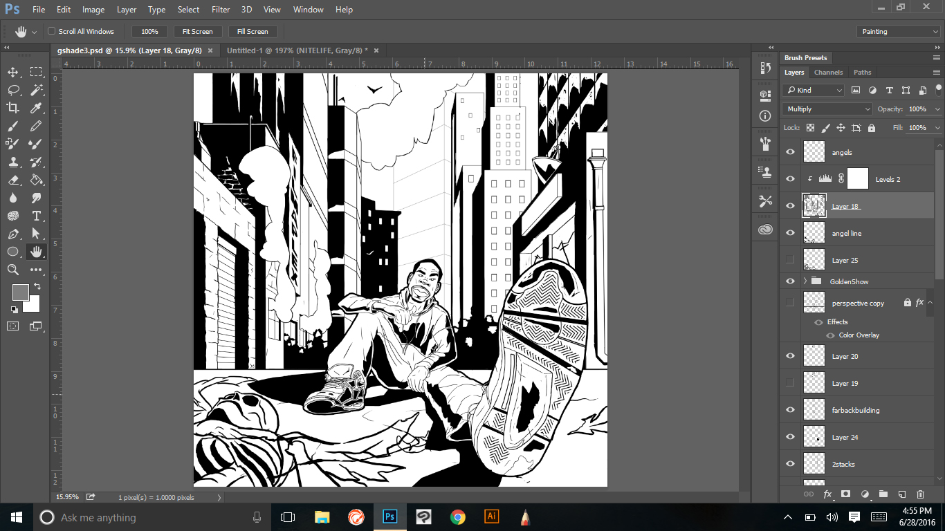
        Here's what the point I've gotten to so far not too much to go hopefully.

        0_1467177711786_GALMOST.jpg

        1 Reply Last reply Reply Quote 1
        • Durrell Odom
          Durrell Odom last edited by

          0_1467267098348_galmost2.jpg

          1 Reply Last reply Reply Quote 0
          • ?
            A Former User last edited by

            Awesome stuff man, really liking the bold shadows. Stoked to see it in color!

            1 Reply Last reply Reply Quote 0
            • Durrell Odom
              Durrell Odom last edited by Durrell Odom

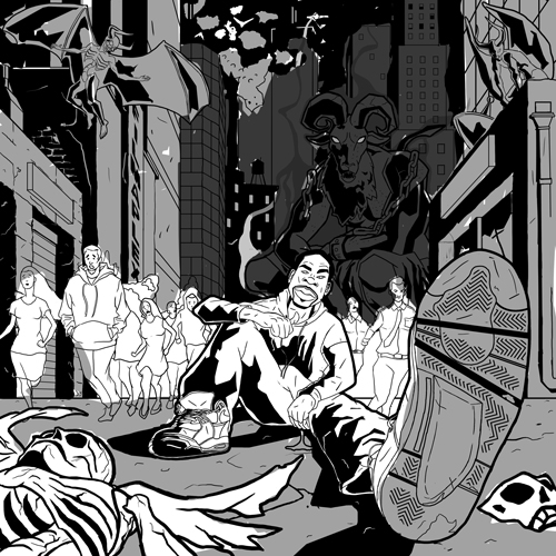
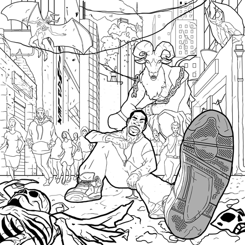
              Last step before going to color

              0_1469602257931_gsvs.jpg

              1 Reply Last reply Reply Quote 0
              • Durrell Odom
                Durrell Odom last edited by

                This post is deleted!
                1 Reply Last reply Reply Quote 0
                • Durrell Odom
                  Durrell Odom last edited by

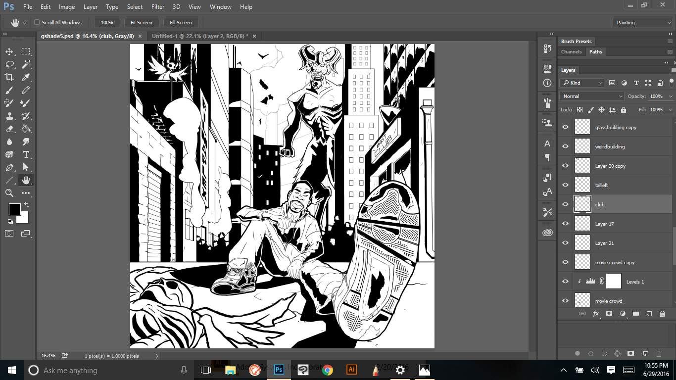
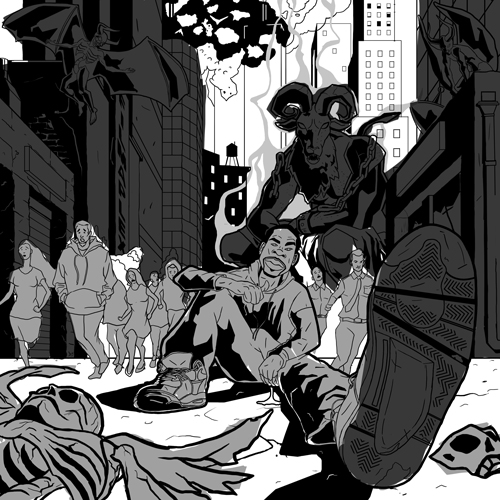
                  Here are some lighting experiments. Please let me know what are your thoughts are please?

                  3_1469996362494_gcolor5.jpg

                  2_1469996362494_gcolor4.jpg

                  1_1469996362493_gcolor3.jpg

                  0_1469996505553_gcolor.jpg

                  1 Reply Last reply Reply Quote 0
                  • Durrell Odom
                    Durrell Odom last edited by

                    0_1470028457115_gcoolaid3.jpg

                    Kevin Longueil Russ Van Dine 2 Replies Last reply Reply Quote 0
                    • Kevin Longueil
                      Kevin Longueil SVS OG @Durrell Odom last edited by

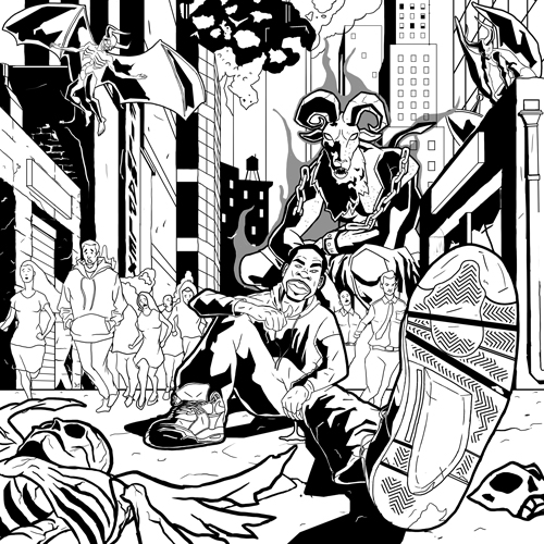
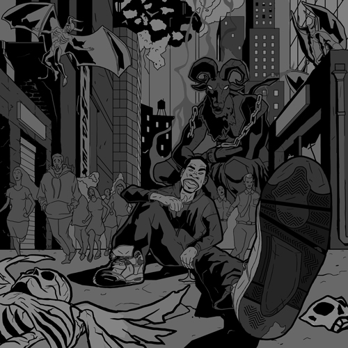
                      @Durrell-Odom Hey Durell - looks like you are about finished! - For critique i would say that it is very saturated and hard to find a focal point - it is even difficult to look at the main character for me - my eye keeps bouncing around - everything has equal importance - i used a desaturate brush in photoshop on everything but the giant demon and the singer and it helped a bit - but i think it will take more than that because desaturate just brings everything to it's grayer self - so i think desaturating and possibly changing some colors to be a bit cooler where you don't need the viewer spending time - i think it can be subtle and still have the inferno effect you are going for - perhaps have a circular composition where the eye goes round and round - top left demon to front pedestrian to singer to giant demon and back to the top left demon - these could be the places that have higher saturation with the singer having the most... but everything else being knocked back a bit or a lot both saturation wise and color temp. Does any of that make sense? Look forward to the final!

                      Portfolio: kevinlongueil.com
                      https://www.instagram.com/kevinlongueil/

                      Durrell Odom 1 Reply Last reply Reply Quote 0
                      • Russ Van Dine
                        Russ Van Dine @Durrell Odom last edited by

                        @Durrell-Odom I agree, to desaturate from the farthest to the nearest, love this style.

                        1 Reply Last reply Reply Quote 0
                        • Durrell Odom
                          Durrell Odom @Kevin Longueil last edited by

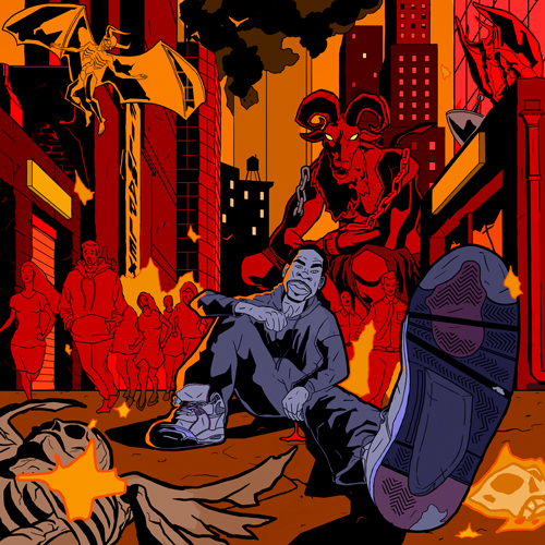
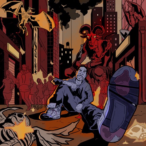
                          @Kevin-Longueil Thanks. I've been really looking at some of classic paintings of hell, Geof Darrow, and Mike Mignola yesterday to give it that feel. I made a change to the twin towers in the background too. As far as color, I was studying the works of Mignola and Dave Johnson for more of a simple read. As far as color, you're right. I believe red was too much. I've should toned it down a bit.

                          0_1470246513377_gstuff.jpg

                          Kevin Longueil 1 Reply Last reply Reply Quote 0
                          • Kevin Longueil
                            Kevin Longueil SVS OG @Durrell Odom last edited by

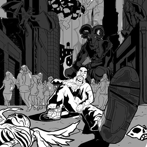
                            @Durrell-Odom Hey Durrell - i just noticed i forgot to load the desaturated version i had mentioned - here it is - i think this is better at explaining what i was trying to say 🙂0_1470256959536_Desaturated.jpeg

                            Portfolio: kevinlongueil.com
                            https://www.instagram.com/kevinlongueil/

                            1 Reply Last reply Reply Quote 0
                            • Russ Van Dine
                              Russ Van Dine last edited by

                              This is what I was thinking also, although, I might add some "glow" around the main characters in the background to pop them off the page a little...

                              1 Reply Last reply Reply Quote 0
                              • First post
                                Last post