Book project (June 17th updates!)
-
@Dulcie Thank you for the comment! Very good idea! I will seriously think about changing it, I just need to make sure I have enough time... I really got carried away with this book and already spent way more time than I was planning on it! But at least I am learning a lot in the process, so it is probably worth it!
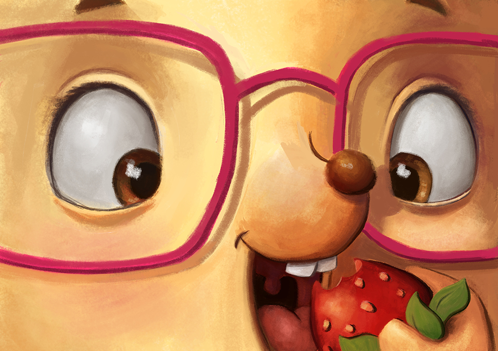
This is my final version of current p10-11 @Kevin-Longueil you were right for the shadows, I hope it looks better now!

-
@NoWayMe I love the composition. The only thing is, someone said it was supposed to be inside a tree? It seems so big to be the inside of a tree. It might look a bit smaller and cozily confined. Less modern and more "naturey'''....if that makes any sense. Love it though! Love it!
-
This is looking really nice - I particularly like the spot illustrations and how you alternate spot and full page. The rendering on the finished illustrations look nice, though I agree with the gutter problem on page 10-11. The story seems really simple, which makes for a challenging illustration task, which I think you have solved with a charming character design. I guess you do not want to spend more time on this, but I am just wondering if there is a way to show more variability in the viewpoints - all illustration seem to be at eye level.
-
@smceccarelli @Marsha-Kay-Ottum-Owen Thanks for the comments! @smceccarelli you are right, the story is REALLY simple, and it IS a challenge!!! The book will be in A3 format, so there is a LOT of illustrations and very few words....
I think I will have to rework p10-11 again... I thought the gutter problem would be fixed with this new version, but everyone seems to agree it will still be a problem. However, does it change something that the format will be huge ? because less of the image will be loss in the gutter... proportionally...
You are also right about the view points! Other than p9 (view from above) and p6 (a low POV) they are all at eye level... I will look at some of the rough sketches to see what I can do!
I just hope that some of the pages will be of portfolio quality, so that the time I have invested in this is worth it! (but anyway I am learning a lot so it is probably worth it)
Thank you all for helping, your comments are all very helpful!
-
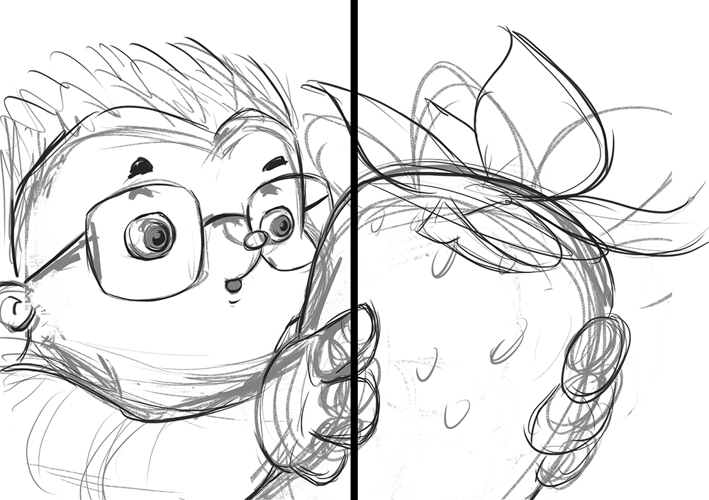
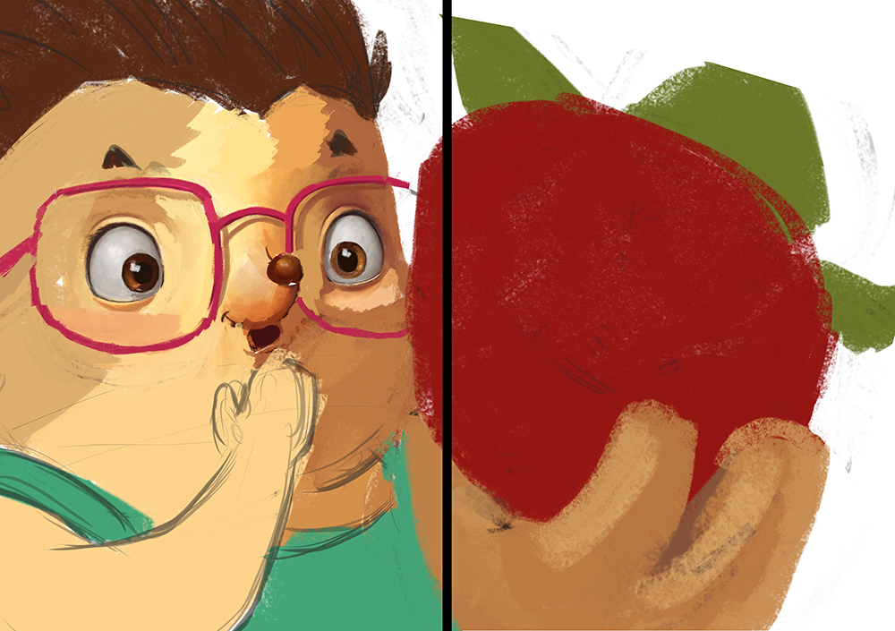
I tried @Dulcie 's idea for my spread P10-11............ and I really like it!!! (thanks Dulcie!) Plus, it takes care of the evil gutter!
Any thoughts ? Of course it is still very rough, but I wanted to have you guys opinion on it before pushing it further.
Thanks!

-
Definitely works with the gutter now! I know it is just.a sketch, but her expression looks somewhat detached - I think you can give her a more ecstatic/enthusiastic expression. Maybe it is also her gaze direction - she does not seem to be looking at the strawberry, but somewhere behind it! One thing that occurs often in animation characters is a slight (or moderate) convergence of the pupils when they are looking at something close. It is not what happens in reality, but it makes drawings and expressions look better!
-
Ah glad you found the idea useful @NoWayMe! It definitely works much better with the gutter.
One thing that bothers me slightly is that because her hands are holding the strawberry like that, it looks like the strawberry is the size of a melon. (whereas on page 12 they look like normal-sized strawberries). I wonder if a way to fix that, would be for the strawberry to have a little stalk attached coming from the leaves, and she is holding that stalk between finger and thumb..so she is dangling the strawberry in front of herself...which means her fingers could be huge/in proportion to a strawberry, but a part of her hand could be cropped off the top of the page so it wouldn't intrude too much. Again just an idea though, looking forward to the next version!
-
@Dulcie Hahaha! Your right about the HUGE strawberry, I fixed it this morning. I guess my brain wasn't working completely yesterday evening! I will post an update soon

-

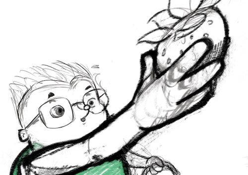
It is still very rough, but I think it will be better than the spread of her eating the strawberry. If someone has tips to improve the foreshortening, I redrew her hand like 1000 times... I am still not sure it looks right.
Thanks for helping

-
@NoWayMe Hello Noemie - this is looking good! - i really like your first drawing of this pose - i think @smceccarelli made some good points worth tweaking but i think it looks good - the new one more challenging - i think for the foreshortening to read well you will have to show overlap of forms and there does not seem to be room to squeeze them in - i had a few goes at it and failed
 - i am not sure of the scale of the strawberry but i took your first version and stretched it a bit and added a tiny second arm to try to give a foreshortened effect - most likely not what you are looking for - but i did want to share that there is something in the first version that i like