October Third Thursday - let´s go!
-
@Kevin-Longueil You have nailed nearly all the issues I saw in the drawing! ;-)) I have corrected all of the items you mention by re-drawing the tin-man completely, changing all limbs as well as the position of the head. It is really great that you saw the same issues, it gives me a lot of confidence, so thank you very much for your input!
There were also some issues with the lion, and with the perspective of the city. I am sure there are some more, but now the flatting process has started, so I will continue correcting while painting.
Next steps are color and value studies! -
@smceccarelli I really get the feeling that you wanted to portray with this piece. Its looking great. Im excited to see it finished!
-
@ShereeNorthrup Thank you! I have been swamped by work the past three days and I am worried I can´t make the deadline for our own "Third Thursday". I have reserved the whole day tomorrow, lets see how far I come!
-
Ok - clear by now that I am going to make it by tomorrow...that is the problem with deadlines that are not "hard" - i..e. accountable to somebody else than yourself.
But, I am definitely going to finish this by end of the week, so I am not too disappointed with myself...
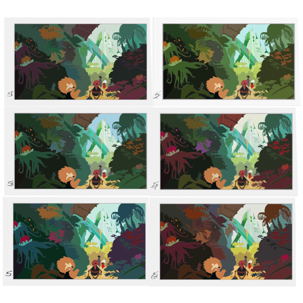
Here are color schemes - let me know which one you like best!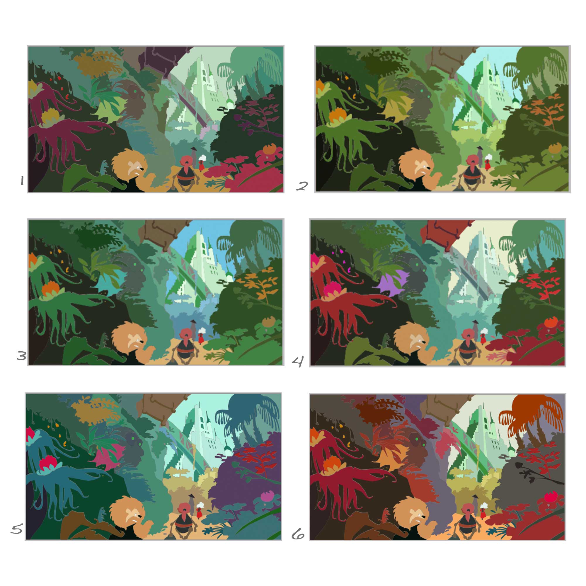
-
I like 6 the best. It really makes the Emerald City look...well...emerald. But really, all of them are amazing.
-
I like #2 the best...I like that it is a fairly simple colour scheme, unlike the others there are just spots of red/orange on the characters which helps focus attention on them and pick them out in all the green...on many of the other schemes the bright red flowers/plants draw attention away from the city and the characters....I like the overall greenness on #2, you feel enveloped in the greenery...but if you go with it you could also make sure that the emerald city has the highest saturation and contrast, to ensure it is the focal point.
-
@smceccarelli this look great Simona! - i will not quite hit my goal for tomorrow either - i am scrapping my Good Witch of the North so i should have only 3 of the 4 portraits done by tomorrow - i'll post what i have done Thursday and give my self till next Thursday to get my missing Witch in order - back to your piece though.... they all look promising - i have an overall feeling that the foreground might work better if it were darker and less saturated with the background becoming lighter and only having the mid ground be saturated because of the intense light in the back ground - anyways i tried my hand at it ... made a mask for the different depths and changed saturation and light level for each layer and the played with the gamma - not sure it is getting my idea across though (but i'll post it anyways) - i did have another though possibly worth sharing - page 164 of james gurney's Imaginative Realism book talks about counterchange - "counterchange is the reversal of tonal relationships between a form and its background that occurs from one end of the form to another. It's a useful way to generate a feeling of tonal movement" - i think this would look so awesome if you had the top of the Emerald City in shadow as though the sun were low or had the top lit and the bottom in shadow - i always love the look of counterchange in a painting though - anyways... very long winded this morning - the short answer is if i had to vote i would vote for number 2 or 5
")
-
Great job on all your studies! Can't wait to see the final piece!
-
I decided to go for a modified number 3, which was one of the two top favorites from everybody I asked.
I had to start over twice and I am realizing that I have never painted a vegetation-laden scene before and it is amazingly time-consuming, and I do not really have a process to tackle this kind of thing. Which I guess is a good learning opportunity. Here is where I am now - I am doing what one of my teacher called "a window process", working on small patches at a time across the painting - which is really NOT how you should paint. I will have to leave a lot of time at the end to balance and unify whatever comes out of it. At the moment I am pretty much hating it, and I am not even half-way through....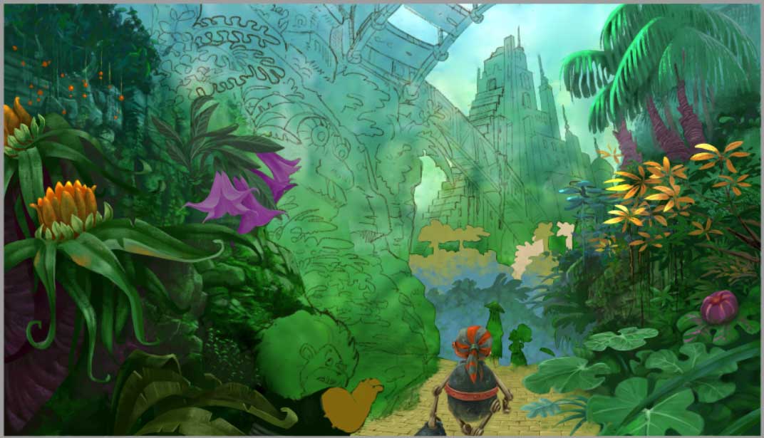
-
@smceccarelli i was hoping you would post your process for this! I think it is looking very good!
-
This looks like a great piece. @smceccarelli. This kind of environment is always a challenge and you have done a great job .