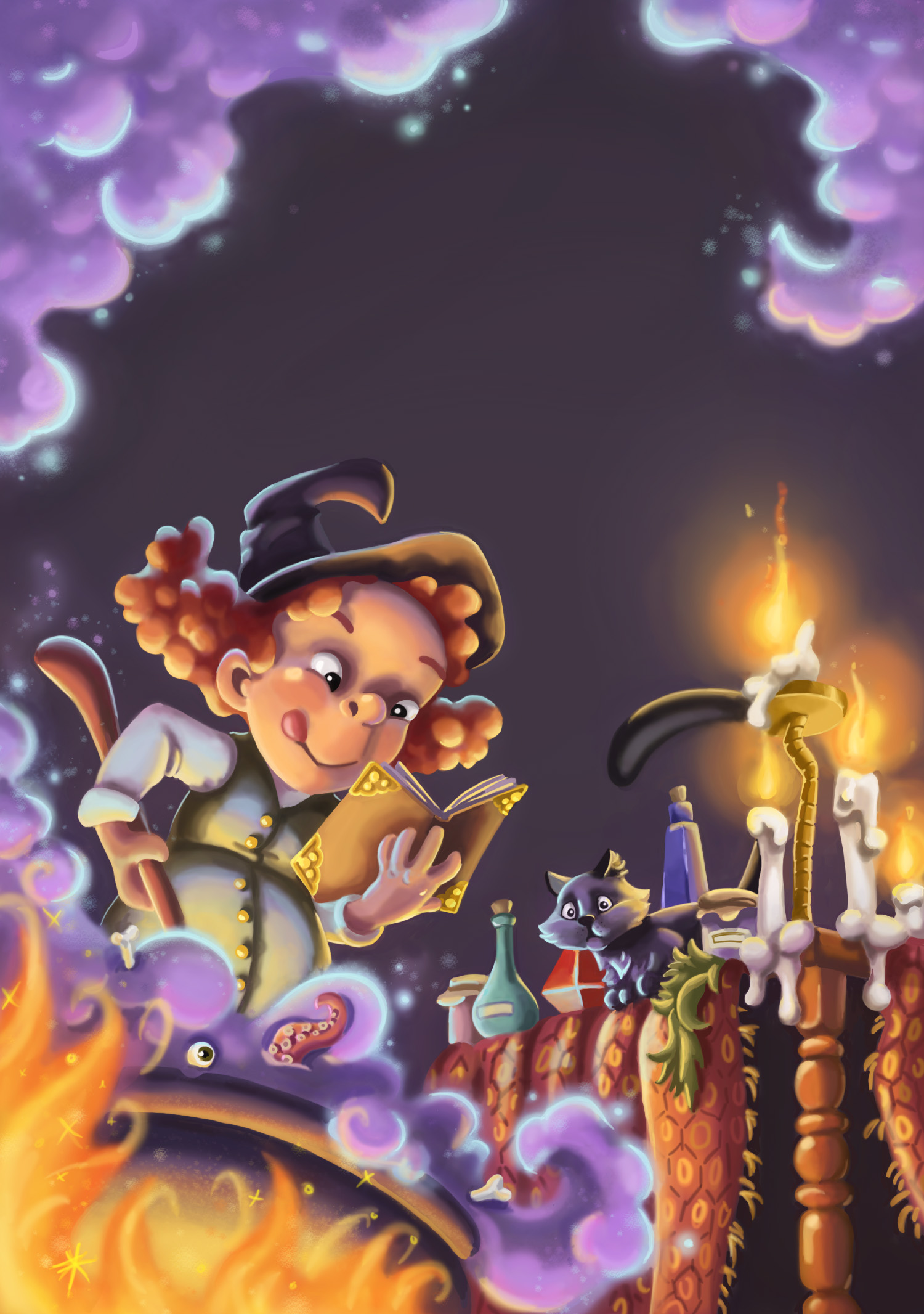
Society of Visual Storytelling

    SVSLearn Forums

    • Register
    • Login
    • Search
    • Recent
    • Tags
    • Popular
    • Users
    • Groups
    • Search

    A Halloween theme!

    General Discussion
    8
    25
    11069
    Loading More Posts
    • Oldest to Newest
    • Newest to Oldest
    • Most Votes
    Reply
    • Reply as topic
    Log in to reply
    This topic has been deleted. Only users with topic management privileges can see it.
    • mcucchi
      mcucchi last edited by

      I like this piece a lot! Perhaps you could play with value in the relationship between the fire and the smoke? Right now, they are both a very saturated middle-tone. Perhaps what is bothering you is that they are competing for your attention. You may try making one of them darker and one lighter to shift focus a little. Just a thought.

      portfolio: moniquecucchi.com
      instagram.com/crookedandbeautiful
      shop: crookedandbeautiful.com

      1 Reply Last reply Reply Quote 1
      • bharris
        bharris last edited by

        @mcucchi That's a great point, I'll work on it! Shadowing that bottom smoke will brighten the fire and help the witch stand in more contrast.

        www.brittanyharrisillustration.com/
        www.instagram.com/britillustration/

        1 Reply Last reply Reply Quote 1
        • Rich Green
          Rich Green SVS OG @bharris last edited by

          @bharris - ok I actually had to so something like this in the book I recently finished and I found that overlay layers were key in getting that glowing feeling from both a fire and a bubbling potion.

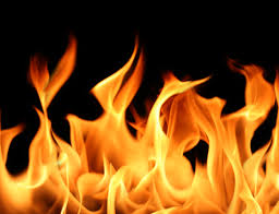
          First - here is a quick sample of fire. Notice how the yellow is intermixed all the way to the tips and not just kept in the center of the flames. I think that could help your fire.

          0_1475787416949_fire.jpeg

          I took your image and added three separate overlay layers. One for each of the following colors:

          0_1475787501228_swtaches.jpg

          I used the deep blue/purple and a soft edge brush with about 30% opacity and 30% flow to start painting over the bubbly potion directly. It helps bring out the purples in a darker more saturated way.

          Then on the next layer I used the lighter blue (same brush settings) to go over the edges and even beyond the edges of the bubbles into the backgroudn and surrouding areas. It helps give a sense of glow and pulls out those cyan tips you have drawn on the edges of the bubbles.

          And finally on the third overlay layer I used the yellow to make the fire really glow and pop more.

          0_1475787703211_1475780492290-witch-x27-s-brew-up3b.jpg

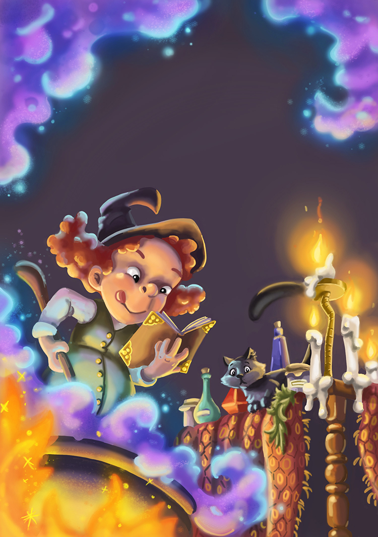
          You can obviously push this much further working with your layered file in Photoshop but hopefully this gives you some tips/tricks to play around with!

          www.richgreenart.com instagram.com/richgreenart/

          1 Reply Last reply Reply Quote 0
          • bharris
            bharris last edited by bharris

            @Rich-Green Thank you! I completely forgot to add overlay. Here's where I'm at now. Still have some work to do, but I like the fire a lot more now! Rookie mistake not grabbing reference... please don't tell. 😉

            0_1475790284455_Witch's brew up 4.jpg

            www.brittanyharrisillustration.com/
            www.instagram.com/britillustration/

            Chip Valecek 1 Reply Last reply Reply Quote 5
            • Chip Valecek
              Chip Valecek SVS Team SVS OG @bharris last edited by

              @bharris this is really looking great! I would push the value darker under the table. It would be almost black.


              https://www.instagram.com/chipvalecek/
              https://www.facebook.com/cvalecek
              http://www.cshellmedia.com/

              1 Reply Last reply Reply Quote 2
              • T
                Tyler Blake last edited by

                Cool! Your candles are nearly white at the center of the flame, you could add some lighter tones to the lowest sections of the fire to make it tie in with the candles/ seem hotter 🙂

                1 Reply Last reply Reply Quote 1
                • bharris
                  bharris last edited by

                  @Chip-Valecek Thank you! Yes, I'll push that more.

                  @Tyler-Blake I gave that a shot, but it seems to wash out the cauldron fire... maybe I'll yellow the candles more...

                  www.brittanyharrisillustration.com/
                  www.instagram.com/britillustration/

                  1 Reply Last reply Reply Quote 0
                  • bharris
                    bharris last edited by bharris

                    Done for now. I'm trying to get one done a week, so I'll turn this over to my friend and fix anything later. Thank you all for your input! Next is the haunted house!

                    0_1475861352367_Witch's brew.jpg

                    0_1475862159292_3,1.jpg

                    www.brittanyharrisillustration.com/
                    www.instagram.com/britillustration/

                    Chip Valecek 1 Reply Last reply Reply Quote 3
                    • Chip Valecek
                      Chip Valecek SVS Team SVS OG @bharris last edited by

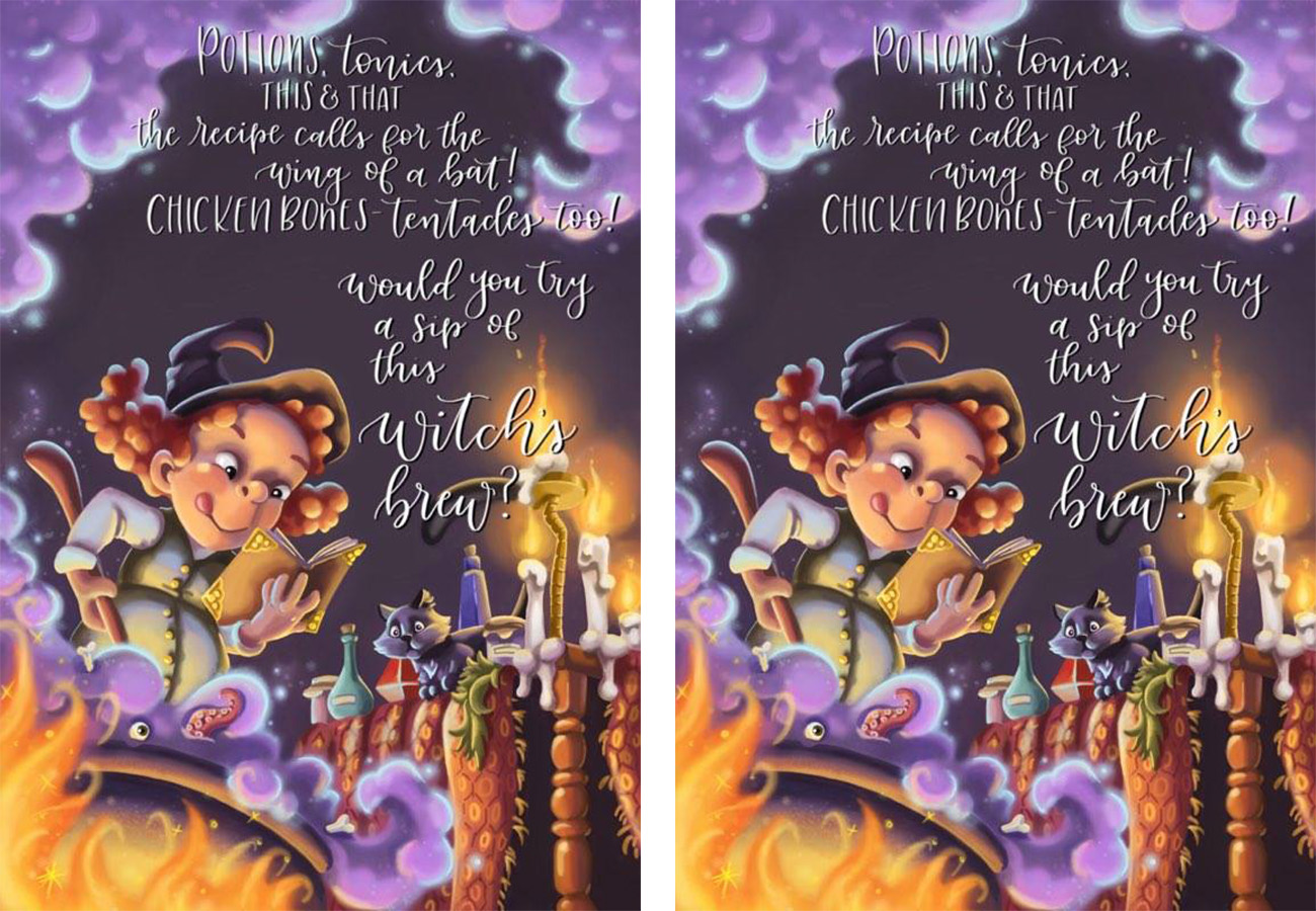
                      @bharris I think it turned out great. Then again I am a sucker for tentacles 🙂 I would love to see that little guy in there. Please share when the text is added.


                      https://www.instagram.com/chipvalecek/
                      https://www.facebook.com/cvalecek
                      http://www.cshellmedia.com/

                      1 Reply Last reply Reply Quote 0
                      • bharris
                        bharris last edited by

                        @Chip-Valecek Thank you! Here were her poems. I think she was going to play around with the placement more too (and I still have a few fixes). I really like the effect, it finishes the image off!

                        0_1476048341000_bc.jpg

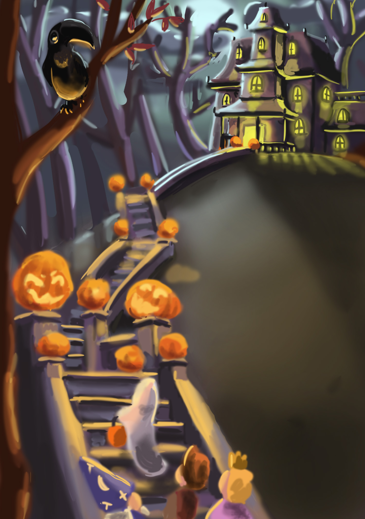
                        Here is a little progress on the mansion. Trying to keep the color scheme a little, but still make it stand alone. 🙂

                        0_1476048112786_Haunted House up2.jpg

                        www.brittanyharrisillustration.com/
                        www.instagram.com/britillustration/

                        1 Reply Last reply Reply Quote 4
                        • amberwingart
                          amberwingart last edited by

                          Love love love all of them! I'm looking forward to seeing that mansion one!

                          Facebook Page: http://www.facebook.com/amberwingart
                          Instagram: @savinafranciscoart
                          YouTube: http://www.youtube.com/amberwingart
                          Website: http://www.amberwingart.com
                          SVS Sketchbook: http://forum.svslearn.com/topic/915/savina-s-sketchbook-updated-2-13-16

                          1 Reply Last reply Reply Quote 1
                          • bharris
                            bharris last edited by

                            @amberwingart Thank you! I'll keep sharing!

                            www.brittanyharrisillustration.com/
                            www.instagram.com/britillustration/

                            1 Reply Last reply Reply Quote 1
                            • Joy Heyer
                              Joy Heyer last edited by

                              I'm loving seeing your process. These are wonderful! I love the mansion and the staircase. Can't wait to see more.

                              Twitter: @Joy_Illustrated
                              Instagram: joy_illustrated
                              Website: joyheyer.com

                              1 Reply Last reply Reply Quote 0
                              • bharris
                                bharris last edited by

                                @Joy-Heyer Thank you!

                                www.brittanyharrisillustration.com/
                                www.instagram.com/britillustration/

                                1 Reply Last reply Reply Quote 0
                                • bharris
                                  bharris last edited by bharris

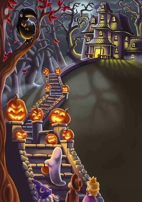
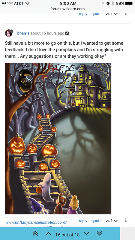
                                  Still have a bit more to go on this, but I wanted to get some feedback. I don't love the pumpkins and I'm struggling with them... Any suggestions or are they working okay?

                                  0_1477001288456_Haunted House up4.jpg

                                  www.brittanyharrisillustration.com/
                                  www.instagram.com/britillustration/

                                  Chip Valecek Rich Green 2 Replies Last reply Reply Quote 1
                                  • Chip Valecek
                                    Chip Valecek SVS Team SVS OG @bharris last edited by

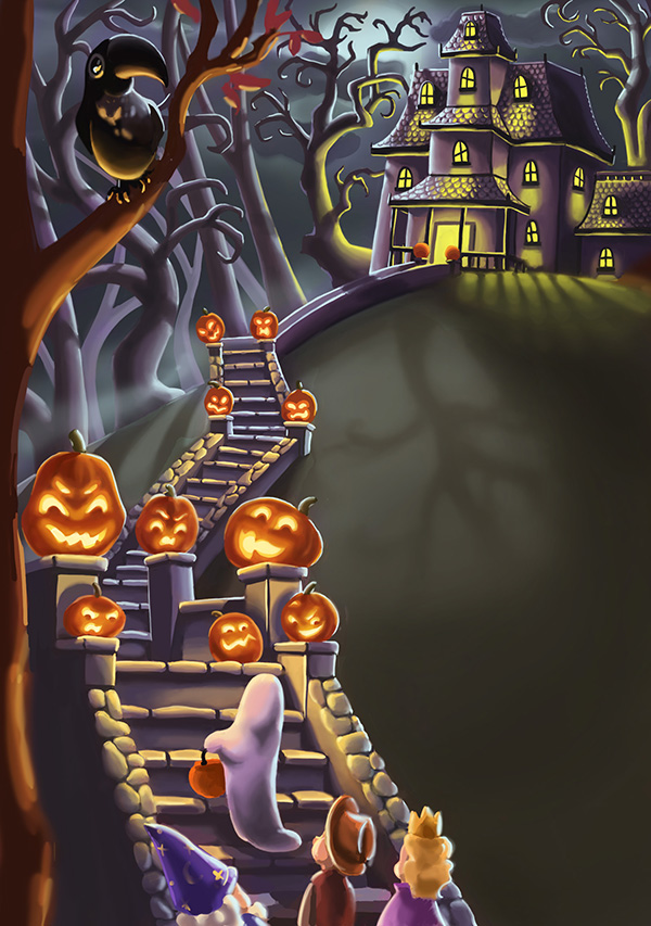
                                    @bharris I think the pumpkins are working, i would however darken the yard in the where the tree shadow is. That will also help with the placement of the text. With that being darker that text will pop more.


                                    https://www.instagram.com/chipvalecek/
                                    https://www.facebook.com/cvalecek
                                    http://www.cshellmedia.com/

                                    1 Reply Last reply Reply Quote 1
                                    • bharris
                                      bharris last edited by

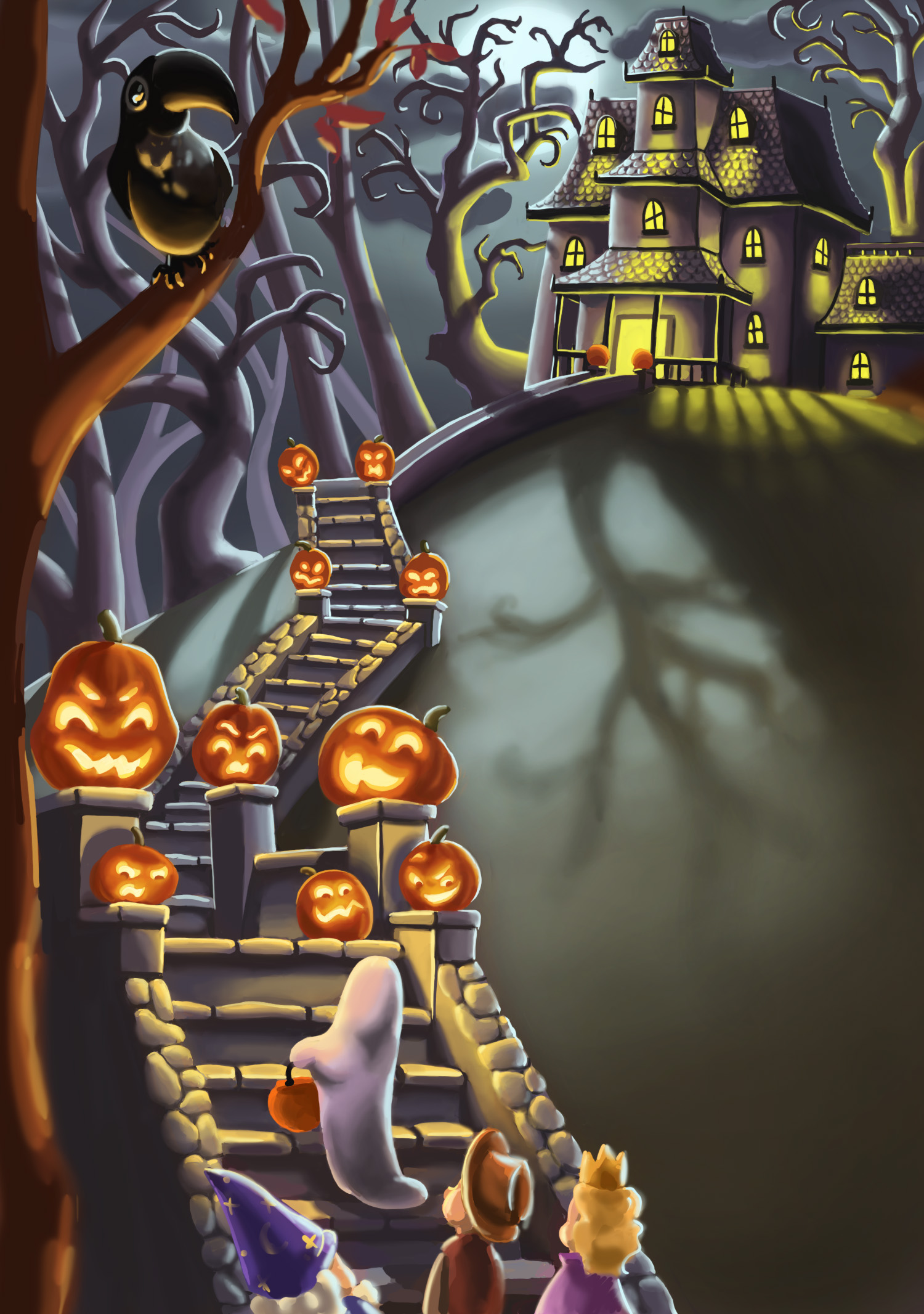
                                      @Chip-Valecek Thanks. I'm getting them to glow and be a bit more threatening now. You're right about the yard, just hard sometimes to leave a blank space sometimes!

                                      www.brittanyharrisillustration.com/
                                      www.instagram.com/britillustration/

                                      1 Reply Last reply Reply Quote 0
                                      • Rich Green
                                        Rich Green SVS OG @bharris last edited by Rich Green

                                        @bharris

                                        Hi Brittany - when I was looking at this on my computer screen the image was quite large and I had to scroll to see the whole thing. I felt like something was off but I could not quite figure out what it was. Then later I came back to it on my phone and the image was much smaller and I could see it all at one time and that is when it sort of hit me.

                                        0_1477055037653_2016-10-21 08.00.59.png

                                        There is almost a disconnect between the color/mood of your three light sources. You have the bright very cool/white light from the moon. The somewhat cooler yellow-green coming out of the windows and then the very warm yellow-orange of the pumpkins.

                                        And based on the composition that almost cuts your image in half with warm on the lower left diagonal and cool in the upper right.

                                        As Chip pointed out - I think it might be to your advantage to darken the sky, tone down the brightness of the moonlight and lose the bright reflection/shadow of the tree cast by the moonlight. I think the sky being a bit more dark/atomospheric would make it a little more spooky and allow the more important light sources of the pumpkins and the house to shine. And it would then also allow for much better placement of the text. Because while the cast shadow is cool and well done - it really is not needed for the story telling.

                                        And then you might consider trying to adjust the color of the light coming out of the house. Something that is cool but compliments the yellow--orange glow of the pumpkins instead of competing with it like it is doing now.

                                        Hope this all make sense?

                                        www.richgreenart.com instagram.com/richgreenart/

                                        1 Reply Last reply Reply Quote 1
                                        • bharris
                                          bharris last edited by

                                          @Rich-Green Sorry about the size Rich, hope this is easier! I took your advice in toning down the moon light and I like it a lot better! I might try to make the pumpkin light a little more yellow-orange. But I just love the green in the house contrasting with the purple of the house. I'll try to tie it in a little more though.

                                          0_1477061594461_Haunted House up52.jpg

                                          www.brittanyharrisillustration.com/
                                          www.instagram.com/britillustration/

                                          1 Reply Last reply Reply Quote 2
                                          • bharris
                                            bharris last edited by

                                            Sent this off! Thanks for the help everyone!

                                            0_1477080127188_Haunted House small.jpg

                                            www.brittanyharrisillustration.com/
                                            www.instagram.com/britillustration/

                                            Chip Valecek 1 Reply Last reply Reply Quote 3
                                            • First post
                                              Last post