Society of Visual Storytelling

    SVSLearn Forums

    • Register
    • Login
    • Search
    • Recent
    • Tags
    • Popular
    • Users
    • Groups
    • Search

    Looking for Feedback

    General Discussion
    13
    27
    8411
    Loading More Posts
    • Oldest to Newest
    • Newest to Oldest
    • Most Votes
    Reply
    • Reply as topic
    Log in to reply
    This topic has been deleted. Only users with topic management privileges can see it.
    • Xovq
      Xovq last edited by

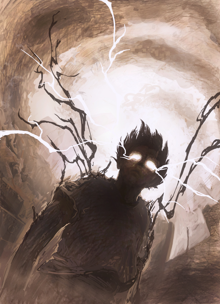
      Sorry it's been a while. This is a piece I just started working on. It's still sort of in the sketch phase, and I'm looking for some feedback. I'm also still trying to figure out exactly what to render as the debris the sky.

      0_1484716214376_17.jpg

      1 Reply Last reply Reply Quote 2
      • natiwata
        natiwata SVS OG last edited by

        Hi! Very dramatic piece, nice low canted angle and great composition! First thing that I am thinking is that if you bring down the background values just a touch, that white lightning will standout from it instead of blending in. I also took a very soft brush and just outlined it for that glow effect. Very cool sketch!

        0_1484721865790_Untitled-1.jpg

        Nat Iwata
        www.iwataillustration.com

        1 Reply Last reply Reply Quote 7
        • RobinSlee
          RobinSlee last edited by

          I would add swirling clouds, small leaves and general detritus! Great image, very dramatic.

          Site: Idrawcreatures.com
          Shop: RobinSleeDesigns.etsy.com

          1 Reply Last reply Reply Quote 2
          • amberwingart
            amberwingart last edited by

            I agree with both Nat and Robin...and this is awesome!

            Facebook Page: http://www.facebook.com/amberwingart
            Instagram: @savinafranciscoart
            YouTube: http://www.youtube.com/amberwingart
            Website: http://www.amberwingart.com
            SVS Sketchbook: http://forum.svslearn.com/topic/915/savina-s-sketchbook-updated-2-13-16

            1 Reply Last reply Reply Quote 1
            • kimchizerbe
              kimchizerbe last edited by

              so dynamic and extremely strong compositionally. I think the texture in your sketch work is interesting and adds to the sense of movement here. I would avoid doing too much tiny detail in debris, as it could be distracting from the point of highest contrast and focus: the eyes. Just my thoughts! Excellent work!

              http://zerbetron.com
              http://kimchizerbe.com
              ig: @kimchizerbe

              1 Reply Last reply Reply Quote 0
              • Xovq
                Xovq last edited by

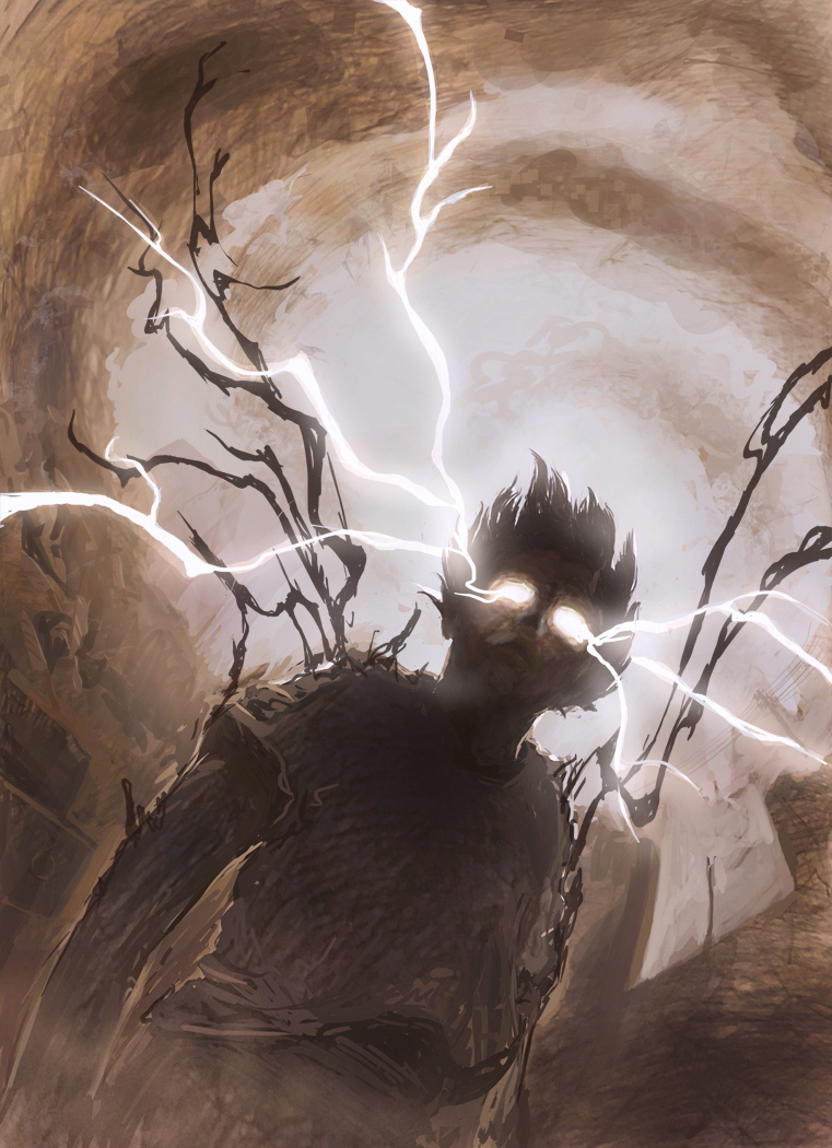
                Thanks for the advice everyone. Here is where it's at now. Does the bottom right corner seem really empty? I keep wanting to put some debris or something there, but I just haven't got it to work. I've been putting things in the sky, but then dialing it back to where it becomes unrecognizable. The line between defined and distracting seems really fine, but maybe my eyes just zero in on every change I make.

                0_1485061748252_21a.jpg

                kimchizerbe 1 Reply Last reply Reply Quote 0
                • kimchizerbe
                  kimchizerbe @Xovq last edited by

                  @Xovq i wish i could offer you stronger advice, but I really am taken with this image and I personally like the space in the bottom left, it allows for a moment of rest for my eyes, and serves as a way to help keep me engaged in the image.

                  http://zerbetron.com
                  http://kimchizerbe.com
                  ig: @kimchizerbe

                  1 Reply Last reply Reply Quote 0
                  • Xovq
                    Xovq last edited by

                    You're right. I flipped the image around and immediately realized that the area needed to be bare. There's so much energy driving into that area from the other side of the picture, the image almost seems to be falling into that space. Anyway I started adding some color to it.

                    0_1485218650176_22c.jpg

                    1 Reply Last reply Reply Quote 3
                    • kimchizerbe
                      kimchizerbe last edited by

                      ugh! this is so good. Dude I love the contrast with even just that little bit of color added. This is gonna be a killer piece!

                      http://zerbetron.com
                      http://kimchizerbe.com
                      ig: @kimchizerbe

                      1 Reply Last reply Reply Quote 0
                      • drawingmelee
                        drawingmelee last edited by

                        Looks fantastic!

                        Instagram: https://www.instagram.com/drawingmelee/
                        Twitter: https://twitter.com/drawingmelee
                        Website: http://www.drawingmelee.com

                        1 Reply Last reply Reply Quote 0
                        • Xovq
                          Xovq last edited by

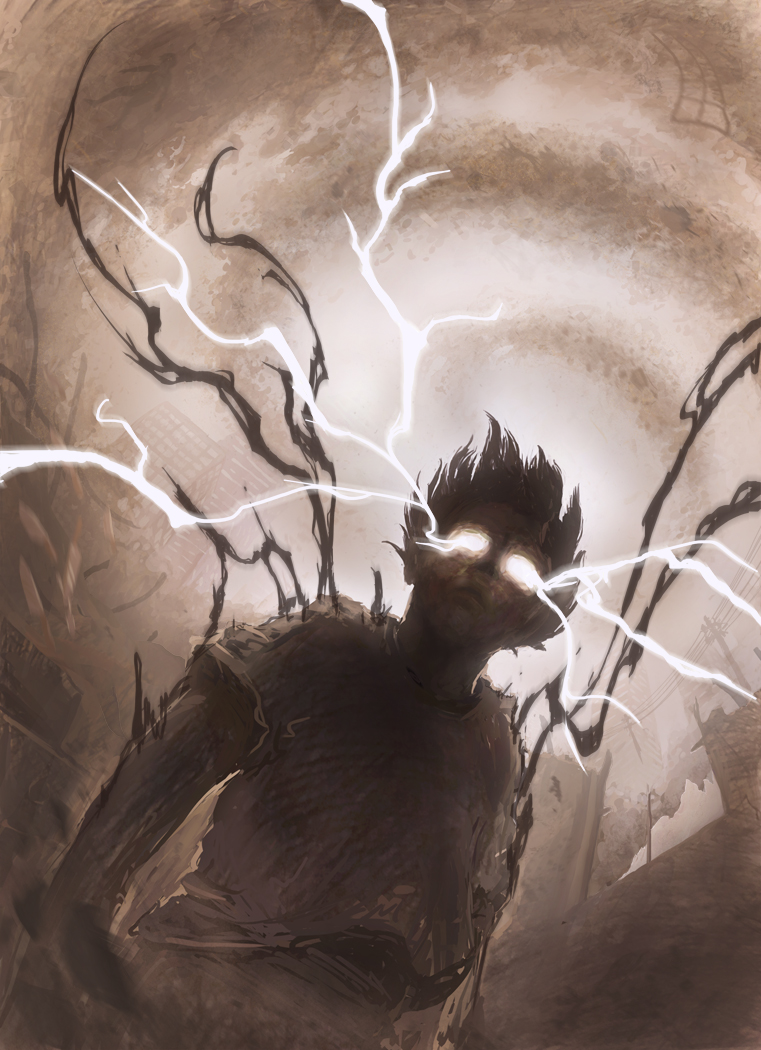
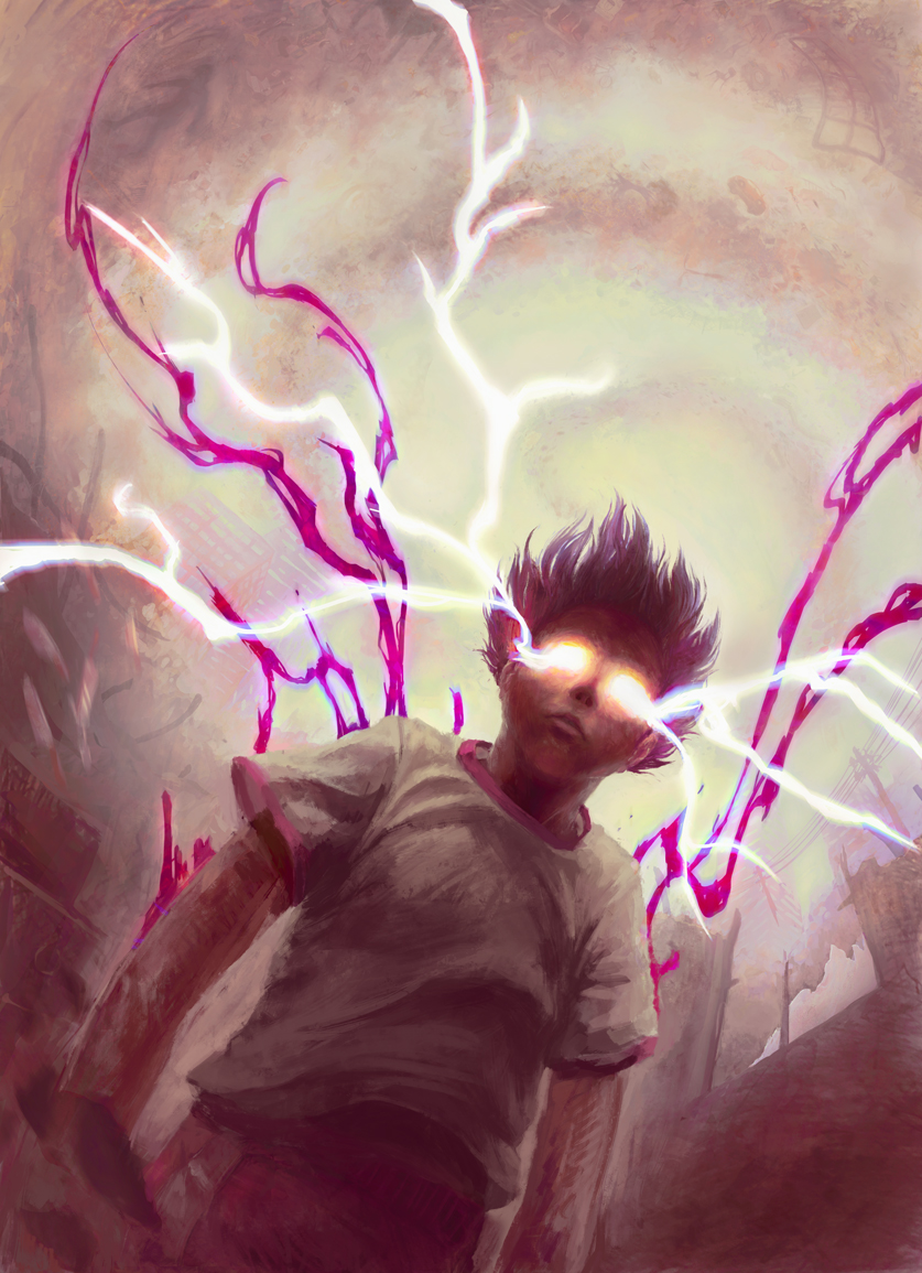
                          Here's an update. I've improved the colors a bit. It keeps getting lighter and lighter, and every once in a while I have to go back and darken the foreground character. I'm looking at it now and thinking the shirt is still too light.

                          I was excited to see that there was a video about making images with several objects. I feel like it helped me a bit, but I was having trouble grouping objects, since most of them are only recognizable by their silhouette. When they start overlapping, the become a little less recognizable. I don't know that it counts for #draw50things given that most of it's not very visible, but there are definitely more than 50 different things in the upper half of the background.

                          0_1486616790450_26b2.jpg

                          mattramsey 1 Reply Last reply Reply Quote 1
                          • MirkaH
                            MirkaH last edited by

                            just looking at this new image again, if he has lightening coming from his eyes, shouldn't there be more drastic highlights around the top edges of his shirt where the light hits closest? it might make that area pop more.

                            http://www.mirkah.com
                            http://instagram.com/mirkadraws
                            http://www.twitter.com/mirkahokkanen
                            http://Shoppicadoodlepress.etsy.com
                            http://facebook.com/mirkahokkanen

                            1 Reply Last reply Reply Quote 1
                            • mattramsey
                              mattramsey @Xovq last edited by

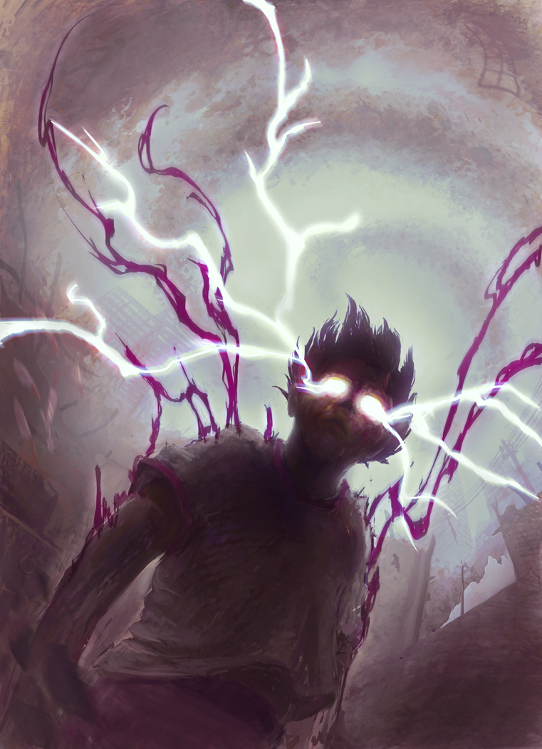
                              @Xovq I definitely like the colors--except for some reason, the "purple" lightning just isn't doing it for me. Not sure what is off except that maybe this is TOO powerful (and saturated maybe) that it is dominating the image.

                              https://www.inprnt.com/gallery/mattramsey/
                              https://mattramsey.artstation.com/
                              https://twitter.com/mramseyART

                              1 Reply Last reply Reply Quote 0
                              • Naroth Kean
                                Naroth Kean last edited by

                                It looks like something I would see on a training card like a spell or trap card. I like the conceptual art brush look on the first one. I would only refine them a bit to get rid of those overlapping transparency strokes. Great work!

                                http://narothkean.com
                                https://twitter.com/narothkean
                                https://www.instagram.com/narothkean

                                1 Reply Last reply Reply Quote 0
                                • Xovq
                                  Xovq last edited by

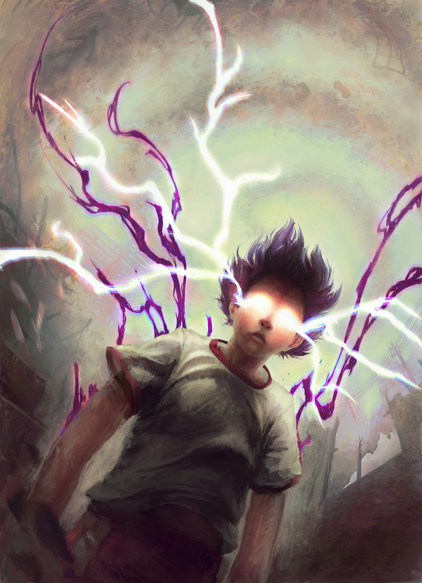
                                  So I realized that my monitor wasn't calibrated correctly and that last image is a lot more red than I intended, so this new image should represent more closely what I was going for.

                                  The purple lightning is darker and less saturated now, but I'm not sure that it's working yet.

                                  I improved the lighting from the lightning, but I think his shirt has gotten too light and is blending into the background. Should I make the background lighter, more purple lightning to distinguish the contour, or something else maybe?

                                  0_1486868723791_27.jpg

                                  0_1486868754807_27no.jpg

                                  1 Reply Last reply Reply Quote 1
                                  • smceccarelli
                                    smceccarelli Pro SVS OG last edited by

                                    I have not tuned in on this piece so far, and I have to say it is shaping up to a great image. There is one thing confusing me though: you keep referring to a "purple lighting". I guess you mean the purple streaks behind the figure, but these do not read like lighting at all. They are actually the darkest element in the image nearly, so they read like streamers or maybe some fluid (blood?) pouring out of him. If you want them to read as lighting, they need to become the lightest or second-lightest element in the whole image - which would probably mean considerably darkening the background. I agree with @MirkaH that adding the effect of the white light on his shirt would add to the realism as well.
                                    Looking forward to the final: this would make a great book cover!

                                    1 Reply Last reply Reply Quote 0
                                    • Xovq
                                      Xovq last edited by

                                      Honestly, I called it lightning because @mattramsey called it that. It's more like this dark otherworldly energy. I was kind of going for something between lightning and fluid for the shapes.

                                      I'm actually doing this primarily as a print to sell at conventions, and secondly as a portfolio piece.

                                      1 Reply Last reply Reply Quote 0
                                      • Perrij
                                        Perrij last edited by

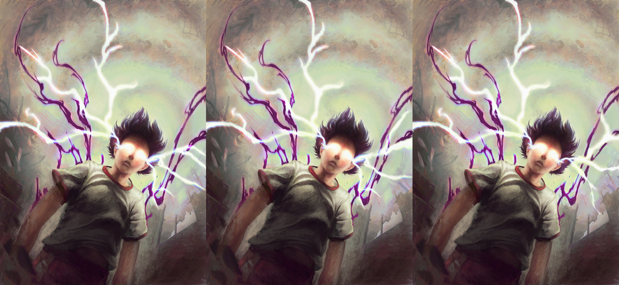
                                        I'm not sure if anyone's pointed this out yet, but there is something about that lightening on the right that's reallyyyy bugging me. Maybe because it's going against the round curve of smoke in the background? Or maybe it's my animation background rearing it's ugly head, but the energy is flowing in a completely different way than the lightening on the left side of the piece. I think, even if you just "flipped" the taller flash it would feel better. Or maybe I have no idea what I'm talking about.

                                        https://perrijs.myportfolio.com/

                                        1 Reply Last reply Reply Quote 0
                                        • Xovq
                                          Xovq last edited by Xovq

                                          I'm not sure I see what's looking weird to you, @Perrij, I tried curving the end of the lightning up a bit and also tried flipping the other bolt over. To be honest, I don't know that it makes enough of a difference to me to change it (or repaint the background anyway.)
                                          0_1487054545067_27ac.jpg .
                                          (original, curved, flipped)

                                          1 Reply Last reply Reply Quote 0
                                          • Perrij
                                            Perrij last edited by

                                            oh wow, my mistake, I was referring to the purple flowing stuff. I don't know why I called that lightening. But yeah, I don't think it's worth it to repaint. Only if you had everything on different layers would it be worth trying out. Sorry for the useless feedback :'DD

                                            https://perrijs.myportfolio.com/

                                            1 Reply Last reply Reply Quote 0
                                            • First post
                                              Last post