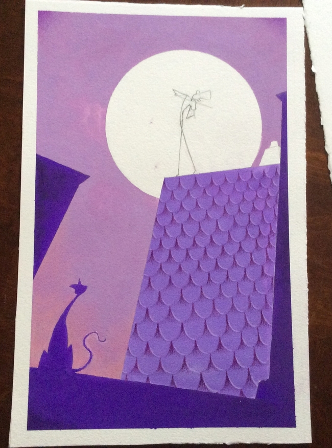
Tell me what you think is wrong with this new piece.
-
@Eric-Castleman
I like the composition better now. If you plan to bring some more things on the right side, be careful not to push the fiddler more to the middle. You might add something only to the bottom right corner. Is that what you meant?
Actually I am not sure if I interpreted right that the mouse was the shadow on the roof or is it the real mouse (or cat now)? -
definitely seems like a better balance and more dynamic composition to me now.
-
Trying a different style, and am wondering what you all my think. I am using gouache and colored pencils.

-
Love the texture of the tiles and the color palette!
-
@Eric-Castleman I really dig this. I was thinking you could tell a bit more story if you had a trail of little mice behind the fiddle player...almost like he's the pied piper like character and the cat is watching all the little mice with great interest.
-
@smceccarelli thank you! Trying gouache and colored pencils really surprised me as to how neat of textures I could pull off.
@evilrobot great insights. I was thinking a something similar as well. I was going to add a mouse next to the cat, to insinuate that the music was so good that they stopped and enjoyed it together.
-
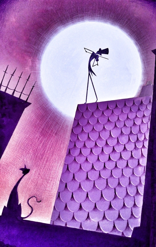
I finished it digitally, but am very conflicted about using filters. I went overboard I feel, but can't help but love the final outcome. Any thoughts on using filters?

-
I really love the poses of the fiddler and the cat and the graphic style of the whole piece.:-)
But somehow I liked the shyness of the original piece more than the digital version. I find the texture in the sky a bit too much. -
I love this style with the gouache and pencils, it's very clean and defined yet textured. I actually prefer the earlier version - the finished one has some really nice finishing touches, yet I like the gentleness of the first piece, and the soft sunset feel of the colours. Maybe you could turn the opacity down on your filter layers, or do it selectively so that the man in the moon has the highest contrast, but it's more restful elsewhere. But great work overall!

-
@Eric-Castleman I love the design and the background, the sketchy scrappy feel. The rooftop texture is a bit distracting. Perhaps you can find inspiration in The credits of Pixars Ratatouille and Tangled?