Skulduggery Pleasant illustration
-
Hi everyone,
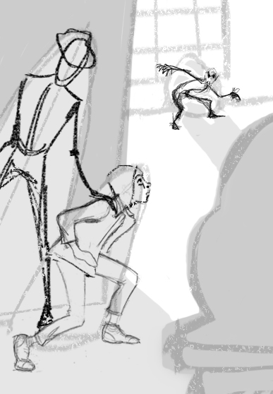
I'm working on an illustration for the Skulduggery Pleasant series
This scene shows Skulduggery (skeleton detective, tall figure on the left) and Stephanie (girl beside him, she s about 12 in this book), sneaking into a museum (big shape on foreground right will be a statue) guarded by vampires (figure in the background near window). Stephanie just witnessed the vampire transforming from his human form in that scene and Skulduggery is pulling her back before the vampire sees them
I'd like to know what you think, especially on the perspective and proportions of the characters, as these are issues that I seem to have every time I start a new illustration
thanks!
-
Hey! I think this is a cool, dynamic composition. Nice energetic poses! That's something I struggle with a lot.
My only suggestion would be to think about the direction of the girl. If the skeleton is holding her back, it would stand to reason that she is trying to run toward the vampire. Right now, it feels like she is running almost perfectly parallel to the picture plane while the skeleton is facing back toward the vamp. Maybe consider a reverse 3/4 view for her so that she and the skeleton are more aligned? Unless it is your intention to have her running in a different direction because she didn't notice the vampire. If so, I would maybe redirect her eyes to reinforce that idea - essentially illustrating the moment right before she understands what is going on.
BTW, I love her shoes.
-
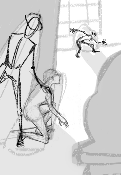
@mcucchi thanks for your suggestion. in the books, she's not running though. she's just crouching there, mesmerized by the vampire's transformation (first time she sees it and she's new to the magic world)
maybe with the knee touching the floor (so we don't confuse her position with running) and grabbing the edge of the wall or something. I'll try that... -
Gotcha! Yeah! The crouch has a lot of energy in it, like she's ready to pounce. I think I read more action than was intended.
-
This post is deleted! -
something like this? the silhouette kind of loses energy and readability though, doesn't it?
-
Hi, I love the composition its really engaging and draws you into the sence. The Stephanie character has a fantastic flow to her the only thing I would say is that in my opinion she is looking in the wrong direction. Am not even sure you have to see her face maybe just a back view with the head pointing to the vampire. But this only my opinion. Great work!

But I love the whole feel of the piece

-
@audrey-dowling I think this is much clearer! I don't feel like you've lost much energy and I can still tell what is going on. Just my opinion, of course!
-
I remember reading the first Skulduggery Pleasant book back when it came out... I haven't picked up any of the others in the series. I remember that it was a really fun one though, so I may have to.
I think the second pose you have looks a bit more natural, I would just make sure where the feet are is clear--It look like they're right on top of each other right now. I'm excited to see where this goes!
-
better now isn't it?
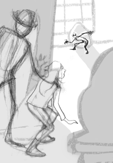
@Sarah-LuAnn I'm on the 6th one right now, I love that series. they're great books

-
I haven't had much time to work on it lately so here I am now
I will have to work on the perspective but the overall composition is ok I think. what do you think?
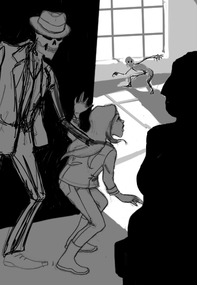
I'm going to refine my sketch now
(why oh why do I always make complicated illustrations??? ) -
and now
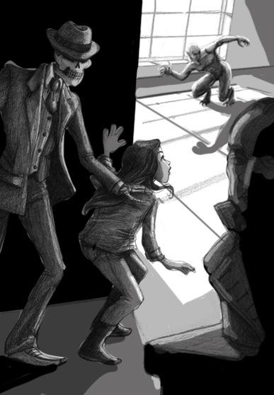
a far cry from the first sketch already
do you see any mistake in the perspective and values?
because of the value structure, I'm tempted to make the final version black and white. what do you think? -
@audrey-dowling this has really great depth with your tone and lighting. Cool!
-
thanks @Tyson-Ranes

-
I love the strong values you've got going on here. Really sets the mood well. My only criticism would be that I think Skelly's intent would be more readable if he was looking at her, and not in the direction of the viewer/bust. Imagine if you were pulling a child away from a hot stove- you'd be looking at the kid as you did it.
-
that's a good point @Rapteev , thanks
now I have to learn how to draw a skeleton's profile
-
This is shaping up to be a nice story! Well thought out for sure.
You asked, in a thread above, if there were any issues with perspective so I thought I would throw something together (I don't have my Cintiq in the office today so the pen tool will have to do).
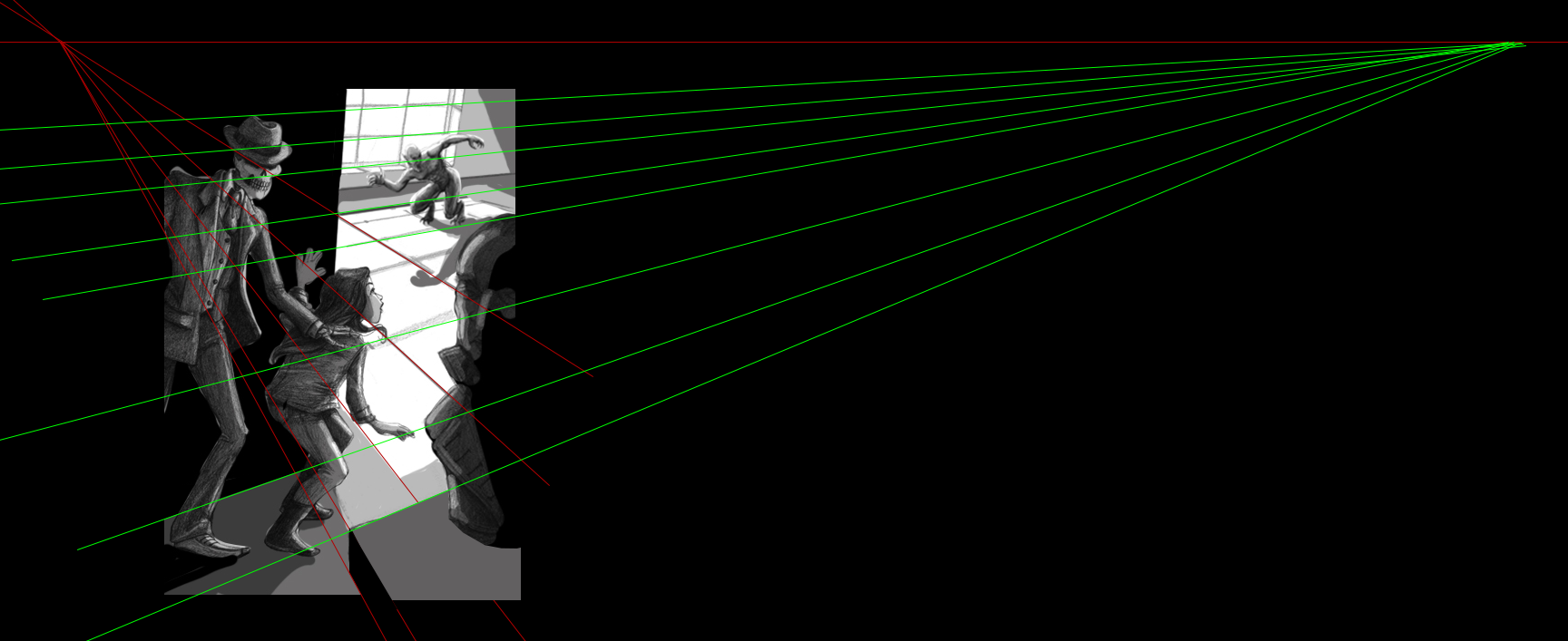
I increased my canvas size to WAAAYY out there - so i could find your vanishing points. I'd say that, for the most part, you have a pretty consistent piece here! BUT I had to take issue with the furniture in the foreground and the wall behind the skelly and girl. Using the points that I extrapolated from your exiting lines, I fixed the pieces. I think it is much more believable now.
Also, you mentioned that you might leave it black and white... while I LOVE the idea of starting all my paintings with tones of black and white, I feel that adding color typically deepens the perception of quality (and perception is reality to clients). To that end, I put together a triptych of the composition - left (before) - middle (after) - right (two colors).
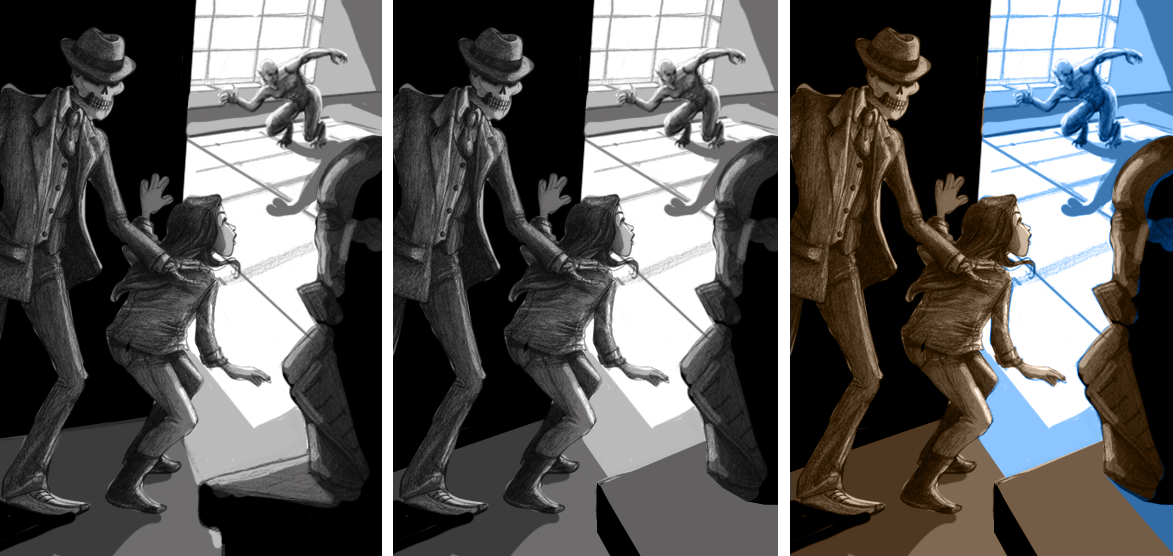
You can see that just adding two colors to the composition makes it more dramatic. I can feel the moonlit interior of the room because it is contrasted with a warm foreground. This even gives you a neat opportunity to make a light blue highlight on the edges of the figures, thus defining them even more in the composition.
Wordy as it may be, I hope you found this a little helpful - I like your piece a lot or I would not even try.
Good luck! -
thanks for your advice @Bob-Crum ! it's very right and interesting
I'm also considering doing it (almost) monochrome. I will try a few colour themes and see which looks best -
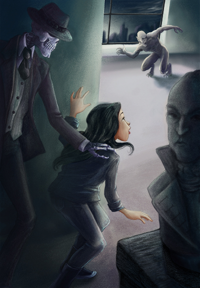
This is where I am so far. Still a lot to do
I'm hanging on to it but I'm going through a rough patch at the moment. I feel a lifetime away from the rendering quality I would like to achieve. It's like I aim too high every time and the end result is far from what I had envisaged...
Also I always get to a point in the coloring where I feel like I don't have a clue what I'm doing
it's so disheartening
-
Audrey, it's great! You're being too hard on yourself. I've said it before, and I'll say it again: those horrible feelings of inadequacy, nine times out of ten, reach their climax immediately before a level up. It's a consequence of seeing things you didn't see before, and a huge indicator that your eye for polishing is developing well. I guarantee there will have been a point in your art journey where you'd have looked at that piece and thought "Never in a million years will I be that good." And yet, here you are, being that good!