Treehouse Tea Party, Feedback Appreciated
-
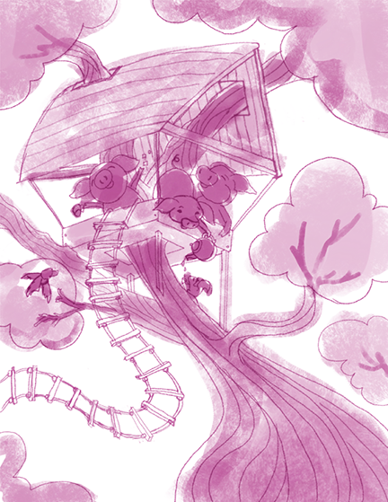
Hi everyone. Here's something new I'm working on-- sketch stage with values roughed in. I'd appreciate any feedback before I move on. Thank you!
Twitter @MaileMcCarthy
www.mailemccarthyillustration.com -
I think it has a lovely flow! Great life in your characters too!
-
@Lynn-Larson That feedback means so much! The giraffe/circus piece taught me so much about pushing my curves. I hoped that would come through here.
I love that you mention the life in my characters. Getting there took so many iterations! My first impulse is always to have people sitting quietly, hehe.
Twitter @MaileMcCarthy
www.mailemccarthyillustration.com -
@Maile-McCarthy You have incorporated the stuff from the giraffe painting quite well! The curves are excellent! So much movement, and it keeps your eye on the page.
-
@Maile-McCarthy GREAT shapes and use of space! I love the fun in this image. The only thing that keeps grabbing my attention is that the bird and squirrel are on the same level. Maybe move the bird, or even have him looking down into the tree house at the top left corner.
Can;t wait to see more!
Keep going on it, it's so great!
Follow me on Instagram and twitter! @christinabdraws
Facebook: https://www.facebook.com/cbrownillustration/ -
I have no suggestions that haven't already been made, so let me just say that I think this looks awesome! What is this giraffe piece everyone is mentioning? I missed it.
-
@Christina-Taylor-Brown said:
The only thing that keeps grabbing my attention is that the bird and squirrel are on the same level. Maybe move the bird, or even have him looking down into the tree house at the top left corner.
Thank you! I see what you mean about the bird and squirrel-- totally the kind of thing I would have missed. I'll play around with their placement before painting.
-
@Sarah-LuAnn Thank you! I think this is my all-clear to go ahead and paint
")
Here's the giraffe one: http://forum.svslearn.com/topic/226/circus-wip
-
This is fun and lovely I really like your composition and the movement it makes. I would watch out for the tree body on the bottom right, it feels a little bit flat to me otherwise everything looks great!
-
@Naroth-Cow Thank you. I see what you mean about the tree. I bet I can do some trickiness with the lines to add dimension, then it will really pop out when I paint it. I have a feeling this is not going to be easy but will look really great if I can pull it off!
-
I like this illustration a lot. Great flow and movement. I agree with @Naroth-Cow that the tree near the bottom looks flat. You can pull this off. You have a great sketch to work from.
-
Oh my goodness I am going to love it!!!! You are off to a great start I can't wait to see the finish!
-
Really fun piece, the sense of movement is fantastic, and your art looks a lot more sophisticated even compared to your last piece. Strong shapes and flow. Good work, can't wait to see it finished!
-
@Kimberli-Johnson @Rob-Smith @Shannon-Perkins
Having feedback in these forums has been so tremendous in my growth as an artist.
Here's where I am at the end of today. I reworked the sketch, and I think the tree has a lot more depth now. Debating between calling this done or adding fun girly stuff to the pigs (tiara anyone?). What do you think?
-
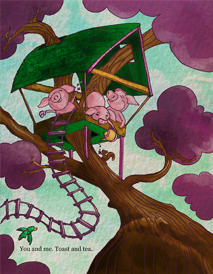
@Maile-McCarthy A tiara, a tutu on the one bending over, and a feather boa on the last? Love the colors!!
-
This is so cute! I really like those piggies and the color as well. I would tone down the highlight on the tree bottom right a bit (the bumping part, don't how to say that in English haha) because it sort of stops the flow for me, maybe just me. I know it's not finished however I think the sky can use a little bit of light and depth. Your composition really inspires me to kick myself out of comfort zone.
-
Super cute. I really love this image, and the colors are so fun! I was a little surprised by the purple leaves, but I'm sure that was intentional. It does seem weird to me that the green on the underside of the treehouse is so saturated. It seems to me like the underside should be less saturated since it's in shadow, and then the roof more saturated where the sun is hitting. Maybe?
Another comment that I wish I could have given earler is that the composition seems very left-heavy--text, bird, house, and squirrel are all on the left side. This jumped out at me more in the colored version, I think that saturated green might be making it seem even more lop-sided. Maybe something as small and simple as putting the bird on the right side instead of the left could fix that.
As before, I love your lines, and the textures are awesome as well--it reminds me a little bit of The Secret of Kells, if you've seen that movie. Keep up the good work!
-
Here's the update.
@Lynn-Larson, Thanks for your suggestions. I had so much fun doing the feather boa. I was excited about the tutu on the one with her bottom up in the air, but I'm not sure if it's working. Any thoughts on how I could tweak it? Right now, I'm worried it looks like the boa pig is sniffing her, and I'm not sure if the tutu looks transparent enough.
@Naroth-Kean Thank you for continuing to push me. I darkened the bump (I don't know if there is an English word for that!). And I worked on the clouds more. That was really tough for me; I think my next personal assignment is going to be pages of skies that express light and depth.
@SarahLuAnn Thank you for this detailed feedback. I'm so glad you said something about the green. Something about it wasn't working for me, and I couldn't figure out what. I ended up using a desaturated yellow for the base and desaturating the green under the roof a bit as well.
I spent a ton of time trying to shift some of the weight of the image to the right. What I ended up with was subtle (toned down the duck, darkened the tree trunk and used the boa to gesture right). Does that change your impression at all? Oh, and I moved the next. Not sure how I feel about that one.
-
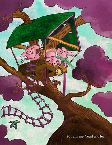
I love those extra accessories you gave them! awesome. The sky read much deeper and the movement/flow are much better. Also like your text over there too. easier to read and you know where it is right away.
-
I do think the image is more balanced now, and the treehouse looks better without the bright green on the bottom. I think the text is more readable and easier to find too. Awesome job!