Environment for a small town studies
-
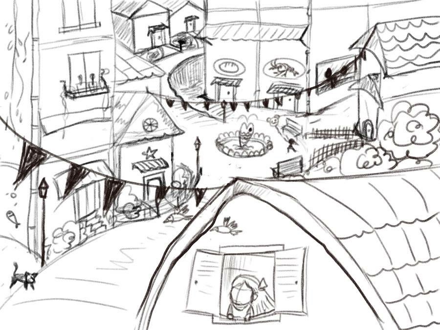
Here my rough design of the town, it took longer than the regular painting I did.
-
@Naroth-Cow I think it's flowing very nicely. The wavy path was my favorite thumbnail, and I'm glad to see you included some of that in your sketch. Looks like a town I'd like to visit.
-
Best way to get good is keep doing it! I really like the feel of your little town
")
-
Thanks a lot guys for the kind comments! Can't no log in with facebook
-
What a cute little town! I can't wait to see it painted!!
-
I have the exact same problem as you--I'm bad at backgrounds, especially with buildings. Way to confront your weakness directly! I need to do that too. I'm excited to see how this turns out.
-
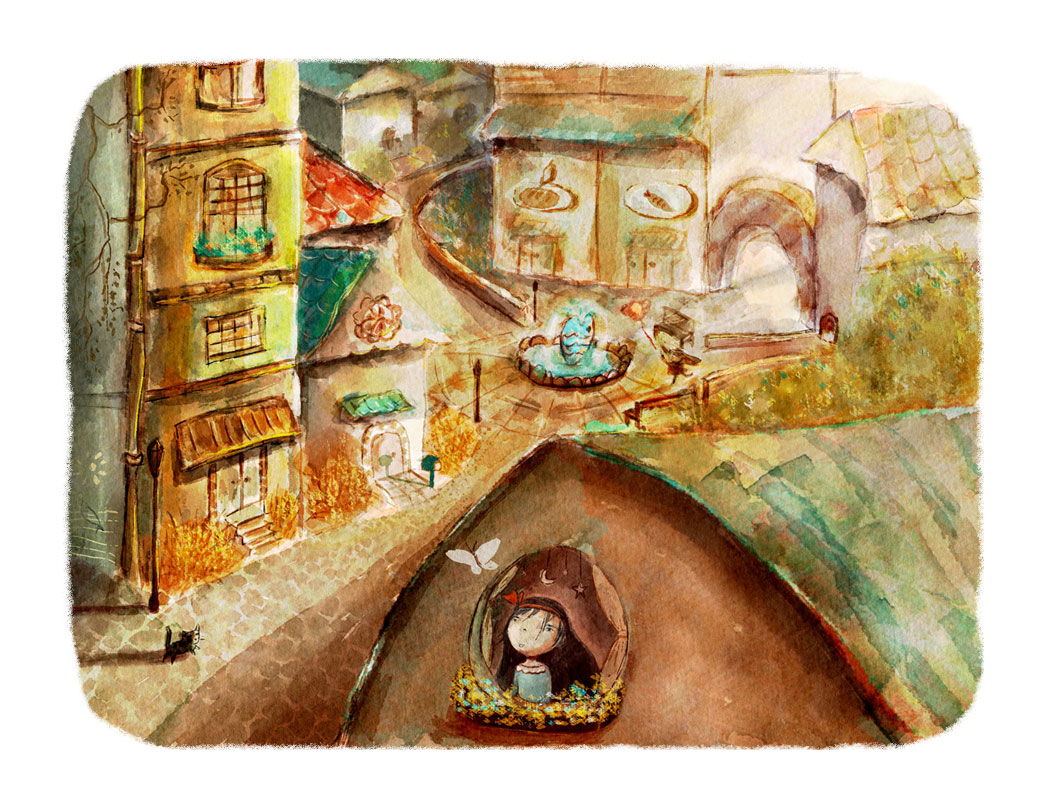
(In progress)
Oh man... after this I gotta bow to whoev.er specialize in environment design. This is such a challenge for me
-
This is just beautiful, I love the colors and textures! You should do more of these. I could really see this in a children's book!
-
@Thrace-Shirley-Mears Thank you! I really appreciate your kind comment. I agree I need to do more to improve. Actually after this one I feel a little bit better about environment with buildings, the fear kind of slowly fading away. Guess the best way is to face it.
-
Wow, that looks awesome! I love the texture and colors. You say its in progress, I'm excited to see the final.
-
Great colors and technique. Some of the values in the background are blending together for me. I still a big fan!
-
Wow you have done so well with this, I am at the moment doing the environment workbooks. hope I do half as good.
-
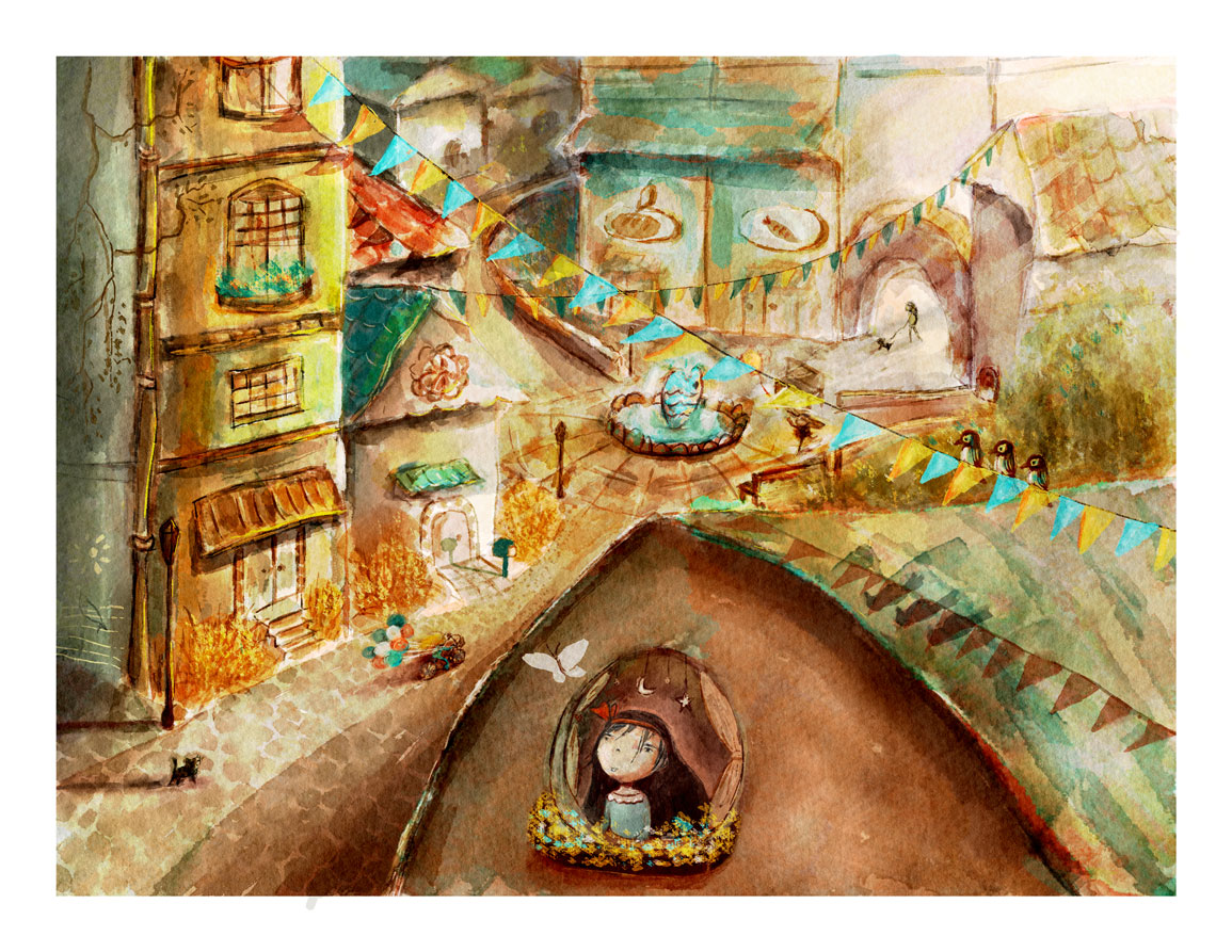
here somewhat I think it's a finished version haha. Thanks for the comment guys.

-
@Naroth-Cow
@Rob-Smith said:
Great colors and technique. Some of the values in the background are blending together for me. I still a big fan!
I agree with Rob, especially the area behind the three birds. Overall, it flows really nicely. All the little details add so much interest. Lots of cool stuff for kids to look at while the adult reads.
-
How about now? I bumped up the value just a bit, I intentionally wanted to make that area to have a wash away kind of feeling since there is a lot of light coming from there. Thanks for the critiques guys, it only helps making this better
-
I should start by saying i love your work and will be near the front of the line when you do a kickstarter or publish one of your stories. my question about your piece is that I am wondering if the flatness of the image is intentional - if it is not i thought i would mention why i think it flattens out - the original sketch is not flat though - it looks to me that the line with pendents stretched diagonally across the canvas is what flattens it for me -there are many tangents along that line that pull the background forward - there is one spot in particular where the ground plane changes value from one side of the line to the other flattening things in almost a cubist way (the triangle of tone with the little yellow balloon in it) - also lines coming from the left that intersect almost perfectly with one of the blue pendants - also above the line of pendants across the middle seems to be treated differently than the bottom left side - less paint ...not as finished- also the blue fish in the fountain is the same value as the pendants in the foreground and background bringing them to the same plane .....and the value of the road next to the house with the girl and butterfly being the same as the local collar and shadow area of the house ......once again i Love your work and feel free to ignore my rambling -
-
@Kevin-Longueil Haha I see what you mean and no worries, any critiques will help me to improve my works better! and I love it. Obviously this my first environment work so I was a bit confused with what color I should use. I was looking at someone work with limit color, and I thought I should set myself a challenge. Normally I usually would not worry about background detail when paint but when I draw it's just differebt. I guess that just the way I work haha. Thanks again for the input, much appreciate.
-
I have a bad habit of hiding thing in my work tho lol. People always ask me why, and I say I want people to find it especially kids when I do children's book illustration and it's true.