Society of Visual Storytelling

    SVSLearn Forums

    • Register
    • Login
    • Search
    • Recent
    • Tags
    • Popular
    • Users
    • Groups
    • Search

    Red Riding Hood Designs

    Projects
    characters design
    15
    22
    11622
    Loading More Posts
    • Oldest to Newest
    • Newest to Oldest
    • Most Votes
    Reply
    • Reply as topic
    Log in to reply
    This topic has been deleted. Only users with topic management privileges can see it.
    • Javier Diaz
      Javier Diaz last edited by Javier Diaz

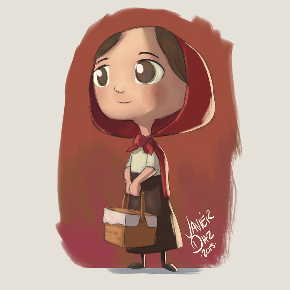
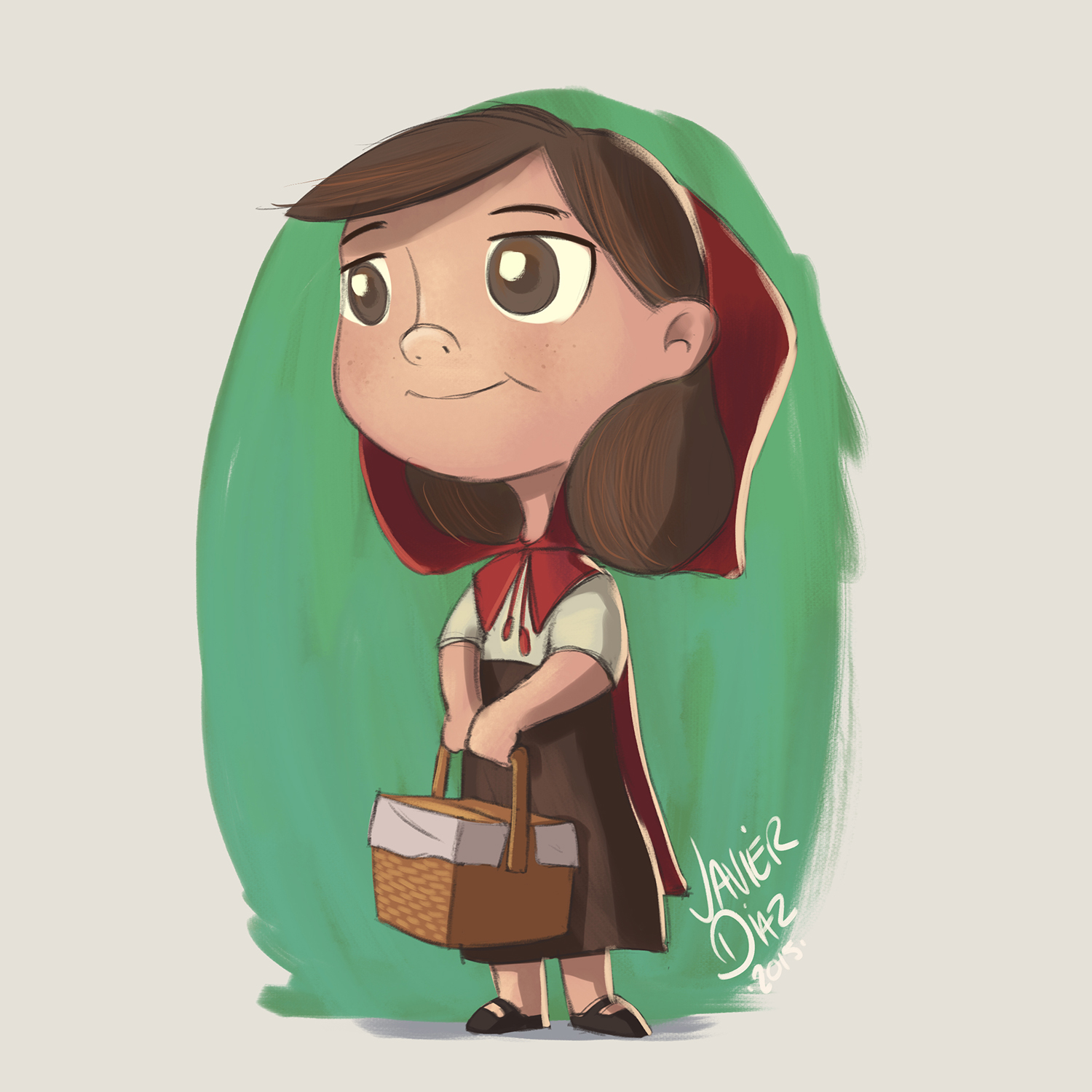
      I wanted to do some character designs for Red Riding Hood for my portfolio. Here's what I ended up coming up with!
      Red Riding Hood.jpg
      Grandma.jpg
      The Wolf.jpg
      The Woodsman.jpg

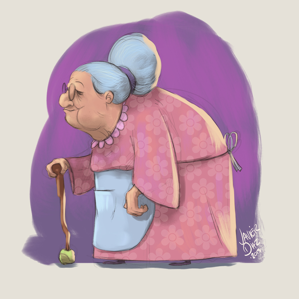
      I have also designed a home for grandma, however I am not too happy with the colours, so I'll probably finish that up this weekend.

      Thoughts/Comments?

      http://wwww.imaginejavier.com | http://www.instagram.com/bejavi/

      Leontine 1 Reply Last reply Reply Quote 3
      • Thrace
        Thrace last edited by

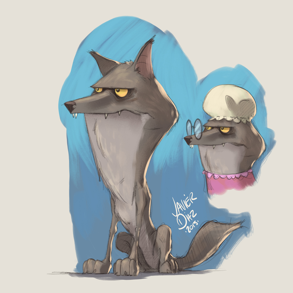
        These are awesome!! The wolves and grandma are my favorite, I especially like the wolf as grandma! The others are naturally good as well.

        1 Reply Last reply Reply Quote 0
        • DanetteDraws
          DanetteDraws last edited by

          @Javier-Diaz nice work! Your character designs are great. I also really like the wolf and grandma best.

          My only thoughts for change are for Red - first off, her body looks like that of an older woman's and the clothing doesn't help that (maybe make her dress a little more girly/frilly or something?). In particular, her arms & hands look to me to be too thick - I'd make them more dainty. Next, she looks like she's bald in the middle of her head since her bangs and side of her hair don't connect. Lastly, just a minor thing - your other characters pop out so nicely on their respective coloured backgrounds, but Red blends into hers too much. I'd change the background colour up to make her pop 🙂

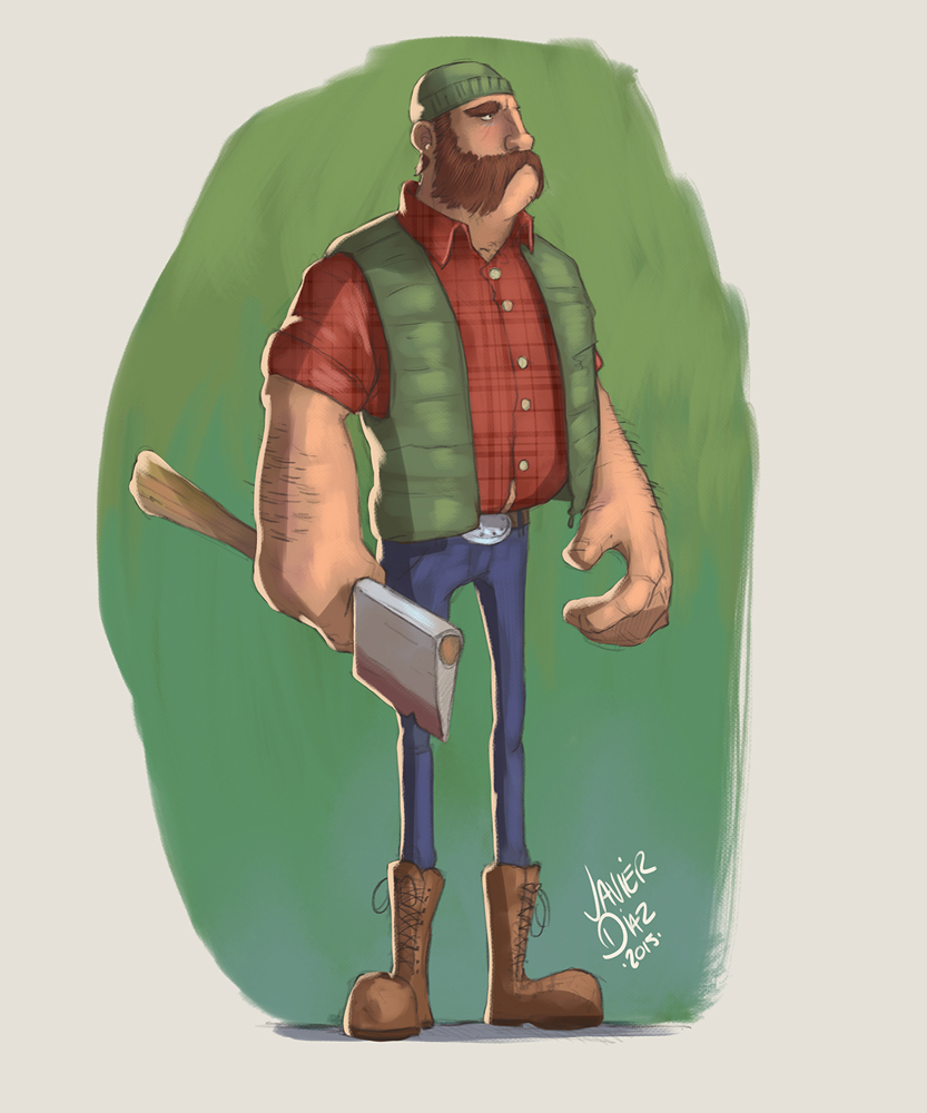
          The lumberjack's 'stache is pretty epic. Look out Ron Swanson!

          https://danettebyatt.com
          Twitter @DanetteDraws
          Instagram @DanetteDraws

          Javier Diaz 1 Reply Last reply Reply Quote 1
          • Rob Smith
            Rob Smith last edited by Rob Smith

            I like your designs. My favorite is the wolf.

            1 Reply Last reply Reply Quote 0
            • Javier Diaz
              Javier Diaz @DanetteDraws last edited by

              @Thrace-Shirley-Mears Thanks!
              @DanetteDraws good point! I'll make that change!
              @Rob-Smith Thank you!

              http://wwww.imaginejavier.com | http://www.instagram.com/bejavi/

              Christina Brown 1 Reply Last reply Reply Quote 0
              • Christina Brown
                Christina Brown @Javier Diaz last edited by

                @Javier-Diaz Wonderful! Your style is fantastic!

                Follow me on Instagram and twitter! @christinabdraws
                Facebook: https://www.facebook.com/cbrownillustration/

                1 Reply Last reply Reply Quote 0
                • Janet_dibbydabby
                  Janet_dibbydabby last edited by

                  Wow, these are fantastic. They all have great unique character about them

                  1 Reply Last reply Reply Quote 0
                  • Leontine
                    Leontine @Javier Diaz last edited by

                    @Javier-Diaz hi Javier, nice work! I would change the top of the head riding hood it looks a bit odd. The rest is very beautiful! love the colors, light and shadows.

                    Leontine
                    "A picture is worth a thousand words."

                    https://leontineillustrator.com
                    https://www.instagram.com/leontine.illustrator/
                    http://www.facebook.com/leontineillustration

                    1 Reply Last reply Reply Quote 0
                    • Steve Young
                      Steve Young last edited by

                      love your characters, they look like traditional disney.

                      Never give up, always push yourself two steps further than you believe you can go.

                      1 Reply Last reply Reply Quote 0
                      • S
                        Shannon Perkins last edited by

                        Really awesome designs! I'll echo what others have said about Red's bald spot. One thing that's getting me is that not all of the characters seem to fit into the same style. The wolf and the huntsman both have extreme distortions on some parts of their bodies (the huntsman's arms, the wolf's neck), which I love and think really make their designs. They also have a design patterning of big versus little as well. Red and grandma on the other hand are lacking those things (red has the big vs little, but it's a typical design). Red looks generic and undetailed compared to the others, and Grandma's proportions and features are much more realistic than the rest. I think just finding those elements to push will really strengthen their designs and make them match the others.

                        http://shannonreneeperkins.tumblr.com/

                        1 Reply Last reply Reply Quote 0
                        • Madlenn
                          Madlenn last edited by

                          Really nice designs. I love how the wolf looks, he made me laugh out loud 😃 The idea to make him so thin because he must be so hungry is really refreshing, as most of the wolfs I've seen done for the story are tough and strong.
                          As for suggestions I could recomend, as others have said, a bit more hair for Red. She seems to have a boy cut. Also tiny similarities between her and her grandma would be nice, just to make them more related.
                          Ther than that, great idea for a portfolio filler.
                          I am eager to see grandma's house. :)))))))))

                          LISTEN!Read!Think...

                          1 Reply Last reply Reply Quote 0
                          • Craig Babin
                            Craig Babin last edited by

                            Beautiful work!

                            Craig Babin
                            http://craigbabin.com    
                            https://twitter.com/CraigBabinArt    
                            https://www.facebook.com/CraigBabinArt

                            1 Reply Last reply Reply Quote 0
                            • Naroth Kean
                              Naroth Kean last edited by

                              vey nice design and yes agree with everyone on Red.

                              http://narothkean.com
                              https://twitter.com/narothkean
                              https://www.instagram.com/narothkean

                              1 Reply Last reply Reply Quote 0
                              • tallison7
                                tallison7 last edited by

                                LOVE the style of your characters and execution/colorization! Red Riding Hood herself has the least detail and texture... top of her head needs a little more shaping and light sourcing but otherwise really nice!! I'm wondering... are you entering the Tomie DePaola contest on the SCBWI website? If not, you SHOULD:)

                                www.traciallison.com
                                https://twitter.com/traciallison

                                1 Reply Last reply Reply Quote 0
                                • tallison7
                                  tallison7 last edited by

                                  Here's the link to SCBWI Tomie DePaola Award, due December 2015. I think you have to be a member to submit your entry: http://www.scbwi.org/awards/tomie-depaola-award/

                                  www.traciallison.com
                                  https://twitter.com/traciallison

                                  1 Reply Last reply Reply Quote 0
                                  • Javier Diaz
                                    Javier Diaz last edited by

                                    Hey all! Sorry for the delay, work has been crazy. Thanks for the feedback! You guys were right about Red, so I ended up changing her.
                                    Red Riding Hood_v02.jpg

                                    http://wwww.imaginejavier.com | http://www.instagram.com/bejavi/

                                    Thrace tallison7 2 Replies Last reply Reply Quote 1
                                    • Thrace
                                      Thrace @Javier Diaz last edited by

                                      @Javier-Diaz she is so much better!

                                      Javier Diaz 1 Reply Last reply Reply Quote 1
                                      • Javier Diaz
                                        Javier Diaz @Thrace last edited by

                                        @Thrace-Shirley-Mears said:

                                        @Javier-Diaz she is so much better!

                                        Thanks! 😃

                                        http://wwww.imaginejavier.com | http://www.instagram.com/bejavi/

                                        1 Reply Last reply Reply Quote 0
                                        • Lee White
                                          Lee White SVS Team SVS Instructor Pro SVS OG last edited by

                                          These are some really sweet character designs. Very pleasing shapes and consistent design throughout! Nice job!

                                          One thing I would suggest here, try putting them in a few scenes and seeing if they work out with their current proportions. I'm a fan of really messing with proportions and often times a good looking character design with heavy exaggeration will need to be adjusted a bit once you put it in a scene. I'm thinking about the size of the head with red riding hood and the wolf. I'd bet you can keep the design you have, but shrink the scale of the head about 1/3.

                                          In many animations and books that use characters with big heads, a good rule of thumb is keeping the head size about a third the size of the body (character that is three heads tall). If you want to age the character a bit, opt for a 4 head character height. Using the roughly 2 head high character like you have here makes all sorts of things difficult in production. things like riding a bike, or just moving through a scene (especially interiors) can look odd. Just a thought. Give it a whirl if you like.

                                          Again, very nice work. I can't wait to see more! : )

                                          SVS Faculty Instructor
                                          www.leewhiteillustration.com

                                          1 Reply Last reply Reply Quote 1
                                          • tallison7
                                            tallison7 @Javier Diaz last edited by

                                            @Javier-Diaz Yes!!!!!

                                            www.traciallison.com
                                            https://twitter.com/traciallison

                                            1 Reply Last reply Reply Quote 0
                                            • First post
                                              Last post