Kasey's Sketchbook
-
Nice composition and lighting! The lion's face is really nicely done, a lot of life there. In looking at some lioness reference pics, I think that the front legs are a bit too far apart and perhaps a little too thick in comparison to the hind legs. Very dramatic piece, well done!
-
I'm watching Jake's class on Comic Books right now. He breaks down the elements of a successful page, addressing the problem you had above. Sorry I missed it the first time reading through your thread. But Jake does talk about how to use type and word balloons more effectively. I would give it a watch when you can...
-
@natiwata Good eye, haha. Making the front legs too thick on cats/dogs is something I've always stuggled with for some reason. I tried to use some reference for the legs on this one to avoid exactly that, but apparently it didn't help enough. Thanks for the feedback!
@Bobby-Aquitania thanks for the hint, I actually did watch Jake's comics class trying to pay special attention to what he had to say about type and it just didn't quite answer the questions I had about how to not make things look cheesy. Specifically sound effects. Like, I know there have to be some rules of thumb out there about things to avoid (i.e. don't use comic sans, don't use the warp tool in this situation, always fade words in this situation, etc...) I guess I"m just looking for something more in depth on using type in comics.
-
I will see what I can find for you. I know I have several books in my collection, but let me see if I can find you an online source.
-
-
@Bobby-Aquitania VERY helpful. Thank you so much!
-
Really liking the progress on this latest piece. The rendering keeps getting better and better. Keep at it!
-
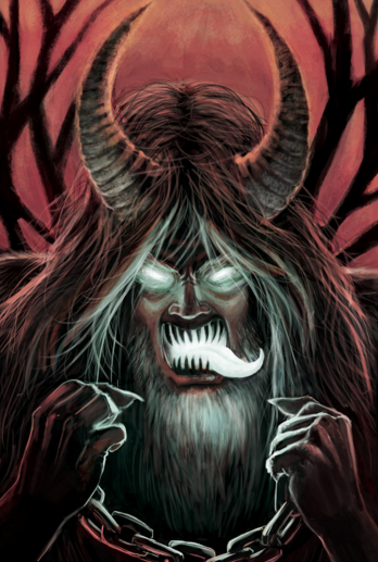
It's been a while since I posted, sorry about that. Been trying to get some personal projects underway. Worked on this comission earlier in the month and figured I'd share. Commissioner asked me to draw a Krampus. At the time I'd not heard of the movie, I went with my own conceptualization after looking up the lore:
-
Here are a couple of pieces I'm working on currently. They are both just sort of blocked in right now and I am entering the "refining" stage. Do any of you ever work on multiple pieces at the same time? I find it helps me to get things done if I have a few things to jump between so that I don't get bored/burnt out on staring at the same piece endlessly. I am envious of those of you who can just get it all out in one go. Maybe I'll get to that point some day.
-
Beautiful work! I especially liked your comic-pages - really nice to see something with that painted look
")
When it comes to typography, it's all about the story you want to tell and readability. Also be careful that the box you put text in, is not to small. You need to have atleast an equal distance from the left and right margin, as you have from top and bottom. The typographic rules that apply are that the distance between letters in a word, is the smallest, then bigger between words, bigger between lines, bigger between paragraphs and biggest to the edge of the page. This is very simplified, of course, but you get what I'm aiming for For instance, the top text-frame has too little margin to the left, and because of that the text seems too big for the box -
Thank you for sharing, I love how you push the light and darks, especially like your big cat in the snow!
-
@Camomilla Thanks so much for the feedback. I definitely see what you are talking about now and will have to watch for that in the future. Please feel free to always point out how my use of type could be better, I'm such a floundering newbie in that arena, haha. Also, I'm glad you like the style of the comic and that it doesn't seem too weird to have a more painted look in a comic format.
@lmrush Thank you.
You know, it's funny you say that because I feel like having strong sense of lighting is something I have always struggled with So I'm glad to hear that something is working! -
Hey guys, sorry for the long absence. I've had other obligations (and some distractions) taking up my time the past couple of months, but it's looking like that is mostly cleared up. So I was wondering, should I keep updating this sketchbook or make a new thread? What is everyone else doing? I'm a bit out of touch from being away for a bit.
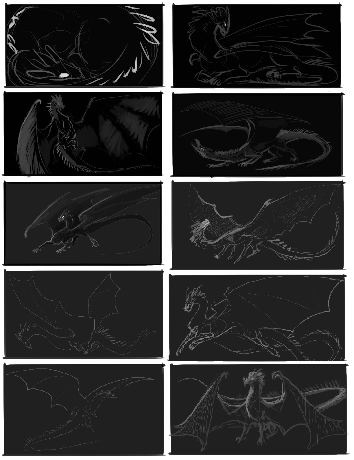
Currently working on a big commission that paid for all of my living expenses last month, so I'll be posting some Works in Progress for that. Here are some of the concept thumbnails I did for the client. He just wants a massive 5'x3' painting of a dragon for his living room.
-
Wow, these are gorgeous, I absolutely love their poses as well.