Building my Portfolio
-
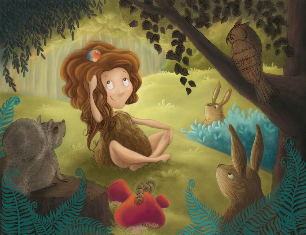
Hello Audrey - this is a really nice piece - i especially like your owl! - the thing i wanted to mention critique-wise is that to me the warmth of the background is pulling it forward - i did a super quick paint over - not suggesting this is correct - i picked the color of the tree trunks in the color picker and slid the slider up to blue and sprayed a low opacity airbrush over it - i just wanted to see it with a lower color temperature behind the girl - i think it helps push the background back where it belongs - i know i am not exactly the color guy but what do you think? -

-
@Kevin-Longueil yes definitely!
I'm not an expert at colours either (yet! ). I wasn't completely satisfied with that background but wanted to experiment again later. I definitely prefer it that way. thanks for that
-
How about 4 months per illustration for a work pace? ahem...
And this one is not even finished yet, but I WILL get there leaves on the top and a fine tuning and done. what do you think?

-
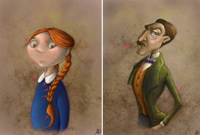
I want to preface that I think your work is great, and that you ARE on the right track. Everyone has given you great advice... this is just one thing I caught in the portraits, because I have used the same style. Which is to use a layer of grunge for the background...
What I think you did here is apply the grunge AFTER the piece was done, which I hope can still be altered. I think when this is done after the fact, the tendency is to make the piece look muddy. I have marked with red arrows where your whites are disappearing from their brightness. And where your colors are looking more speckly and not adding anything to the piece as a whole.
Also watch out for applying this effect too dark or opaque. It tends to take away from the surrounding areas.
Like the side of man's nose and chin, the girl's braid, and parts of the man's coat. This can be avoided if the grunge layer is on it's own layer, so that it can be adjusted. I would turn the opacity down slightly so that the man's face comes forward more. And erase it out of the braid, the coat, the collar, her eyes, and his white shirt...
I know you meant to do this, but the grunge is overpowering all the other great stuff you did, so much so that I saw it first. Cause it covered up all your great little details, and you don't want that to happen. This is just my opinion. I hope I haven't offended you... I see in your new piece you didn't use grunge at all, and it's full of bright wonderful color.
But I do get why you did use it for the single pieces, it gives a nice " antique-y " feel to them, like old photographs.

-
Thank you Bobby I will remember your advice for next pieces. However, for these two, it is the effect I was looking for
 The grungy background and the details that you have pointed out are 2 different layers, and I purposely used a brush with a lot of texture to paint the characters. Like you said, the "antique-y" feel was what I was after
And I think I am finished with this piece too. phew!
Feel free to critique

-
@audrey-dowling I think it is amazing! The critters are adorable, she's cute as a button, and your colors are so pleasing
 I wouldn't change a thing
 -
@Lynn-Larson thanks so much Lynn!
Especially the nice comment about the colors, which are not my strongest point. I've sweated to get this illustration done... and already I'm starting to become not entirely satisfied. I can't wait to start the next one to improve!
-
@audrey-dowling I can't wait to see the next one! Keep progressing like you are and it will be incredible!!
-
Very pretty, I thought as you were progressing I would like the rabbit best but I like the owl best now
 very nice
 -
nice work, love your feel for color, composition and style, try to practice your hands and feet, it will give it that extra punch! but overal great work!! keep it up
