New Portfolio Piece Critique
-
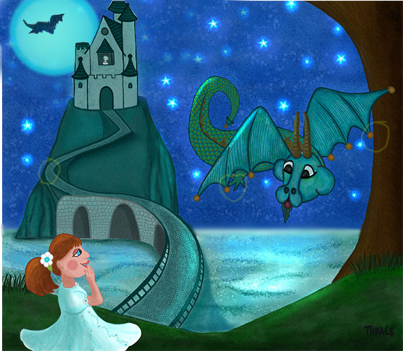
I am trying to get a group of piece together for my portfolio and would love some feedback, thanks!

-
Hello Thrace - a lot of good stuff going on with this piece - great job! I thought i might mention a couple things that pop out as possibly needing a tweak - the first thing would be the shape of the ellipses above the horizon line - they are all tilting down and forward toward the viewer when they should be tilting up and away because they are above the horizon - Jake did a good tutorial on this i believe in the mastering perspective videos - that being said it seems as though the horizon line is too close to the edge of the land where the castle resides - it looks almost as if the ocean drops off immediately after the rock - also the lines on the stones of the colonnades under the roadway should follow the same contour as the line that defines the edge of the road above it - right now they are too straight i think - also the roadway seems to be missing some supporting structure on the right as it meets the grass - also the kink in the road near the castle is very eye grabbing - you may want to soften this into a curve - you could make the roadway a tower of babel type road that goes around and down - i think the shadow under the road after the kink makes the road look a bit impossible - the lines also that drop from the road to show that it is built up on a cliff serve to flatten the face of the mountain - i think if you get rid of the shadow and the lines and add a core shadow to the mountain it will make more sense to the viewer - like i said though there are a lot of great things going on with this - the detail in the scales - the sky - the water - all great - i do not mean to monopolize the feedback of your work - and i am not trying to pick your piece apart - i do feel like i nickel and dimed you with input last time and it was probably irritating - anyways - hopefully some else will give you their perspective also - cheers -
")
-
@Kevin-Longueil thank you for taking the time to point everything out. It is not irritating at all and the only way to learn. I knew there was a lot not right with the mountain and bridge I just didn't know how to fix it. I need so much practice with these types of things. I will work on this again. Thanks so much for your feedback.
-
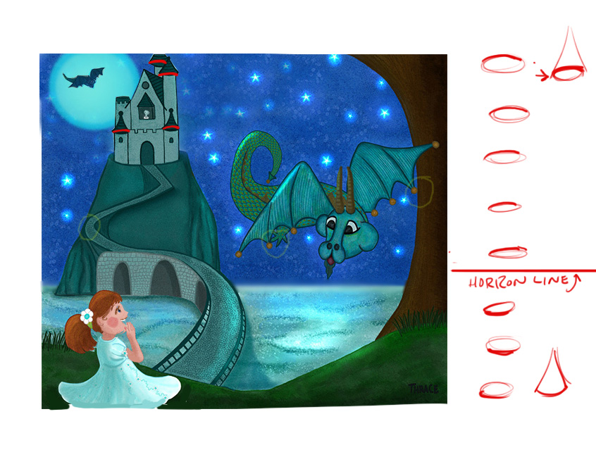
I agree with everything Kevin said. I love the textures and you have a good sense for color harmony that's working really well. The first thing that I noticed was the moon. I think the edges could be softened up a bit kind of like you did on the stars. That harsh edge and the size and brightness of the moon are competing with the interaction you have going on with the girl and the dragon which I think is where you want the focus to be. Another thing I noticed with the moon (sorry, I guess I'm kind of obsessing over it) is that the bottom edge is hitting right at the top edge of the mountain which is creating a bit of a tangent. I did a quick draw over where I resized the moon and softened some of the edges up. I also noticed a few more tangents and indicated those. Hope that helps. It's looking good.
-
@Jonathon-B oh yes, I like that much better! Thank you for the draw over!! I will change the moon and the others.
-
Oh good , I was a little nervous about messing with your piece. I've never done a draw over and I have to admit I felt like an intruder in someones house rearranging furniture and such, but if anything I did helps then I'm a very happy intruder. Haha
-
@Jonathon-B I personally love it when people do draw overs because it helps to see how others see things that you don't and its so much better to see it because I am a visual learner. Thanks again!! I really wish Kevin would have done one too!!
-
Really nice piece! I love the night sky and the composition! Great job!
To add to what Jonathon said, I did this little draw over. An easy way to think about perspective is really understanding what happens if something is above the horizon line or below it. For example, the base of the roofline of the castle spires are all going downward, but they should go up. If you think about flipping a quarter, anything above the horizon line will show the bottom of the quarter (we are seeing the underside of it), once it drops below the horizon line, we are seeing the top of the quarter. I emphasized the edge on each and showed how that relates to your roof lines in red.
One other thing to point out is your character design could use some tweaking. This is totally just personal opinion so I'd like to hear what others think, but to me she seems like not quite a kid and not quite an adult. Her eyes are bulging out a bit too much and perhaps too much emphasis on her lips. I did a quick draw over there to try and show her expression more and to simplify the features a bit.
Hope that helps some. Let me know if you have any questions at all!
Again, great work. Your water is STUNNING!
SVS Faculty Instructor
www.leewhiteillustration.com -
@Lee-White OMG, thank you so so much for your help and your compliments!! You are really great at explaining things and giving explicit examples, an excellent teacher!!!
I like the changes you made to the girl, I envisioned her being around 12 but I am not very good with people yet, so thanks for the help! -
Updated image, still working on the mountain. Better though?

-
I think it looks better for sure! - the ellipses are still off though - you are showing the top plane of where the castle sits but it is above our eye level - i did a quick draw over to see what would happen if you raises the horizon line - also tried to come up with a way for the road to make sense with the terrain - i think it needs to recede more - get smaller as it goes away from us - than it does in the original - a couple of other things i wanted to try was making the girl bigger and adding a small visual element to the bottom right - i added the continuation of the road - the curve of the dragons tail has a flat spot so i tried to plump it up a bit - i also wanted to see how it would look without the brickwork as it was really pulling my eye to it - anyways feel free to disregard
.....not sure why i picked brown to draw over with....not the best choice....... cheers 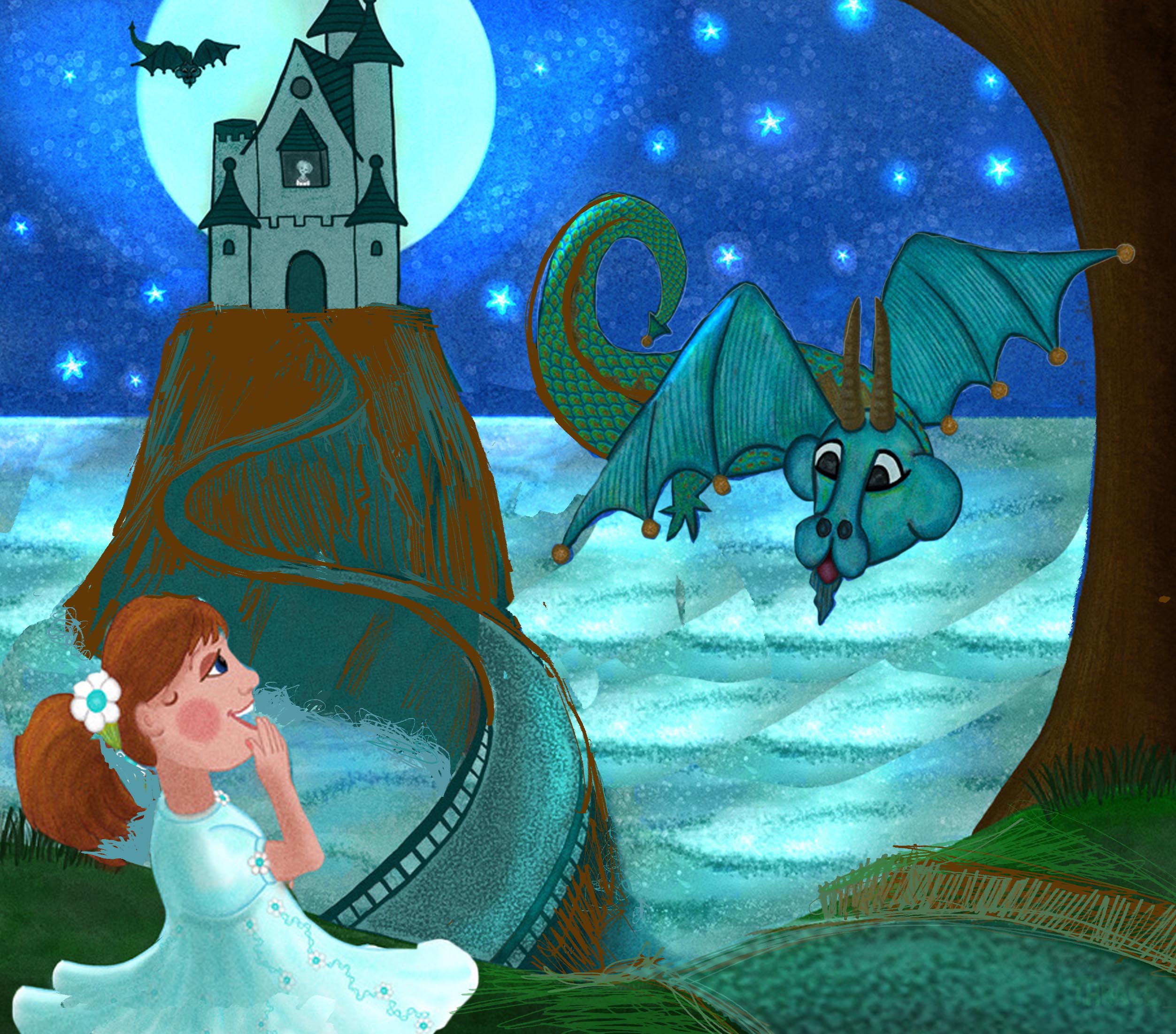
-
@Thrace-Shirley-Mears Nice job, I like where you placed the moon and the halo around it gives it some nice mood.
-
This is lovely
you've gotten some great feedback already, and you are definitely going in the right direction!! I love the little flower details on her dress! -
@Lynn-Larson Thank you!
-
Newest update

-
@Kevin-Longueil I am just mortified because I just realized that I never did thank you for the draw over you did for me. It really helped to see what you were talking about! I used a lot of your advice. Again, thank you for taking your time to help me and sorry for my short-sightedness!!
-
@Jonathon-B thanks for your help!
-
@Thrace-Shirley-Mears Wow the core shadow on the mountain really makes a dramatic difference - great job on this - it really is looking good - if you are up for more i would mention that in previous versions more of the castle was leaving the top of the canvas - i think it was enough that it did not feel like a tangent before - now i feel it has that tension that a tangent creates at the top of the tower where the finial touches the top of the canvas - the bridge looks good - i like what you did to lessen the contrast - the moonlight on the water the rim lighting of the mountain and dragon wings - very nice - there are still some things that read as being flat - this may be the style you are after though - but if not - i believe the castle looks flat - the way it meets the top of the mountain is a very nice curve and would work better if the horizon were above the top of the mountain - but the horizon is well below so we should not see that nice curve at all - i think a fix that might preserve what it might be that you like about this view would be to push the bottoms of the two towers next to the castle gate back a bit this would mean shortening the bottoms even just a tiny bit - the bottoms would have a different curve to them - even a straight line there would work a bit better to help the perspective - if you put a roll of paper towels on the kitchen counter and look at it from the kitchen floor that you will see the contour the bottom of the towers should have - ..the dragons wings and part of his tail have volume but much of it is flat - a hint of a core shadow on the dragon would help to give volume to it (maybe on the wings too)- the face is flattened i think because it has a very even light on it - but also the shape of the eyes do not feel as though they are surrounded by bone and muscle but seem flat which might be flattening the whole face for me....but you may be going for flat with this so i will stop :).....I'm sorry you were mortified about not thanking me...absolutely no worries ever about that!! - i didn't respond right away when i saw your update because i wanted to hang back and see if you could get someones else's opinion or perspective - i worry that my laundry list approach will might get old with folks
- ..a couple last things - i think it would be pretty easy to construct a 3d model of the castle - even out of paper,cereal boxes, cardboard tubes and tape - you could make a maquette of the castle then sit on the floor looking up at it to get the right lines and angles - you could even light it from the back to see what it would look like....white or grey legos or wooden blocks would work for the model too - then you can really get the perspective and volumes nailed - and lastly the road next to the tree needs to taper on its top edge as it nears the water - i did a real quick job on my draw over but if you look at it it gives the impression that the road continues down the hill - with an abrupt line that does not taper and curve on the top edge it looks like it may just drop off after we pass that point....does that make sense - anyways - looking very good! -
@Kevin-Longueil Thank you once again for all of your advice. I am working on it now!
-
Hi Thrace - I think one of the reasons the castle looks flat is that you have not done any shading (highlights or shadows) on the structures. I really think those rounded towers could use some volume lighting to give them that rounded effect.