Leontine's Winter Challenge
-
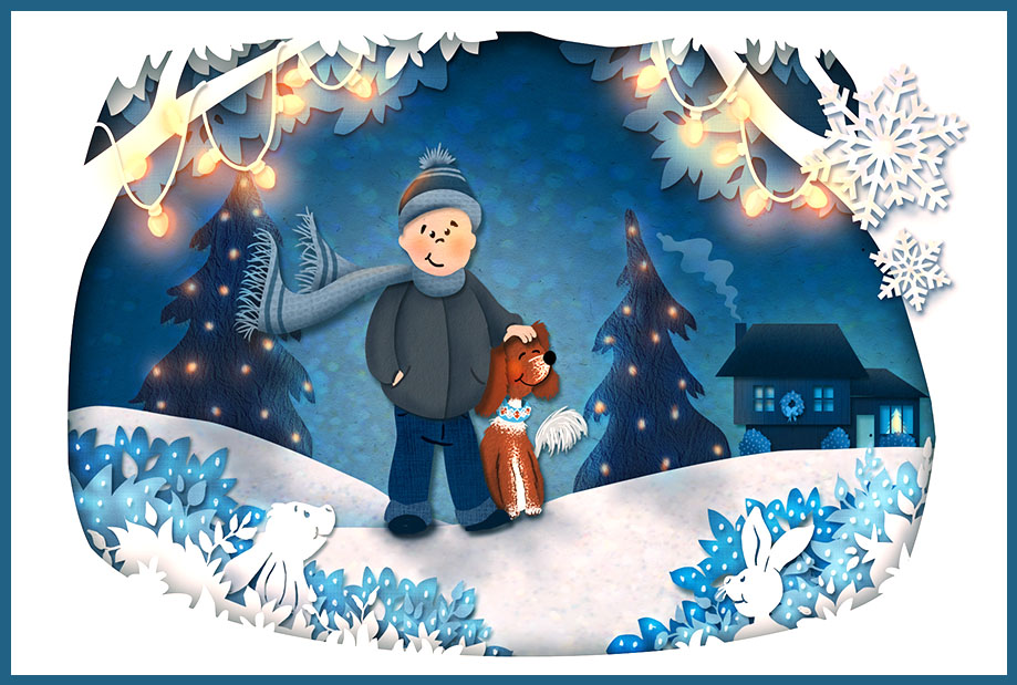
I was wondering if I should post an earlier piece here because I have shown it before, but after hearing you, @rob-Smith, saying that you like cut out, I was convinced to show it.
I love Richs (@rich-green) piece so much! You pushed it even further, Rich. I will try to make something in your style. Really great!
-
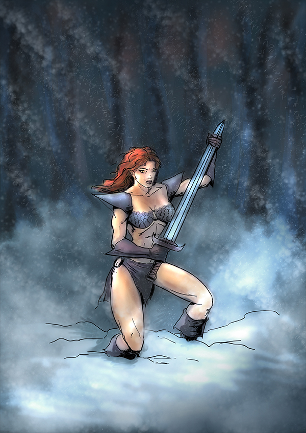
@Bobby-Aquitania Nice work Bobby, how nice of you to join in the fun! I Really like the pose and the composition, What bothers me a bit is the linework, It seems out of place. Maybe you can push the rendering So you can get rid of the lines? Than the character can sart speaking for it self. If you do have time watch the Youtube video's of Istebrak-art instructor for tips and critiques.one that really helped me is this one: https://www.youtube.com/watch?v=-7EpXCnN0lo
Good Luck!
-
@Rich-Green Hi Rich, is it digital, or in real life? I Love it! Thank you for joining in! Can you give the lights a warm glow? Than it warms up the scene and gives it a warm Christmas feeling ...

-
@Leontine Wow, it looks even more magical with the warm lights! I had been so fixated on the idea of keeping everything blue I never even considered a more traditional light color. I only wish I had seen this suggestion before I had submitted my card order with the printing company!!! (I just checked to see if I could cancel it so I could adjust it with the warm lights but they are already in progress). Lesson learned - wait a bit longer for feedback before going to print.
And to answer your question - this is all digital. I used a bunch of different textures to create the look of materials/papers. I did use the Photoshop drop shadow filter on most everything to get the base consistent shadow between layers but then I would also add my own layer on Multiply to enhance that in certain areas and help make it feel a bit more natural and not all completely perfect.
Thanks again for your draw over - I really do love it!
Finally - thank you to @Thrace-Shirley-Mears, @Rob-Smith, and @Jana for their compliments as well. Much appreciated!
-
@Rich-Green Your welcome! I love it very much! I love the different layers and the feel of it! Can you give me some suggestions for textures? I like to try this style sometimes!
-
@Jana really Nice Jana! Love the texture and there's some stillness in this which I really like!maybe you can add some snow?
-
@Leontine I just created a separate forum post on the textures and how I used them. You can find it here: http://forum.svslearn.com/topic/873/textures-and-how-i-used-them-in-my-leontine-s-winter-challenge
-
@Jana Love it! I'm going to have to check out @Rich-Green's post. Thanks!
-
@Leontine said:
@Bobby-Aquitania Nice work Bobby, how nice of you to join in the fun! I Really like the pose and the composition, What bothers me a bit is the linework, It seems out of place. Maybe you can push the rendering So you can get rid of the lines? Than the character can sart speaking for it self. If you do have time watch the Youtube video's of Istebrak-art instructor for tips and critiques.one that really helped me is this one: https://www.youtube.com/watch?v=-7EpXCnN0lo
Good Luck!
Thank you very much for commenting Leontine. Yeah I feel I didn't follow the " mostly blue with 1 complimentary " color challenge very well, as I was using the challenge to do a warm up. For me, my piece is just a coloring mood warm up. I used the black line intentionally, because I come from a US Comic Book industry background. That's the art I grew up on and wanted to emulate as an adult. It's traditionally done with black ink lines over pencil, in the industry we use a non-photographic blue pencil to sketch with instead of a normal pencil, because that can have black india applied to it and the final image won't show any of the pre-drawing when reproduced in print. Normal pencil would photograph of course.
Jake Parker, Will Terry's partner here at SVS also teaches a course here on just Inking, and several others on Comic Book style artwork.
So this is why the black line is used, to define form. It is essentially the same as the classic ink and watercolor method, only the lines have more purpose than providing a shape to color. They define where the light is hitting the form, the anatomy, all the things a heavy pencil line would do. The style was primarily done with a brush from the 30s - 90s, but is now done digitally as well. I have better programs to do it, but I like Mischief which gives you an infinite canvas to draw on...
Thank you for your video, some of it was useful, I prefer this style which oddly enough is the style I evolved to as I had grown tired of the traditional comic book look in my work. I still do it as a warm up, to keep myself loose, and work on my muscle memory as I will always love this style. But now I work like...
This and this... each stage in the article is clickable to see larger.

Where I build my values up in " painted " tones before applying color. But that's what I do for my personal work. I joined SVS because I liked many of the digital techniques Will was using over his pencils, which he sometimes does digitally as well, and I applied some of that in this challenge. He uses a " color dodge " layer to brighten up color values, I think in mine I went too far and it looks over saturated. Last night I was watching his Mixed Media course and I saw him bring down the saturation of his whole piece and then just build up the color on his figure using this same method of color dodging.
I had a layer like that on mine, but again I went too far trying to keep more blue. If I applied Will's class to my piece it would look like this, where I only color dodged the skin and hair, and left the background less saturated.

I could paint this out in my normal style, but again I was only trying to warm up... I may go back to it with more blues like the challenged called for, but I've got to get cracking on that 3rd Thursday piece, in which I'm using a totally new style, more cartoony. If you've never done pen and ink, it is an art form all it's own, I suggest looking at artists like Wrightson, Barry Windsor-Smith and Jeffrey Jones they all knew each other in the UK, and worked at a place called The Studio in 1975 along with artist Michael Kaluta. Their work heavily influences comicbook creators till this very day...
Thanks again for your help.
-
There's also a method of comic book coloring where the black line is colored individually for the area it's trying to convey, but it's a lot of tweaking. I actually haven't done it in ages, but Will's Mixed Media class sort of covers it, separating your black line from the white of the page. It can be then colored, which he does in one example as white... it has a softer looking feel to it, but it's a little laborious to do. Some days you know, you just wanna doodle...
-
@Rich-Green Wow love your challenge piece, it's really charming and beautifully constructed using the paper-cut techniques and textures, the values work great too. I also like that it says something personal about you, which is a great thing for a Christmas card, and Annie looks so cute

-
@Dulcie Thank you so much Dulcie! Yes I really had a lot of fun creating this piece and I am just so thrilled that everyone can feel that coming through when they look at it. Everyone here has really made my day with all of your wonderfully supportive input on this one!
-
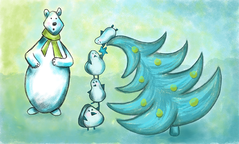
I used this challenge to practice a different style which is much more graphic. Really liked the panda bear I got after some exploration so I needed something for him to be a bit surprised to be looking at, pretty predictable scene but was great practice and fun!

-
@Stephanie-Hider I think this image looks good! Your bear is expressive. You have some nice texture work going on. Thanks for posting!!
-
@Rob-Smith Thanks! I like the bear and the tree but my daughter who is great at critiquing me said the penguins have to go
 I will think of something and rework it eventually.
 -
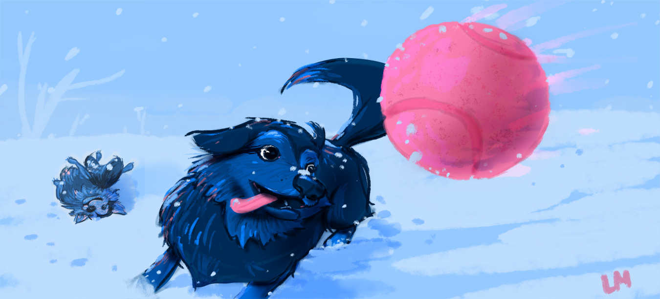
These are my crazy dogs playing in the snow. It snowed in Illinois recently and they were so pumped after living the snow-free life in North Carolina for a couple years. It was fun working with just pink and blue.

-
@gimmehummus Love it! Colors are great. Thanks for posting.
-
@gimmehummus! So cute and beautifully painted!
-
@gimmehummus what a great moment to capture - love the energy and the anticipation of the pup catching the ball. Nice job!
-
@gimmehummus It is illustrations like this that make me want to give into my children's desire to have a dog! You captured their personalities perfectly! And great use of 2 colors. Impressive!
@Stephanie-Hider I love your penguins! Great "before action" scene! Nicely done.