second childerens book illustrations
-
@Leontine ty, but stil lots off work on it, hope to finished this year! :
-
Hello and welcome Smoke! These are great...huge amount of work you have put in....very nice! You are looking for feedback i'm sure so here is what i see - it could just be that all of the paintings are in an early stage so please disregard if this is the case but what jumps out at me is that texture and edge quality is almost uniform across all surfaces and all images - when you do harden the edge of an object it becomes the focal point...for instance in 23/24 the tree on the right has hard edges and a texture that is different from most of the rest of the book - the tree is the main character in this image(to me) in image 22 the lady bug is hard edged and red and becomes the focal point - the trees on the left in 5/6 are awesome but they keep pulling my eye to them because the right hand side of the composition has softer edges - even the leaves that are closest to the camera - ...i am not against hard edges - i believe you should use them where you want our eyes to spent the most time especially if it is contrasted with soft edges - so putting hard and soft edges into each composition and varying the texture greatly is what I think will push these forward -( i think fur and feathers can look soft but still have crisp edges)...look forward to reading your book when you are done!
One thing i forgot - is to possibly reverse your composition of 23/24 so that it reads from left to right - worth checking out i think
-
looking good smoke, Love your expressions in the faces.
-
WOW! You are doing stellar work! All the movement in the tails, the expressions and perspective, plus I just love the house on the first two pages. Really inspiring stuff, thank you for sharing!
-
Hey Smoke - I would love to do a draw over - which one would you like help with?
SVS Instructor
http://willterry.com/ -
@Will-Terry Pick one, i should not know, thy all need rendering. i would say choose one where i can benefit and learn the most off, and thank you!
 realy, thank you!!
 ")
smoke
-
@smoke Hello again Smoke - I keep looking at your images because i knew there was something was missing - I think I have it figured out now - I believe it is contrast - I think it is important to consider light on dark and dark on light when looking at our compositions - I think in general we should be able to point at the most important part of our image and say "I decided to make this character light on a darker background" or "dark on a light background" - in the first image I can pick out this relationship as being "light on dark" but not in the other images - so I think increasing the contrast where needed for emphasis - I'm sure there are many degrees of light on dark and dark on light but I'm sure you get the idea
- really looking forward to Will's draw over! -
Hi Smoke,
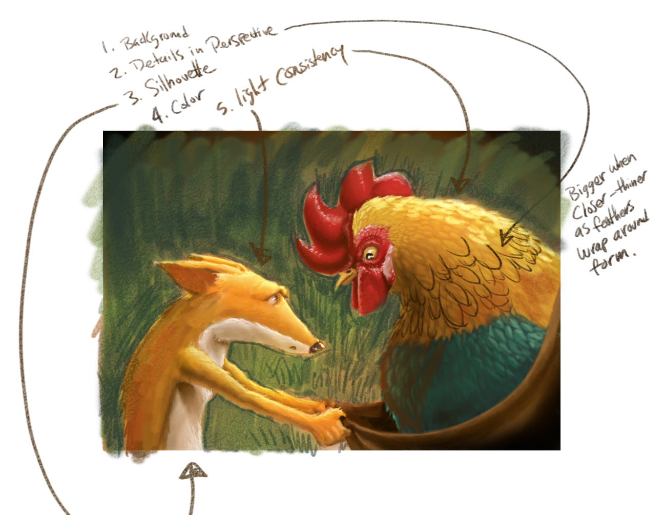
So - I just thought of a few things that I think will make this piece even better. Great characters by the way. I don't think you were finished but I thought I'd mention adding a background just in case. Remember that when the same details repeat around a cylindrical form they will appear larger when they are closer and as they round the form they will get taller and skinnier (eliptical). I don't think that tail was helping - it confuses your focal point -the face of the fox/coyote. If you have warm colored figures it helps to highlight them on a cool background. Maintain one light source and you will be able to convey more volume in your forms. Hope this helps
SVS Instructor
http://willterry.com/ -
Hi Smoke, It will be a wonderful book! I love the concept. and I know that you put a lot of effort in this one! I really like the long tail of the fox! Cant wait to see the finals! have a nice day 'Buurman'!
-
@Will-Terry Thanks!
, your totally right, the caracters pops from the canvas on your example, big improvement, i still got alot to learn, i am very grateful you opend my eyes on a few details on that one piece so i can take it to consideration to apply this new point of view on the other pieces!! Realy Thank you