Dream Portfolio Homework -3rd Inline
-
To understand the values a bit -not everything there is replicated.
-
Progressing is fun!
Instagram: www.instagram.com/heatherboyd.illustration/
Website: https://heatherboydillustration.ca
Shop: https://www.inprnt.com/search/products?q=HeatherBoydIllustration
Ko-Fi: https://ko-fi.com/heatherboydillustrationBe blessed,
-
This is great! A good reference, Teressa has some very solid work to study. I ought to take a page from your book and do some value studies as I feel like it's one of my weakest points.
And I have an annoying question, sorry, but what brushes/application are you using? -
Haha it’s all good, Corel Essential 5 and a square soft x pastel and a hard one I’m pretty sure. But I sketch in the grainy cover pencil.
-
Thanks. Honestly I dislike having to ask that question, but I’m still on the hunt for the right combo of brushes for me. That is ones I like using. I keep chopping and changing between Photoshop and Procreate. However it just goes to show it’s the artist not the tool

I really love how you’ve replicated the texture. Well done.
-
Thank you. I have an old photoshop but it is failing so I stick to Corel. Within those brushes I play with the opacity and grain as well. I have enjoyed trying to select her colours by eye and then I went and played with what I thought might make those mixture of colours, it was playful fun and I like that.
-
Finished I already see things but it's done lols. Thank you guys for your encouragement!!! I have others to do just not today.
")

Note: The most difficult was the blue, still didn't get it just right.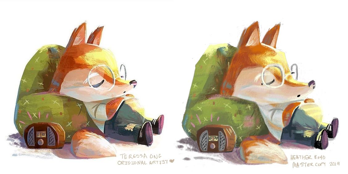
-
Great work!
-
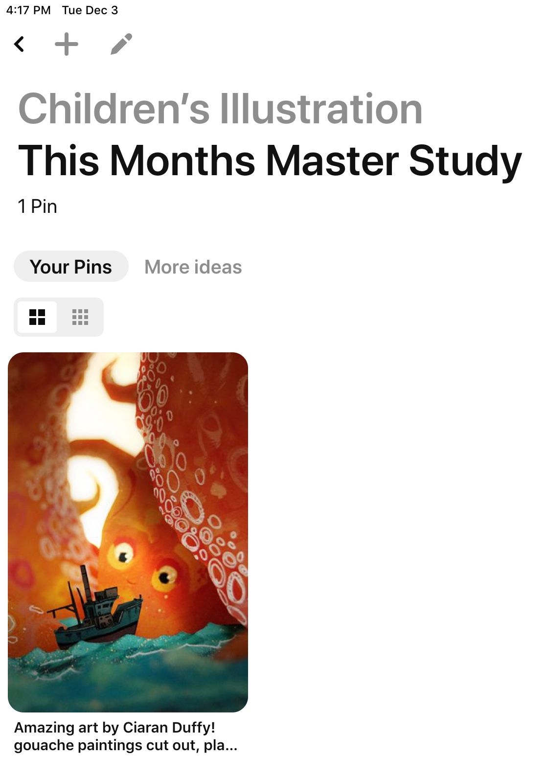
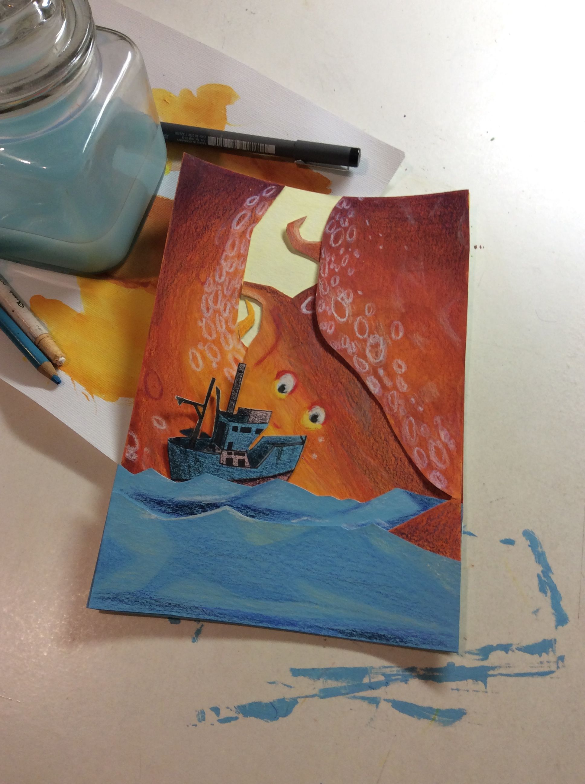
Thought I just keep with this old thread, even though my dream portfolio is ever changing I still like a few pieces from my latest attempt.
So this is Ciaran Duffy’s original and she uses gouache and cut outs and then on a table lights it and photographs it. I didn’t do all that. I found cutting out and putting together fiddly enough but I enjoyed some traditional elements. You’ll see I improvised and used gouache (out of practise) with pencil crayon and ink pen instead of the photography part (I remember how frustrated I was doing this cut and stage in school). My composition started out correct and then I lost it somewhere and the sea colour is off, strangely noticed at the end more teal then blue.
I will be doing a digital version with a new process I have in mind. I still enjoy gouache and pencil crayon on top.
-
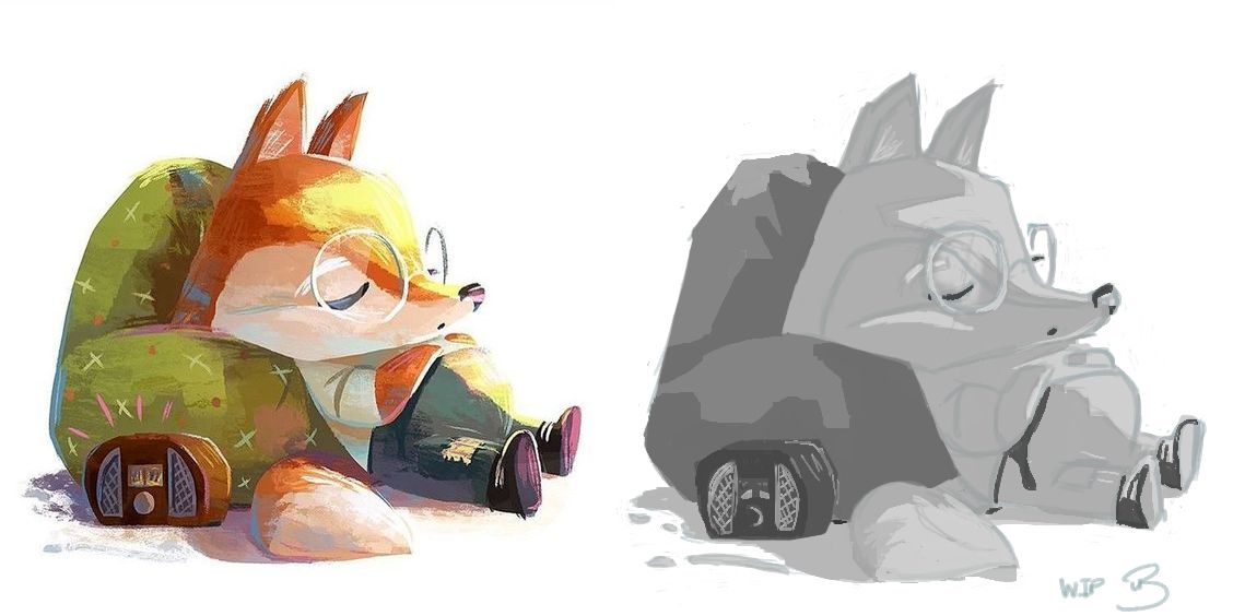
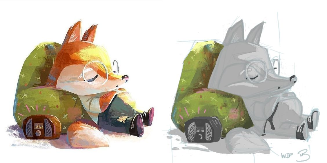
Master Study of Ciaran Duffy's work in digital with my new process.
I found it time saving and still beneficial. Now I just focused on the overall composition and shape (sketch), and values (direct reference -changed work to black and white) and colour (and back to colour after black and white parts were done) but you could also focus on line or texture if that's what you like most about your study. I hope this helps you!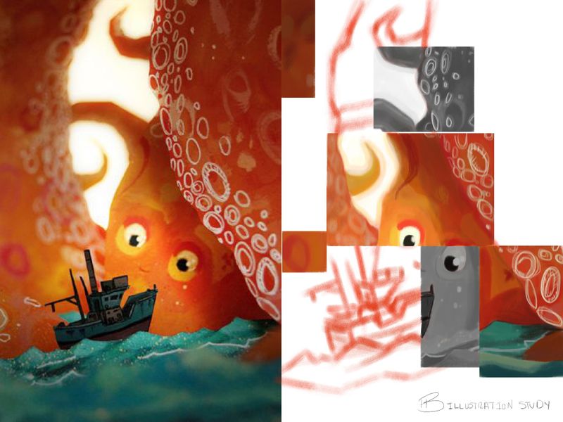
What I learned:
- I didn't use a gouache brush but enjoyed blending with a soft conte brush instead.
- I would have missed more than half the colours if I didn't take it straight from her work (love her colours). The sparkly yellows so I thought are actually a green -boggled my mind.
- The bottom right coloured area looks cut out. I think that was due to cleaner edges and darker shadows. Needed to clean up the edges above for the same effect.
But all in all, I enjoyed this process.
I will continue to do this.
Thank you.