Photoshop layer affects - Color, Overlay, or Multiply?
-
Everytime I get to the color phase of a digital painting, I get stumped with figuring out the best method in photoshop. I use the Color layer affect, but sometimes it's unpredictable with the colors or they appear "hot." And multiply sometimes looks muddy. Is it normal to have several color layers? The current piece I'm working on has a few color affect layers (a combination of multiply, color, and overlay, depending on what I'm looking for). I wish I could just use one, but it's not happening. Am I doing something wrong?
-
I no photoshop expert but using a combo of different layer modes seems common. I always use a bunch. Just do what works for you

-
@Laurel-Aylesworth you are doing everything correct. I always have multiple layers. I mainly use multiply with a cool blue grey for shadows. I use overlay and softlight with a bright warm color or a bright cool color for highlights depending on the light source. Color mode is best to get your colors over your values if you work that way.
-
@Zachary-Drenski @Chip-Valecek Thanks, guys. This is good to hear. Multiple color layers it is!
-
Another question regarding color: if the overall tone of the piece is warm, should the shadows also be a warm color, or does it make more sense for cooler shadows? Can you tell I'm a self-taught artist?

-
@Laurel-Aylesworth I would say the shadows would be cool since no light is getting there to warm it up.
-
@Laurel-Aylesworth I second @Chip-Valecek opinion about the light.
-
Warm light/cool shadows or cool light/warm shadows is a principle but not the rule. Think of it like this- there are two light sources in your painting. The first is called the "direct light" and this is typically what we think of as the light area. The second light source is called the "fill light" and this gives the shadow it's color. If there were no fill light the shadows would be black.
So, if you go outside on a sunny, snowy afternoon you can see the direct light and fill light working in nature. Everything the sun's yellow warm light hits is in direct light. The shadows would be a blue because the fill light is the blue sky. So this setup is definately a warm light/cool light situation.
But... it's up to you. You can also have a warm/warm or a cool/cool and it helps to think of it as a direct light color/fill light color relationship.
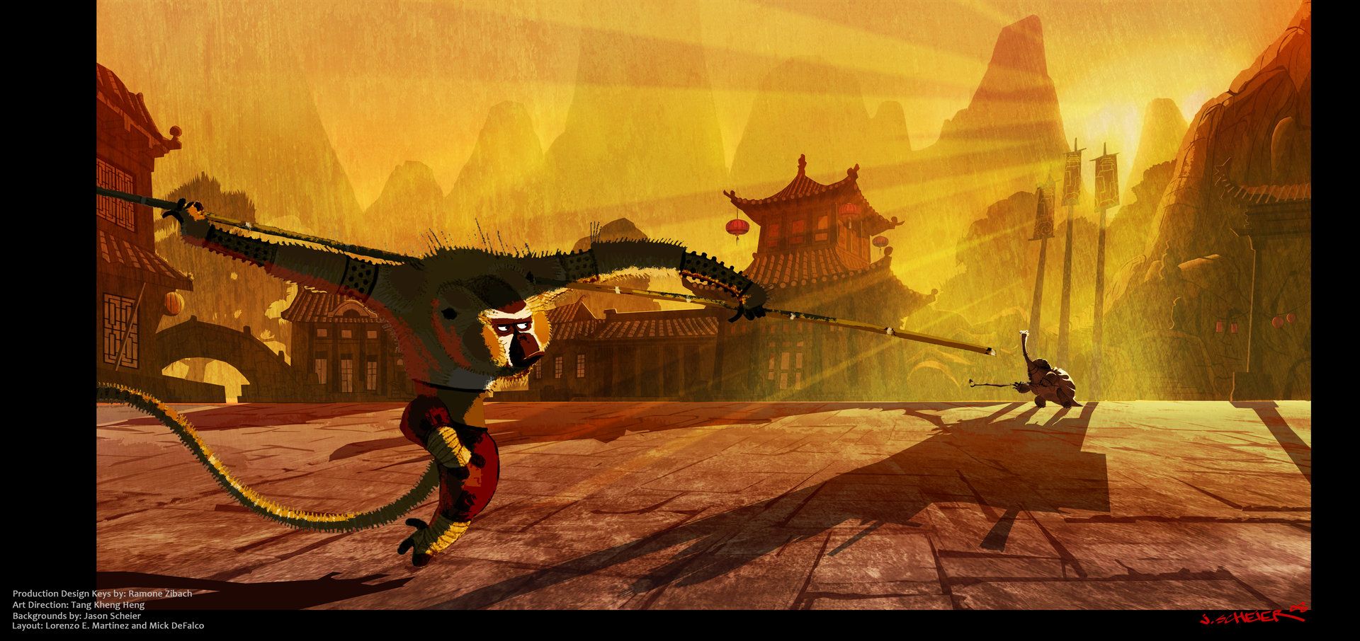
To me this kung fu panda art looks like warm light/warm shadow. All that said, I am open to learn if anyone has something to add to this or if I've gotten it wrong. I'm also self taught and nowhere close to where I'd like to be as an artist
-
@Zachary-Drenski Thank you for this. I'm glad you said warm/warm can happen...when I change the shadows to a desaturated purple color they look muddy. It's a fall scene so lots of oranges and browns and it just feels better with warm shadows.
-
In my opinion, there is no hard and fast general rule on the shadow colors for an overall warm piece. It depends on many factors- style being one of them! If your shadow colors are looking muddy- something to check on is the saturation level of your shadows- not just the hue. I will often times make the shadows more saturated than the light side- not always- but many times that's the case.
Look at some of your favorite artists color wise and use the eyedropper tool to see what is happening with hue/value/ saturation in their light vs shadow sides on different areas of their paintings. You should learn a lot.
-
@Zachary-Drenski That was a great explanation! I had always heard the rule but never the explanation. I will remember that from now on!
-
@chrisaakins Answering this question brought up more questions so I'll do some research and post back here again if you're interested
-
@Zachary-Drenski Sure! I am a traditonal artist and art teacher who is trying to transition into illustration and digital art. I know traditional mediums pretty well but Photoshop and all its abilities is making me feel like a kid again.
-
@Laurel-Aylesworth i usually just use normal layer for coloring. I use multiply for shadows and Color dodge for lights.
Portfolio: nyrrylcadiz.com
Instagram: https://www.instagram.com/nyrryl_cadiz/
YouTube: https://www.youtube.com/channel/UCbJCF1Im8ZO7hpGWTKOJMuA -
I was looking for the ultimate answer for this question earlier this year. My conclusion is "it depends...", which is both exciting and frustrating. The frustrating part is every image requires trial and error to get something I like, the process looked very mess to me, and it does not get smoother, but I got used to it. The exciting part is making image is not a streamline process, that also means unexpected positive surprises along the way.
Two things I learned from my experiments:
-
Images with light tones and dark tones work very differently. In general, multiply layers works better with light images, and color overlay works better on dark images. (as many of you mentioned, I also mixed up different layer properties in one image all the time.)
-
Approach an image as if you were paint it traditionally first. Understand how artists work with different traditional media has given me a lot of interesting ideas about the process of making digital illustrations.
-
-
@xin-li Thank you for your thoughts. I also find that with every piece, there's trial and error...I thought I'd have a fool proof process by now, but it sounds like this is normal. I find that the closer I am to the finished piece, sometimes the harder it gets. I am LOVING your ink pieces on Instagram, by the way. There's so much life in them.
-
@Nyrryl-Cadiz Oh, I never played with color dodge. I'll give that a try.
@TessaW I definitely agree with checking out favorite artists...always good to go back to that. Yep, shadows are definitely going on the muddy side if I use a cool desaturated purple, so the warm tones are feeling better to me. I'll post my piece soon -- hopefully I'll get out of the ugly phase of it soon. There's always an ugly phase - lol
@Zachary-Drenski It's oddly comforting to know even pros like you have challenges with digital color. It's a surprise every time! -
I use a normal layer at low opacity for colouring and Multiply layer for the shadows at about 50% opacity, sometimes a colour dodge layer looks good for lights and some people use hard light to add light .I could not understand all this for years but now I realize just fiddle with the sliders until you are happy with the result.
-
Personally I've been struggling with coloring because there seems to be SO many different techniques to do it. And it compounded the problem because every artist I really like seems to do it completely differently.
Some artists say you should paint in value only (black and white) then add color. Marco Bucci I think is one of the more outspoken voices against that because to his point colors that begin to work off of each other create their own magic that coloring value simply will never get. And I've tried both and I honestly can't say which technique I actually even like best.
If for example you're doing the value based approach, it's usually the best route to do a gradient map to give everything a baseline, then you're using Overlay, Multiply and Normal layers together in different opacities to finish the job. If you're doing the what I might call the "painterly" approach, then a lot of these artists are painting the entire piece on usually just one layer, mistakes be damned and they consider mistakes to play in the finished piece.
One technique that I've used and really liked is once your overall piece is done and you're adding shadows, do a complete multiple layer over the entire canvas in one color and set it to like 40% opacity. Add a layer mask and then just start painting in shadows in huge sweeps. It starts to look "right" REALLY fast and you can change your shadow color from cool to warm to see how it affects the final result.
-
@Laurel-Aylesworth lol, I'm no pro
@chrisaakins I have been working digitally for years and moving in a couple of months. After we get settled into a new place I can't wait to try my hand at traditional painting again! Now I know who to go to for advice.