SLOWVEMBER IS HERE!!
-
Just a side comment in support of @Lee-White Slowvember concept: After Slowvember of 2017, I started using Lee's process in a number of illustrations I was doing with animal characters and for each one I would spend the first week just reading about the animal's habitat and behavior, doing anatomical studies from skeletons, and even building clay and wire models before I even began to think about compositions. Most of what I did never ended up in the final painting but I learned a lot about animal anatomy etc. during that research phase that came into play in later paintings that I did. I tend to be a slow painter anyway so I have always appreciated Slowvember!
-
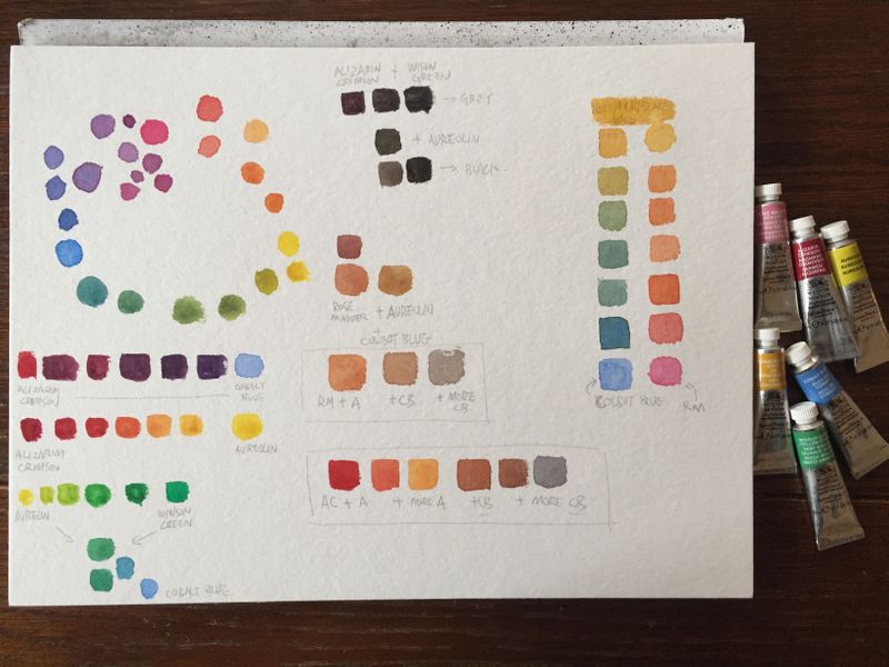
@xin-li you always want to use a transparent yellow if possible. Especially when mixing dark tones. If you use an opaque yellow, it will lighten the mix when you are neutralizing a dark violet color. I use Quinacridone gold which is a a wonderful warm transparent yellow. Or indian yellow if that isn't around.
SVS Faculty Instructor
www.leewhiteillustration.com -
@Lee-White @xin-li Quinacridone Gold is a good example of how pigments with the same name can vary considerably across brands. Daniel Smith (and Winsor-Newton) had a single transparent pigment Quinacridone Gold (P049) until it was discontinued. I still have a tube and it’s my favorite for warm, transparent yellows and mixing warm greens.
Daniel Smith replaced it with a combination of a transparent orange (Quinacridone Orange, PO48) and transparent yellow (Nickel Azo Yellow, PY150), which I haven’t tried, but you will see watercolor artists complaining that they don’t like it as much as the original.Winsor-Newton adds 2 transparent pigments to the Nickel Azo Yellow to make their current Quinacridone Gold, both in the red-violet family (Quinacridone Maroon, PR206 and Quinacridone Violet, PV19). I would guess that this brand is going to look duller with the addition of colors that border on being a complement to yellow.
Schminke’s adds a rust-color (Red Iron Oxide, PR101) that can be less transparent to the Nickel Azo Yellow.
Sennelier’s Quinacridone Gold is a cross between Winsor-Newton’s and Schminke’s, adding to the Nickel Azo Yellow the rust (Red Iron Oxide, PR101) and a red-violet (PR206, Quinacridone Violet).
You will find the pigment numbers in very small print on the side of tube watercolors (not sure if pan watercolors include that information). It can be very helpful to reference these numbers in getting to know the characteristics of your watercolors rather than doing so through trial and error. Not just transparency, but whether or not it’s a staining pigment, lightfastness, how granular it is, etc. This knowledge is practical: for example, if you think you want to lift color from an area, don’t use a staining pigment, but if you want to mix a rich intense black, use staining colors like Perylene Maroon (PR179) and Phthalo Green (PG7).
Knowing the formulations can also save you money when you find out that Daniel Smith’s “Opera Pink” that’s calling you is PR122, the same number of the Winsor-Newton tube of Quinacridone Magenta already in your collection of red watercolors

-
@BichonBistro and @Lee-White thank you so much for the info. I did not realize there is a science around the watercolor pigment :-). Definitely worth taking time to understand it.
-
@xin-li I try to keep a very simple palette. I found one that works for 99% of the time for me which is:
Quinacridone yellow
Hansa Yellow
Cadmium Red
Permanent Alizren Crimson
Ultramarine Blue
Indigo BlueThen a few earth tones like Burnt Sienna, Yellow Ochre,
And a white Gouache for correcting mistakes, adding some highlights, etc.I'll add in something every now and then if really need a special color, but that simple pallette covers me most of the time and I rarely leave it. Most of the time I'm only using like 3-4 paints within this palette and don't use them all.
-
Here is my slowvember kickstart:
I am speechless.
This is magic for me.
After following @Lee-White, @BichonBistro 's recommendation + advices and the svs tutorial on mixing water color with limited palette, I got these colors I never knew it was possible to do with watercolor out of 6 tubes.
Quinacridone yellow is so beautiful.
-
@xin-li looks great! Isn’t it fun? You’ve mixed your own raw sienna
 and your blacks and greys will be much richer than those from a tube. Your painting is going to be beautiful
-
@Lee-White I am at the art questions you've posted, Lee. Maybe it's a language issue, but could you please specify what's meant with this?: "Provide 3 examples of concepts that showcase this theme"
Is a concept something closed like a movie, or book, or channel ... Or can it be sth. like a global movement, a group of interest etc. ...? Could you maybe also give some examples of themes? I am not sure if I got that right ... Thank you for clarifying! -
@Meta The theme I was referring to is the subject matter. For example, are most of the images showing big landscapes and dramatic lighting? Maybe most of the ones you picked are just showing fantasy elements or characters? Really it's just looking for patterns within the subject matter in the airtists that you picked.
Hope that helps some. : )
SVS Faculty Instructor
www.leewhiteillustration.com -
@Lee-White Okay, than it is much simpler then I thought
") Thank you!
Thank you! -
I’m also taking part! ... hit a bit of a road block with it last night which caused serious frustration but will battle through!
-
@Lee-White this step has helped me in my art journey so much! I’ve actually identified the pattern in the work I like and that is also what I want to be creating! So thanks for this project ... really enjoying it! ... even though I find it hard haha
-
Just wanted to check in on everyone and see how it's going. Week 3 is really the hard one as you get into the real painting and things become tricky. Hang in there, next week is easier. Don't be afraid to start over if things go south.
My current painting WAS going well. Now it's a mess. It's ok. Even if it's a disaster, I'll just paint it again. No big deal. : )
SVS Faculty Instructor
www.leewhiteillustration.com -
I like your attitude! I am behind because I have been out of town a lot, and so I did more thumbnails today. I'm not entirely sure I'm on the right track, but I wanted to explore a number of landscape/townscape scenarios, and so I did. The perhaps-not-on-the-right-track part is that I'm not sure the thumbnails emphasize my keyword wonder, because if the figures are too small the feeling is less intimate. (Or maybe "intimate" is another keyword?) I find that when I zoom in on them they do a bit better, but then I'm not sure where the landscape/townscape part fits in. Integrating the figure into the environment is the hardest part for me at this stage of my learning.
Thanks for checking in!
-
@LauraA time to pick a direction and get moving on it. By the end of this week the painting should be well underway.
SVS Faculty Instructor
www.leewhiteillustration.com -
Here's a few close ups of my painting now so you can see the texture. SHould be done by Friday I think.

love painting like this. This one is big!
-
@Lee-White said in SLOWVEMBER IS HERE!!:
Just wanted to check in on everyone and see how it's going
No hurdles so far (which means there's a major hurdle down the road somewhere) but I am cautiously optimistic
")
-
@Lee-White I ran out of Arches so I'm waiting on a delivery!
 oh well, i'll go do more thumbnails
 -
@Lee-White You're right, of course! Sometime today I will move on. I wanted to linger a while because I think my problem is often at the beginning or the very end.
Update: Thumbnail shortlist posted in WIP thread!