Light & Shadow - In watercolor
-
@Lee-White my printer does not have waterproof ink... I looked for the best printers for artists and ended up getting a Canon PRO-100. It is really nice... just not archival inks. Didn't realize I was going to be needing waterproof ink until later.
I really liked Naomi Vandoren's tutorial on watercolor in the Christmas 2019 issue of ImagineFX. She also uses a P800. Her process is similar to yours, I think.
In the end, I am planning on watercoloring my relief prints and that ink does play well with watercolors as it is oil-based and repels them. So it won't be a problem.
Using my light table is very similar to using a projector (just don't have to do the step of penciling).
I did have a question for you. Do you have a recommendation for a good watercolor paper that is pretty smooth?
Right now I am using a mixed media paper as it does ok with watercolor and works well with printing. I have some heavy cold press paper, but it doesn't do relief prints too good.
-
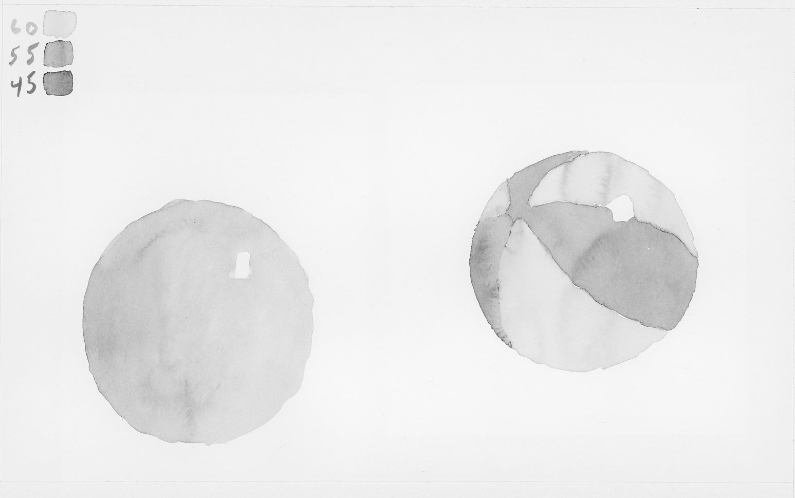
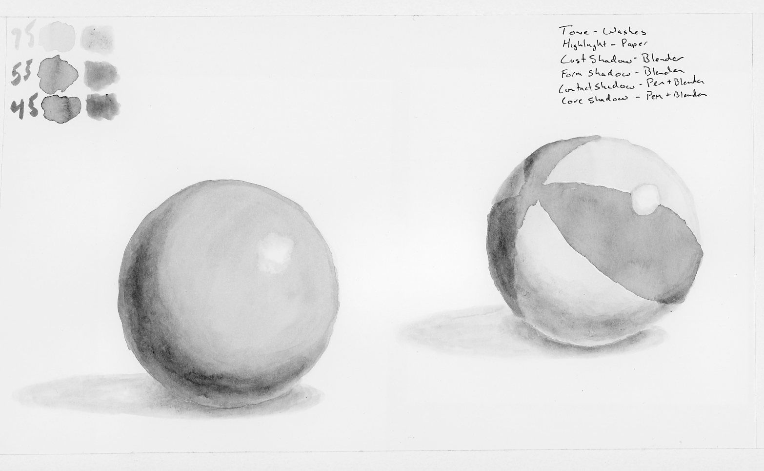
Here is the circle and ball using all washes.
I don't think I like the 100% wash technique. I think maybe the shadows and the core shadows should have been added with the blender. I do really like the wash for the tones though.
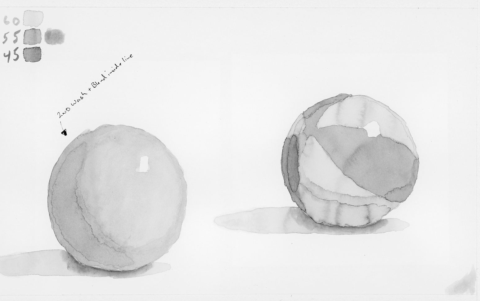
@Lee-White the highlight worked much better!
One more try!
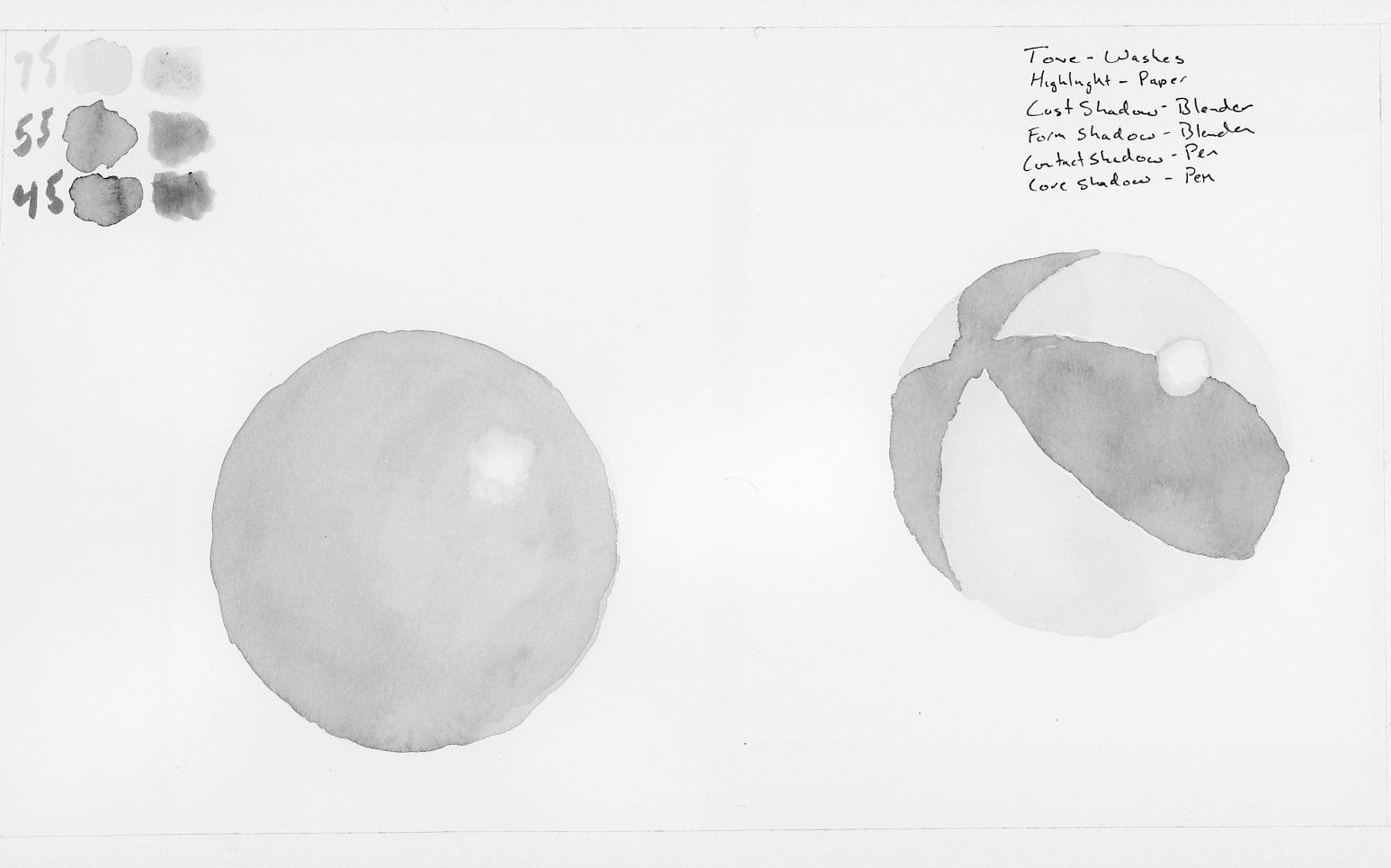
Tone:
Shadows:
-The Prairie Fox
https://www.instagram.com/theprairiefox
https://www.theprairiefox.com -
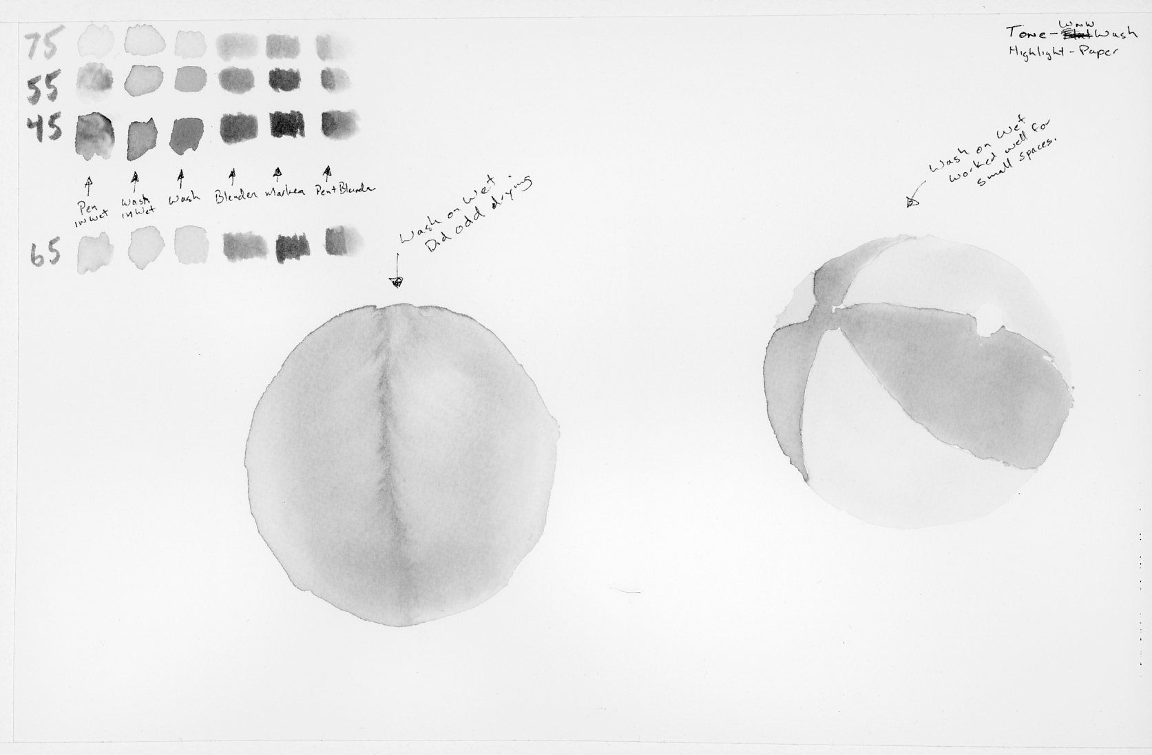
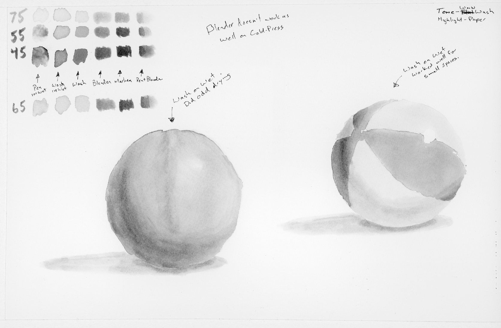
@theprairiefox I love your take on doing this excise with watercolor. I will get my hands on this later this month as well - I really want to do more watercolor this year. I do not know if you want to achieve a smooth transition when adding shadows. If you do, you could try the "wet on wet" technique. Just wet the ball with a clean wet brush before you apply pigment, you might be able to get a more smooth transition.
-
@xin-li thanks for the advice. I will try 'wet-on-wet' tomorrow. I am having lots of fun playing with this class.
I am pretty pleased with the next revision. I used a wash for the tone and a mixture of a blender and a direct marker on the paper. I think the transitions work a lot better. Let me know what you think.
-
Here is a version using a wash as a base tone and then using the blender to add the shadows. With direct marker for the contact shadow and core shadow (then they are blended.)
I think I prefer this technique with no core shadow.
Tone + Highlight:
Tone + Highlight + Shadows (no core shadow):
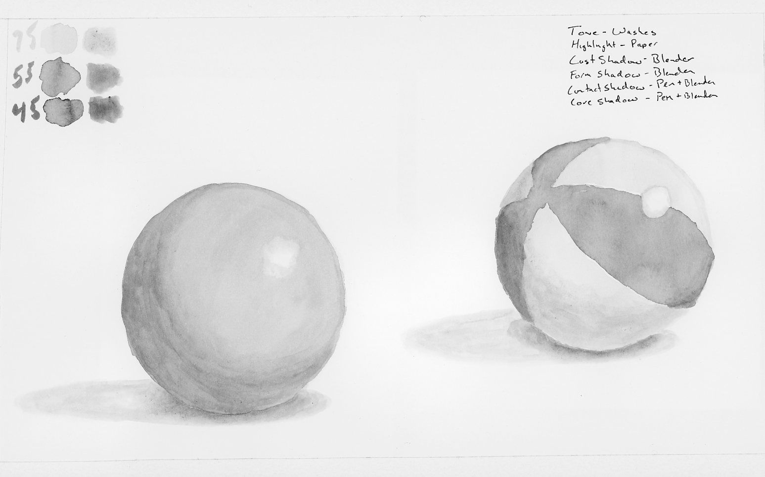
Tone + Highlight + Shadows + Core Shadow:
-The Prairie Fox
https://www.instagram.com/theprairiefox
https://www.theprairiefox.com -
@Lee-White I would be very interested in any watercolor classes you do! I loved the process video you did of the boy in the boat and all the trees..
-
@theprairiefox Good! BUT, control that value and don't go too dark with the shadow. There will never be anything near a black on the grey ball or the beach ball. Watercolor is tough when you are trying to get it to do specific things.
SVS Faculty Instructor
www.leewhiteillustration.com -
You will need to use a paper like arches cold press for this exercise. Paper is EXTREMELY important when trying for specific results. Arches gives nice smooth blends. The same exercise with a paper like a Canson Montval will end in disaster. In watercolor, the paper dictates the look. When I want to control the blends, I use arches cold press. When I want more texture and technique isn't as important, I use a heavily sized paper like The Canson Montval.
SVS Faculty Instructor
www.leewhiteillustration.com -
@Lee-White regarding to watercolor paper: can you print sketches on Arches watercolor paper with Epson P800?
-
@xin-li yep!
-
@Lee-White thanks for the hints on the paper. I am going to try an Arches cold-press today and see the difference it makes.
I am going to purchase an Arches hot-press paper to test with doing prints and watercolor together. I think the smoother surface will work better for printing, but the heavier paper will hopefully hold up to the watercolor better.
I would agree that the core tone went TOO dark on the last set. But it feels like I am starting to get to a place I like. I was pretty happy with the balls before I added the core shadow. Though the highlight on the beach ball is maybe not smooth enough.
I am glad that I am started with both balls for this project. It is amazing the difference working on the beach ball and the plain ball. I am getting anxious to start the more complicated objects. But I want to have my techique nailed first.
Thanks again for all your feedback.
-
Well, wet in/on wet is interesting! I think I might have been doing it too wet!
It worked well for adding tone on the beach ball, but the simple ball it appears all of the pigment moved to the center. I applied water, then added tone via a wash and left it to dry. When I returned there was a line down the center! It might have been the fan working on it as well? Looks interesting, just not what I was going for.
-
Here is the final wet on/in wet tones with shadows added.
I used Arches cold-press with this one. I have to say it is the paper is definitely less reactive to the water. But I found the painting with the blender is harder. The paper holds on to the pigment more than the smoother paper. I ordered some hot-press and am curious how that will do with the various methods?
I am very happy with these balls. I am going to continue to use the methods for this one (maybe a little less water on the wet in/on wet) on the other exercises. Wish me luck.
-The Prairie Fox
https://www.instagram.com/theprairiefox
https://www.theprairiefox.com -
@theprairiefox Check out this link for a really helpful tutorial by Susan Harrison-Tustain on using Hot Press. It reacts very differently from coldpress.