Society of Visual Storytelling

    SVSLearn Forums

    • Register
    • Login
    • Search
    • Recent
    • Tags
    • Popular
    • Users
    • Groups
    • Search

    Finishing Wizard of Oz Cover - need sugestions and critique!

    Questions & Comments
    11
    23
    1448
    Loading More Posts
    • Oldest to Newest
    • Newest to Oldest
    • Most Votes
    Reply
    • Reply as topic
    Log in to reply
    This topic has been deleted. Only users with topic management privileges can see it.
    • NessIllustration
      NessIllustration Pro @Jordi Ventura last edited by

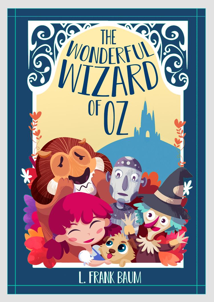
      @Jordi-Ventura This is really great improvement, but the text is still so hard to make out.. Any reason you're not making it black, or a very dark teal or brown, so it stands out against the pale sky?

      vanessastoilova.com
      instagram.com/vanessa.stoilova/

      Check out my Youtube channel for tips on how to start your career in illustration! www.youtube.com/c/ArtBusinesswithNess

      1 Reply Last reply Reply Quote 1
      • Lovsey
        Lovsey @Jordi Ventura last edited by

        @Jordi-Ventura Nice work on turning the feedback into improvements - this works much better in my opinion! 😁 The only part I miss from the original is the inclusion of the door to the Emerald City, it helped define the shape nicely.

        1 Reply Last reply Reply Quote 1
        • Nyrryl  Cadiz
          Nyrryl Cadiz SVS OG @Jordi Ventura last edited by

          @Jordi-Ventura you could still move the lion higher. He’s just getting covered up by Dorothy.

          Portfolio: nyrrylcadiz.com
          Instagram: https://www.instagram.com/nyrryl_cadiz/
          YouTube: https://www.youtube.com/channel/UCbJCF1Im8ZO7hpGWTKOJMuA

          1 Reply Last reply Reply Quote 1
          • Jordi Ventura
            Jordi Ventura last edited by

            @NessIllustration If Im honest probably I was little lazy/tired and want to finish it hehe, I tried a little bit to change but I didnt like it, feels like black was breaking the color harmony, but after you posted I give it another try and I think now looks better!

            @Lovsey true, added!

            @Nyrryl-Cadiz hey! yes, I upper bit and I make the mouth expresion 100% visible, was little hidden.

            Now I see is very important to have the PSD file very well organized to make fast changes, if not can be a pain in the ass haha. Also thinking about the illustration I feel one of the big mistakes I did was not taking enough time in the value phase, I jumped to draw to color to fast, I see time after time that values are the most important.

            So here is the images with all the changes, now for sure is finished, no more changes!! haha
            Also I added a the proces if someone is interested!

            Final image:
            alt text

            Process:
            alt text

            https://jordiventuraart.com
            https://www.instagram.com/jordiventura.art/

            NessIllustration 1 Reply Last reply Reply Quote 1
            • NessIllustration
              NessIllustration Pro @Jordi Ventura last edited by

              @Jordi-Ventura Actually I wasn't talking about the shadow, but the white text itself! The title is most important on a cover and has to be readable from far away. White on pale yellow is a very odd choice! The shadow helps, but it doesn't really get to the root of the problem...

              vanessastoilova.com
              instagram.com/vanessa.stoilova/

              Check out my Youtube channel for tips on how to start your career in illustration! www.youtube.com/c/ArtBusinesswithNess

              1 Reply Last reply Reply Quote 0
              • Jordi Ventura
                Jordi Ventura last edited by

                @NessIllustration ups! ok, I tried and looks more way solid, its true that from the distance was hard to read, I think now it can read well, thanks!

                alt text

                Here I can see it reads way better, Also I think it helps to equilibrate the composition! thanks for all the suggestions, I really appreciate it!

                alt text

                https://jordiventuraart.com
                https://www.instagram.com/jordiventura.art/

                NessIllustration MOO 3 Replies Last reply Reply Quote 3
                • NessIllustration
                  NessIllustration Pro @Jordi Ventura last edited by

                  @Jordi-Ventura Wonderful!! ❀

                  vanessastoilova.com
                  instagram.com/vanessa.stoilova/

                  Check out my Youtube channel for tips on how to start your career in illustration! www.youtube.com/c/ArtBusinesswithNess

                  1 Reply Last reply Reply Quote 0
                  • NessIllustration
                    NessIllustration Pro @Jordi Ventura last edited by

                    @Jordi-Ventura One last thing and feel free to completely disregard this. But I'm not really sold on your green color for the background... I'm not sure what it is about it! But your characters all seem to have some blueish tinge to their shadows, like how tin man and the witch hat have a blueish sort of gray, so I think a blue background would really groove with this color scheme:

                    Untitled-1.jpg

                    vanessastoilova.com
                    instagram.com/vanessa.stoilova/

                    Check out my Youtube channel for tips on how to start your career in illustration! www.youtube.com/c/ArtBusinesswithNess

                    Jordi Ventura 1 Reply Last reply Reply Quote 3
                    • cszoltan
                      cszoltan last edited by

                      @Jordi-Ventura said in Finishing Wizard of Oz Cover - need sugestions and critique!:

                      an @MOO I didnt think about that until all you pointed it and yep! The title was getting to small, I also did some ajusments to make the title pop-up more and more bigger! Thanks!

                      Hi Jordi, I think the Title is much better with the solid dark green, it reads much better. It also works with the deep blue!

                      C.S.Zoltan
                      Portfolio: www.behance.net/cszoltan
                      Instagram: www.instagram.com/c.s.zoltan

                      1 Reply Last reply Reply Quote 1
                      • MOO
                        MOO SVS OG @Jordi Ventura last edited by

                        @Jordi-Ventura great job!

                        Marsha Ottum Owen

                        1 Reply Last reply Reply Quote 1
                        • Jordi Ventura
                          Jordi Ventura @NessIllustration last edited by Jordi Ventura

                          @NessIllustration Hey Ness! This blue version looks really good! I think I like it more than the green one haha, feels more integrated. But I will keep it the green one because I feel green color its a key color to the history at least from the reference I got from the movie and other works I saw.

                          I will keep that in mind for next time to play a little bit with the background πŸ˜‰ !

                          @cszoltan Yes, I think that too!
                          @MOO Thanks!

                          Thanks everyone for all the help, you rock!

                          https://jordiventuraart.com
                          https://www.instagram.com/jordiventura.art/

                          1 Reply Last reply Reply Quote 2
                          • First post
                            Last post