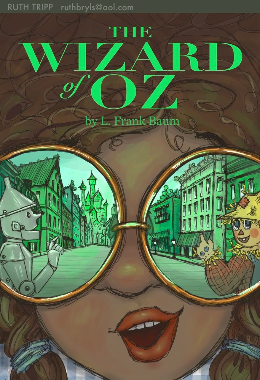
JULY CONTEST: Design a book cover for the Wizard of Oz
-
@jdubz this is really good, great use of shadow. I wonder how strict the judges will be about changing the brief. It's a great portfolio piece either way, and that's the main goal at the end of the day. Love the dark castle on right too.
-
I don't know if they'll judge based on the spec, but my opinion is that it's disrespectful not to follow them. They would have intended us to follow them or they wouldn't have written them. You wouldn't do this with an actual client would you?
-
@deborah-Haagenson yes that's what I thought, I assumed Jake's intention was to create a more realistic brief as if we were working for a client, so I've stuck to the specs. But if it doesn't align with the market people want to work for, I guess it makes more sense to create something more specific to their portfolio aims. I wonder if solutions that don't fit the brief will be considered in the final 16.
-
@deborah-Haagenson Well, Jake did give use creative freedom

-

What a fun prompt! This is my first ever submission. I’ve been super inspired by all the amazing art here at SVS! Was a little intimidated to post, but everybody else’s courage to post their work is rallying. So here I go, too!

 Thanks, SVS Team!
 -
@Eric-Droke Love your unique concept, attention to the details of the original story and final illustration! Looks very intriguing and professional.
-
@carrieannebrown Thanks I appreciate it! Yeah that was my thought - more than likely I won't be in the contest because I went that direction, which will be fine. It was my call to deviate so I'll live with what happens

-
@Nyrryl-Cadiz Ahh thank you so much!
-
Hi everyone, Here is my submission!
It took more than I expected, but I think I learn a few things doing it, so worth the time investment! Have a nice day!
-
@jdubz This is brilliant. I want to read this grim edition of the Wizard of Oz. Jake did say "..an edition of the Wizard of Oz" so that could be an edition that hasn't been published yet.
-
@Johanna-Kim, Thank you very much!
-
@Ruth-Tripp So great! I love your sketchy, painterly style. The composition really adds to the story, and the colors are absolutely striking! Really, really beautiful piece.
-
@sigross Hah thanks. That's how I had originally read it when I saw "an edition" being not just the linear story. Could be wrong though and that's what he did indeed mean. We'll find out soon enough. My wife was over my shoulder when I was finishing it saying "Ohh, are you going to do a Wizard of Oz comic?" and I was like "Hah NO! Huh, maybe?"
-
@Jordi-Ventura This is so cute!
-
@JoshuaDages love this. This would be my pick for winner so far
-
@JoshuaDages aww thank you!!!
-
@JoshuaDages Thank you so much! I really appreciate it. I LOVE your design, too! Your use of texture and light/reflected light is masterful. If you don’t mind my asking, what tools do you use? I’m using Procreate right now, but love learning about other artists’ processes. I’m amazed by how you captured that lighting! Thanks again!
-
@Griff Thank you so much!
-
@Ruth-Tripp Thanks Ruth! I usually do my thumbnails with pencil and paper and then scan them into Photoshop for the rest. I haven't used Procreate, but it looks like a lot of fun. I have been learning how to create my own brushes in Ps and used a few from Lee White's brush class to get the lighting effect I wanted. Then it was just a matter of playing with layer modes and such! Thanks again!
-
This post is deleted!