How do you choose colors?
-
@CaseyKinseyArt
Check this Youtube Video from Simona Ceccarelli. She was an SVS student.
Color for Illustration part 2: Forget theory, keep calm and do color studies
https://www.youtube.com/watch?v=ZHbAGFbEwsM -
I have a folder on my computer fill of artworks and photos that inspire me. If I'm having issues with the colour scheme of a piece I will go through that folder and literally colour pick colours I like from pieces that I think fit the vibe of my piece. Maybe that is cheating but I know other illustrators which do this too

-
@CaseyKinseyArt i steal colors from pro illustrators. i follow a lot of artists and when I don't know which colors to use, I visit their portfolios and ig accounts and get "inspired" by their works. hehe

Portfolio: nyrrylcadiz.com
Instagram: https://www.instagram.com/nyrryl_cadiz/
YouTube: https://www.youtube.com/channel/UCbJCF1Im8ZO7hpGWTKOJMuA -
@Nyrryl-Cadiz Haha knew I wasn't the only one who did this

Instagram and Twitter: @eriberart
Website: www.erinmcclean.com -
@eriberart lol!
-
For some reason I wasn't getting notified of these responses, so apologies to everyone for not responding until now. Thank you all, I will absolutely put these suggestions to the test!

CK•XXII
-
@CaseyKinseyArt I think we only get notifications for posts that tag us directly, even if it's on your own post. So if people reply to your post without tagging you, you get nothing haha
vanessastoilova.com
instagram.com/vanessa.stoilova/Check out my Youtube channel for tips on how to start your career in illustration! www.youtube.com/c/ArtBusinesswithNess
-
@NessIllustration Ohhhhhh! Thank you! I'm super new to the forums, so I have idea what I'm doing
CK•XXII
-
@CaseyKinseyArt Based on the last couple years of my own journey, where my problem wasn't the actual colors I chose but it's the saturation of any given color I was choosing. So what happens is that if the saturation is off, no matter what color I picked it feels off.
I considered myself very much in the terrible at coloring boat and I feel like I've turned the corner in the last 18 months or so. The piece of advice that really started to make it "click" for me and stuck was from Marco Bucci who said (and I'm paraphrasing), "gray is the language that all colors use to speak to each other". In other words, the closer colors are to grayscale the more they naturally work with each other.
Our eyes are really deceptive when it comes to making us think what a color is. What we might perceive is a super brilliant neon green color in nature might only only be like 60% saturated if you took a picture of it and color matched it. Everything is influenced by light, shadow and the colors around it. So what you're seeing is a mix of everything together to make that final result.
So the closer to grayscale your palette is, say the majority of your piece is sitting at 30-35% max, the more harmonious the majority of the piece is going to be. Once you've laid that foundation, you can start selectively cranking up the volume in areas and bring it up slowly. And you'll see that you may not have thought that red was very loud on the color picker, but on the piece it jumps off the page. The closer to grayscale your colors are, the less it matters what colors you choose.
I'm definitely not saying this is the best way to color, but it was the best way for me to personally understand how color works. For example, as I figured out how light affected colors, the final color was never the "base" that I started with, but the addition of everything in the scene together to render whatever that final tone was.
Hopefully that makes sense and is helpful. I personally was really frustrated with watching how people colored and I felt like there was a disconnect between the start and finish. What I finally did was I'd pick an artist I liked and try their process if they had one that I could see for a 4-6 weeks. Eventually as tidbits came together and I understood different things, my current process came out of that. And I'm 100% confident it'll evolve a ton in the next couple years too
")
-
@CaseyKinseyArt Also I actually just finished picking my colors for a book, maybe this will give you ideas of how to do it
It's set at night but I didn't want a blue color scheme. I was aiming for soft purple, not very saturated. I picked out a few colors that I liked and then planned out my colors for the book based on that. The final plan always differs a bit from the original palette because you often (almost always) have to go darker or lighter in place to create the contrasts you need to highlight the important areas.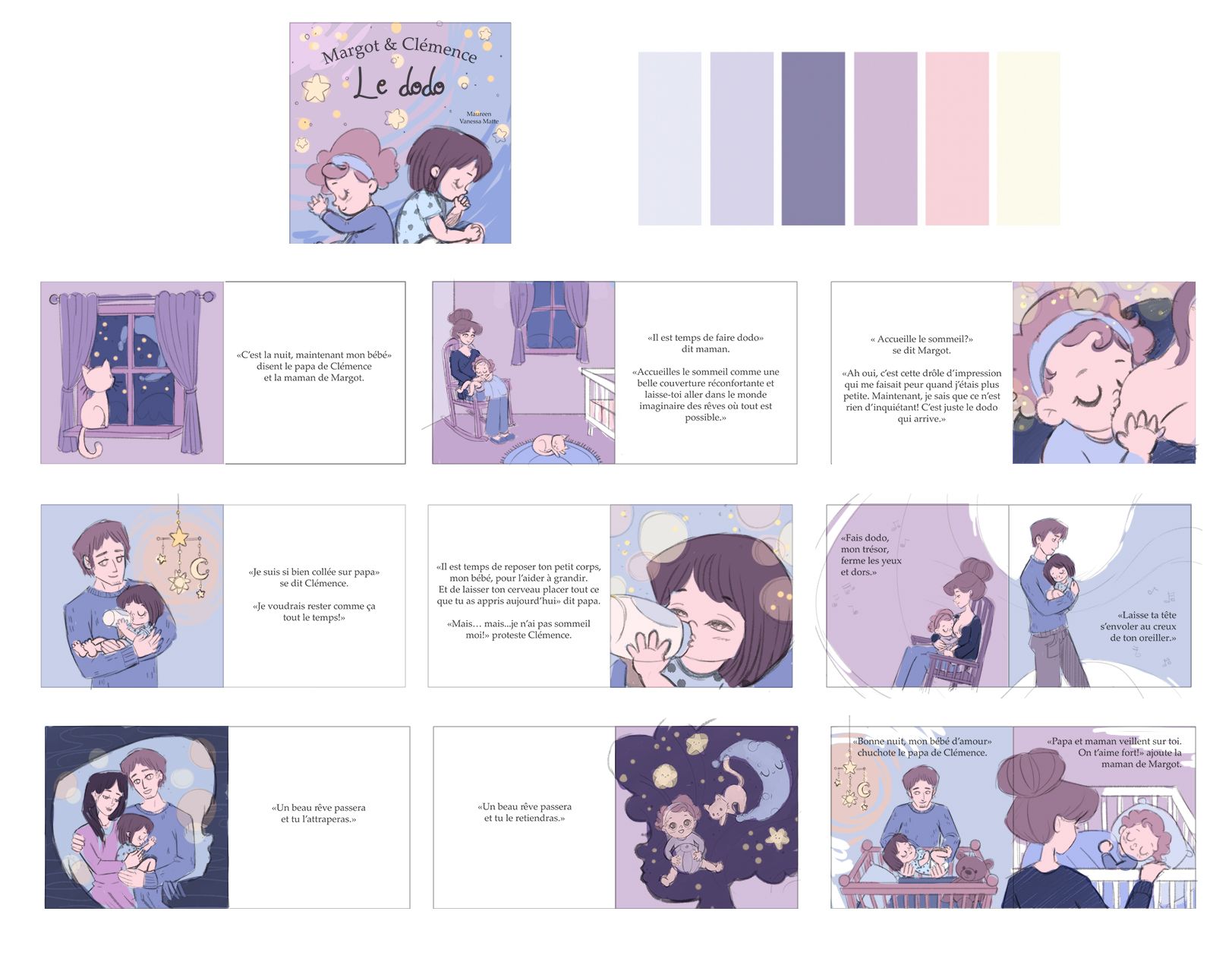
vanessastoilova.com
instagram.com/vanessa.stoilova/Check out my Youtube channel for tips on how to start your career in illustration! www.youtube.com/c/ArtBusinesswithNess
-
@NessIllustration this is so beautiful!!! I love you color choice.
Portfolio: nyrrylcadiz.com
Instagram: https://www.instagram.com/nyrryl_cadiz/
YouTube: https://www.youtube.com/channel/UCbJCF1Im8ZO7hpGWTKOJMuA -
-
@jdubz Now that’s a new perspective for me! I’ll definitely try these tips! Thank you!!
-
@NessIllustration wow, this is awesome!! Thank you for this!
-
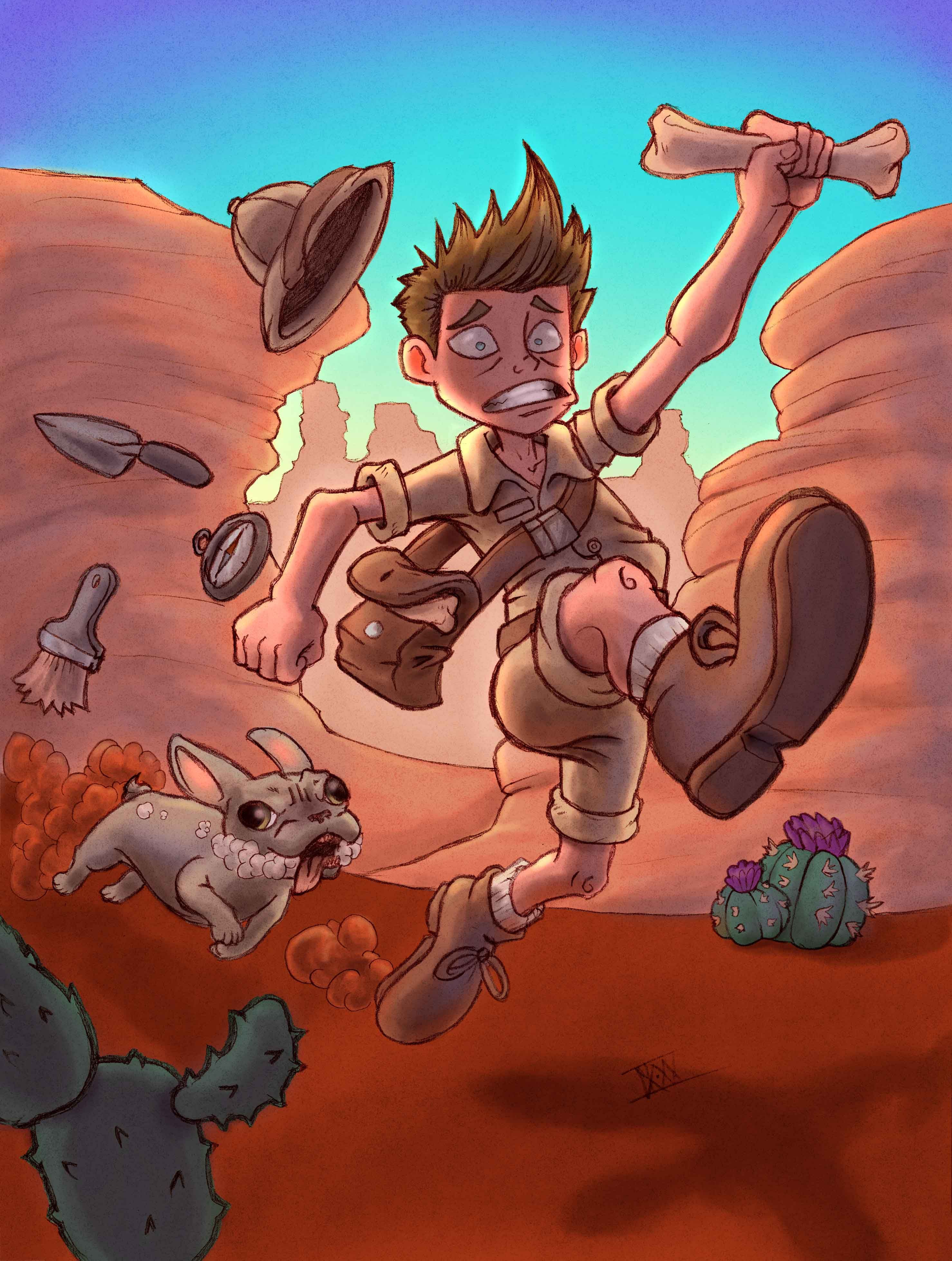
For anyone wondering, this is what the final piece ended up looking like. It’s not perfect, but I’m pretty happy with it! Thanks for all the wonderful advice everyone!
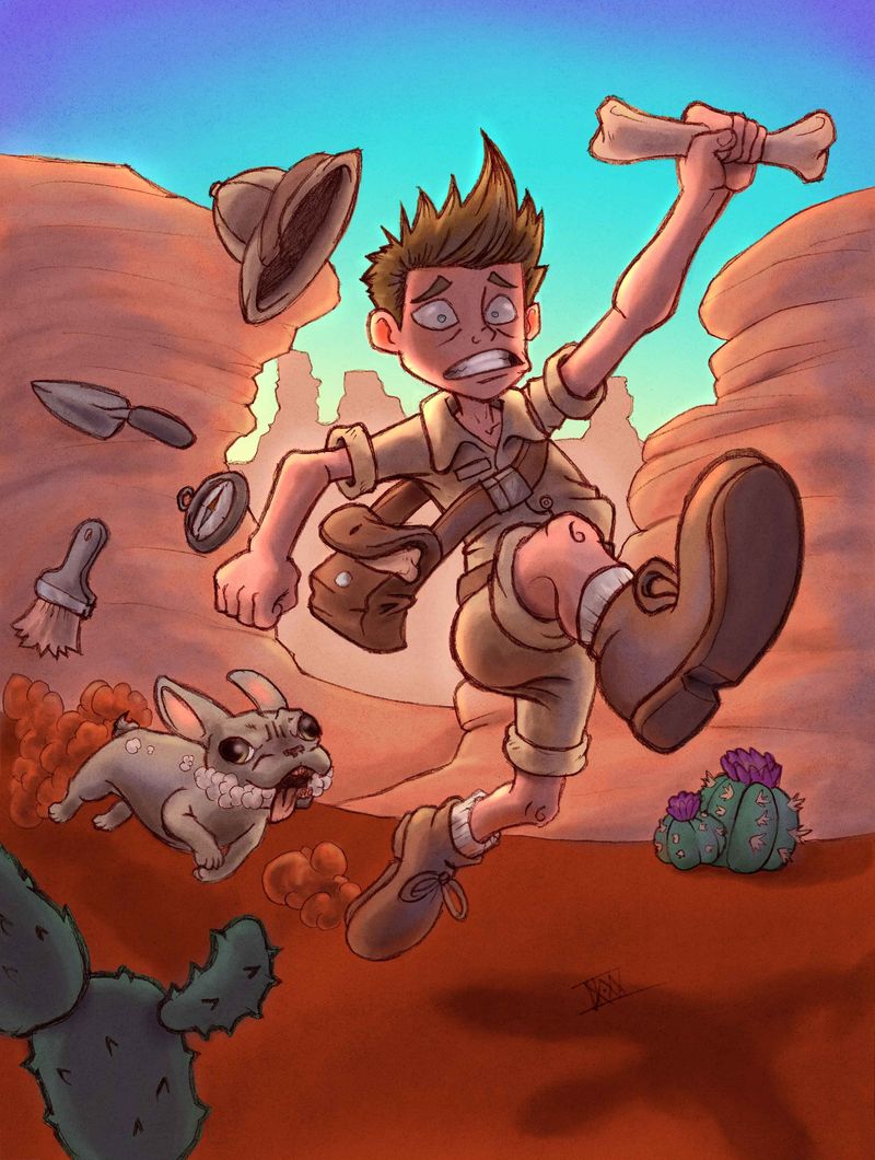 https://forum.svslearn.com/assets/uploads/files/1599360116556-desert-run_2.jpg
 -
So much great advise!! I just wanted to add one thing that I was told recently. When you use a lot of line work your colors should be more saturated.
-
@deborah-Haagenson Interesting! Just curious, but do you know why that is?
CK•XXII
-
@CaseyKinseyArt Yes, because the linework and the colors compete and together can overpower the piece. When I was told this I went and looked at illustrations online and found that many followed this. Of course all rules are made to be broken, but it's something to consider when choosing colors. Especially if something looks off.
-
I'm a little late to the color party but check out this website! I use it when I have art block in terms of choosing a color palette.
https://coolors.co
It's a free color generator. You can either screen shot the color palette or download it and place it into your procreate/photoshop. Pretty cool and easy to use website. -
I know the piece is done (excellent work!) but I wanted to share these because I STRUGGLE with color and this artist's demos really really helped me gain some confidence! I essentially try not to worry about the "color" as much anymore and focus more on the "values". It helped me sort of step out of my color box, and have more fun just experimenting with a variety of colors. As long as the values are correct then the colors end up looking much better together!
https://www.youtube.com/watch?v=Fbo6ZAuF914&list=PLS2oTl89g8i7C7gNl8xARB8ufGS2dX5wC&index=6&t=1s
