Cropped Composition Feedback
-
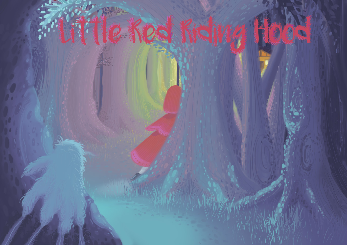
This is a piece I did as part of the homework for the visual storytelling course. We has to using cropping from The Little Red Riding hood story. Let me know what you think. Ive also been working on my colour theory warm and cold colours etc, comments would be much appreciated, thank you.
-
@egarnerart I think your color work is really nice. Muted tones that seem to work really nice together.
-
I think you did a really nice job on your color, light and concept! I especially love all your details, it really makes this stand out! The only thing I wonder about is if the hand in the foreground would be better in a different color, just a very subtle difference from the other blues.
-
I love the colors, and the concept. The trees look amazing. But, I'm curious... why is the wolf's hand clawing away from Red Riding Hood? Shouldn't the hand be facing the other way, as though the wolf is heading toward Red? To me, it looks as if the wolf will be coming toward the viewer. Granted, maybe I am seeing this wrong. If so, sorry!
-
Thank you for replying, its a bit nerve wracking your right the hand needs some work. I was trying to make the hand blend in so you would have to look twice to see it or it would pop out.
-
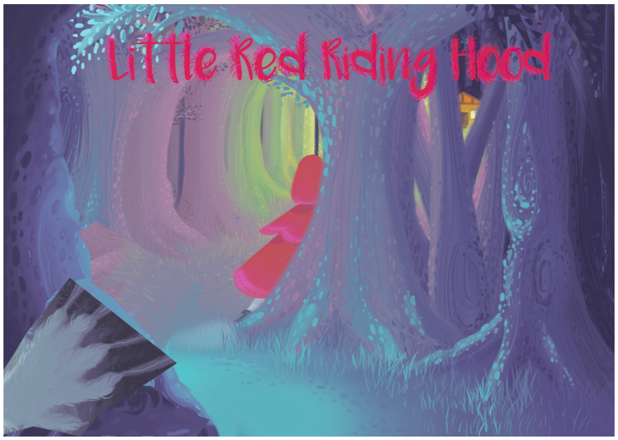
Quick mockup with bharris and pixby suggestions.
- hand different color (@bharris)
- hand facing other way (@pixby)
@egarnerart looks great, love the warmth in the house and the coolness of the forrest.
-
@egarnerart any updates on your piece? looking forward to it.
-
Hi there! Great start on this one, and nice to see you experimenting with warm and cool colors/lighting. One suggestion I'd have on this would be to try a couple of other compositions. As it stands now the focus of the piece is a little broken up. The house through the trees will be the brightest thing and draw attention, but then there's the glow of the trees on the left then hood and the wolf. I wonder if a more straight forward approach with the house off in the distance and showing more, maybe a few trees but not this harsh separation between the house and the rest of the image.
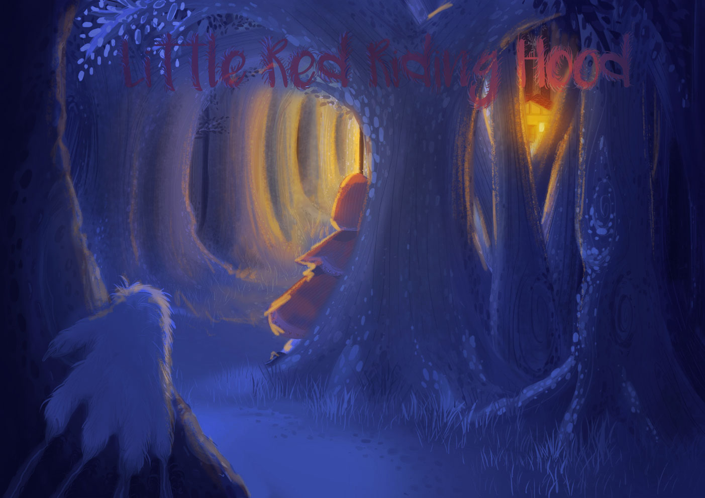
There's a technique that can be useful for images with a mostly singular light source and shadow where you make a version of the image and add blue, darken it, etc. Then you make a warmly lit version of the image and add your warm tones, light, etc. Then you use a mask to reveal parts of the light over parts of the dark. It's a fast simple way to get the contrast you want and very easy to change or try things with. I've done it quickly on this image just to show you what I mean, this is probably way too simplified, but you get the idea. After you have that of course you and go and paint on top and finish the painting, but it does help to separate your warm and cool, light and dark areas cleanly initially. Hope this help!
-
Are you a fan of Mary Blair by any chance? It's got a real Mary Blair feel to it.
Ace
-
The text needs to stand out more in my opinion. The value of the text is very similar to the background.
Ace