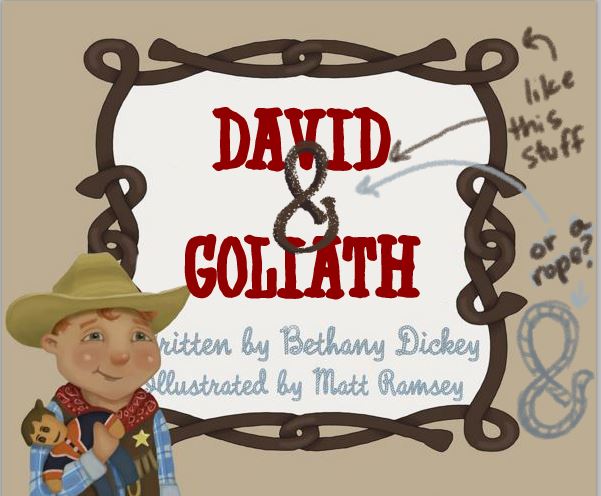
Book cover--graphic design help
-
@mattramsey i'm not much help in this department - but my first impression was to possibly change the white to a light cream color - ....or just not white ...it feels a bit stark in contrast to your warm illustration - could be wrong though - i think @Danettedraws is pro at this stuff - maybe she will chime in
")
-
I'd stay away from very decorative fonts for the title. The rope font is a nice touch but the title is difficult to read. Plus when you use two very decorative fonts together is can look busy. There are loads of Western style fonts here-
It just needs something cleaner.
-
I changed the font and gave it some breathing room. I also overlapped the & because it was hanging out alone and taking up space. You could also tie the style in with the border or the rope.
-
Some quick thoughts..
I agree with @gimmehummus that using two highly decorative fonts together, normally isn't ideal. I usually try for one clean and one decorative so that they complement each other. Also, it might represent/evoke the characters better if the word David was smaller than Goliath..to try to represent them in words so to speak.
Your cowboy character overlaps the bottom text quite a bit...personally I would change that to improve legibility.
Font choices - I do like the rope font at the bottom. I also agree with gimmehummus that it would be nice for the ampersand.
Hope you don't mind I had a tweak. The font I used is called Edmunds and you can get it from www.fontsquirrel.com - this is a fantastic font site because they are all permitted for commercial use. It basically collects all free for commercial use fonts in one place. If you don't like that font then search for 'western' and lots pop up.
-
What age group is this for if you don't mind me asking?
-
@Stephanie-Hider hmmm, well the text is pretty simple so I'd say maybe 2 to 5 or 6? It's not a board book and it probably wouldn't keep the attention of a 7 or 8 year old. Maybe they'd like the pictures though?
-
Here are some more suggestions:
-
Watch you kerning (the space between the letters). For example: In your original font the D, A, and V in DAVID are way too far apart. Treat each letter as a separate layer and manually place them next to each other.
-
I agree with @gimmehummus and @Dulcie's suggestion to have one decorative and one clean font but I would explore having the title be the fancy font and the author and illustrator be the clean font. As cool as you are, it is the title of the book that you are trying to get noticed ;).
-
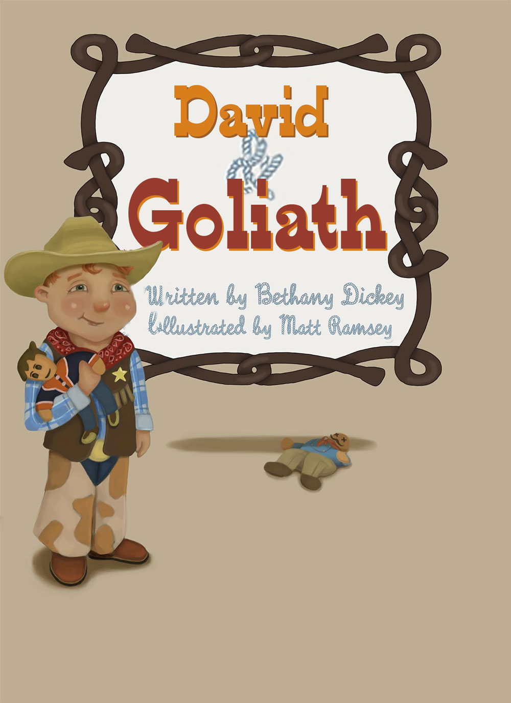
Watch your tangents and composition. The cowboy is uncomfortably close to the edge. He is also a similar "weight" to your title box. Vary it. Remember the rule of thirds and small-medium-large.
Your cowboy is very cute! Can't wait to see updates!
Twitter: @Joy_Illustrated
Instagram: joy_illustrated
Website: joyheyer.com -
-
@mattramsey Hi Matt, what a cute little boy character you have there!
Thanks @Kevin-Longueil for tagging me, yes you're right - I'm a graphic designer in my "day job" so typography is my thing
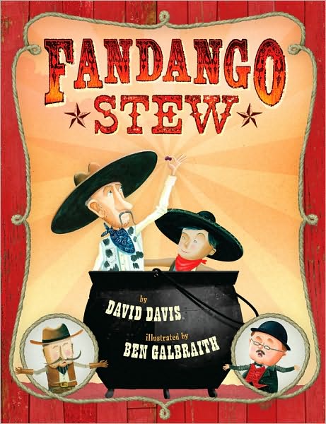
and I'd love to give my 2 cents.I've read through everyone's comments before me and I agree with everything that's been said. It was also nice of @gimmehummus and @Dulcie to do mockups to go along with what they were saying, but unfortunately I don't think either pulled it off (sorry guys!). Dulcie - the title font you changed it to is still considered a decorative font and doesn't go with the rope script font below it. Although in theory you have it correct - only use one decorative font paired with one sans serif or serif. I personally wouldn't use any of the fonts chosen in this thread, they all look like "free fonts" and that's not a good thing. You can by all means use free fonts, but it takes a bit of digging to find a good quality one that isn't tacky.
I'm going to go on a limb though and say that I think you should try hand-lettering the title. It's going to be very hard to find a western font that doesn't have that 'tacky' quality to it, and a hand done one will give it such a nice touch. I have the perfect example for you of a western children's book cover that is done REALLY well that you could be inspired by (and I'm almost positive the title was hand-lettered):
See how the font that was chosen for the names looks like it could be the same font as the title (except without the decorative inside bits) and 'by' and 'illustrated by' is a traditional serif font.
I also like what @Kevin-Longueil said about the background colour (look at how nice and warm Fandango Stew's is!) and what numerous people said about the overlapping text that's hard to read. @Joy-Heyer is also spot-on about watching your kerning.
Text aside, I would work on your rope looking more rope-like. Again, the Fandango Stew cover is a great example to draw from! Also - why is there so much space on the bottom right? I would actually utilize that space for the author and illustrator credits and just have the title within the rope.
Good luck - I look forward to seeing the end result!
https://danettebyatt.com
Twitter @DanetteDraws
Instagram @DanetteDraws -
@DanetteDraws Thank you for the advice! I agree with what you've written--just not sure how to execute it. To do hand written lettering would mean I'd have to be somewhat good at lettering/graphic design and if that was the case I'd be able to choose a better font than what I had!
Well I will work on it.
Good call on the rope. It needs more work.
I will check out that Fandango book--that's a really great example.
I'm not sure if I like the idea of putting text at the bottom right--though I do agree that there is a lot of space there. The idea is that the kid is standing in front of a sign (hence the cast shadows). I'll play around with it but I'm thinking that putting text there would be like saying: I didn't have anything to go here so I'm putting text here. Whereas, by leaving it, I'm saying this is intentional and I'm fine with it. I know I've seen 100s of books that have a lot of space at the corners and covers with maybe one or two images only. I'll search around to see how other authors handled that.
A couple people mentioned you didn't like the fact that he was in front of the text. I guess I don't mind that at all. In fact I kinda like it. Is there a reason that we absolutely have to see all the letters? I figured it would be pretty obvious to readers and it, in my mind, helps sell the idea that he is in front of a sign.
All that said, I'll take another look at it and see if I can change it to something different because I'm open to the suggestions!
-
@Joy-Heyer said:
Here are some more suggestions:
-
Watch you kerning (the space between the letters). For example: In your original font the D, A, and V in DAVID are way too far apart. Treat each letter as a separate layer and manually place them next to each other.
-
I agree with @gimmehummus and @Dulcie's suggestion to have one decorative and one clean font but I would explore having the title be the fancy font and the author and illustrator be the clean font. As cool as you are, it is the title of the book that you are trying to get noticed ;).
-
Watch your tangents and composition. The cowboy is uncomfortably close to the edge. He is also a similar "weight" to your title box. Vary it. Remember the rule of thirds and small-medium-large.
Your cowboy is very cute! Can't wait to see updates!
Thanks for the suggestions! I see what you mean by the kerning. I'd like to try a different font though so hopefully I can find something.
I want to keep the sign centered so I suppose I could over lap it more with the boy but I'm not really sure about that. How close is too close? How far is too far? I've never really been able to get a good understanding on that when I read people's crits of other's work and they mention stuff like that. I'm not sure if it's a personal preference or....?
Also: isn't the sign large, the boy medium and the doll underneath the sign small?
I think you are right about the author illustrator font. I wasn't really trying to stand out--just my general lack of text sense. I still have to figure out a good font to use for words of the book. Not looking forward to doing that.
-
-
I want to keep the sign centered so I suppose I could over lap it more with the boy but I'm not really sure about that. How close is too close? How far is too far? I've never really been able to get a good understanding on that when I read people's crits of other's work and they mention stuff like that. I'm not sure if it's a personal preference or....?
I agree that the sign is great centered. And I like the boy standing in front of it. But how close is too close or far too far is hard to explain. Think of too close as uncomfortable. If the edge of the book is a cliff, would you really want your little cowboy that close? Also, think of printing. If the printer is off by even a little, your little cowboy may lose some of his hat. Too far would be any space that detaches the subject from anything it should be interacting/competing with...including negative space.
Also: isn't the sign large, the boy medium and the doll underneath the sign small?
It isn't just the actual measurement of each, it is their visual weight. Visually the cowboy and the sign feel the same weight to me. Enlarging the font of the title and changing it's background color may change the visual weight. Also making the cowboy a bit smaller would help in multiple ways: it would move him away from the edge, give the author and illustrator text more room, and create size variance but still keep him in front of the sign.
As for not being able to draw your own letters--I've seen your work. You have a lot of talent! With a little research on lettering, I have no doubt you could create your own lettering--and do a fantastic job of it too!
Twitter: @Joy_Illustrated
Instagram: joy_illustrated
Website: joyheyer.com -
@Joy-Heyer said:
It isn't just the actual measurement of each, it is their visual weight. Visually the cowboy and the sign feel the same weight to me. Enlarging the font of the title and changing it's background color may change the visual weight. Also making the cowboy a bit smaller would help in multiple ways: it would move him away from the edge, give the author and illustrator text more room, and create size variance but still keep him in front of the sign.
I get what you are saying now--I'll play around with it!