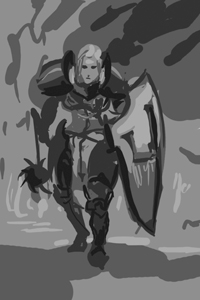
Wounded
-
Another project going on.
Early WIP
-
had to take a picture of myself posing for this hand fix >.<"
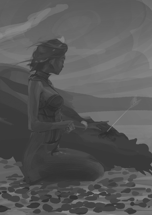
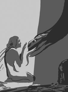
does composition reads well from far?
trying to make face - left hand as focal point, I tried to make everything else support that -
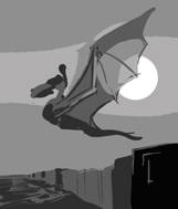
dragon appeared!
-
@Alberto-M Looking good!!
-
-
Hey Alberto,
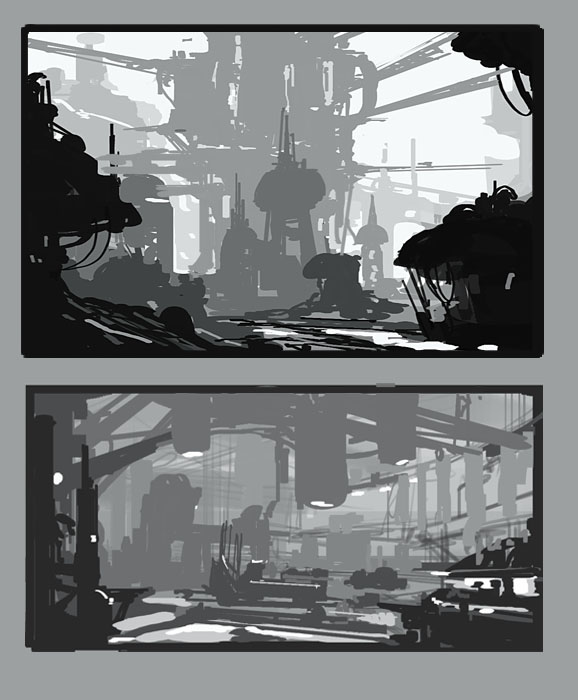
I think this one is having some of the same problems your last one did. It's all in the mid-lower scale on value and looks really underexposed in terms of value. I think the same advice from the last on would work wonders here. start with 5 values and do a big block in. white, 25%, 50%, 75%, and black. If you can make it sing using those values, it will hold up once you add all the details in. Here's a few samples of this type of rough value block in
[
-
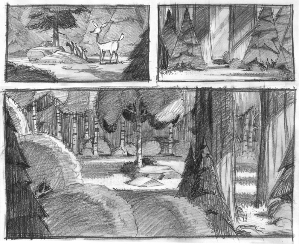
worked on some value studys, going back on it now
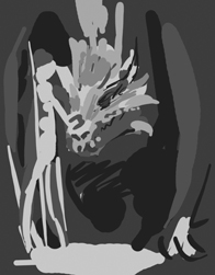
hope I change my value contrast paralysis lol
-
Very good, i like the what you have done.
-
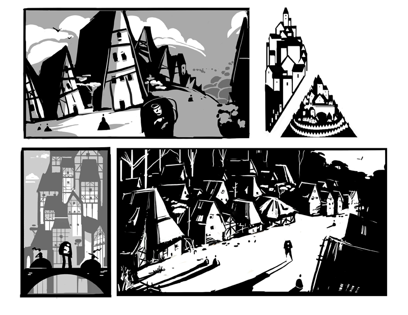
updating thumbnails studys to fix it
quick test nº1
Nº2
-
Love the value studies. Thanks for posting. Your sense of composition is awesome. This last piece is definitely an improvement from the first one. Well done. I usually try to do values at the thumbnail level or step back and squint at the drawing. But I'm still working on my sense of composition.
-
@Nor said:
I usually try to do values at the thumbnail level or step back and squint at the drawing. But I'm still working on my sense of composition.that's exactly what I SHOULD BE DOING to save time and headaches, haha
-
there ya go!! much better!!!! : )
-
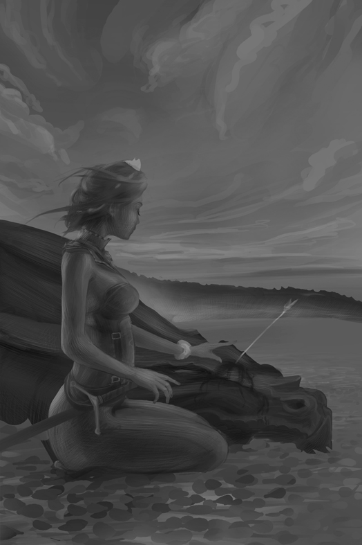
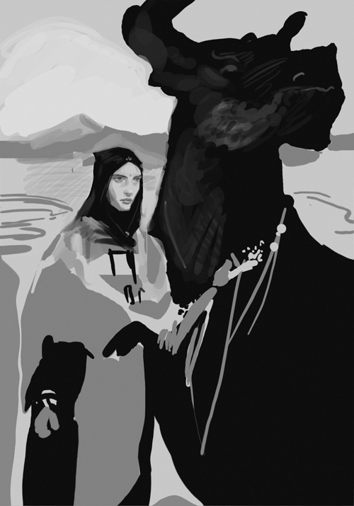
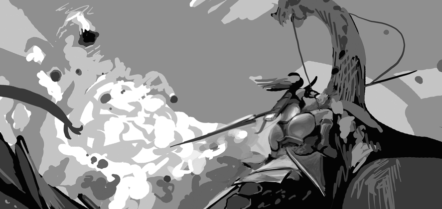
@Alberto-M I really like where you're going with this. I love the way the sky draws me in, as well as the value studies you did, particularly the image of the dragon flying.
For me, at least when viewed from a distance, her left hand gets lost. I'm wondering if you could add more contrast between the hand and the dragon. Or maybe subtly change the shape or lighting on the bracelet to point the viewer's eye toward the hand.
-
@Maile-McCarthy said:
@Alberto-M I really like where you're going with this. I love the way the sky draws me in, as well as the value studies you did, particularly the image of the dragon flying.
For me, at least when viewed from a distance, her left hand gets lost. I'm wondering if you could add more contrast between the hand and the dragon. Or maybe subtly change the shape or lighting on the bracelet to point the viewer's eye toward the hand.
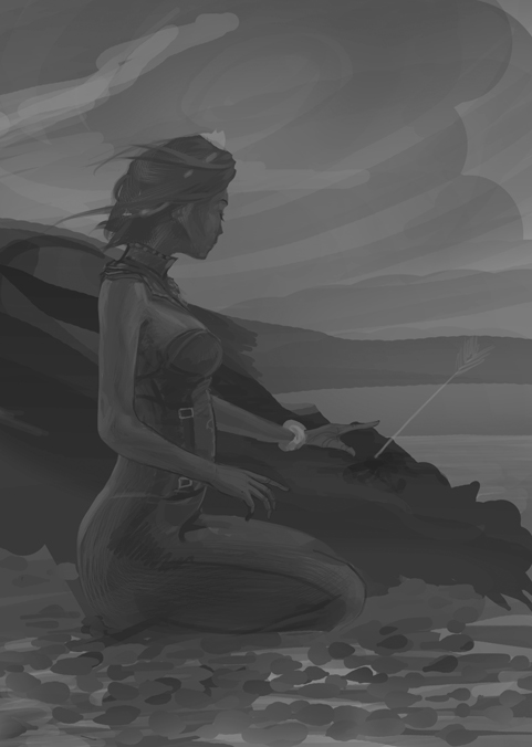
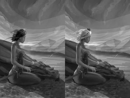
thx for pointing out the hand issue, on the first test it's better
I'm also taking some parts of the cast shadow from the dragon of first image, so that shadow does not "cut" the way to the eye to navigate around the dragon head
major issue right now will be to choose between blonde or brunnette xD
-
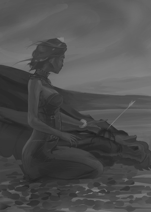
@Alberto-M Blonde or Brunette-- such a tough call. I really like both. For what it's worth, the blonde reminded me a lot of Daenerys Targaryen from Game of Thrones.
-
My vote is for the Brunette. Your thumbnails are much better!