My Journey of Creating a Book
-
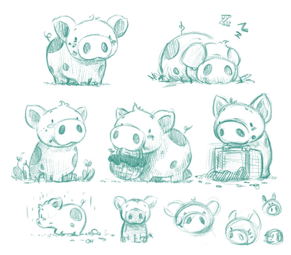
Some sketches of the "Easter pig" in the story, as well as some of the older sketches I found that I did a couple of years ago. I wish I could add more but either they were on paper or I cant find the files.
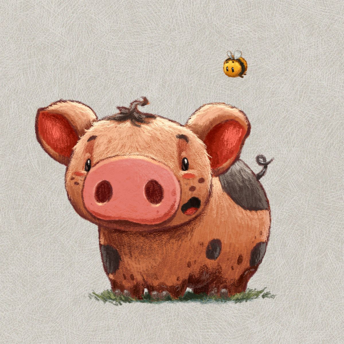
I struggled with whether to have the pig walking on 2 or 4 legs, but I prefer a more natural form as I don't want to overly anthropomorphize his character. One issue with this was how to make him carry a basket in his mouth. If his head was too low then the basket would be tiny, so i've tried to make sure there is enough space between his head and the ground. I may explore having the basket on his back, but that might affect some areas of the story.
@Mara-Price Yeah I think I hope I can help retain her cuteness and oldness when it gets to color.
@Pamela-Fraley @MattBaker @Georgios-Christopoulos @Coley @LauraA thanks everyone. I hope I can provide something useful for others
")
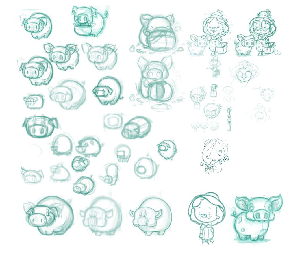
Old sketches. I was originally planning to have mother nature look more like the upper left characters, but I wasn't happy with the proportions, and felt something cuter and simpler would be best. Also, I wanted to use the pig in the bottom right, but it felt too Warner Bros cartoony and lacked some of the maturity that I wanted in the pig:
-
your illustrations are so cute and huggable! Too cute that I even want to own dolls like them

-
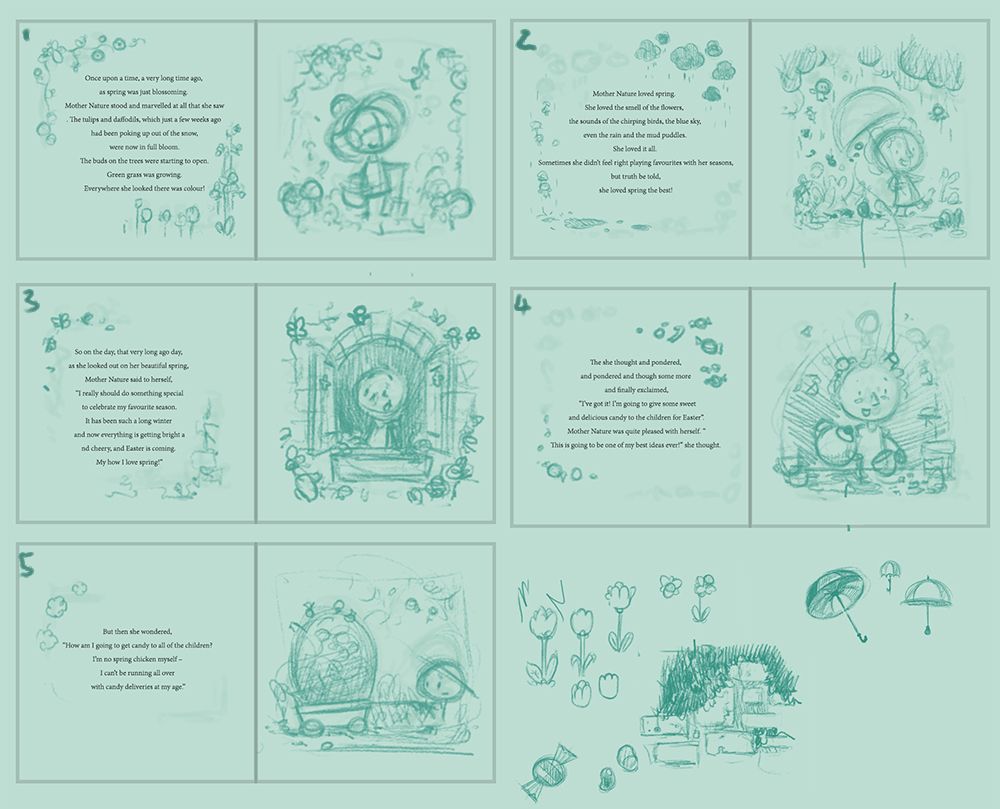
Slowly moving forward with things and started doing some thumbnail sketching for the first 5 spreads. I avoid adding much detail and just put in the elements that are important as well as using stick figures for any characters. I want to get a thumbnail for each spread, before refining anything at this stage as I am sure things with be adjusted later. A lot of the time I draw, erase and draw over so the ideas evolve as they are being created. Most of this story doesn't require anything flashy so I try to keep the ideas simple and focused on the main character.
I will have some side characters, such and birds and bugs that follow her to add a bit more flavor and help with the painting's flow.
-
I'm still working on setting a foundation for the book and have started playing around with some color to give the project a bit more life.
-
@Gary-Wilkinson Your illustrations are absolutely adorable! Thank you for sharing your process. Excited to see this develop!
Any particular reason you've maintained the left page text + right page illustration pattern throughout the book?
I've seen books which alternate the text/illustration sides so that the readers eye actually travels throughout the book. I'll always have a soft spot for illustrations, but if I'm putting in effort to come up with the text (something I personally struggle with a lot!), I'd like the viewer to pay attention to all aspects of the book. -
@Neha-Rawat It's a good point and something i'll look into as to which people prefer, nothing is set in stone, so having them alternate could work really well
It's probably just a personal preference, as I like the flow of turning the page to lead directly onto another illustration. Also it's a small thing, but I find it helps when reading a book to a class of children as I don't have to adjust the position of the book when turning the page. -
Holy Crap!... this is a great thread to motivate others to study your approach and do it! everything looks amazing...
-
I've been away from the forum - but I'm popping back on and I am SO GLAD I have because I am now so excited to see more of this!!
beautiful beautiful work. -
Thank you for the kind comments. Once everything is complete i'll try to organise it into more of a step by step process for each section and image as I gradually find my way with it too.
Still working on getting these mini color studies done. A long way to go still, but these are really helpful as they don't take a great deal of time and I can just focus on the concept and whether the colors work or not. When all the studies are done i'll be able to see whether things flow well and can adjust or redo parts without getting too invested in them.
-
completely personal opinion without real help which is not related to the art itself.
i am really not sure about the white side with the text. for me it feels way to dry and formal for a children book but i must say i havent had a recent one in my hands so maybe thats how people do it these days. not much of help this time, more a personal opinion about the layout. -
@Gary-Wilkinson love your illustrations. The character design, the lighting, and the color are so lovely.
I too wonder about your layout design choice. The current layout reminded me of some classical children's storybooks. If your story has the same kind of vibe and aiming for a timeless, classical feel, this layout may work perfectly. If you are looking for a more dynamic feel, this layout solution may not be ideal.
I look forward to reading your book. The illustrations look so fun :-).
-
This is fantastic! Your characters and colors are delightful. I especially love seeing all the process work and alternate directions along the way.
I work as a designer professionally and agree the typography has a classic look. I don't think that is a bad thing at all given the amount of text you have on each page. I have seen some children's books that try to get too cutesy with the typography and end up making the words harder to follow and identify for early readers.
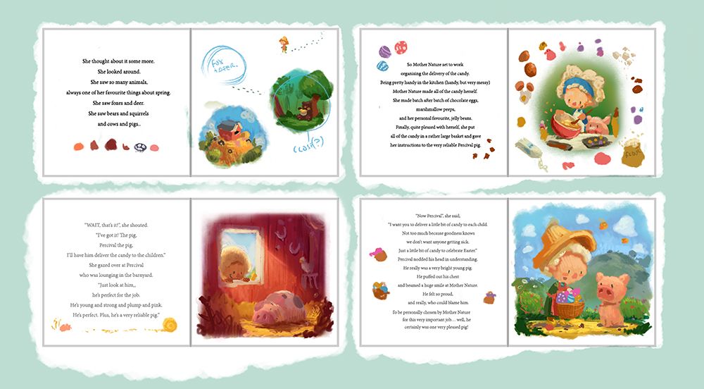
One thought on the cooking/mixing bowl illustration: There are a lot of ingredients floating in the margins, but not a lot of motion in the composition. Maybe the ingredients form more of a spiral, swirling out of the bowl? Nothing extreme, just a bit more dynamic, and give the eye an obvious path through the illustration.
Nice work! I look forward to following your progress on this!
Instagram: https://www.instagram.com/verysamish/
Comic: http://comicdetours.com/ -
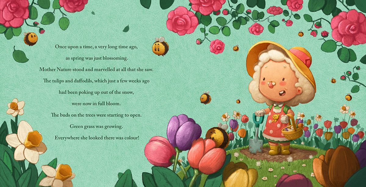
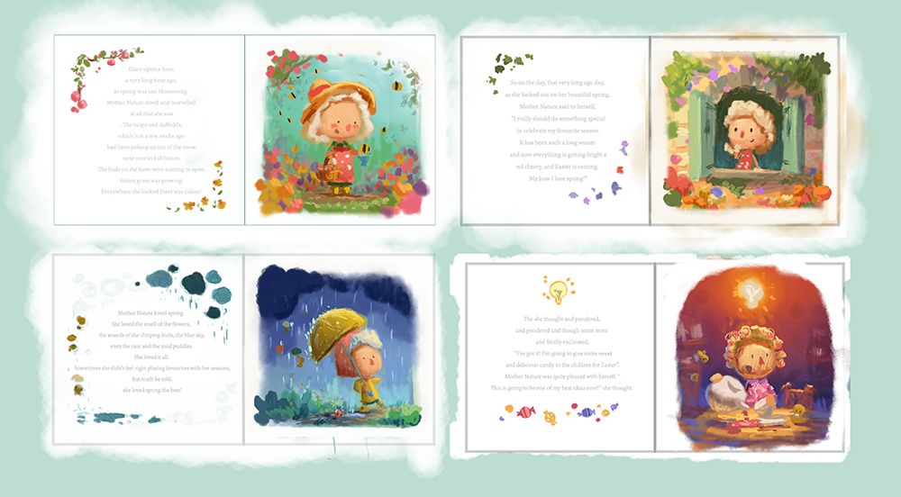
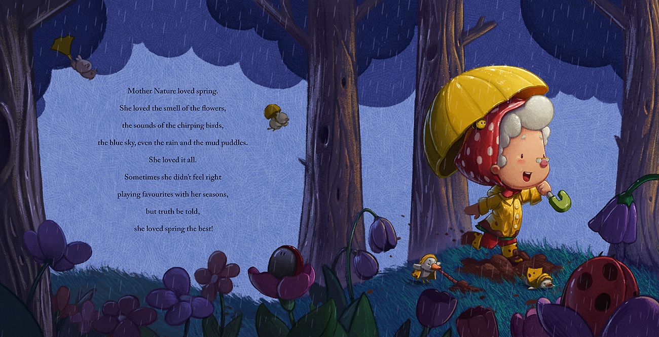
Another thread back from the dead. So I recently finished a project and have some time on my hands before the next, so I wanted to see where I could go with this book and to further practice a more traditional media look. I agree that the layout seemed quite dull in the earlier versions and although I want to keep with a single page for text and a page for the main image I felt like it could be done a bit better. This is the first spread and although I don't have all of the book planned out yet i'm hoping I can keep this style throughout without it becoming boring.
-
@Gary-Wilkinson turning it into a two page is definitely an improvement in the composition. Also the bees are very cute! Having some pages be two-page and other pages having spots/vignettes will help give variety for the story but also for your portfolio to show how you incorporate text on the pages.
-
How did you do the texture for the background?
-
@kayleenartlover the texture is a layer I made by cross-hatching and is just set to screen mode over a flat color. I kept the layer as it's own file so I can use it for multiple images.
-
@Gary-Wilkinson cool thanks
-
Still some detail to add here and there, but starting to take shape. Will be looking at adding vignette/spot illustation in some of the next pages.
-
Also redesigned the pig somewhat to fit with the new style
-
@Gary-Wilkinson Adorable character sketches, so expressive.