How do you think when you are working with HSL?
-
Would you be so kind to sharing any insights?
I am looking to understand more from other artist by listening to what you think of when you are choosing/using hue, saturation, and luminance in a painting.
[H] Hue - For me I initially think of the feeling of the color.
I also try to refer to shape theory to partner with those feelings.
- What practices do you think of when you are hue-ing?
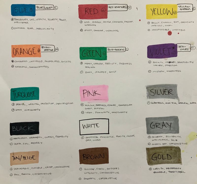
[S] Saturation is a little more difficult for me. So far I’m thinking saturation is to guide the reader’s eye. I’m thinking the more saturated the more contrast with the desaturated one can use to focus the artwork.
- Is there another theory to help guide your sat/desat portions?
[L] Luminance - For me i think of lighting and how much the texture of the object reflects or absorbs that light.
I try to refer to 3D shaping and how the light bends around it.
-
Is there another idea to help guide the luminance process?
-
Also if you can think of a good course or YouTube video i would watch it?
I’ve searched but I’m just getting tutorials on what HSL actually is.
**** I’m looking for ways to think to keep me focused and balanced as i deal with color and composition. ****
I am in a evaluating, deconstructing, and constructing mood so feel free speak your mind. Thanks for your time and patience.
Much love and God bless!
-
@dafoota I don't think I have much to say on the topic myself. Usually I only end up sketching and drawing (basically, I need to practice with color more!)
Here's a video by Marco Bucci that might help: He doesn't deal with HSL directly, but talks about some principals between hue, saturation, and value and how they can interact; I certainly learned something new from it!
https://youtu.be/gJ2HOj22gDo -
@Jonathan-Malski Good video!
-
@Jonathan-Malski Awesome! Thank you for your reply. I will check it out ASAP!
-
@gavpartridge I love it... Im going to chew on this for a bit.
-
@dafoota I am on the same page now! Really trying to understand how to choose colours. I am reading a great book "Colour and Light" by James Gurney.
-
@aska Awesome. Maybe we can share some insights back and forth. Maybe i can pick up that book and we can start a book art club thingy haha.
Much love and God bless!
-
@Jonathan-Malski Yes!. This was helpful in understanding the study of the colors it self. I will definitely add and refer to this concept. Thank you for sharing.
-
@dafoota sure! no problem
")