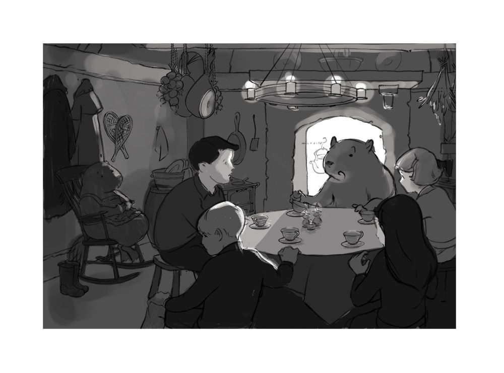
Even Sloooowervember!--WIP feedback please?
-
@Heather-Boyd Well, I certainly need to fix that!
 This is exactly why I ask for feedback--at this point I am just so deep into the details that I don't see the obvious. Thanks!
 -
Hi Laura,
the scene is looking great, all the preliminary work was worth!- I think the drawing is really nice. No comments here (as i cant draw that good
 ).
). - The scene design is great, telling the story well, but it is also very hard on you to keep the value structure readable and still have some convincing light to support the storytelling.
I think you are on a good track there though. Just some ideas to experiment with:
more separation foreground-background, expose more on the light side, group more the darker values, use (possibly cheat with) dark/light, translucent/reflective/matt surfaces to help to keep values where you want for the storytelling.
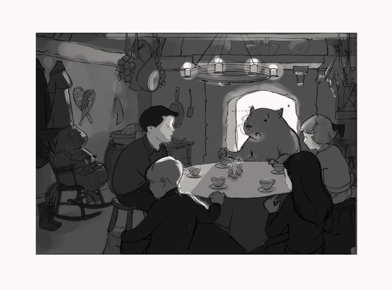
Something in this direction maybe?
- I think the drawing is really nice. No comments here (as i cant draw that good
-
@marek-halko Well, I really like what you've done there, especially with the overexposure! By translucent/matte/reflective surfaces, do you mean that the reflective surfaces have more contrast and so I should use them where I want some sharp highlights (say, the teacups), whereas matte surfaces could fade into the background? Thank you!
-
Hi, I really like your value study. The only thing that I am not sure about is the kettle behind the beavers head. I think it takes too much attention and somehow is a weird placement. Over all, super nice though.
-
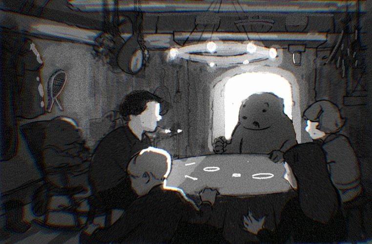
Here's another take using your critiques. After moving Mrs. Beaver to the far right, middle (winds up in the gutter) and having her do dishes (didn't solve the problem), I finally just moved her back a little bit and hid her in the shadows. I may do another lighter value take (it may feel too dark in mood right now to me), but I will "bleach out" the kettle. It's just there right now because the drawing is on top.
P.S. What I really liked about your take @marek-halko is the gradient bleed from behind the fireplace, but I'll have to go back and figure that out later. So much going on today!
-
@LauraA Hi Laura, sorry for delayed answer. Yes exactly, local color/value and surface quality gives different result after interacting with light (for example black , matt object may stay quite dark even when hit by a stronger light).
The scene is guite challenging (two main light sources, bounce light, lots of props...), but it will be rewarding if you manage to pull it through.
Keeping the hierarchy of values might help (lightest-light source, second lightest-highly reflective objets, third lightes-white objects...)PS:
The bloom effect of chimney light can be done with overpainting with color of the light in overlay mode and then apply gausian blur (can look cheese though if it is too much or too little or doesnt fit rest of the rendering)
As i see the light in the chimney now, it may be too much. Maybe a gradient would tell more about the fire at the bottom.
The advantage of darker scene is,that values
can be grouped better together. The disadvantage is, that it might not fit the story. -
@marek-halko What a lovely and detailed answer! Thank you for taking the time.
-
@LauraA i could write longer, but didnt want you to fall asleep from boredom when reading
. I like doing value studies (not that i am good in it). Hope you have fun with the picture. It is a very nice scene. -
@marek-halko What, get bored talking about art? But thank you. You are very kind.
-
Hi Laura! I love the tone of this (both feeling and value). I'm going to throw a wrench in: I think I would like to see more of Edmund's facial expression, so maybe turn him more toward the camera. I like the foreshadowing you're providing with his body language, I'm wondering if we need to see his face to bring that home?
-
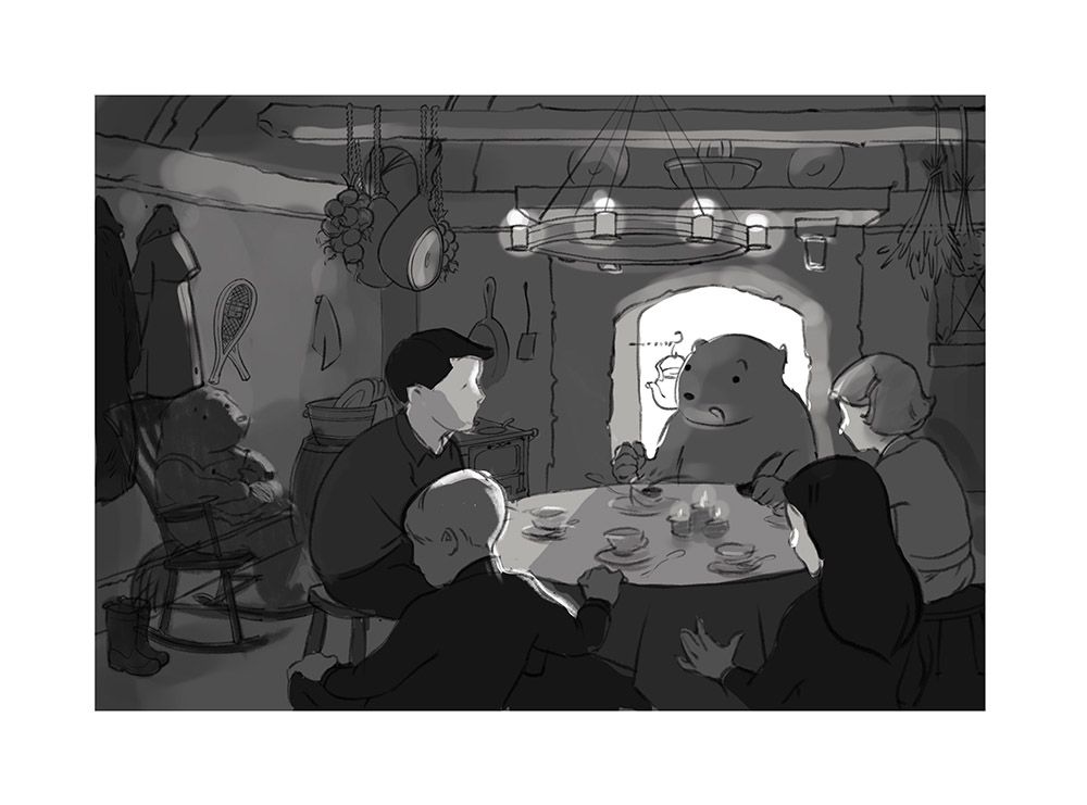
@Laurel-Aylesworth Is this enough face showing? I'm still playing around with the exact expression, but going for something a bit pouty.
I'm also still not quite satisfied with Susan's gesture and Mrs. Beaver's feet.
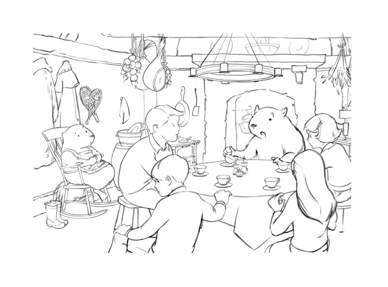
Oh, and also I tried two compositional options for getting the fireplace out of the gutter. In the first I moved the whole composition to the right, and in the second I moved only the fireplace. Preferences, anyone, as to the better the solution to the gutter problem? I think I prefer moving the whole composition, which surprises me somewhat.