I need some fresh eyes to finish this
-
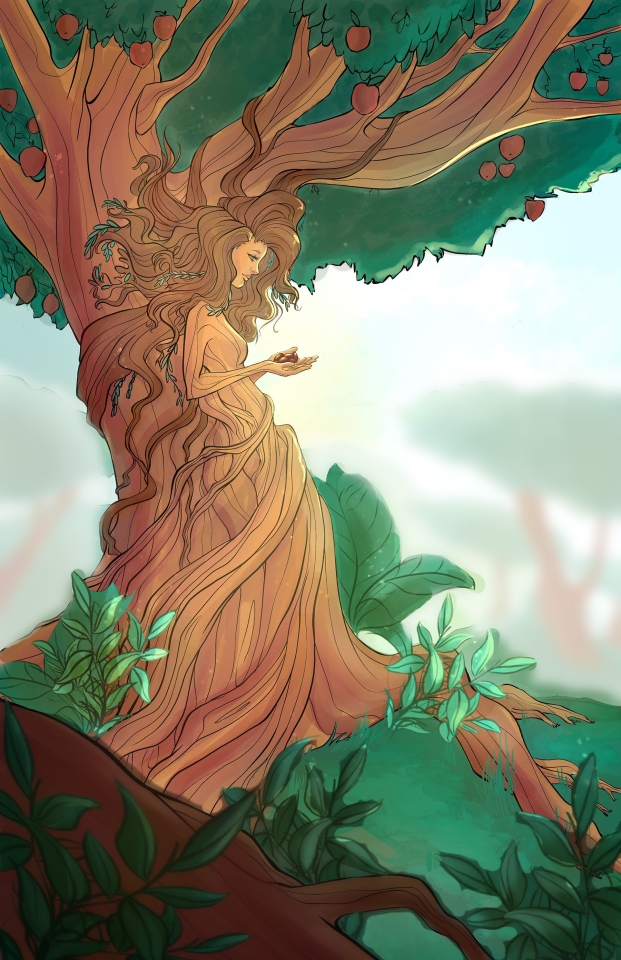
Hey! This is awesome! But my focus is drawn to her hands, and I’m not quite sure what she’s holding or if it’s significant. Also, yes the mountains. I’m not quite sure what’s up with them. I feel like there’s a disconnect between the background and main focus. The mountains kind of just appear. Or it might be that they’re too small. I’m not entirely sure though.
-
Hi
I can see two things that I would do different.
• Im sure her hands are very delicate, but since they are drawn side by side, to the quick eye they look crooked.
• My sight is drawn to the "hole" in the tree crown.
Either have more "holes" or take the single one away.Mic
-
@Elisa-Miko-Price it actually looks very finished to me. Don't change it.
-
This looks really beautiful to me. It was clear to me right away that she's part of the tree. On first read, without looking at details, my mind thought her two hands were just one hand, which made it seem like her hand was too big. A closer look solved the problem, of course. Best wishes and thanks for sharing your piece!
-
But my focus is drawn to her hands, and I’m not quite sure what she’s holding or if it’s significant.
Yeah same - that was my first thought as @Cole-Rts. They look like seeds? And if so, why or what?
I think the problem with the mountains in the background is that they're painted with a soft brush. If you look at pictures of mountains, they aren't blurry. The lines cut the horizon just as sharply as the mountains that are closer to you. They're just losing details and get closer to the color of the sky depending on the atmosphere.
The soft brush is also inconsistently being used in the foreground. Some of the leaves are crisp, while others are soft. It feels like the soft leaves should only be those guys right in the front that might be blurred by perspective.
-
@Elisa-Miko-Price The others have great feedback, I just wanted to add this is beautiful!
-
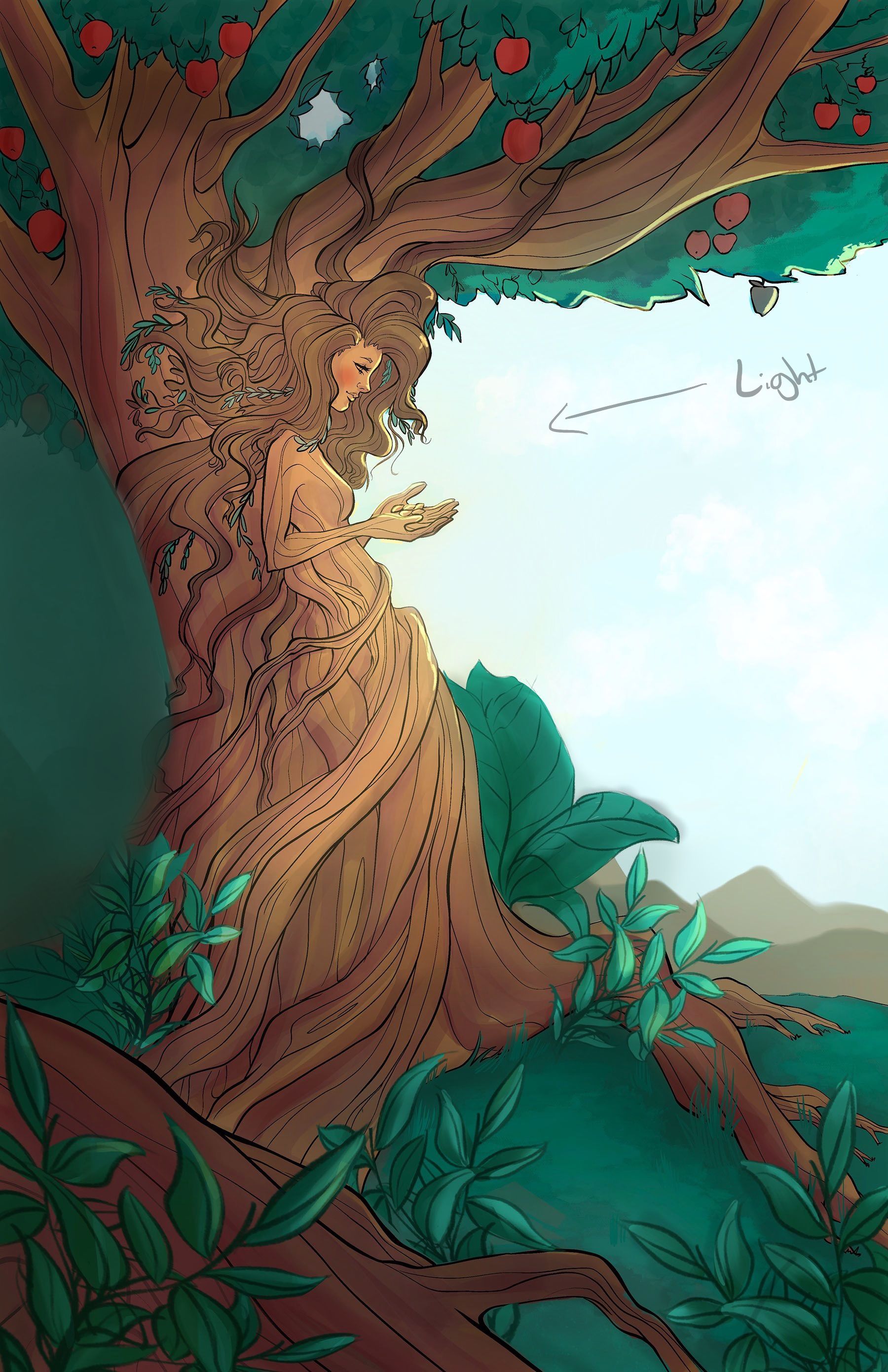
It looks good so far. It may benefit from a little more contrast to emphasize the focal point which seems like would be the lady/seeds.
It may also be a nice touch to reuse that red some where.. face or maybe a fallen red fruit.
IDK about the mountains, Maybe it's a perspective issue?
She looks like she's part of the tree but maybe it can be pushed by having her fade into it (color & line) instead of wrapping around it. Can follow the cross contour lines of cylinder to give it more structure.
I did a quick layer in procreate, that explains some of what I meant. Anyway good job, I think your friend will like it.
-
I know that when I play with light that it helps to add a nice and subtle overlay layer what sets the tone of the entire image. For example, the first one was my final product whereas the grey one comes out bland. the blue adds a tone of cold darkness whereas if I left it grey it be boring and unrelated. if you add a warm gradient and add an overlay filter on it, it might improve both the lighting and the contrast.


-
This is really nice! I love the concept. I have no problem seeing that the character is part of the tree. I like the way you blended her body into the trunk.
Some suggestions: The reds on the apples are really popping and I find my eyes drawn to them.
I like @TD-Sketches idea to use light to place the focus on the character. When the red is muted, the piece looks a lot more focused.
I would consider blending her hair with the tree trunk a but more with the colors. (like what you did with her body). Maybe a gradient of light brown to dark brown from the trunk to her hair would help to make the viewer be sure that she is part of the tree.
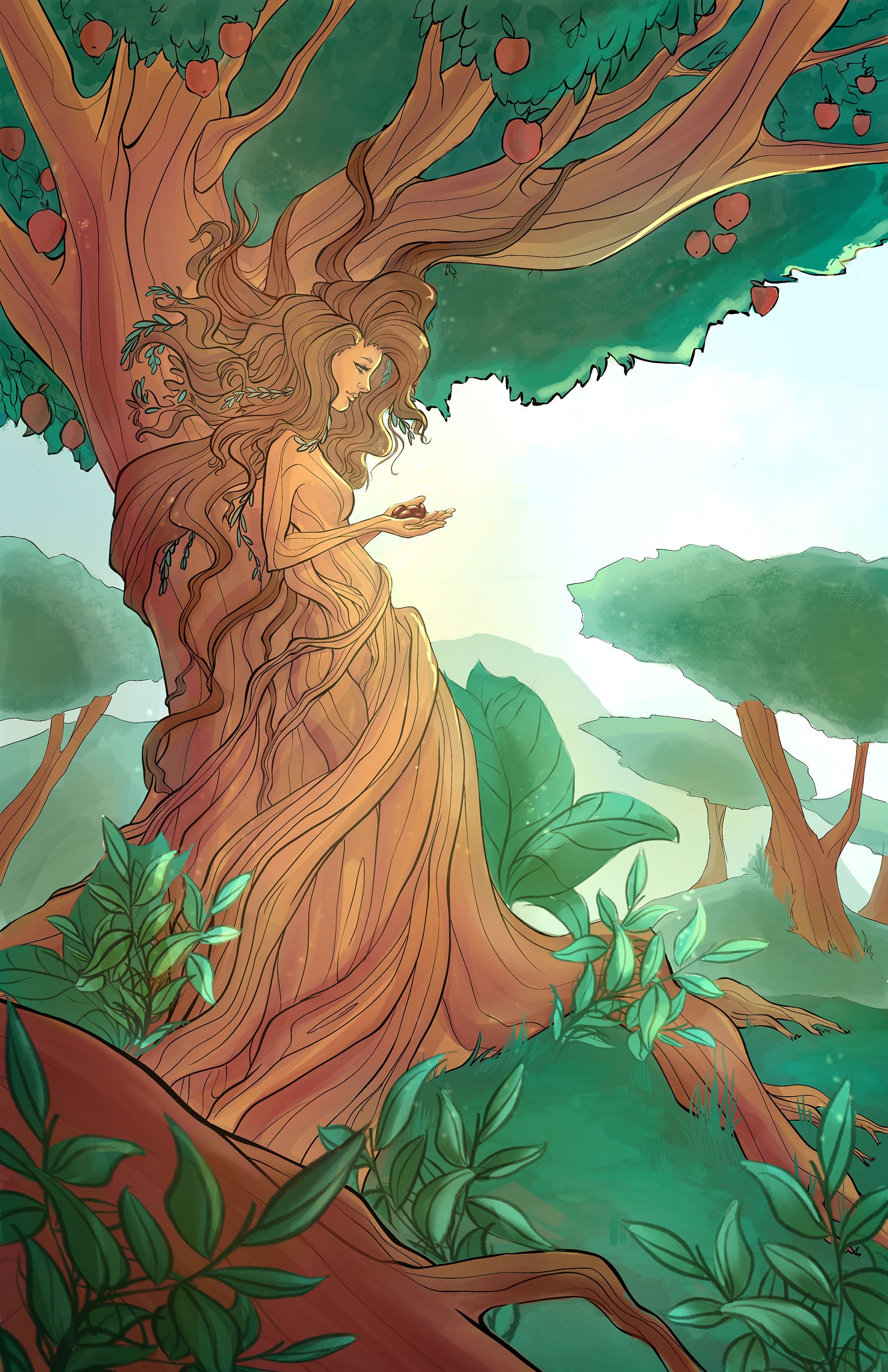
I feel that the colors of the mountain does not go with the rest of the image. Perhaps colors that are in the same family of green and brown that you are using in the foreground would make the mountains blend in even better?
Great job! I love it! I'm sure your friend will too. -
I think this is a lovely picture. One thing I would do is add to or change the green. It looks artificial. When I paint greens of vegetation, I almost always put it in the yellow range and choose a grayed yellow. It comes out a nice olive or sage green. Conversely, like I did in the draw over, you can get a nice effect by creating a multiply layer and coloring in some red, orange or yellow. It helps tone it down and adds realism. The reason we see these colors in the fall is that they are there but mixed with the green. Without them leaves look fake. Just my two cents. -
@Elisa-Miko-Price I think if you work the highlights and the shadows better across the tree if would make it pop out better. The head placement doesn't seem right. I feel like the hair is an very uncomfortable fluffy pillow and is making her neck stiff
-
@Elisa-Miko-Price Like some, I was instantly drawn to the hands and noticed what look like seeds. I was trying to figure out if there was some significance to it. Why is there a lone green apple (on the right)? It's the only one with a highlight and yet it's green compared to the rest.
As for fresh eyes, perhaps color the foreground leaves and bark darker? They seem to blend with the everything else. Also maybe less detail? No lines in the middle of the foreground leaves, just the outlines. The foreground doesn't necessarily need to be "blurred", just less detailed.
The background mountains seem like an afterthought. Perhaps try removing the mountains and that giant leaf behind the tree? Especially if you weren't originally feeling good about the addition of the background. Also, why the hole in the bunching leaves at the top of the tree?
Sometimes, it's more about taking things away than adding something. All the best!
-
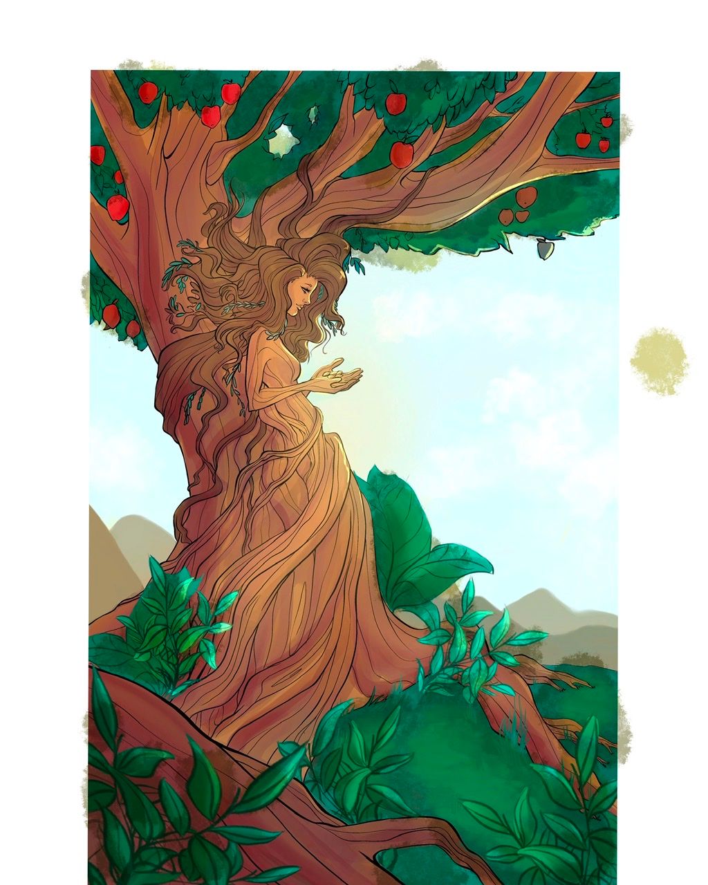
Thank you so much everyone! I made as many edits as I could, but I think I could still push it further. What else needs to be changed/fixed??
-
@Elisa-Miko-Price There isn't enough variation in the greens and browns causing the overall look seem flat, despite all the elements.
Here's really rough edit of a point I'm trying to get across. Hope this helps!