Coloring Easter Storybook Update!
-
Nice work, keep us posted on the progress please.
-
@joanie-stone I will Joanie!
-
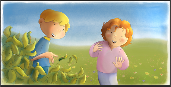
 Hi Friends, here's the first spread.
The Boy and Girl are walking to their grandfathers house and they find caterpillars, and take one home. its a project in witch I work together with my husband. the coloring is my job and needs to be finished by dec. the 7th. Coming up next, the cover. -
@Leontine This is very sweet. Love the expressions and the softness. Right now the girls hands are floating a bit and don't feel fully attached..here is a quick draw over suggestion on how to maybe tackle that issue. Hope this helps and best of luck with this project, can't wait to see more.
-
@Charlie-Eve-Ryan Thank you, good call! Ill change that.
-
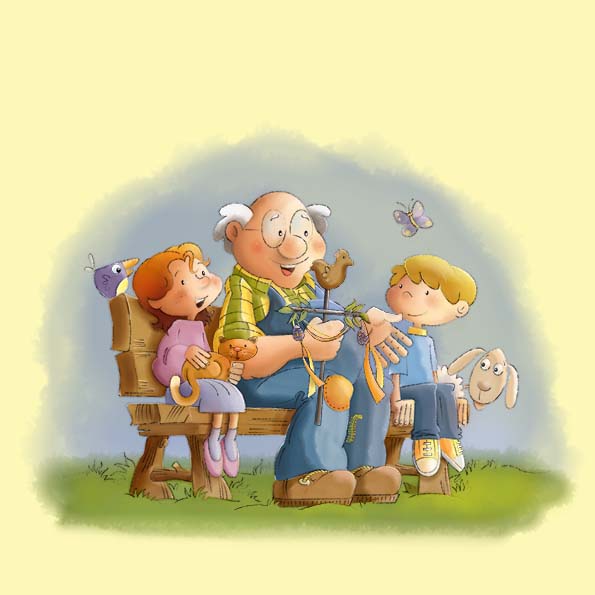
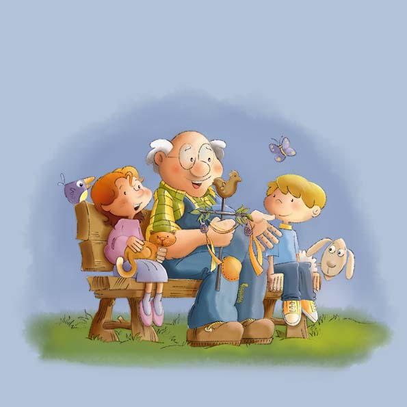
Hi Guys, here's an update, working on the cover, which one do you like the most? Any suggestions to make it more vivd?
Your critiques are more than welcome

-
Looks really good Leontine. I love the Yellow colour in the first one.
-
Hi @Leontine, looks great! I agree with @Lee-Holland, my preference is for the yellow background too - it looks more nostalgic and picks out the creamy highlights within the image too. The blue image looks a bit flatter in comparison. My suggestions would be maybe some drawn highlights/texture on the grass - you have some lovely fronds drawn but the shading/values there doesn't reflect that. If the light is coming from the right, perhaps a soft shadow cast by the bench? (would make it look sunny) But overall very sweet image, beautifully drawn

-
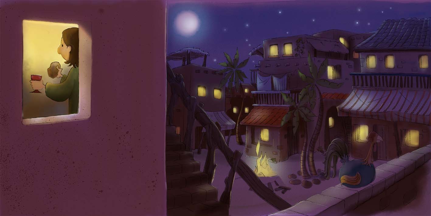
About the easter book. Its about a Grandfather who tells his father the story of Christian Easter. So to say, a story in a story. Next spread

-
@Leontine I like the yellow background as well. You have some really nice work displayed here.