Society of Visual Storytelling

    SVSLearn Forums

    • Register
    • Login
    • Search
    • Recent
    • Tags
    • Popular
    • Users
    • Groups
    • Search

    Illustration thoughts/feedback...

    Illustration
    9
    22
    7227
    Loading More Posts
    • Oldest to Newest
    • Newest to Oldest
    • Most Votes
    Reply
    • Reply as topic
    Log in to reply
    This topic has been deleted. Only users with topic management privileges can see it.
    • Lisa M Griffin
      Lisa M Griffin @natiwata last edited by

      @natiwata yes, I do often play fast and loose with perspectives... but I do appreciate your map, very helpful to see and consider. Really appreciate your taking the time to do so. 🙂

      instagram: lisamgriffinart

      1 Reply Last reply Reply Quote 0
      • Lee White
        Lee White SVS Team SVS Instructor Pro SVS OG last edited by Lee White

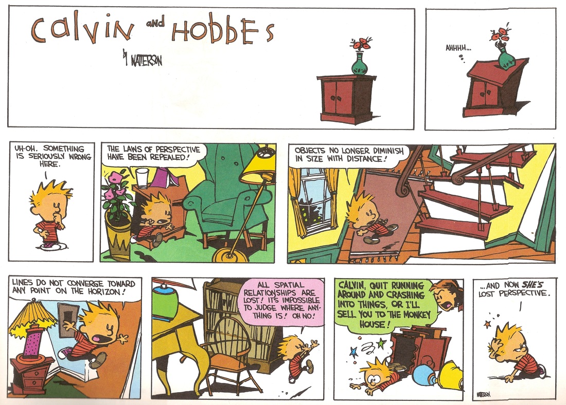
        I would advise against fixing the perspective. She's actually using a modified isometric type perspective which I use in a lot of images as a way to make interior scenes more interesting. They used this type of perspective in a lot of eastern art throughout history. The main idea is that lines don't converge at all. As long as this is consistent throughout the work, I like it a lot. The trouble starts happening when you mix up a convergence based perspective with an isometric one.

        Ready to really be confused as to how you should be drawing? Check out one of my favorites, Beatrice Alemagna. I don't know what type of drugs she is doing to draw this way, but she threw out the whole damn system of perspective and I just love it. Many will hate this, I know, but after years of doing traditional perspective, I find this work so refreshing. : )
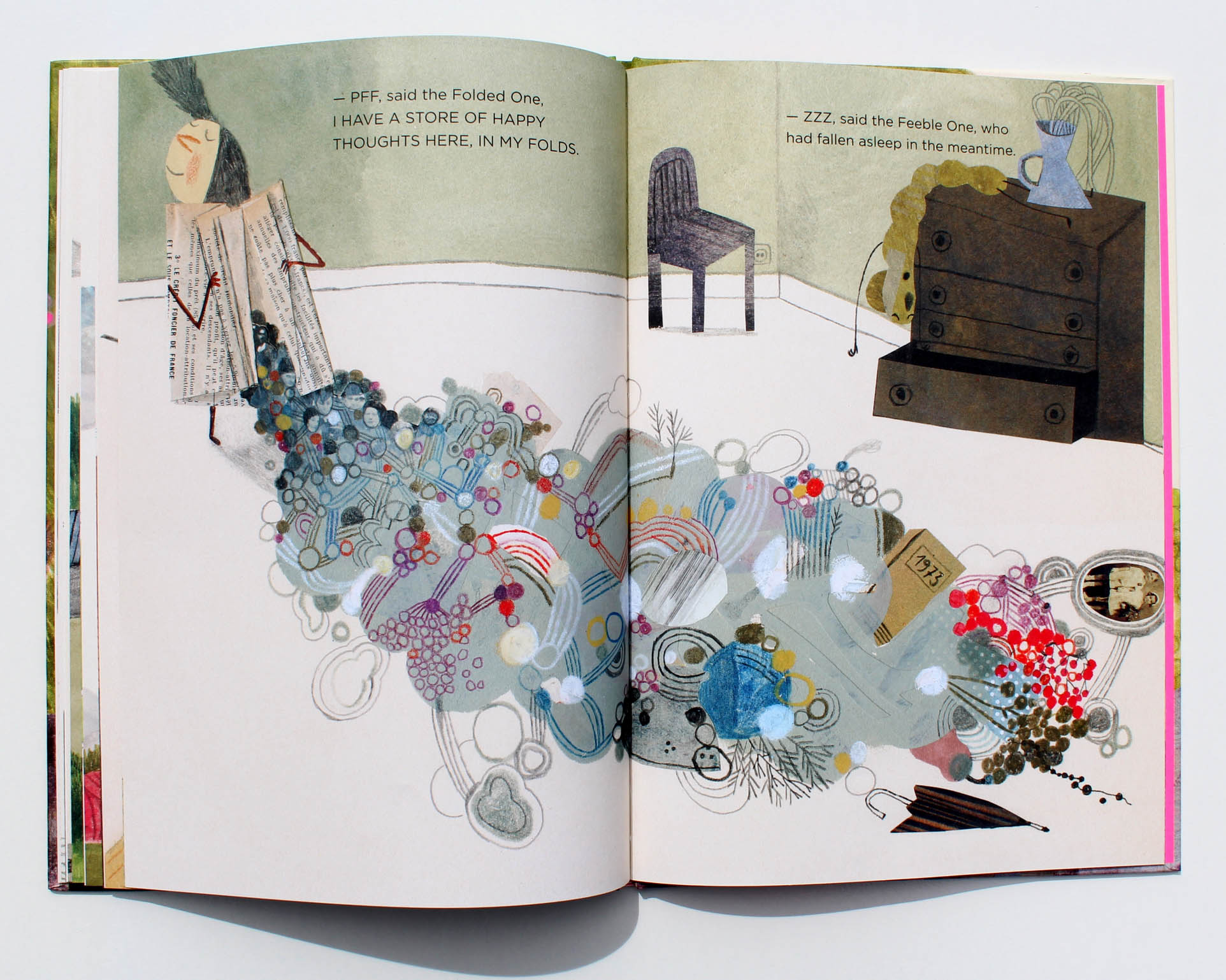
        Screen Shot 2016-01-15 at 12.36.55 PM copy.jpg Screen Shot 2016-01-15 at 12.37.30 PM copy.jpg

        SVS Faculty Instructor
        www.leewhiteillustration.com

        natiwata Lisa M Griffin 2 Replies Last reply Reply Quote 5
        • natiwata
          natiwata SVS OG @Lee White last edited by

          @Lee-White Whoa, very cool reference pics! With these it seems very intentionally not in a realistic perspective, so maybe she needs to go even more in this direction?

          Nat Iwata
          www.iwataillustration.com

          1 Reply Last reply Reply Quote 0
          • Lee White
            Lee White SVS Team SVS Instructor Pro SVS OG last edited by

            not necessarily with this piece per se, but definitely as an overall body of work. If this were the only piece in the portfolio to do this, it definitely call attention to itself.

            SVS Faculty Instructor
            www.leewhiteillustration.com

            1 Reply Last reply Reply Quote 0
            • Bobby Aquitania
              Bobby Aquitania last edited by

              Also the only line I see needing any kind of fixing is the left top of the wall where the ceiling fits. The perspective draw over with that line fixed, does help you draw your eye back to her in the middle. As to the bed, it could just be not lined up, which makes sense, unless you're some kind of Feng Shui nut who has to line everything up at right angles.

              1 Reply Last reply Reply Quote 0
              • Lydia M
                Lydia M last edited by

                Have you ever heard of Zingerman's? They have good food but I mostly love their catalog because of the bizarre but beautiful product illustrations. I don't know who does them. The wacky perspective we're talking about reminded me. I love it!
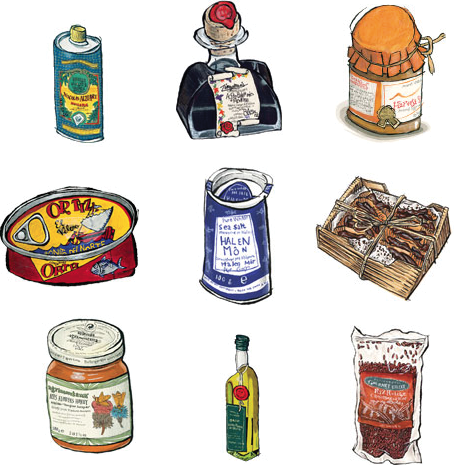
                tumblr_kok61rLAoN1qz50x3o1_500.png

                www.lydiamueller.com
                Twitter @lydesigns

                Lisa M Griffin 1 Reply Last reply Reply Quote 2
                • Lisa M Griffin
                  Lisa M Griffin @Lee White last edited by

                  @Lee-White Amazing! I had not heard of this artist before, thanks for sharing. I have been influenced by Júlia Sardà of late - I really enjoy her approach and lighting, use of pattern. I am adding more watercolor textures into my compositions as well thanks to Lee's classes - I find it works well when layering in patterns. And certainly I enjoy seeing how Lee uses perspective in his work, as (in my opinion) it just makes the illustrations more whimsical.

                  instagram: lisamgriffinart

                  1 Reply Last reply Reply Quote 0
                  • Lisa M Griffin
                    Lisa M Griffin @Lydia M last edited by

                    @gimmehummus these are really interesting spot illustrations. thanks for sharing!

                    instagram: lisamgriffinart

                    1 Reply Last reply Reply Quote 0
                    • Lydia M
                      Lydia M last edited by

                      Or remember this??? Haha I'm sorry!

                      6553900_orig.jpg

                      www.lydiamueller.com
                      Twitter @lydesigns

                      Lisa M Griffin 1 Reply Last reply Reply Quote 3
                      • Lisa M Griffin
                        Lisa M Griffin @Lydia M last edited by

                        @gimmehummus Fantastic! I am printing out a copy. 🙂

                        instagram: lisamgriffinart

                        1 Reply Last reply Reply Quote 0
                        • Naroth Kean
                          Naroth Kean last edited by

                          I like this! it has very nice mood.

                          http://narothkean.com
                          https://twitter.com/narothkean
                          https://www.instagram.com/narothkean

                          1 Reply Last reply Reply Quote 0
                          • NoWayMe
                            NoWayMe last edited by

                            Really nice work! Love the color and the mood!

                            I also like the concept of boycutting the rules of perspective in some of the work shown here, it does give a sense of whimsiness... However, I think that in your piece, there is a slight sense of perspective, just enough to give the impression that the incorrect perspective wasn't done on purpose. Maybe by pushing it further like @Natiwata suggested, we would more easily get the feeling that this is your style. I'm not sure though

                            noemiegionetlandry.squarespace.com
                            noemie_illustration on Instagram

                            1 Reply Last reply Reply Quote 0
                            • First post
                              Last post