Fairy godmother
-
This is beautiful! I love all the texture and the color scheme. One thought...use the color of the wand-light to highlight the edge of the fairy godmother's cheek, her skirt and headpiece, and hand where the wand-light rays would reach. There can be some of that color highlight on the boy too. Hope that makes sense. But really, it is a very lovely illustration.
Twitter: @Joy_Illustrated
Instagram: joy_illustrated
Website: joyheyer.com -
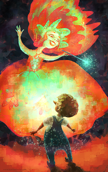
After my critique with March Bucci I adjusted the values to make the little boy pop out. (Also added Pinocchio's nose) It's going in my portfolio so it's gotta sparkle!
-
@Rich-Green You totally made my day knowing that 'Charly' is inspiring you! Thank you!
-
@Joy-Heyer Thank you for the ideas. It was great seeing you at the Marco critique. I learned so much from watching everyone's piece being worked on. Do you think I pulled off Marco's suggestions?
-
It was great seeing everyone's pieces and the suggestions by Marco, I really enjoyed it too
") Your piece is looking great.. but I do remember in Marco's value study, that the white T-shirt was really white and a lighter value than the dress behind it. I can't remember exactly how it went (will be good to revisit the video when it's available)..but I remember really loving how beautifully white it looked but also sparkly and popping out against his dungarees. The edges of his dungarees were also a bit more sparkled out, from memory.
Your piece is looking great.. but I do remember in Marco's value study, that the white T-shirt was really white and a lighter value than the dress behind it. I can't remember exactly how it went (will be good to revisit the video when it's available)..but I remember really loving how beautifully white it looked but also sparkly and popping out against his dungarees. The edges of his dungarees were also a bit more sparkled out, from memory. -
@Dulcie you are so right! I had completely forgot! Must have sparkly shirt and overalls! Back to the drawing board!
-
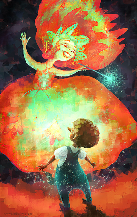
I think I fixed it...
-
Hey katrina,
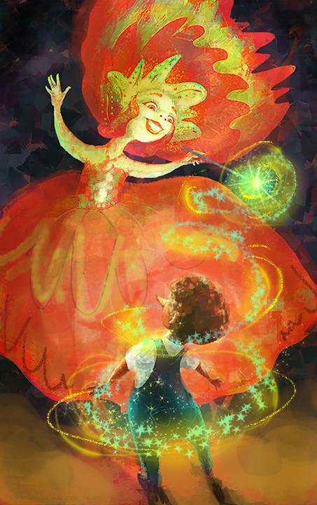
Cool image! Great that Marco critiqued it! He's a cool guy and a great painter.
Now I'd like to throw in my 2 cents (of course!). There are a few things that are distracting me in this image which I wanted to mention. These are totally subjective so take it as food for thought and not concrete directions.
The first Thing you might address is the overall color balance. Color is great! Too much color hurts my monitor! This one has fully saturated reds with fully saturated greens which will vibrate and will be screaming when put together. Might I suggest going analagous with the fairy and keeping her in the yellow/orange/red family?
Srokes: The top half of the image seems like it's painted much tighter than the bottom half. I love brush strokes, but they need to be consistent around the image. At first I thought the bottom of the image was actually pixelated or low resolution. I'd tighten up around the boy and let the loose brush strokes happen around the edges and in the negative space llie you did for the backgorund.
Light: Like the color, this one has light everywhere. You might want to control that a bit more and guide the viewer. I added a shape to the glow and backed off of the hot spot on her dress. Then I lightened his face so it's easier to read against the darker dress.
Lastly, you want the red to be just part of the fairy and by having the ground be the same red it takes away from the fairy a little bit. So I changed it to an ochre color.
Again, take these comments as just rough ideas. To sum up, I'd pick the spots where you want to go saturated and where you want to go contrasty and really control them. If everything is saturated and contrasty, it makes the viewer a little confused on where to look and can make the image overly loud.
Here's a quick paint over keeping that stuff in mind. Keep up the good work. I love seeing all your explorations!
-
@Katrina-Fowler Hello Katrina - I really like this piece and feel it fits in well with your Charly piece as far as showing continuity of ability and style - I would say that I agree that the brush strokes at the bottom are a bit large and they maybe feel too saturated at the edges of the canvas and might lead the eye off the page down there - but i do feel that for me the most Magic is in the final version of your first post - i love how the boy is blown out by the light - his edges almost disappear into it - to me that looks awesome! - i like that he is looking away too - he is looking in wonder - i don't have to see his face to know that - i love how you painted his hair too - i guess for me it feel the most successful and interesting in the first version - i don't mean to disagree with anyone about what is right or wrong in an illustration for sure - just giving my subjective opinion
Great work! -
@Katrina Fowler It was great seeing you and @Dulcie too! I love this illustration! Dulcie was right about the t-shirt...and the last post fixes it perfectly. I totally think you pulled off all of Marco's suggestions. I understand the reasoning behind other suggestions about color and texture, but in this case, I don't agree. The saturated colors indicate power--which is exactly what is happening. The fairy is using her power to make Pinocchio a real boy. And I really like the textured strokes. It may be worth considering a stronger shape to the glow emanating from the wand and around Pinocchio, but it isn't necessary. I love the highlights in Pinocchio's hair, the change in the highlights on the fairy's arms and face, and Pinocchio's nose. It is lovely!