Society of Visual Storytelling

    SVSLearn Forums

    • Register
    • Login
    • Search
    • Recent
    • Tags
    • Popular
    • Users
    • Groups
    • Search

    Introduction to Prop Design - Looking for fellow 'classmates'

    SVS Class Work
    classes homework propdesign
    14
    86
    9293
    Loading More Posts
    • Oldest to Newest
    • Newest to Oldest
    • Most Votes
    Reply
    • Reply as topic
    Log in to reply
    This topic has been deleted. Only users with topic management privileges can see it.
    • G
      granger49 last edited by

      Lots of great art here!
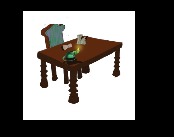
      Here's where I ended up with this.

      875c6b38-0f8c-4eaf-b749-d182540a1e1d-image.png

      PieterVanDerBeek 1 Reply Last reply Reply Quote 5
      • R
        robbery last edited by

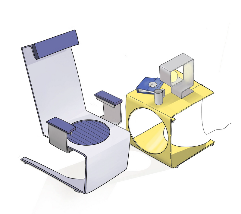
        Great work. This is awesome.

        G 1 Reply Last reply Reply Quote 0
        • G
          granger49 @robbery last edited by

          @robbery thanks 🙂

          1 Reply Last reply Reply Quote 0
          • DaveLeekArt
            DaveLeekArt @PieterVanDerBeek last edited by

            @PieterVanDerBeek I’m in love with your font haha. I need to add to my inventory in that department and I think I’ll start by stealing this one haha.

            I assumed that since you were doing the vehicle design course that you had completed the prop design course already? Maybe you’re going at them in reverse or just a different order. I was looking forward to bringing a crew with me to the Character Design section of the Curriculum.

            Have fun with the props! They were a bit challenging for me but beneficial for sure.

            Instagram: @daveleekart

            PieterVanDerBeek 1 Reply Last reply Reply Quote 0
            • PieterVanDerBeek
              PieterVanDerBeek @granger49 last edited by

              @granger49 Really nice! Love the slickness and thin materials with the punched-out shapes! :-]

              1 Reply Last reply Reply Quote 0
              • PieterVanDerBeek
                PieterVanDerBeek @DaveLeekArt last edited by

                @DaveLeekArt I finished my prop designs a while ago. Currently still occupied with the vehicle design class – going slow but steady. A little too early for me to start with character design already, but please go ahead, and I'll try and catch up! :-]

                (FYI, the font is loosely based on a classic serif, Bodoni if I remember correctly...)

                1 Reply Last reply Reply Quote 1
                • Heather Boyd
                  Heather Boyd last edited by

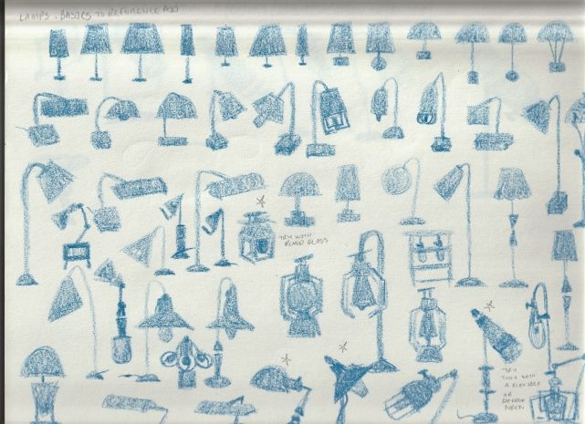
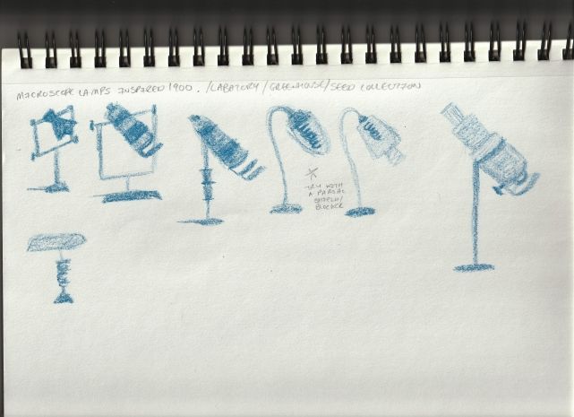
                  Prop Class finally started. So this collection will be around 1900s inspired but I still need to simplify it for children's picture books, which puzzles me a bit. But anyways,
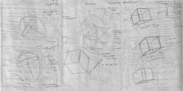
                  Prop Class 01 (2) svs.jpg

                  Prop Class 02 (2) svs.jpg

                  Instagram: www.instagram.com/heatherboyd.illustration/
                  Website: https://heatherboydillustration.ca
                  Shop: https://www.inprnt.com/search/products?q=HeatherBoydIllustration
                  Ko-Fi: https://ko-fi.com/heatherboydillustration

                  Be blessed,

                  1 Reply Last reply Reply Quote 2
                  • Heather Boyd
                    Heather Boyd last edited by Heather Boyd

                    Feedback requested!

                    I noticed my first step silhouettes had a bit more detail so I wasn't sure if I had actually made the second step thumbnail sketches with a few of them. So I added more detail and now I am unsure if this second step turned more into the third step.

                    Also I have a question for step 3 detailed sketch -I am working more with shape and less with outlines (lines -like comic/ Jake's style). Should I still follow Jake and make line art detailed sketch or stick to shape detailed sketch like below and let me know if I need to go deeper for this step 3??? Also I am trying to simplify my shapes to keep them in a children's picture book style that I like.

                    Lamp to Print (dark version -draw over) svs.jpg

                    Instagram: www.instagram.com/heatherboyd.illustration/
                    Website: https://heatherboydillustration.ca
                    Shop: https://www.inprnt.com/search/products?q=HeatherBoydIllustration
                    Ko-Fi: https://ko-fi.com/heatherboydillustration

                    Be blessed,

                    PieterVanDerBeek 1 Reply Last reply Reply Quote 2
                    • PieterVanDerBeek
                      PieterVanDerBeek @Heather Boyd last edited by

                      @Heather-Boyd

                      I'm not sure if I remember all steps correctly, but I understand the dilemma – whether to go for a more comic-style render or to digitally paint the shapes with less emphasis on line work.

                      I think the gist of this assignment is in creating a set of props that have an obvious purpose / origin (who made it, where would you find it, how / when was it made, etc). I would choose a (rendering) style that fits you and/or the context for your lamp. :-]

                      Heather Boyd 1 Reply Last reply Reply Quote 1
                      • Heather Boyd
                        Heather Boyd @PieterVanDerBeek last edited by Heather Boyd

                        @PieterVanDerBeek

                        Thank you,
                        that confirms my thoughts. I am now on the structure step and puzzling through how to draw my elongated sphere in perspective and on the diagonal arching down (post my attempts on Saturday).

                        I am also trying to figure out to what length (or how many parts in a scene) I want my work to be in 2d perspective, because I really like wonky perspective.

                        Instagram: www.instagram.com/heatherboyd.illustration/
                        Website: https://heatherboydillustration.ca
                        Shop: https://www.inprnt.com/search/products?q=HeatherBoydIllustration
                        Ko-Fi: https://ko-fi.com/heatherboydillustration

                        Be blessed,

                        1 Reply Last reply Reply Quote 1
                        • Leah
                          Leah last edited by

                          ee69a2d1-f471-4ffe-87a1-febedefe65e9-image.png
                          cant say its great but here is finished thing

                          Heather Boyd 1 Reply Last reply Reply Quote 1
                          • Shane Lees
                            Shane Lees last edited by

                            I just started posing. I'm not quite there yet.

                            1 Reply Last reply Reply Quote 1
                            • Heather Boyd
                              Heather Boyd @Leah last edited by

                              @Leah "it's finished" is something I need to work on. I suppose I am a perfectionist in that way but also I want my best. Good job for finishing!

                              Instagram: www.instagram.com/heatherboyd.illustration/
                              Website: https://heatherboydillustration.ca
                              Shop: https://www.inprnt.com/search/products?q=HeatherBoydIllustration
                              Ko-Fi: https://ko-fi.com/heatherboydillustration

                              Be blessed,

                              1 Reply Last reply Reply Quote 0
                              • Heather Boyd
                                Heather Boyd last edited by Heather Boyd

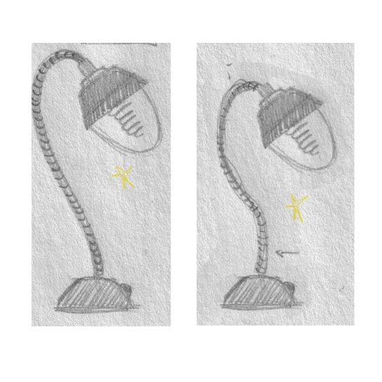
                                This is my progress. Still struggling with a titled lamp head, however I have learned a lot and these are still my 3/4 top view sketch/drawings.

                                Lamp Box in Perspective Drawing svs.jpg

                                Lamp in Perspective Drawing svs.jpg

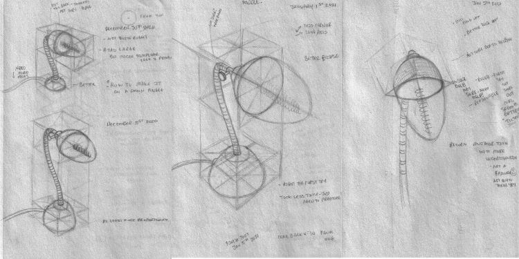
                                I really had to brush up on my perspective homework (few months back). The light part in the middle one looks heavy vs the coil support but I got the ellipse perspective right. And then I struggled with the position of the last one (with a titled box). Out of the first three which do you prefer proportion wise? Also I wasn't sure how to draw the coil (middle support) in proper perspective -I sort winged it.

                                Thanks as always,

                                Instagram: www.instagram.com/heatherboyd.illustration/
                                Website: https://heatherboydillustration.ca
                                Shop: https://www.inprnt.com/search/products?q=HeatherBoydIllustration
                                Ko-Fi: https://ko-fi.com/heatherboydillustration

                                Be blessed,

                                PieterVanDerBeek 1 Reply Last reply Reply Quote 2
                                • PieterVanDerBeek
                                  PieterVanDerBeek @Heather Boyd last edited by

                                  @Heather-Boyd Nice sketches! I like the middle one - the head being a bit out of proportion gives it character. Maybe it's the 70-30 ratio on the 'weight' that makes it more interesting? The tilted one on the right seems like a hard nut to crack, perspective-wise... but the silhouette is way less interesting so maybe just skip it? :-]

                                  Heather Boyd 1 Reply Last reply Reply Quote 0
                                  • Heather Boyd
                                    Heather Boyd @PieterVanDerBeek last edited by Heather Boyd

                                    @PieterVanDerBeek thank you so much. The middle one you like best, do you think it be able to stand by itself as a functional believable lamp, because the head lamp is heavy? I am also unsure how the light will project out of it. I need to find similar light sources.

                                    Instagram: www.instagram.com/heatherboyd.illustration/
                                    Website: https://heatherboydillustration.ca
                                    Shop: https://www.inprnt.com/search/products?q=HeatherBoydIllustration
                                    Ko-Fi: https://ko-fi.com/heatherboydillustration

                                    Be blessed,

                                    PieterVanDerBeek 1 Reply Last reply Reply Quote 1
                                    • PieterVanDerBeek
                                      PieterVanDerBeek @Heather Boyd last edited by

                                      @Heather-Boyd I think the believability would depend on the context / world in which it lives. But you could still tilt the head down a little so it will have more of a projected beam directed downwards, if that makes figuring out the light / shadow of your scene easier... :-]

                                      1 Reply Last reply Reply Quote 1
                                      • First post
                                        Last post