WIP - feedback appreciated
-
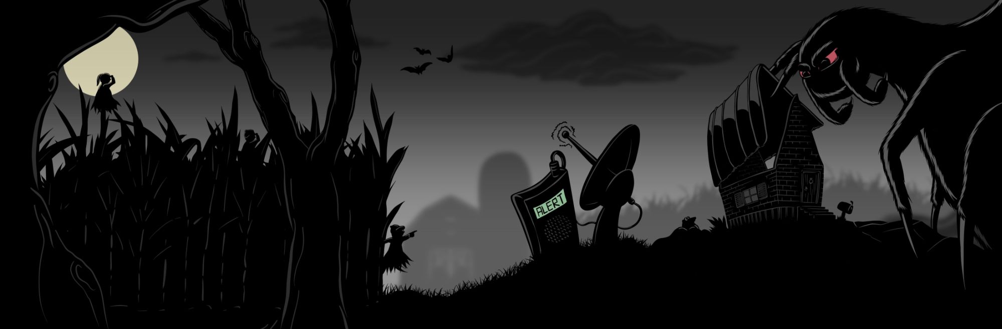
I’m working on a new illustration heavily focusing on silhouettes. The end goal is that when I post to Instagram, each third of the whole can be intriguing enough to stand on its own. I know I have a lot of cleaning up to do (especially in the right third), but I’m looking for general feedback. If there’s anything you think I should adjust to make it a stronger piece in the end.
Thank you in advance for taking the time to help me out!
-
Hi @jaredhdesign, this is a great start; however, here a few comments for your consideration.
I’m not sure what the focal point is. In other words, I’m not sure what to look at. The satellite dish is placed in the center which gives it high importance given its size and placement.
At first, the silhouette of the creature in front of the moon looked like an upside-down flower. Is that the focal point?
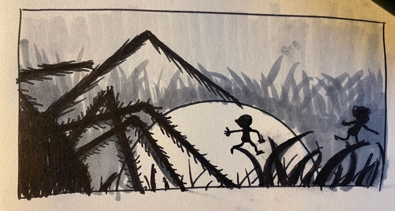
I hope you don’t mind, but I did a quick sketch with my markers of the spider chasing the little creatures to highlight the center character stands out in front of the moon despite the gigantic spider.
Use the thumbnail technique.
Hope this helps! Keep us posted.
-
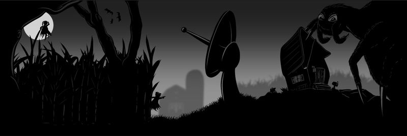
@jaredhdesign This is a great start. And I like your idea of posting it to IG in 3 parts and making it look like one illustration.
Some feedback (of the illustration as a whole)
- The satellite dish (due to size and placement) and the moon (due to contrast) are competing for attention.
- I'm not sure what value the satellite dish is adding to the story. Does it have a purpose?
- In any good storytelling, character interaction plays a massive role. So you may consider having the spider look at the 2 characters instead of the viewer.
- The depth between the foreground and background elements is clearly visible. However, since the foreground is all black, the depth in the foreground elements is not clear. Everything looks like it's in the same plane. Just drawing a few lines to show overlap may help eg. between tree and crop, between the dish and grass, or even overlaps in the ground itself.
Good luck!
-
@Neha-Rawat @Jeremy-Ross
Thank you both for your feedback. I’ve addressed many of the issues you’ve addressed. Most importantly I think was giving the satellite dish purpose.