Society of Visual Storytelling

    SVSLearn Forums

    • Register
    • Login
    • Search
    • Recent
    • Tags
    • Popular
    • Users
    • Groups
    • Search

    illustrated poster

    Projects
    14
    35
    10698
    Loading More Posts
    • Oldest to Newest
    • Newest to Oldest
    • Most Votes
    Reply
    • Reply as topic
    Log in to reply
    This topic has been deleted. Only users with topic management privileges can see it.
    • Christina Brown
      Christina Brown last edited by

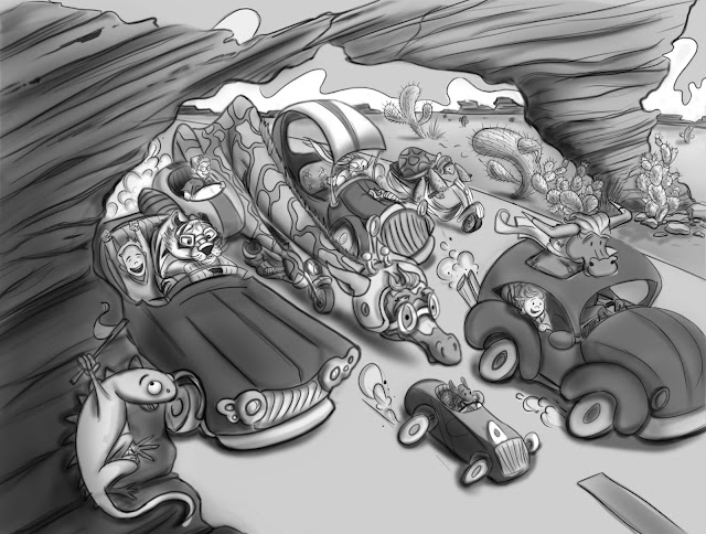
      Applied cast shadows, occlusion shadows and tone...

      Follow me on Instagram and twitter! @christinabdraws
      Facebook: https://www.facebook.com/cbrownillustration/

      Jiří Kůs 1 Reply Last reply Reply Quote 1
      • Jiří Kůs
        Jiří Kůs @Christina Brown last edited by

        @Christina-Taylor-Brown The rock will probably cast some shadow too 🙂

        Follow me on
        https://www.instagram.com/yiri_kus/
        http://yirikus.tumblr.com/
        https://www.facebook.com/yirikus/

        1 Reply Last reply Reply Quote 0
        • Christina Brown
          Christina Brown last edited by

          Ah! Thanks! Almost forgot that!

          Follow me on Instagram and twitter! @christinabdraws
          Facebook: https://www.facebook.com/cbrownillustration/

          1 Reply Last reply Reply Quote 0
          • Christina Brown
            Christina Brown last edited by

            Color tests: I'm having trouble deciding. Can anyone help me pick?

            Follow me on Instagram and twitter! @christinabdraws
            Facebook: https://www.facebook.com/cbrownillustration/

            1 Reply Last reply Reply Quote 0
            • Lee White
              Lee White SVS Team SVS Instructor Pro SVS OG last edited by

              These are looking good. Although I might suggest going back to the value stage and working that out a bit more. If you turn off your line layer, you will see that your have mostly middle greys without real darks and lights. Think about local tone a bit more. Some cars will be dark, and some cars will be light. Then the lighting pass gets added on top of those values, but you never lose that value structure.

              SVS Faculty Instructor
              www.leewhiteillustration.com

              Christina Brown 1 Reply Last reply Reply Quote 0
              • Christina Brown
                Christina Brown @Lee White last edited by

                @Lee-White Thank you ! I was wondering about that. When I do values, I'm always scared to go too dark. I really need to work on that!
                Here's what I've got and i'm happy so far. I normally work traditionally, so this is probably my third attempt at a digital piece.

                Follow me on Instagram and twitter! @christinabdraws
                Facebook: https://www.facebook.com/cbrownillustration/

                1 Reply Last reply Reply Quote 1
                • Stephanie Hider
                  Stephanie Hider last edited by

                  This looks so fun!

                  http://stephisdoodling.com
                  http://stephaniehider.com
                  https://www.instagram.com/stephhider/

                  Christina Brown 1 Reply Last reply Reply Quote 0
                  • Lynn Larson
                    Lynn Larson SVS OG last edited by

                    Oh girl, this is so amazing!! I love the whole feel of it!! The only thing was the speed limit sign, and it looks like you took care of it! I like color study #4, everyone knows red cars are fastest hehe

                    https://instagram.com/lynnlarsonart/
                    https://twitter.com/lynnlarsonart

                    1 Reply Last reply Reply Quote 0
                    • Naroth Kean
                      Naroth Kean last edited by

                      that looks really good

                      http://narothkean.com
                      https://twitter.com/narothkean
                      https://www.instagram.com/narothkean

                      1 Reply Last reply Reply Quote 0
                      • bharris
                        bharris last edited by

                        I really like your design, you've done a great job problem solving! Personally I'm liking number 2 and number 4 for your color tests.

                        www.brittanyharrisillustration.com/
                        www.instagram.com/britillustration/

                        1 Reply Last reply Reply Quote 0
                        • Christina Brown
                          Christina Brown @Stephanie Hider last edited by

                          @Stephanie-Hider @ Lynn Larson @Naroth Kean @bharris Thank you all! I'm trying with everything I've got! haha! I keep making lots of mistakes, but I've already learned so much! Here's what I've got down for my color theme so far.

                          Follow me on Instagram and twitter! @christinabdraws
                          Facebook: https://www.facebook.com/cbrownillustration/

                          1 Reply Last reply Reply Quote 4
                          • Lynn Larson
                            Lynn Larson SVS OG last edited by

                            Gorgeous colors! The giraffe on the tiny bike kills me every time hehe!

                            https://instagram.com/lynnlarsonart/
                            https://twitter.com/lynnlarsonart

                            1 Reply Last reply Reply Quote 0
                            • audrey dowling
                              audrey dowling last edited by

                              Great work Christina, you're on the right track!

                              website: https://audreydowling.wordpress.com/
                              twitter: https://twitter.com/audreydowling
                              facebook: https://www.facebook.com/Audrey-Dowling-Artist-Illustrator-498582176906242/timeline/?ref=bookmarks

                              1 Reply Last reply Reply Quote 0
                              • Chip Valecek
                                Chip Valecek SVS Team SVS OG last edited by

                                This piece reminds of the old Hanna Barbera cartoon where all the different characters race against each other. Fun piece!


                                https://www.instagram.com/chipvalecek/
                                https://www.facebook.com/cvalecek
                                http://www.cshellmedia.com/

                                1 Reply Last reply Reply Quote 0
                                • Christina Brown
                                  Christina Brown last edited by

                                  Thanks! Here's a little snippet of where I am now. Making some little changes as I go. Fun stuff!

                                  Follow me on Instagram and twitter! @christinabdraws
                                  Facebook: https://www.facebook.com/cbrownillustration/

                                  Jiří Kůs 1 Reply Last reply Reply Quote 5
                                  • bharris
                                    bharris last edited by

                                    HA! I love the carrot on the rabbit's car, very clever! Your rendering is really nice and I love the shapes you're using. Can't wait!

                                    www.brittanyharrisillustration.com/
                                    www.instagram.com/britillustration/

                                    Christina Brown 1 Reply Last reply Reply Quote 0
                                    • lindsayraecarr
                                      lindsayraecarr last edited by

                                      Christina this looks so lively! You are doing great I bet those boys will love it!

                                      www.lindsaycarr.com
                                      Instagram: lindsayraecarr

                                      1 Reply Last reply Reply Quote 0
                                      • NoWayMe
                                        NoWayMe last edited by

                                        Wow!!!!! I love it! 🙂

                                        noemiegionetlandry.squarespace.com
                                        noemie_illustration on Instagram

                                        1 Reply Last reply Reply Quote 0
                                        • Thrace
                                          Thrace last edited by

                                          You have a great sense of humor to your work, it is very clever! Really well done piece I can't wait to see it finished!!

                                          1 Reply Last reply Reply Quote 0
                                          • Jiří Kůs
                                            Jiří Kůs @Christina Brown last edited by

                                            @Christina-Taylor-Brown It looks great, but noticed one tiny mistake. Either hand or carapace(it should continue further around his head) is in the wrong place. if you erase the head, his hand will float in the air. If you broke the rules just to get better silhouette, just ignore my comment, its not really that bothering.

                                            Follow me on
                                            https://www.instagram.com/yiri_kus/
                                            http://yirikus.tumblr.com/
                                            https://www.facebook.com/yirikus/

                                            1 Reply Last reply Reply Quote 0
                                            • First post
                                              Last post