Society of Visual Storytelling

    SVSLearn Forums

    • Register
    • Login
    • Search
    • Recent
    • Tags
    • Popular
    • Users
    • Groups
    • Search

    working on a book dummy - need some feedback for the cover design

    Projects
    7
    25
    1645
    Loading More Posts
    • Oldest to Newest
    • Newest to Oldest
    • Most Votes
    Reply
    • Reply as topic
    Log in to reply
    This topic has been deleted. Only users with topic management privileges can see it.
    • D
      doro_thea @Jeannelle last edited by

      @Jeannelle-Pita thank you!
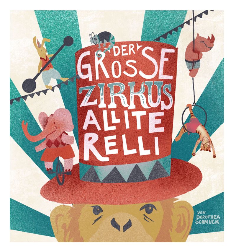
      I like what you are saying about the mysteriousness. Therefore I think I will go for the first crop, as it really doesn't need to be a happy monkey. I will keep on posting here how it still evolves. I still need to add some detail and play around with the colours some more...

      Jeannelle 1 Reply Last reply Reply Quote 0
      • Jeannelle
        Jeannelle @doro_thea last edited by

        @doro_thea Awesome! I would love to see how this turns out. Good luck 🙂

        instagram: https://www.instagram.com/jeannellepita/
        website: http://jeannellepita.com/

        1 Reply Last reply Reply Quote 0
        • Kim Rosenlof
          Kim Rosenlof last edited by

          This is looking really good! I think the colors are nice, and to me it's okay that the animals are not the exact color they are in real life. The typography is cool. All the animals are silhouetted nicely, but I have a hard reading the elephant because the greenish color behind it is the same value. When I squint, I have a hard time seeing the part that is on the green.

          Instagram: https://www.instagram.com/kiminyrose/

          D 1 Reply Last reply Reply Quote 0
          • Melissa_Bailey
            Melissa_Bailey @doro_thea last edited by

            @doro_thea looking really good! Love your concept and the idea of using abstracted colors. A few things to think about:

            • The elephant is disappearing -- perhaps it could be a brighter or ligher color, to stand out from the darker teal and red?

            • If this is an ABC book intended for young readers, you may want to consider upping the saturation of the colors or making them brighter, to appeal to very young eyes. However, your palette is gorgeous and this may not be needed. Just a thought.

            illustrator - author - smiley person
            mbaileyart.com
            instagram.com/mbaileyart/

            D 1 Reply Last reply Reply Quote 0
            • D
              doro_thea @Melissa_Bailey last edited by

              @Melissa-Bailey-0 Thanks for the suggestion. the elephant works way better in a lighter colour. going to post an update in a minute, feel free to take a look at the most recent version.
              I think I am going to stay with the colour palette though. I Know what you mean about the more saturated colours, but somehow I find this fits the mood and the intention quite well...

              1 Reply Last reply Reply Quote 1
              • D
                doro_thea @Kim Rosenlof last edited by

                @Kim-Rosenlof @Kim-Rosenlof Thank you! And thanks for pointing out the part with the Elephant. Hope the newest version fixes it. I am going to post it in a minute, feel free to take a look.

                1 Reply Last reply Reply Quote 0
                • D
                  doro_thea last edited by

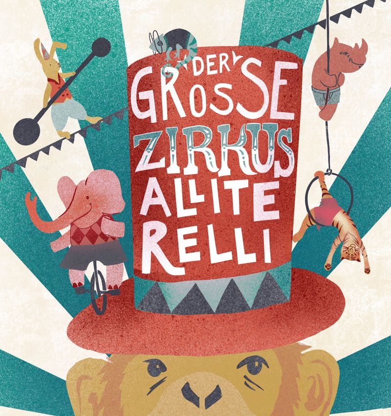
                  hi, thank you everyone for your feedback! here is the newest version. If there is anything still jumping out at you that needs fixing or could be nicer differently, please point it out to me. Cover_zirkus_final.jpg

                  KaraDaniel Melissa_Bailey 2 Replies Last reply Reply Quote 2
                  • KaraDaniel
                    KaraDaniel @doro_thea last edited by

                    @doro_thea really cool! Love this!

                    instagram.com/sha_kara
                    karadaniel.net

                    D 1 Reply Last reply Reply Quote 0
                    • D
                      doro_thea @KaraDaniel last edited by

                      @KaraDaniel thank you!

                      1 Reply Last reply Reply Quote 0
                      • Melissa_Bailey
                        Melissa_Bailey @doro_thea last edited by

                        @doro_thea looking really good! The elephant reads MUCH clearer -- one tiny thing you might want to look at is the color of the elephant's shorts. They're still disappearing into the background, which isn't happening to any of the other characters. But overall, two thumbs up!

                        illustrator - author - smiley person
                        mbaileyart.com
                        instagram.com/mbaileyart/

                        D 1 Reply Last reply Reply Quote 0
                        • D
                          doro_thea @Melissa_Bailey last edited by

                          @Melissa-Bailey-0 thanks for pointing that out again. I saw it and somehow couldn't muster the energy still to change it and said to myself:" oh it is not that bad". But it was good to see that you picked it up straight away, so here is the hopefully final update. Zirkus.jpg

                          1 Reply Last reply Reply Quote 2
                          • First post
                            Last post