Zero skill techniques
-
Howdy folks!
I’m hoping to create a thread where we can all list techniques we have learned that require zero skill.
Let me explain. A zero skill technique is something you learn that you do not have to practice, it is simply a tool in the form of knew knowledge. For example: having cool lights and warm shadows or warm lights and cool shadows. When I learned this I was amazed at how much it improved my paintings. It did not require any skill or practice really, it was simply a matter of having that knowledge. What are some zero skill techniques you have learned? I hope by sharing our pools of knowledge we can all help each other grow even just a little bit more. This stuff can seem pretty simple but at some point we weren’t aware of them but just having that awareness can really change ones artwork in my experience.My list of zero skill techniques:
Cool lights and warm shadows OR warm lights and cool shadows
Making a multiply layer at a low opacity and using a dark blue or purple to creat shadows (also applies to traditional work but varies depending on medium)
Thick outlines and thinner internal lines
Atmospheric perspective
Drawing objects as less defined and/or with thinner lines the farther they are in the background
Turning off saturation so you can see tones more clearly and adjust them for better contrast ( @NessIllustration )
Looking at your piece from far away or making the image smaller to see how readable it isI’m sure I have more that I’m forgetting, I’ll add them in if I remember.
-
I was going to say atmospheric perspective, but you beat me to it. Curious to see what others come up with.
-
@Griffin Contrast in your tones (turning off the saturation to see if your image is an unreadable puddle of middle grays). This is a cool trick, you can drastically improve the readability of your illustrations just by using a bigger range of light to dark tones
")
vanessastoilova.com
instagram.com/vanessa.stoilova/Check out my Youtube channel for tips on how to start your career in illustration! www.youtube.com/c/ArtBusinesswithNess
-
@NessIllustration yes! That’s a great one
-
i don't know if this is that simple to use but using perspective grids to check your perspective. you can find images like this on google or make your own. put it on top of your work to check it or draw over it.
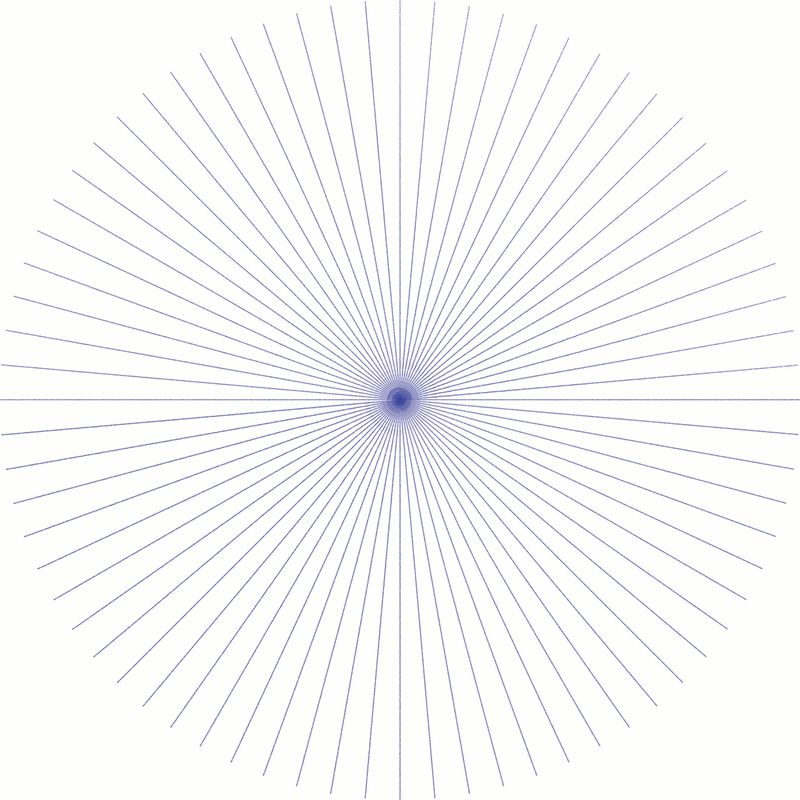
Portfolio: nyrrylcadiz.com
Instagram: https://www.instagram.com/nyrryl_cadiz/
YouTube: https://www.youtube.com/channel/UCbJCF1Im8ZO7hpGWTKOJMuA -
@Nyrryl-Cadiz this one requires learning just a bit about perspective but it’s super handy nonetheless!
-
Look at your image reflected in a mirror to check if things still read or look ‘off’, particularly in figures and faces
-
Cool idea! Here's some I know.
Squint your eyes, to see the value in your drawings. if things become blurred together, they are too close in value.
Internal Colored Lineart - coloring all lineart takes way too long, but if you only color the lineart on the inside of things (like the internal finger outlines on a hand drawing) then it can look really cool!
Shape Design - if somethings hard to shape, if you draw varying connected triangles, big medium and small ones. That can help you shape it well. Ethan Becker on Youtube has some videos about this.