Finished a dummy! Yay!
-
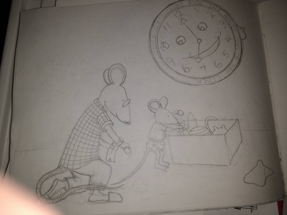
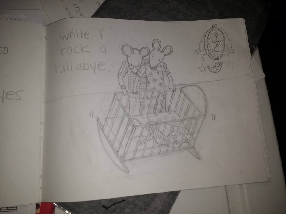
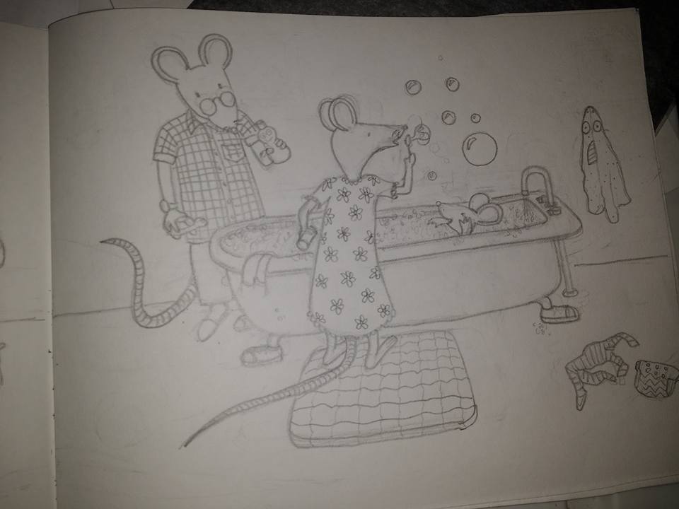
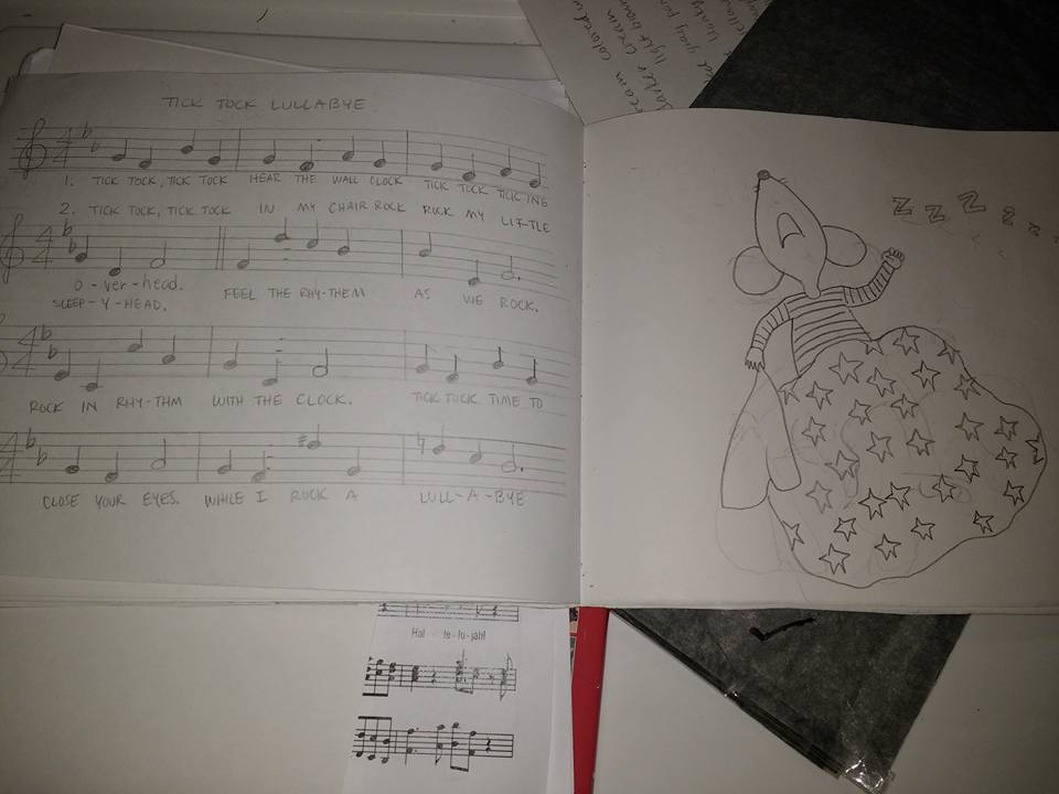
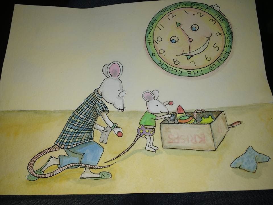
I finally did a book dummy for my little lullabye. Tick-Tock Lullabye. Big accomplishment. Now I need to decide on a color scheme and work on painting them. I made this about 23 years ago and wanted to illustrate it since my kids were babies. One down (part way down), a few more to go.
Marsha Ottum Owen
-
Working on colors. These are not working. I need more contrast and brighter colors maybe. Bigger or smaller palette? Any tips? Thanks.
-
@Marsha-Kay-Ottum-Owen Congrats on your first dummy...that is a big challenge and you seem to be moving along wonderfully.
It really depends on what you are going for but I would say if you are unsure about color I would focus on a limited pallette...maybe 3 at most and do a few color studies with them and see how it feels visually. It is easier to run into trouble with bigger pallettes and too many colors to choose from.
If you are not going for a muted, soft pastel feel I would say definitely play with and push the contrast more.
-
Thanks Charlie. It's a lullabye-bed time book so I probably should keep it kind of muted....maybe. Hmmmm.....
-
For sure, if it is a quiet, bedtime book...it's nice to have the color reflect that in the images. I always thought pastels were great for giving a sense of calm and quiet.
-
How wonderful! What a great feeling/accomplishment. I am curious about the music involved, did you incorporate an actual lullabye?
Finished a pb dummy is one of my goals for 2016, it is quite the project so great job/work with how far you have come.instagram: lisamgriffinart
-
@Lisa-Middleton-Griffin I have a very simple lullabye I made up. I do have a page incorporated with the notes and lyrics on it on the second to last page (which I will have someone double check as I am not really a musician). I mainly want to do these as keepsakes for future posterity. It's good practice too. I have another project called Uncle Carl Has A Chicken on His Head that I have been working on for months and then stopped for awhile. It was much more complicated than I imagined to figure out the layout, etc! This short one is helping me work my way up to finishing the other one
") It's crazy that the rhyming of a story can come so much easier to me in comparison with the illustrations! This should keep my brain from atrophy as I age
It's crazy that the rhyming of a story can come so much easier to me in comparison with the illustrations! This should keep my brain from atrophy as I age -
I do like the muted, soft colors. However, Papa mouse's shirt colors are very similar to the floor. Perhaps, using a pink for the floor (like the inside of the mouses' ears) would be good. This would help Papa mouse stand out and wouldn't add a new color to your work. A bit of gradiation should help give the flooring depth. Also, it's hard to read Papa mouse's right hand as it has lost the finger definition from your sketch. I love the clock (super cute idea to show the time progression through book plus Hickory Dickory Dock!) but one hand is pointing at 12 but the other hand is just off 7 - it should be pointed directly at 7 since the other hand is at 12.