Noah's ark picture book cover design update!
-
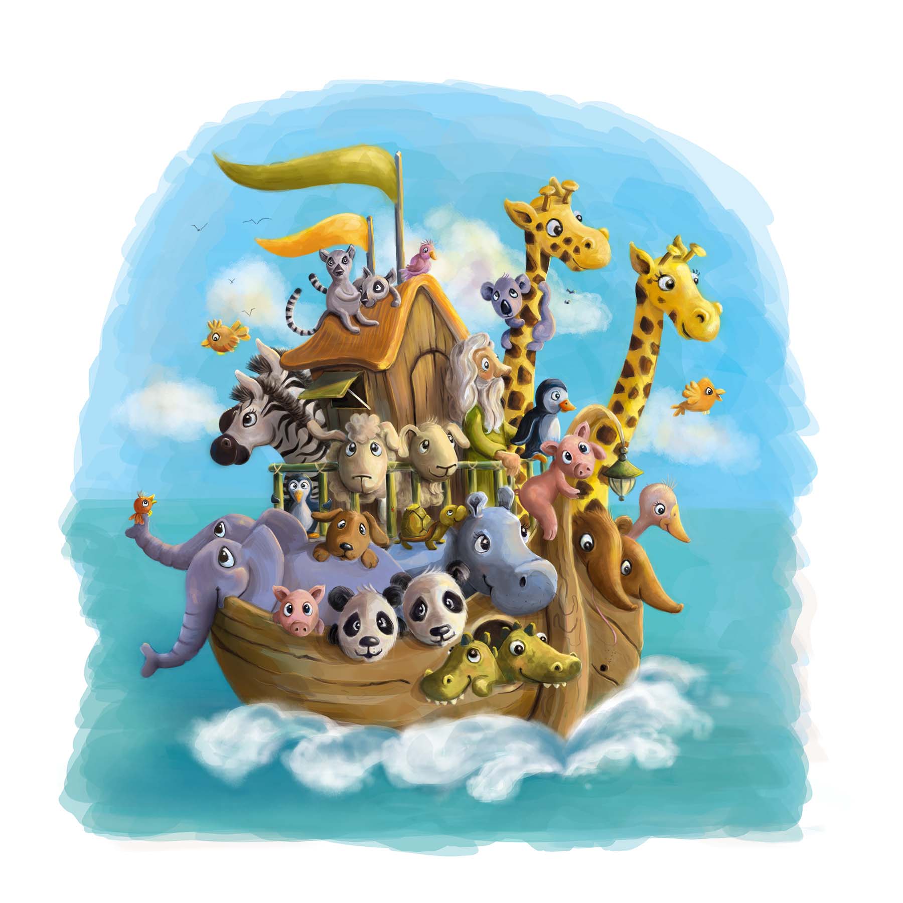
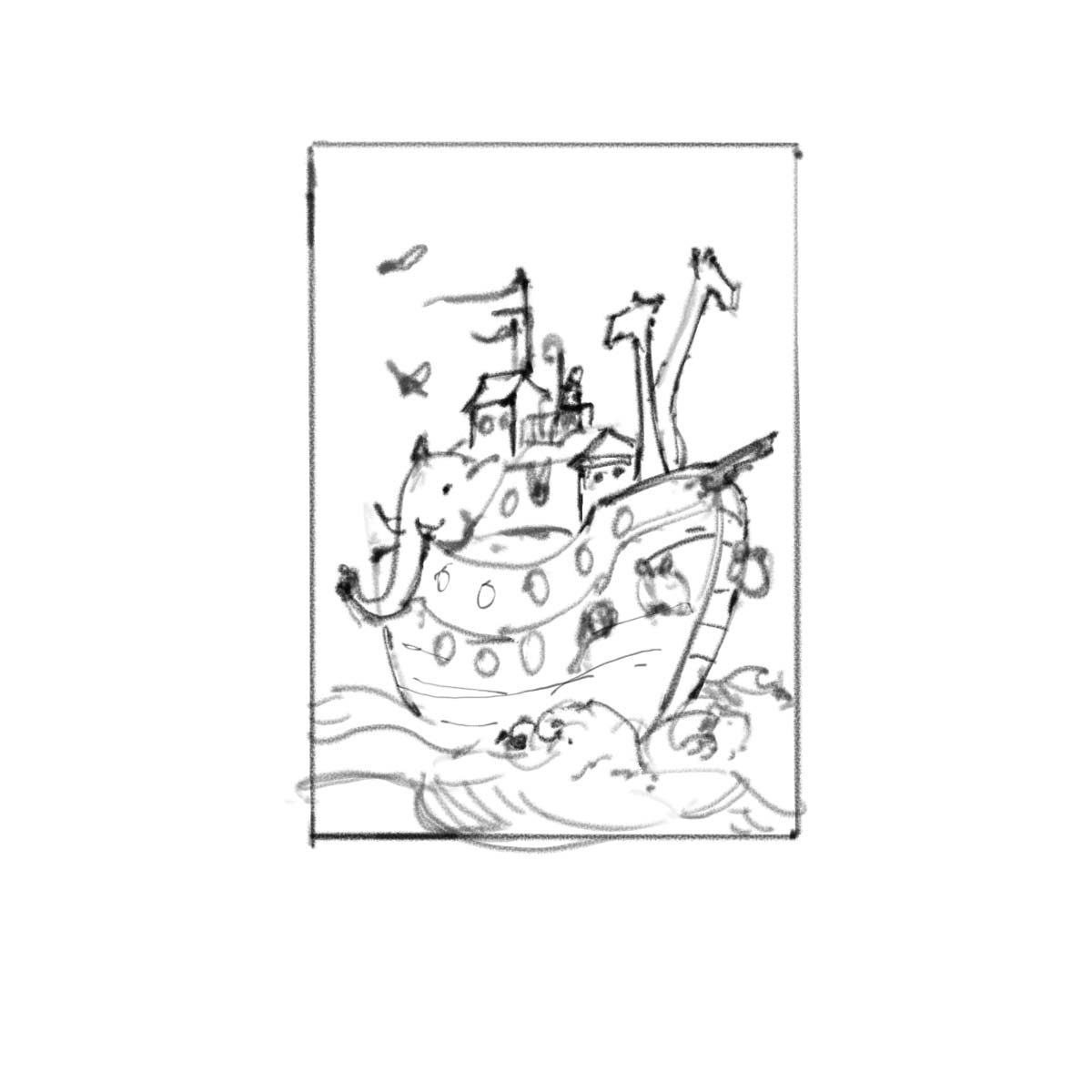
The first colored version. Please add your comments
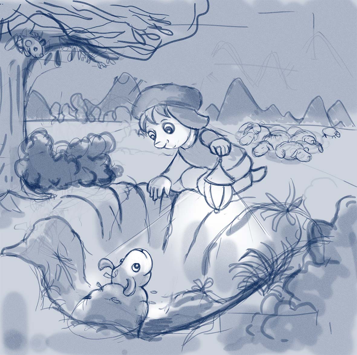
Here are two cover designs for a bible picture book. witch one would you choose ad why?
comments are welcome.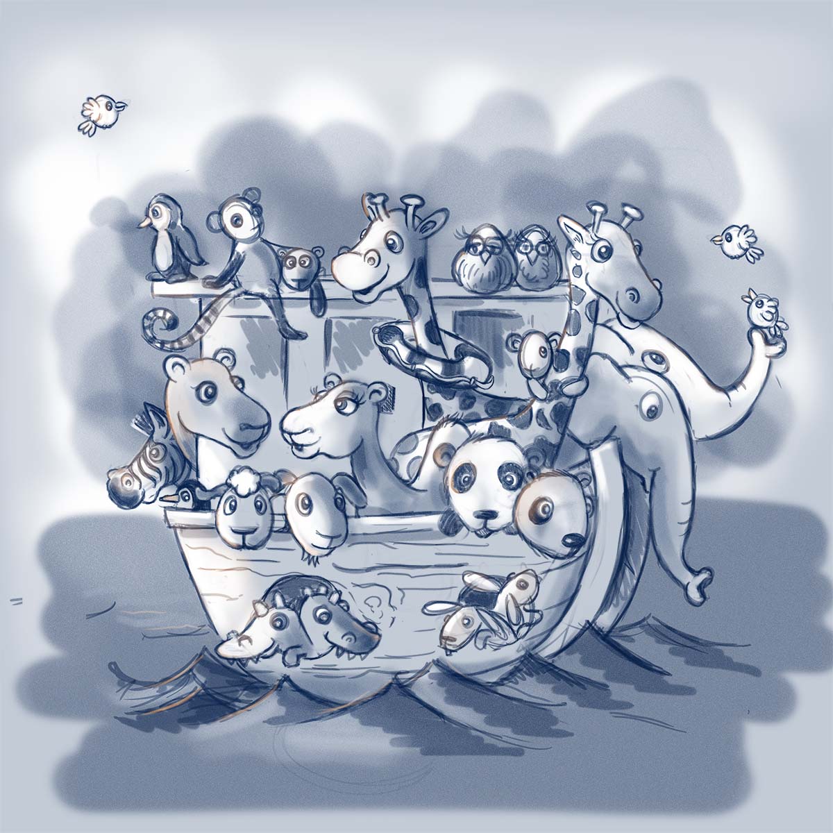
-
I love the composition of the first one, plus Noah's Arc is one of the most noticeable stories.
Great work as always,
Ace
-
it's lovely leontine
I find that the design of the 1st one looks more fitting for a cover -
I agree with Ace and Audrey, the first one is much more attention grabbing and the second one looks like an illustration you would find inside the book! Children would be drawn to all the animals and it's very cute!!
-
I'd pick #1. More animals (which is fun) and it's referencing a very well known story.
I'd consider myself pretty knowledgeable on the Bible and I'm not sure what that second picture is referencing. Maybe David?
-
@mattramsey the parable of the lost sheep...
-
@Leontine Really nice work. I personally like both of these but I also know these stories well so maybe that helps.
-
I'd go with #1 as well. Great work!
-
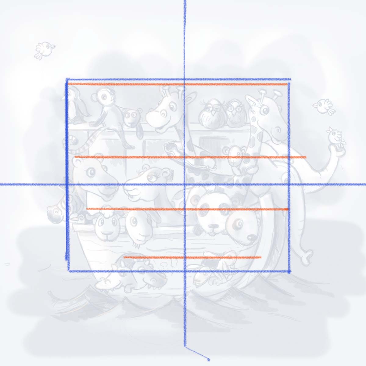
nice looking animals, but that composition is killing me! I did a quick overlay to show the basic composition problems. You will notice the overall composition is just totally dead center. Then, almost all the animals line up on these horizontal lines which stagnates the image a bit.
Think about changing up your sizes and shapes a bit more to give the interest. Your animal designs are spot on so you have already done the hard part. Now I'd play a lot more and get a dynamic composition going. : )
SVS Faculty Instructor
www.leewhiteillustration.com -
What age are those images for?
-
Lee, Is it wrong to have an image dead center? I am working on a children's book and will have a 7 month old baby on the cover. It should not be centered? It will not be in the cross-hairs.
Leontine - I love the animals on the ship. So cute! But the baby dinosaur sticks out to me... since dinosaurs obviously didn't make it.
")
To All - I don't understand why some people's names have the @ symbol before the name. Enquiring mind wants to know. Thanks.
-
I also prefer the first one and with Lee's comments it would make it even better.
-
@Beatriz-"Bett" When you click on reply next to the persons name it will tag the person in the reply by putting the @ in front.
-
Leontine, your animals are awesome! I agree with Lee's composition comments, but once you make a few adjustments this will be amazing! I'm looking forward to seeing this one finished...
-
@Beatriz-"Bett" I'd definitely check out the "Creative Composition" video - it explains the problems with a dead-center image and tons more! That lesson alone has totally improved my artwork.
-
@sergio the age is 2-4 years
Leontine
"A picture is worth a thousand words."https://leontineillustrator.com
https://www.instagram.com/leontine.illustrator/
http://www.facebook.com/leontineillustration -
@Lee-White Thanks Lee, I think you are right. As I tried to keep it simple for 2-4 year old. I probably lost track in creativity. Thank you!
Leontine
"A picture is worth a thousand words."https://leontineillustrator.com
https://www.instagram.com/leontine.illustrator/
http://www.facebook.com/leontineillustration -
I think the 1st one with lee's comments this will be great for a book cover
-
@Leontine definitely go with a Noah's Ark theme for sure. Really looking forward to seeing what you come up with based on the input from Lee!
-
@Rich-Green Thanks Rich!