Feedback needed - Need new logo for Website
-
Hello everyone! I am trying to give my website a makeover.
I've decided that my current logo "GO MAD! Cartoons" doesn't scream children's book illustrator, so I'm compositing some new logos. At the moment they're more compositional, and once I can conclude on a physical design, I can start experimenting with color. Here are the few batches below.
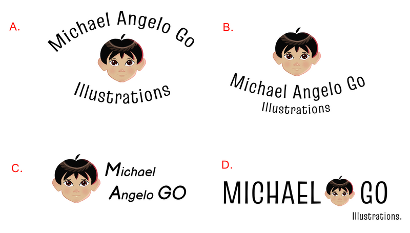
They're all pretty much the same tbh, but which ones do you think would be the strongest for my portfolio. (FYI, I'm not a graphic designer, but I do have a degree in architecture, and I should probably have those skills).
Here's a link to my website: www.michaelangelogo.com
Finis Coronat Opus
Instagram: www.instagram.com/madgcartoons/
Behance: www.behance.net/madgcartoons
Website: https://michaelangelodgo.wixsite.com/madgcartoons -
@Michael-Angelo-Go i like D best
-
@Michael-Angelo-Go D is my favourite!
")
-
B is my favorite of these versions; it has a nice uplifting feel to it.
I like the direction of D, but the boldness of the text seems to overwhelm the fine detail on the character's face--maybe for this one, you could try making the head larger or adjusting the weight of the text.
-
My first thought was to simplify the name and therefore the logo, why not call it MAnGO Illustrations? You'd have the M and A from Micheal and Angelo as well as the Go... plus the emblem would be simple and to the point

-
Hi @Michael-Angelo-Go In this case, I would think about your main application for the logo - I imagine it is primarily for your website?
If so, you should look at what format works best in that application - it will likely be the horizontal version (D).
If you go with a rounder format (A or
") when it scales down to fit at the top of your website the text may become too small for legibilty, or alternatively, the logo will need to be so large that it will push your initial website load content down to 'after the scroll', not ideal.
when it scales down to fit at the top of your website the text may become too small for legibilty, or alternatively, the logo will need to be so large that it will push your initial website load content down to 'after the scroll', not ideal.I'll just point out that this reads differently than the others eg. just 'Michael Go Illustrations'. You could always move the face to the left, if you want to add the rest of your name. This would then allow you to easily separate the text from face image for applications if need be down the track.
-
Hello everybody, so based on everybody's advice, it seems like most people like D because it's horizontal, which would be best for the website's formatting... But I know some of you like the roundness effect. So I've created a logo that tries to stay in one horizontal lane, but does have some curve to it.
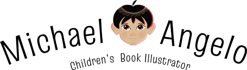
How is this?