I got an honorable mention! So many questions !
-
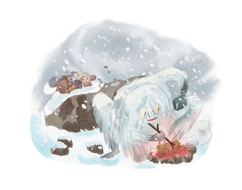
Gotta be honest I like the third it’s the most clear. I see what they meant.
-
@Isabel-Reyes-Feeney 3 for me too - maybe with the two explorers and the rock raised a tiny bit?
-
I am struggling with the same thing- I want to include all sorts of details and backgrounds that establish storytelling, and I haven't yet learned the 'less is more' lesson. But it's way easier for me to see how effective simplifying is when I look at someone else's work! (lol) Totally agree that the image has more impact without the rock cairn, and wouldn't have arrived at that solution myself. But I vote for #2, perhaps just because the dark shape of the rock is softened by the flags on top of it. Maybe consider lightening the rock so it doesn't pull focus so much? The edge between the rock and the snow is the greatest amount of contrast in the image right now, and my eye goes straight there.
-
@Isabel-Reyes-Feeney Congrats on your honorable mention! This is a really fun, unique yeti!
The rock does seem to draw a lot of attention because of the contrast and the yeti blends in since it's nearly the same color as the background. I think your modified versions help, but they could be pushed further. Maybe try covering the rock with more snow and find a way to make the yeti pop out a bit more (possibly darkening the background)? Another solution to consider would be making the yeti giant and the people tiny (right now they seem to be about the same size). That would also have a more dramatic yeti-sized impact that Will was talking about in the critique.
-
@Isabel-Reyes-Feeney I like 3!
-
@Isabel-Reyes-Feeney congratulations on the honorable mention! I LOVED your yeti!
You've gotten some great feedback from everyone else. Just going to add one thing about February's prompt: they were looking for a spot illustration, which is all about character and story with little to no background. And to be honest, your yeti does get a little lost amidst a similarly-colored background.
This composition would be beautiful as a full page or even spread illustration, and in that case, you would want to add more background, perhaps even some rocks or rocky terrain behind the yeti to help him stand out.
If you want to keep it a spot, ask what it absolutely needs to tell the story and what you can do to spotlight your yeti. The yeti is crouching in snow, does snow have to be falling as well to establish that this is a snowy landscape? Does the dark object of the cairn help tell the story? If it's just there to establish setting, is there another way to do that? What if the figures spying on Yeti were sherpas instead of generic scientists/explorers? Could you move the rock outcropping behind the yeti and make it larger to help him stand out, and use that as the border? Then have the two spying character's heads peeking out over the top? Would these changes make the storytelling stronger in the piece?
Just some questions I would ask if this were my piece. Don't know if this is helpful or not, but for me, what helps in illustrating a spot is thinking about story first and then editing the composition down to include only what is needed to tell the story.
All this being said, I LOVED your piece! It's definitely something you should put in your portfolio.
illustrator - author - smiley person
mbaileyart.com
instagram.com/mbaileyart/ -
@Melissa-Bailey-0 yeah I see what your saying that the yeti is blending into the background, funny I didn’t notice that ! Usually I would about a month later haha........it’s funny how I find it hard to spot these things in my own drawing but when I look at others it’s more apparent to me. I like the idea of the shepherds too. I’m gonna give that a go and defo take into account your advice , thanks so much
-
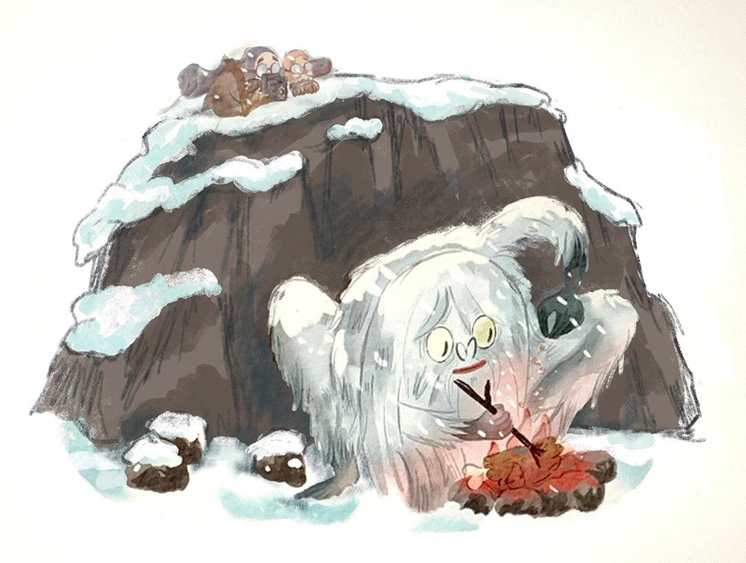
@Melissa-Bailey-0 I just did this super duper 2 second quick rough edit , was this what you meant ? Love to know your thoughts.
-
@Isabel-Reyes-Feeney awesome
-
@Isabel-Reyes-Feeney Big improvement! That looks great!
-
@Isabel-Reyes-Feeney you're welcome! And yes, looking better, but what if the rocks were even bigger? Like he's crouching under a boulder or outcropping to shield him from the wind? In that case, it would be a lot bigger than he is. And putting him completely in front of dark rocks will help him stand out.
If you do this, though, to keep him looking big, you'll need to make the background characters small to show scale.
Gonna say it again, LOVE your yeti!
-
Ok so last question I promise
") I rewatched the critique arena for the cooking yeti to remember what will and lee said about my piece. I was so nervous when it was live so thought it might be smart right
I rewatched the critique arena for the cooking yeti to remember what will and lee said about my piece. I was so nervous when it was live so thought it might be smart right ") anyhow I’ll get to the point ......... they mentioned that in my piece the rock pile over took the piece which I remembered but they also mentioned the other two characters taking focus away from the yeti sooooo do I loose these two ? Wouldn’t it be real bland and boring and a yeti just at a fire cooking his dinner? I’m so confused ! I thought story telling matters but then in this spot it takes away focus on the yeti ? Any0ne have any thoughts on this ?
anyhow I’ll get to the point ......... they mentioned that in my piece the rock pile over took the piece which I remembered but they also mentioned the other two characters taking focus away from the yeti sooooo do I loose these two ? Wouldn’t it be real bland and boring and a yeti just at a fire cooking his dinner? I’m so confused ! I thought story telling matters but then in this spot it takes away focus on the yeti ? Any0ne have any thoughts on this ? 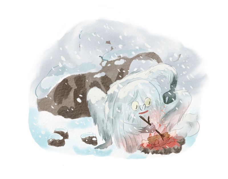
-
@Isabel-Reyes-Feeney hope you don't mind that I did this (took a screen shot and did a quick draw-over) -- but this is a really rough sketch of what I was trying to explain in words, and probably failing miserably.
Don't know if this helps at all, and you'd draw it SO much better than me, but this is just one way to include the characters and tell the story you want to tell while composing the spot in a way that makes the yeti stand out. Not sure if this is even a composition you'd like, but it's one possibility of many. (The rocks probably don't even need to be this dark -- it might work better lightened slightly.)
illustrator - author - smiley person
mbaileyart.com
instagram.com/mbaileyart/ -
@Melissa-Bailey-0 of course I don’t mind, quite the opposite , I really appreciate your input. I see what your saying now, but now does the big rock take over.........? im gonna take it all into account the advise which I’m super grateful for and I’m g0nna start chipping away at it !
-
@Isabel-Reyes-Feeney LOve your drawing.
I like it with the bigger rock, I think because the colours make the Yeti stand out moreS Thompson
-
@sarahlovellart Agreed! The big rock actually makes your idea easier to understand! It both makes the yeti stand out more, because of the contrast (the red in the fire does this too) AND it eventually (which is important because it should be second) leads the eye of the viewer to the people watching the Yeti.
So to recap: I see the yeti first, thanks to the way you accented him, and AFTER that I see the people watching him. There is a hierachy of ideas that you achieved here! Great work
Also the fact that there is some kind of second idea, that adds mystery, makes your first idea stand out more.
-
@Isabel-Reyes-Feeney oh I'm so glad you didn't mind! I never want to encroach on a fellow artist's work or offend! Really looking forward to seeing what you come up with.
 ️
️