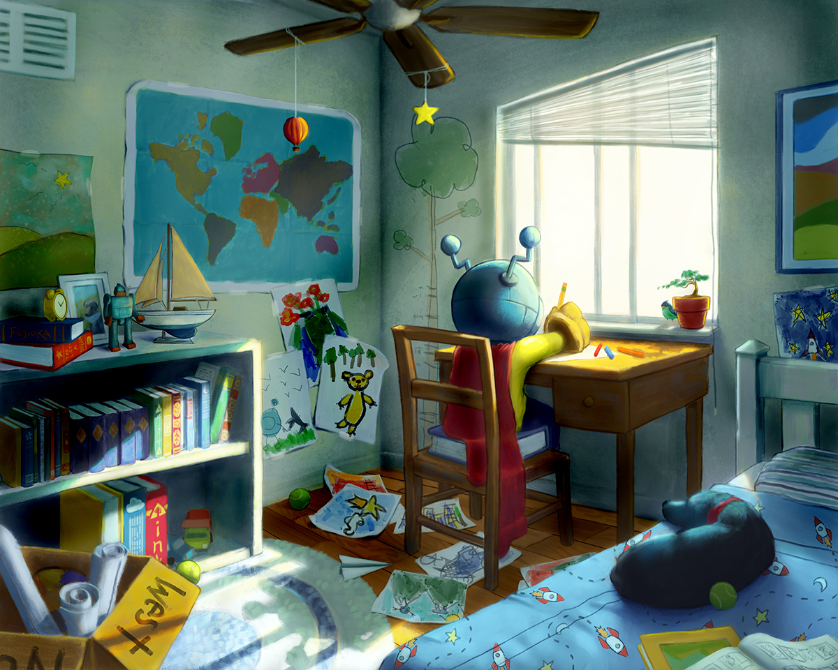
Helmet And Hound #7
-
@shinjifujioka Off course Sinji, Your piece is awesome! What bothers me is the color of the light, coming from the window. Why not lighten it up a bit, and push the contrast way more? It would give it some interest I think.
 hope this helps!
 -
I think it looks great. l love the wall art and the paintings.
-
@Leontine Thanks for the suggestion! I'll have to play around with that idea.
-
@shinjifujioka please follow your own idea's, it was just a suggestion, I hope that this character will end up having his own book, it is just awesome! Love your style and strong use of lights and darks! Chapeau!
-
@shinjifujioka I have looked at this piece a few times now and each time I come back to this post I see some new detail you placed into the room that I did not notice before. That is what I love about it - and why I think kids would really enjoy this in a storybook that they read over and over again.
I also think you are so talented with perspective and scale in this interior scene like that. Its really great work. And of course all of Helmets artwork is fantastic! I can only hope to be as good of an artist as little Helmet is someday!

-
@Leontine Oh don't worry, I end up going with what I like best in the end. But during the process, it helps me to get inspiration from other sources. That could be looking at other artwork, watching films, or getting suggestions from other people like yourself :). Honestly, I feel the most comfortable with getting inspiration from other artwork and watching films or just taking a walk and thinking, but this forum has been a great crowd to bounce ideas off of. I'll even read suggestions that people have on stuff that other people have submitted and think about how I could improve my own art. Thank you for the kind words!
-
@Rich-Green Thanks! I didn't realize how mentally exhausting it would be to tackle a piece like this. I felt like my head would explode near the end with how many decisions I had to deal with. But I'm glad I did and I'm glad to hear that you enjoyed it

-
@shinjifujioka probably sounding like a broken record but this is really great! Do you have this book story boarded? about how far along are you ("finished" pages)?
-
@mattramsey Thank you! I don't have any plans to make this into a book. I just have a running list of ideas for images with these characters, so once I'm done with an image, I just pick another idea from the list and start drawing. It allows me to tackle a variety of settings and topics while not getting burdened with making sure that the images fall into a linear story.
Maybe down the road I'll consider writing a story that involves these characters.
-
Almost perfect for me. What I feel a bit odd is the hard outline in the helmet an other minor parts and the absence or softness of other outlines. The lighting is awesome.
-
I think Leontine's suggestion makes the entire piece look more realistic and dramatic but at the same time I like the soft airiness in your version...its kind of got this dreamy quality to it (especially how you handled the bookshelf) that goes well with the story. If I had one super nit-picky suggestion, I would say the folds and draping of the cape could be improved and watch out for the folded corners on those paper...maybe look up some reference images. (when I was in school my instructor pointed out the way I drew the corners of my paper and told me to look up references haha) but otherwise your lighting looks amazing and I love the story!
Also I knew you were Japanese when I saw the helmet lol ....made me feel nostalgic about my childhood watching oldies Japanese cartoons .
-
I was looking at older illustrations you did and your progress in the last 2 years is amazing! well done shinji!
Unlike Sergio, I love the way you mix soft and crisp edges even if it wouldn't be that way in real life sometimes. It gives a unique dimension to the picture, and I like that
If I had to say something to critique, I would just advise you to work on improving the texture of the hound, his coat, as well as the texture of fabrics. I find they don't reach the same standard as the rest -
Thanks for the feedback/suggestions and kind words everyone

@Biscuits I still watch Japanese cartoons. Just not old ones, haha.
-
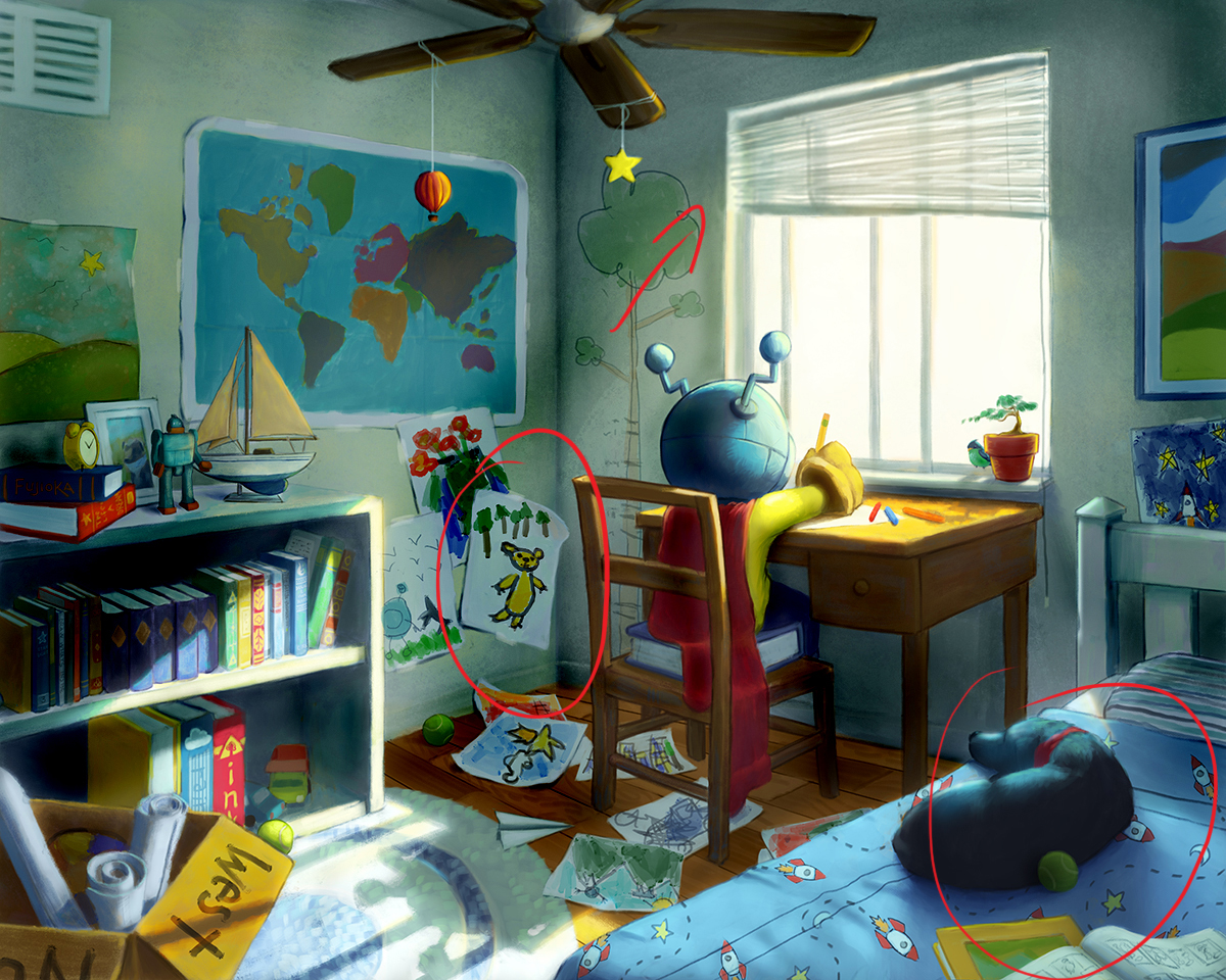
Hey there. this looks great! as everyone has said the lighting is spot on. There are three little things that catch my eye and could be improved. (I didn't read all the comments so i apologize if i repeat something) 1 is the perspective of the window. the angle at the top of the windows ought to be similar to the degree of the top of poster on the other wall. I'd suggest lengthening the left side a bit. 2. the tennis ball behind the dog is a little flat. perhaps try to push the color of the left edge so it blends into the dark part of the pup. 3. The drawing of the yellow bear is a bit too forward facing and it draws my eye right to it. try skewing it so it falls at an perspective angel.

all in all these are just little things. it's a great piece. -
I really love how you hinted the previous scenes or history of them.
-
@Naters-Calderone Good eye on the window angle. I started the sketch using perspective lines, and the initial sketch had the top of the window at that angle. I think as the piece went on, and I started adjusting angles to have more of a aesthetically pleasing feel personally, I missed the top angle of that window. And I'll make adjustments to the ball/bear.
-
@Naroth-Kean I don't know what you're talking about...
Haha, jk. I'm not sure how many people notice it.
-
@shinjifujioka let pretend nothing ever happened
