Dragonfly (in ink) way past deadline :)... feedback welcome
-
So... I really liked the August prompt (Dragonfly) and the "drawing in ink" one... however I typically don't have enough spare time to work on a contest prompt within the month. But I had this idea buzzing in my head that I had to turn into an illustration. So here it is.
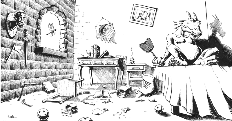
I'd love to get some feedback - as this is by far the most elaborate ink drawing I've ever made, I'd like to learn what things you would change in terms of lighting, composition and storytelling to improve the result. (In particular I'm focusing at the moment on black and white drawing with traditional ink.)
-
What a clever piece! Love your line work. What is your favorite pen (or dip pen, if that's what you're using)?
One thing to think about: there is a lot of wonderful texture on the left side and the dragonfly is beautifully placed. But there is a lot of white space on the right side.
The stark shadow does help balance the composition and make the character pop, but instead of relying on shadow, what if you brought in more texture and detail on the dragon like you did on the bricks? That would also help balance the piece while making the dragoon stand out amid all that white space.
Just a thought.
(Oh, and where are his wings and tail? Or is he a wingless, tail-less dragon?)
Wish that my inking skills were on the same level as yours. This is a really good illustration!
illustrator - author - smiley person
mbaileyart.com
instagram.com/mbaileyart/ -
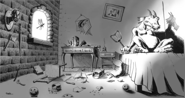
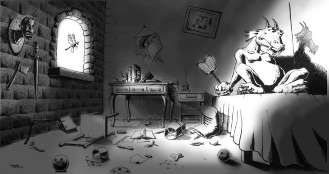
This is so awesome! I love the narrative here and all the details that add depth to the dragon character. As far as lighting goes, I think you have a good start but it seems unfinished only because the shadows are so clearly coming from the window but it seems like the shape of the window would produce less light (hope that makes sense). If you want to focus on traditional ink, you could dilute with water to create a different values of grey washes to enhance the shadow. I did a couple quick draw over in Photoshop to try and explain better what I'm trying to say (hope that's okay?).
-
@Melissa-Bailey-0 thanks for your feedback!
Re: what if you brought in more texture and detail on the dragon like you did on the bricks? - that is a good point, I've had lots of doubts about this in particular - whether adding more texture to the dragon was a good idea or not in terms of making it a focal point. I think you are right, by leaving the background white, texture on the dragon would help it pop out better.
Re: wings and tail -- oops great point! I did a number of original sketches and the wings at least were definitely there... however they got lost on this final draft. The tail, I may not even have thought of it. Maybe it's a tail-less flightless dragon after all

In terms of pen, for this illustration I've used sakura microns and occasionaly a Tombow marker that gives some variable width. The main reason is that I don't feel confident enough with my Pentel brush pen or just a brush - these would be my favourite tools because I love the fluid lines, however I need way more practice... when I use brushes my lines are skaky.
-
@Tiffany-Thomas thanks a lot for these!
I did some initial studies with Copic markers... however I decided that for the purpose of learning I wanted to see what I could do purely in black and white. I never considered using diluted ink, which you made me realise is an interesting option to explore.
I can see how the image is much improved with the extra shading. I believe that for the type of illustration/comic I want to work on, digital shading and coloring on top of the B/W ink may end up being my go-to approach.
I will experiment and see.
-
@Tiffany-Thomas "it seems like the shape of the window would produce less light (hope that makes sense)" yes it does make a lot of sense.
-
@txels One idea, you could do some ink washes across a whole blank page, scan it and use it as a layer in photoshop. You'd be able to play with the transparency, erase out some of the highlights and maintain the organic texture from the ink wash without worrying whether or not you'll loose your line work from the original. If you're doing comic work, digital color/shading probably makes the most sense ;).
-
@Tiffany-Thomas that is a great suggestion, thanks!
-
Cool pic! As far as story telling - Are the things scattered on the floor because he's been swatting at tiny dragon flies? Is he just missing them? Is he going to hit the one coming through the window? Perhaps some squished dragon flies on the walls and floor would answer some questions. If he's at war with the one in the window, its body gesture is not showing a fly in battle mode. It is a fly passively floating through an open window.
-
@Kim-Hunter that is an interesting point. The picture shows the aftermath of a nightly battle between this one dragon and dragonfly. The dragon, tired from the fruitless chase and the lack of sleep, has given up. The dragonfly has escaped and takes a final look from outside the window before leaving - you are totally right, it might help if the dragonfly's posture or look was victorious/defiant/... or something like that... I never thought about that - also TBH I find it really hard to draw
.